


Wyvern
Wyvern
About
- Username
- Wyvern
- Joined
- Visits
- 3,240
- Last Active
- Roles
- Member
- Points
- 5,521
- Rank
- Cartographer
- Badges
- 24
Latest Images


-
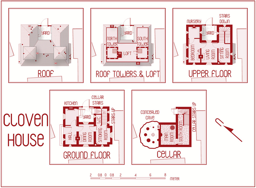
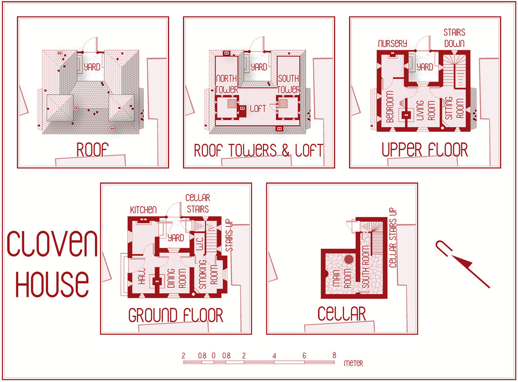
[WIP] Community Atlas August Mapping Contest: Cloven House
Although I've already posted about this in the contest topic, to round-off this WIP topic too, here are the final versions of Cloven House, without and with its secret Cellar cave, now with added cupboard under the Cellar stairs:

For those who might be interested, and again something that's in the contest entry topic too, I've attached here the PDF notes for the map, which will be in the Atlas version in the fullness of time, for those wanting an early preview of this little haunted house:
Do be aware that there's a hint of "adults only" about a couple of the potential apparitions and other ghoulish elements in these notes. Nothing too salacious, just something to be aware of.
Incidentally, anyone thinking I might have abandoned my preference for random design mechanics in devising my Atlas maps in this instance, might be reassured that there were hints of that in selecting what ghostly items to pick from in constructing this description (I have a long list drawn from numerous past sources and ideas!). Such a mechanism was used less here than in other features I've designed previously, however.
And good luck to all the other contest entrants, especially those struggling to get things finished by the deadline!


-
August Mapping Competition - Building Floorplans - Win Prizes
Yes, it's coming up to that time isn't it? So here's my final version of Cloven House, firstly with the secret cave hidden, and then revealed:

This will be winging its way to Remy for the Atlas shortly, with its text and PDF notes, but in case anyone might be interested, the PDF description is here as well, should anyone wish to be "enlightened" further on the nature of this haunted house:
Worth noting though that a few comments are a trifle "adults only", concerning a couple of the potential apparitions and other ghoulish elements.


-
City of Torlok
D'you think he knows there's a giant skull monster trying to eat his head? 😉
The gold staff doesn't look quite right though. It seems as if it's behind his hand, not in it. Might be worth checking to see which sheet the staff's on, as if it's the staff version with the hand cutout, it should fit to look as if it's being gripped correctly.
-
[WIP] August Mapping Competition -- Vertshusen Distillery
Looking good!
You may be having a few problems with the classic "jumping text" issue, pushing things out of position too far at different zoom resolutions, or with different bitmap image renders - hence "Grain & Water Storage" in your Second Floor map ends right at the edge of the panel behind the text lines, for instance. This is down to how CC3+ handles text, and is a perennial problem, unfortunately. Beyond exploding the text again (which fixes it in place) - as before, not an ideal solution, as it means it's no longer editable text - you can try to make fuller use of the text placement point (like "Bottom Center", "Mid Left", etc.), as that means the text nearest that chosen point will not move away from where you place it. However, it will move away in the opposite direction (or both, if you pick something like "Mid Center") if it needs to/feels like it, so there's an element of swings and roundabouts here.
The only real solution is to expand things like the coloured background panel behind the numerical key list, so that when you view the map complete on screen, all the text fits in it. Then try scrolling in or out a little, and see if the text still fits inside that area. If it doesn't, adjust the size of the panel again. This should mean that in most cases the text block will look OK both in a normal CC3+ view, and in most whole-map image renders. Most, though not all, sadly, and it can sometimes mean the background panel looks a little too large.
![[Deleted User]](https://secure.gravatar.com/avatar/c75d9a245b74d9c59be0999ea81ca541/?default=https%3A%2F%2Fvanillicon.com%2F92add7f8c954488718110edc4896ad39_200.png&rating=g&size=200)
-
[WIP] Community Atlas August Mapping Contest: Cloven House
I know not everyone likes to provide typed notes to go with their Atlas maps, and that's fair enough. However, and partly I suppose because I've been designing RPG scenarios with both maps and written descriptions since I first discovered the original D&D booklets, it's something I like to do. I find moreover that both facets work together to create more detailed settings overall. So it wasn't a huge surprise that when I began typing-up my notes for this map yesterday, I started realising I'd missed something in the floorplans.
So, a bit of extra drawing, moving things around and so forth, beyond what I was anticipating in my comments here earlier, and now we have this version - normal first, then with the secret cave below:
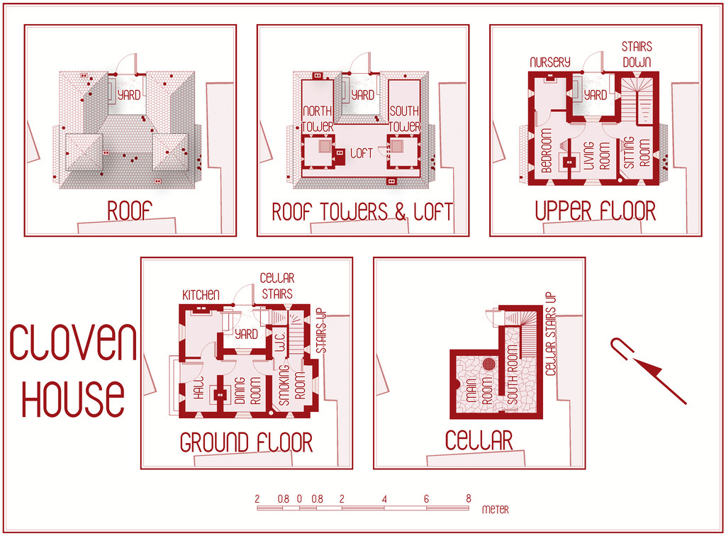

Most of the changes are along the top row of drawings, with a few "missing teeth" scattered across the roofs now, and adding the chimney stacks, but they're mainly in the central plan, where we have an entire Loft and a new access door from the South Tower now. The Loft doesn't extend right out to the edge of the tiled roof, because I wanted to show only where access is practical - often just as a crawlspace - for creatures the size and form of a typical adult human, something that'll be explained in the notes.
Further tweaking is still required of course, and I'm sure I'll spot other things that need adjusting before this is done, aside from finishing-off typing in the notes. That got sidetracked when I decided I needed to add the Loft! Plus this is already the third iteration of how the Loft should look, as things developed and changed along the way. "Color Key" is your friend when suddenly deciding you need a major rejig of this sort, is all I can say!
