


Wyvern
Wyvern
About
- Username
- Wyvern
- Joined
- Visits
- 3,240
- Last Active
- Roles
- Member
- Points
- 5,519
- Rank
- Cartographer
- Badges
- 24
Latest Images


-
Community Atlas: Map for the Duin Elisyr area, Doriant
It seems we may soon be looking to more new maps, and some fresh mappers, for the Atlas, which can only be A Good Thing!
Meanwhile, back at the camp, and wondering which style to choose for the area map...
One of the issues with symbol-based overland styles is the hidden "north" side of everything, where you can't properly show what's happening there without using some sort of indicator or map notes. Often, that doesn't matter too much, but for details of what's where within a mountain range, it can become more problematic. For this area map, I decided to use a top-down drawing style instead, and picked one I've been intending to try for a while, the Worthington Historical from CA91. This has only a few symbols for the settlements particularly, with the terrain and vegetation all illustrated using bitmap-fill drawing tools and sheet effects.
As the area's size had been determined already, the one thing I changed when creating the new map in CC3+ was the background fill style, opting for the green Farmland fill in place of the default blue Sea one, as there's no large expanse of open water here. After that, I simply created the usual new BITMAP Sheet and Layer, and inserted my features map onto them:
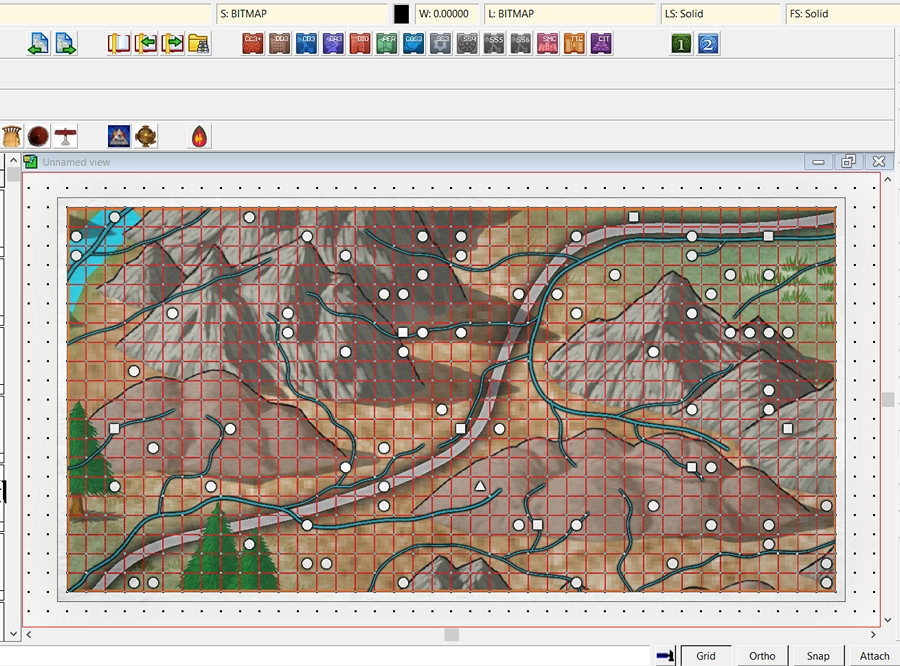
The grid dots that are showing are from a new "2 miles, 2 snaps" one created for the purpose as well, making for both easy placement of the inserted map, and a check that the scaling was correct (I did a double-check using the Info -- Distance drop-down menu command as well, just to be sure).
I sketched in a base colour for the rising land that fills much of the map except in the top right and lower left corners using the Terrain Default, Hills tool. That was rather hard to distinguish, as it uses the Solid 10 fill, the palest of the transparent "Solid" fills. I tried changing it to Solid 20, and while the Glow effect on the TERRAIN HILLS Sheet looked interesting, the fill itself still didn't really show clearly enough. After a further couple of failed attempts using the darker Solid fills, and an examination of what effects were on which sheet, plus a few more experiments, I ended up simply copying the drawn HILLS area to the CONTOURS (LAND) Sheet, and changed the fill style to the Land, Default style, which produced this:

Happy with that, I began draughting-in the hill and mountain terrain using the Terrain Default, Mountains drawing tool, only to find that the two Mountain sheets had no effects on them. I'm not sure if this may have been corrected subsequently in that Annual's download file. If not, it's easy enough to correct by just copying the effects over from one of the sample maps for this Annual issue instead. Which I did!
I had a couple of false starts in drawing the terrain. While it's important to try to mimic the placement of symbols with where the more dominant features are in this kind of "zooming-in" area map, I find it's often a question of trial and error to see what looks best when converted to a different, in this case more topographical, drawing style, something that will likely also need testing variations in the sheet effects subsequently as well.
As the mountain terrains are all drawn using the same fill and effects in the unadjusted Worthington Historical style, stacking mountain contours atop one another also creates the dreaded mottling of transparency acne, thus a series of "BACK" sheets without effects and a different fill had to be added - and changed - each time I redrew the various contours during this. So long as you do this singly or in batches, to make best use of the "Prior" selection option, that's not too bad though.
This shot is only partway through the process of changing the contours, so it looks really messy still in places. The Glow effect on the various terrain sheets is obviously too strong as well, for all it helped keep things clearer for me while drawing to this point. Hence why I hadn't changed it at this stage. This is as far as I got during the session:
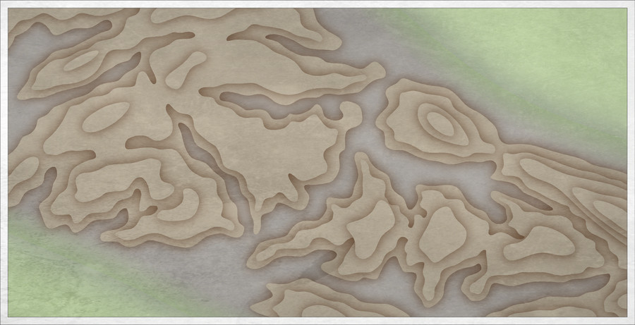
The final image for today shows what happens when one of those "BACK" Sheets is deactivated:
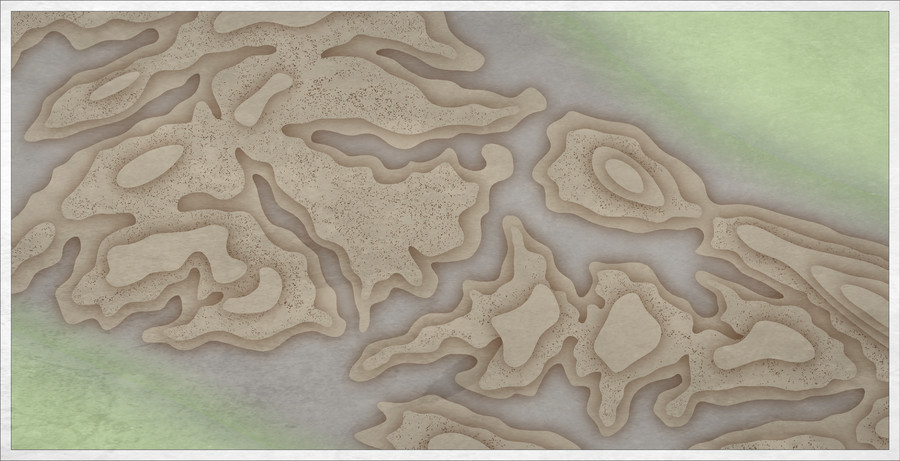
Someone's knocked over the pepperpot 😉.
More to follow.


-
WIP - Senan
Indeed, good luck with the surgery. As someone who also has manual dexterity problems, I can quite appreciate the problems. CC's been a definite boon in this regard.

-
Community Atlas: Map for the Duin Elisyr area, Doriant
All the places that have been either mapped or reserved are shown as such in the online Atlas. Everywhere else is free to choose from - and don't forget that even if somewhere has already been mapped at some level, you could always map a smaller piece of that, down to a room in a house or a dungeon (or even smaller places!) if that hasn't been mapped in detail yet, should you choose to. There are no limits except your imagination!
You can reserve a place or places by commenting on this Forum topic, or by contacting the Atlas' organiser and coordinator, Remy Monsen.
Full information can be found out regarding all aspects of mapping for the Atlas on the How to Contribute page of the Atlas.
-
Community Atlas: Map for the Duin Elisyr area, Doriant
Long preamble post today, sidling-up to the area map.
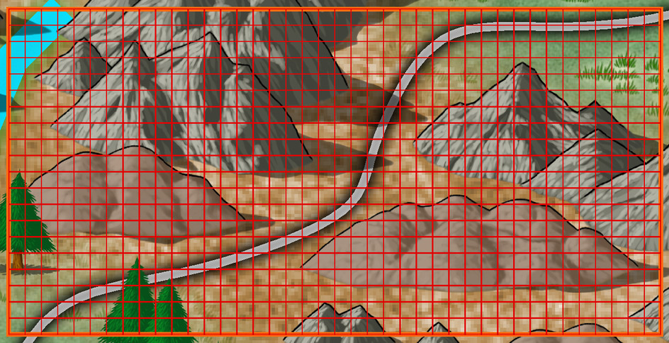
It's never been a secret where the underground map's to go, but the Duin Elisyr area in Doriant is huge, so clearly I needed to zoom-in to find somewhere suitable as an actual location. This is where Duin Elisyr is (the orange rectangle is about 1,000 by 800 miles):
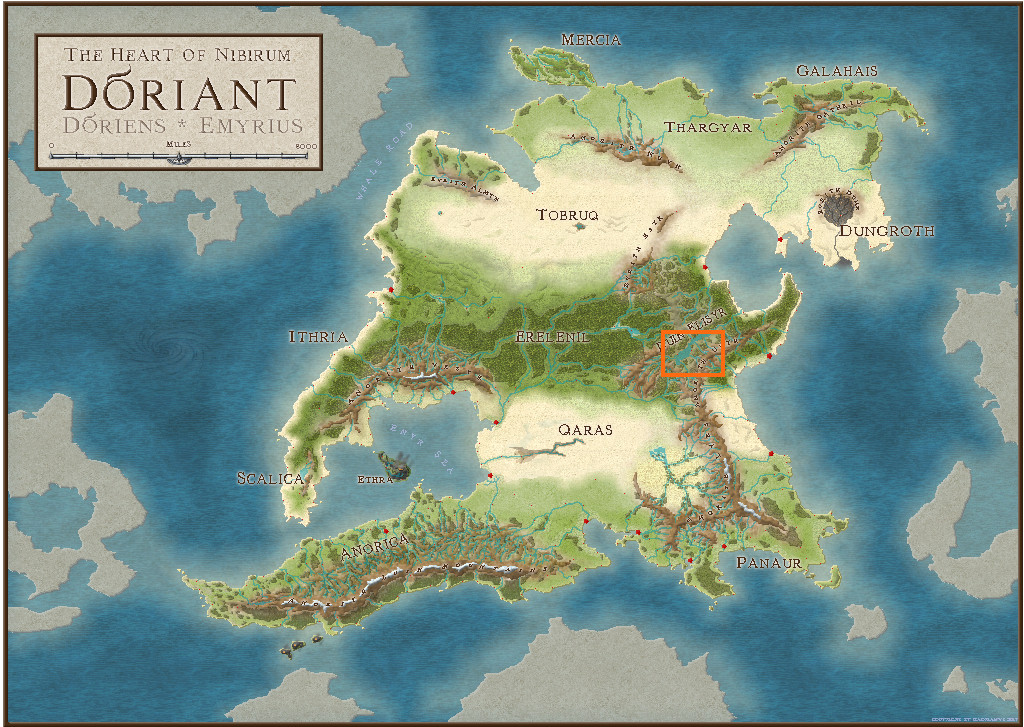
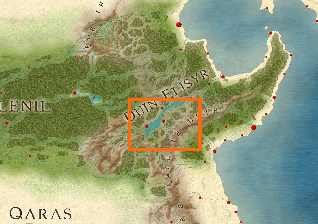
Nibirum's equator runs through this area, so from early on, I was contemplating vaguely warm to hot tracts of jungle-like vegetation, perhaps with savannah stretches, and of course mountains, as the whole area is somewhat elevated (albeit fairly modestly compared with other mountainous areas of Doriant). So it was something of a surprise to open the Duin Elisyr map and find only typical temperate vegetation symbols had been used there, even into the lower lands in the map's southeast corner, not that far from the near-desert lands a little further south.
However, that's what the map showed, and it didn't have a great bearing on my choice of a humanoid bee-folk as the inhabitants of the caverns. So I simply hunted around for a suitable spot, not too near any habitation, to create a new small area map, as no other smaller maps linked from this one when I arrived there. Snag was, my typical choice of about 20 miles square for such a map looked tiny in this vast region. I doubled it, only to find that still looked ridiculous, as just covering half the mountain pass zone I was looking at. Thus - gulp! - I doubled the horizontal length again to be now 80 miles by 40...
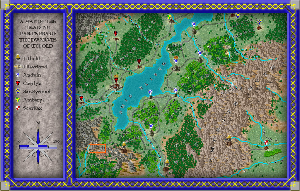
The Duin Elisyr map, complete with my selected rectangular zone:
And a closer look:
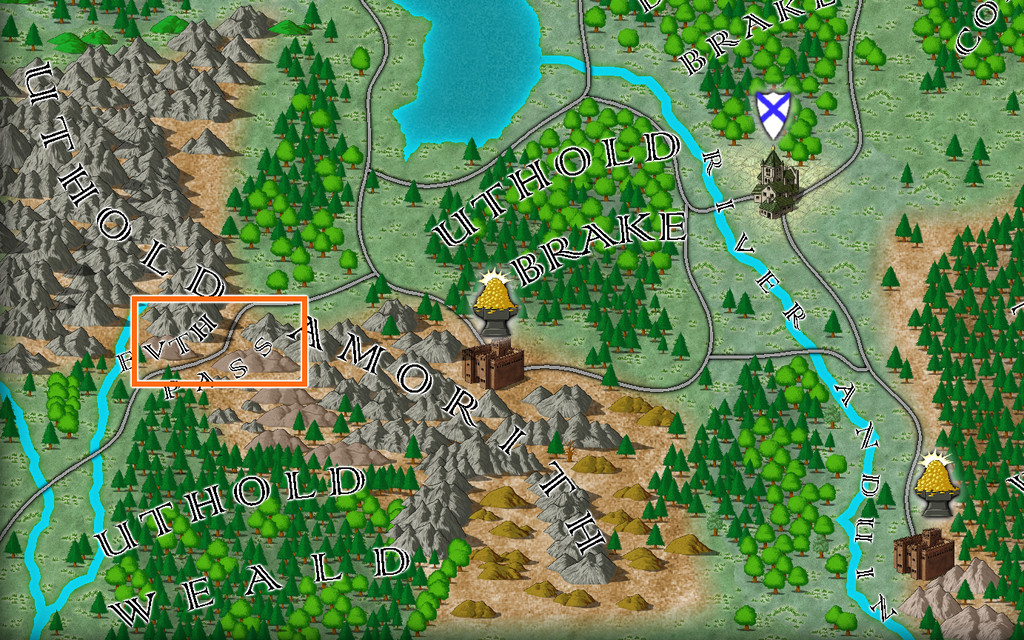
The new map's name had become obvious as "Evth Pass" by this stage, and suddenly those innocuous-seeming bee-folk had become bee-folk raiders, waiting to snare passing travellers using the mountain route from their hidden cavern lair, in this corner of rather peripheral lands to the Uthold Dwarfen realm.
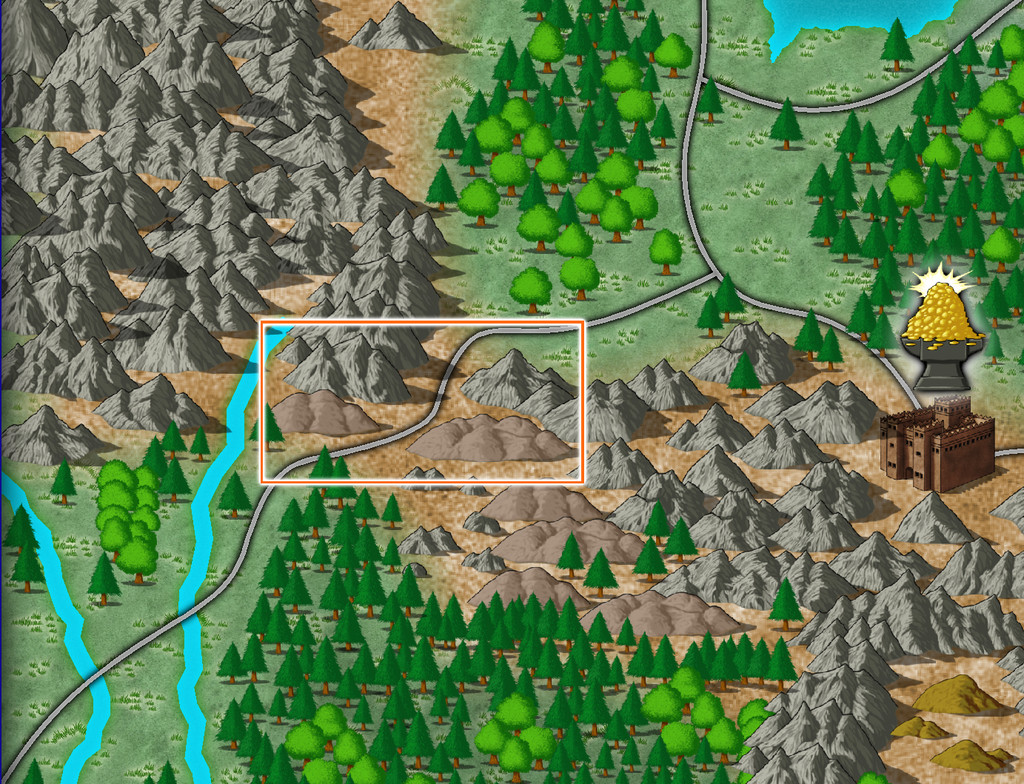
For map-planning of course, we need a still closer view, and preferably without the labels:
Ordinarily, I'd hand-sketch the proposed area onto graph paper, having set an appropriate scale for each square first, which is typically a mile or two. As I'd intended to present the process here on the Forum this time though, I decided a version others might make sense of would be useful instead, so I simply added a two-mile-square grid to the area, thus:
As usual, I then rolled to see what random squares might contain points of interest at this mapping level. I choose a rough percentage value first of all, dependent on the overall terrain and what indications of habitation there may be nearby, which is normally between 10 and 20%. Here, as this is pretty wild country without substantial nearby settlements or farmland, I opted for 10%, of which I decided around 12% might be surface settlements of some kind (this proportion I often vary between roughly 8 to 20%). In this case, that meant rolling quite a lot of D10s (any 1s = the required 10%), and then checking which of those might be settlements by rolling a D8, with again "1" allocated as the determinative.
Once that was done, I had to identify what each feature actually was. The settlements were decided using my own random tables, but for everything else, I opted to use various published sets of information cards. One was a newly-arrived set of Monte Cook Games' "The Weird" cards (like their random RPG tables book of the same name that I've used before, but adding a whole fresh array of options for people, places and things beyond what's in the book). The others were seven different sets of Inkwell Ideas "Sidequest" decks with 52 to 54 cards in each, which provide an array of ideas for enlarging into RPG adventures. The choice of deck was rolled randomly from this group of eight, and then a random card from the relevant deck selected. From that, an option, or sometimes more than one, was picked, or adapted, to fit the map and what terrain the spot was in.
After completion, and some time spent poring over what all this showed, allowed the sketching-in of some basic river lines too (living settlements need a water source of some kind, after all). Which brings us to:
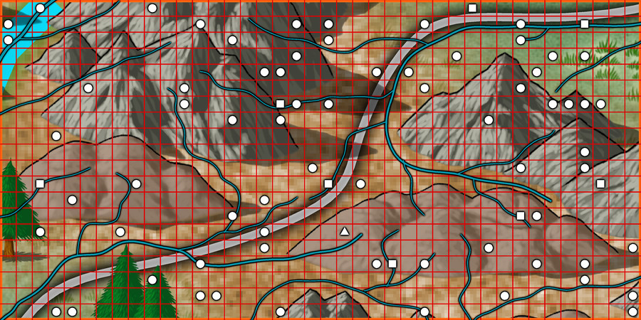
Here, white squares are the surface settlements (8), the white triangle is the bee-folk cavern location, and the numerous white circles are all the other points of interest (68), just a little under the expected random average of 80 items in all. The blue lines, of course, are the potential watercourses (including a substitute place-holder for the one actual river from the original map, up in the top left corner.
As the "new" river lines suggest, the terrain symbols here are simply being used to indicate raised areas and valleys now, and as if being viewed from top-down, not from their pictorial side-on appearance.
All of which (as I warned at the start😊) lengthy preamble means choosing the style and starting the area mapping will have to wait now till next time!

-
EUREKA MOMENT: CA15 Heraldic Symbols as CA180 Marine Dungeons 2 Brass Inlays
Possibly one of the more important, yet least discussed, skills with CC3+ drawing creation is understanding what things can be repurposed beyond what their titles alone may indicate. Textures like this are just one element, as symbols can be reworked/rescaled to look like something completely different too. And then tweaking items using the effects as well. Remembering, or finding, the key thing when you need it is, of course, quite another matter!

