


Wyvern
Wyvern
About
- Username
- Wyvern
- Joined
- Visits
- 3,239
- Last Active
- Roles
- Member
- Points
- 5,519
- Rank
- Cartographer
- Badges
- 24
Latest Images


-
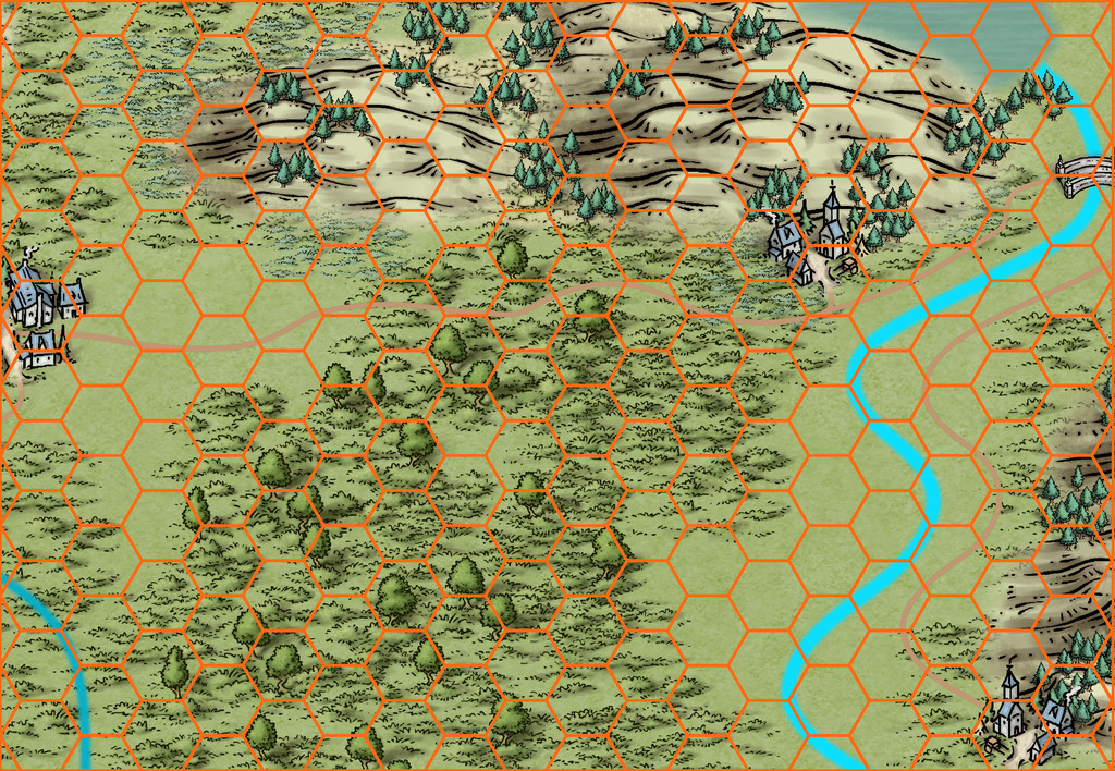
[WIP] Community Atlas, 1,000 Maps Contest: Villages in The Whispering Wastes of Haddmark, Peredur
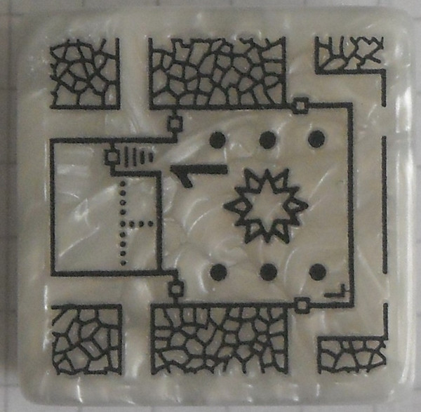
Having thus generated the surrounding wilder lands, it was then time to construct the random, geomorphic-dungeon-designed map, as noted earlier, using the OSR Dungeon style from the 2015 Annual, in the manner established for my immediately prior map, again mirroring that used in the Shadowdark supplements. Since the Inkwell Explorer dice are one of the sets for which no written descriptions are available, I'd had to work up some ideas about the content well in advance, so seeds for some could be planted in the regional Whispering Wastes map. One of the random map designs for this layout was a fairly obvious temple structure, albeit with a curiously crystalline-looking central focus:
Having tried a few random rolls on the main Shadowdark tables, I came up with a cult that spoke only in whispers (which of course ultimately developed into the area's name), but nothing that seemed to match the temple's crystal focus. So I turned instead, and rather by-chance, to a free PDF Shadowdark supplement, created by the online Discord community earlier this year, which allows the design of slightly weird mega-dungeons randomly, on-the-fly. This is called "Shadowdome: Thunderdark" (SD:TD), and was used to create a random mega-dungeon, run through by two teams of players in direct competition, at Gary Con 16 in Lake Geneva, Wisconsin, USA, in March 2024.
I began with a few random rolls from tables in SD:TD, and stumbled onto several items with a crystalline theme that way. Some quick adaptations to extract other related features, more random rolls and a few deliberate choices, and suddenly the layout became The Crystal Cathedral of the Whispering Wastes, or "Crystal Cathedral" for short:
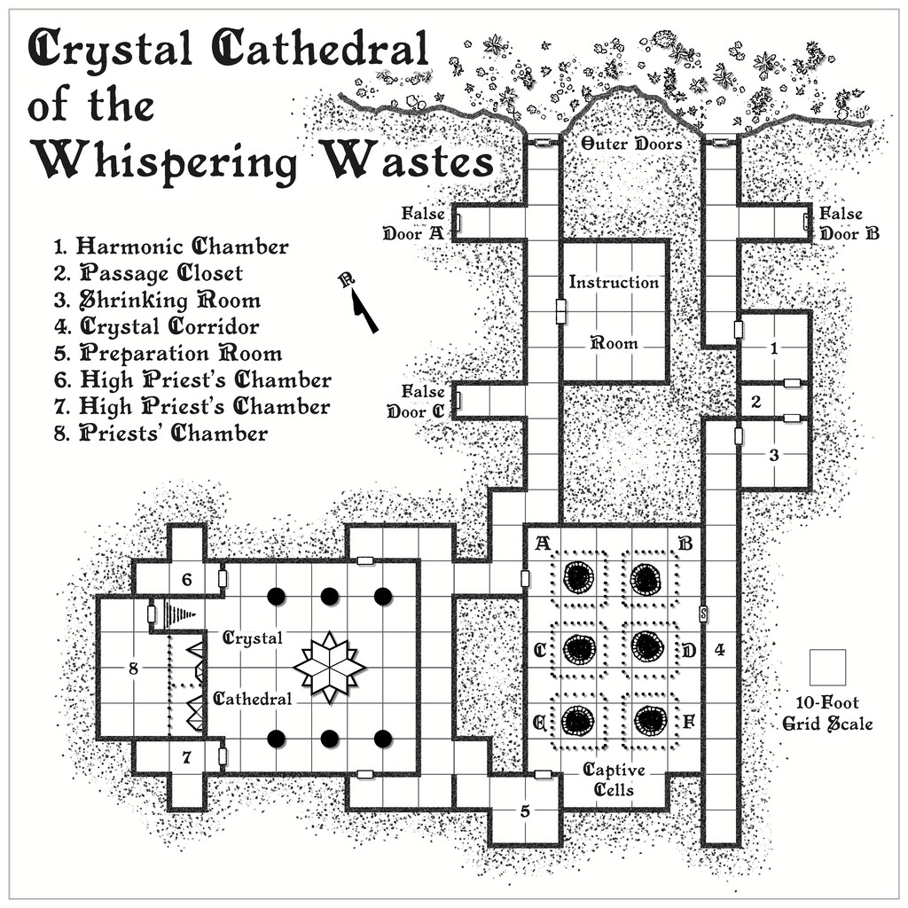
This was located, hidden away and hard to find, in Lightning Ravine, Hex 1002, with the Outer Doors opening onto a ledge partway down one of the side-canyons in said Ravine. It was rather fun to watch the whole coming together from what was provided by SD:TD, with some expansions and a little adaptation in places.
Ultimately, the process provided a gigantic creature, "The Shimmering", that was living in the crystal, and which had descended from the stars long ago, sinking into the earth and creating a protective crystalline casing for itself. It had set-up a cult of humanoids (The Shimmering Cult) to provide living creatures it can feed upon, turning them into fresh parts of the crystalline features scattered throughout this little complex, with a view to eventually having sufficient power and energy to return to the cosmos. (Freely acknowledging here influence from Lovecraft's "Colour Out of Space", and Nigel Kneale's "Quatermass 2", where even the cult acolytes receive a small "mark".) The cultists become transformed into parts of the crystalline structures eventually, gaining extra powers and abilities along the way. Plus parts of the cult can be found in other places in the Whispering Wastes, as the notes for that map, and this one will suggest. Cultists who are always on the lookout for lone travellers and others who seem unlikely to be missed...
Ordinarily, that would have been that, submission ready for the Atlas, and I'd have been moving on to the next small dungeon map in the series, intended for somewhere in the Feralwood Forest of Alarius. However, while I was finalising the notes for both these maps, Remy Monsen dropped-in the 1,000 Atlas Maps Competition. As noted in my first posting here, the Shadowdark hex-mapping system allows the creation of individual sites as well, including settlements, of which there are ten on the hex map, all village or hamlet sized. As I'd already done the basic layout designs for these in preparing the map notes anyway, I decided to try mapping all ten. Whether they'll all be finished before the contest ends is, of course, another matter. I will complete them, if other things allow, regardless of that though.
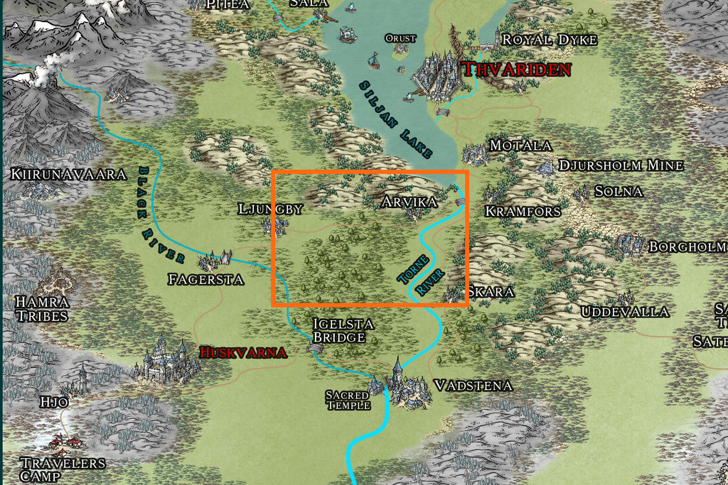
First village is to come next - Ljungby (Hex 005)!


-
Community Atlas 1000th map Competition - with Prizes [August/September]
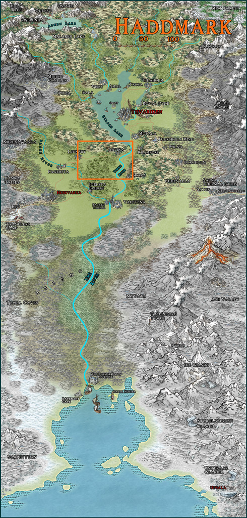
Having already reserved the orange-highlighted area below in Haddmark, Peredur to place the next small dungeon map in my ongoing mapping project this year, I'd already completed the map for it before the contest was announced.

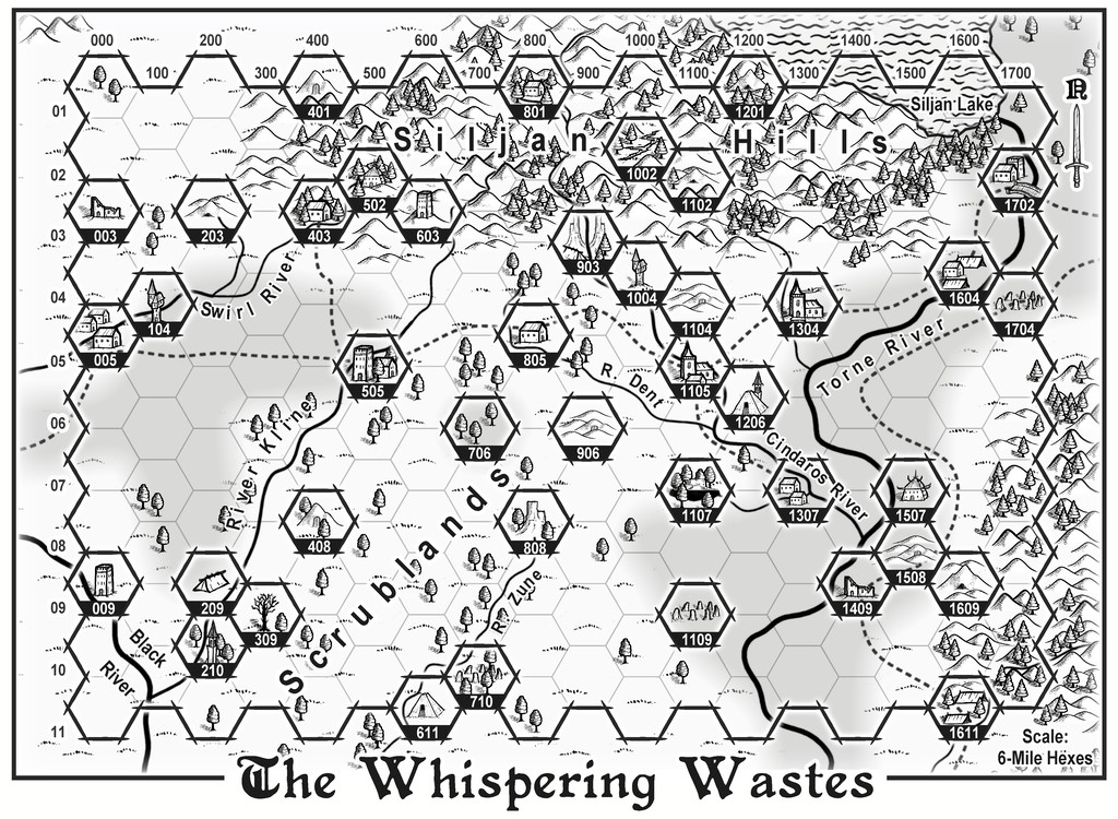
While it's not been submitted for the Atlas yet (it will be later), this is the map I've prepared, called The Whispering Wastes:
I've explored why it is as it is elsewhere on the Forum, including how I'd had the crazy notion at one point to prepare maps for all 41 features in the labelled hexes. I'd even worked-up details for most, including the ten small settlements. I'll not be doing all that. However, I have decided to try mapping the ten little settlements, although whether I'll finish them all by the end of September is another matter!
The list of settlements, and the theoretical order in which I'm hoping to map them, is as follows:
- Ljungby Village (Hex 005)
- Bruga's Hold (Logging Hamlet, Hex 403)
- Ivan's Keep (Defended Village, Hex 505)
- The Village of Toresk (Hex 805)
- Osalin (Necropolis Village, Hex 1105)
- Arvika (Bridge Hamlet, Hex 1304)
- Rularn (Isolated Hamlet, Hex 1307)
- Brightlawn (Watery Hamlet, Hex 1604)
- Fairbridge (Torne Crossing Village, Hex 1702)
- Skara (Farming & Logging Hamlet, Hex 1611)

-
[WIP] Community Atlas, 1,000 Maps Contest: Villages in The Whispering Wastes of Haddmark, Peredur
Delayed for a clutch of reasons during the last couple of months, I have, off-camera, been continuing with my sort-of Dungeon24 project for the Nibirum Atlas, drawing small dungeon maps, and, where necessary, the area maps to place them in. Progress has though been a lot slower than I'd hoped of late. Plus, as I was finalising the accompanying texts for the latest pair of maps, Remy Monsen announced the 1,000 Maps Competition for the Community Atlas, which has complicated matters further. We'll get to that shortly (although if you've seen my notes in the main Competition topic, you'll have some idea already).
As I'd enjoyed developing the black and white style reminiscent of that used in various of the Shadowdark RPG supplementary materials last time, with the OSR Dungeon style from Annual 97, I decided I wanted to continue with that for the other three maps created from designs rolled-up using the Explorer set of Inkwell Ideas Dungeonmorph Dice. As it's turned out, this has also become a pleasing way to help celebrate the Shadowdark RPG's winning of no less than four prestigious Gold Awards at this year's Ennies, announced at GenCon on August 2nd (for Best Layout & Design, Best Rules, Best Game and Product of the Year)!
Back to the dungeon map and where it was to go. The random choice for its location was to be Peredur, as last time, now though in the southern part of that island continent, in Haddmark:
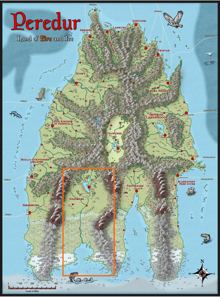
I soon discovered that this region had been less heavily mapped than others on Peredur, and as none of the regional maps really fitted with what I'd been thinking of for this dungeon, came to the conclusion I'd need to draw an area map as well. Of course, I wanted a black and white option for that too, to try to emulate the style of hex-maps used for similar areas in the Shadowdark supplements. These have a very specific size, using 6-mile horizontal hexes, with 17 columns west-east, by alternating 10 and 11 rows north-south. Typically, I had to expand my map by one column to make sure I collected all the places in the area I eventually selected (after quite some internal debate), a minor amendment. The area I went with doesn't have a name-label, so, and partly for how I'd already started developing the dungeon map, it became the Whispering Wastes, here:
Even so, it was a bit of a squeeze! This was the base map, with a suitable hexgrid superimposed that I used to draw the final map, with the place-name labels hidden for clarity:
Then, as normal, I randomly rolled-up a variety of overland map features, in this case using tables, with occasional amendments or adaptations, found in the main Shadowdark rules (which have a specific hex-map design system). Indeed, aspects of those tables would allow the creation of more detail for many of the places. While time-consuming to do in full, I did give serious consideration to this for a while, although as luck had it, the dice came up with rather more hexes with features than the average for this map anyway - 41 instead of 31 - which acted as a deterrent.
Some places were obviously decided already, with the three small settlements and one bridge symbol (which I decided should be another settlement too), although randomness being what it is, only one of those coincided with the hex-feature rolls, so a few adjustments had to be made. I did though retain or adapt those "moved" features into the settlement hexes as well. After which, it was time for the CC3+ mapping!
I opted for the Annual 121 Black & White Fantasy overland style as the basis, since it has a useful range of symbol options, which was then labelled-up mostly using the standard Windows Arial font, except for the title, which continued the use of Primitive, from the 2015 Annual, as previously. And this is how it finished:

The highlighted hex-map border and individual number-labelled hexes follow the style set by the Shadowdark supplements, though I stuck with the Annual's normal road, water and river appearances for ease here. On-map labels are typically kept to a minimum on the Shadowdark maps I was mimicking, so the place-names for the one-hex features are all to be found in the accompanying PDF and text map notes once in the Atlas only. I also decided to extend the mapped region a little outside the hex-mapped zone, as while ordinarily those outer hex-lines would form the border, that felt a little too edge-of-the-world to me in this case, as well as creating problems for where to add the main title, compass pointer and scaling note.
Overall, I was pleased with how this turned-out, although I have a fondness for hex-maps anyway, so am likely biased!

-
Importing Symbols from Other Mapping Programs
So long as the artwork is available in PNG format, you can use it to make symbols for CC3+ in the program. Whether the creators of the artwork will allow you to do this is something you'd need to investigate with each individual's licensing agreement under which you'd obtained the images. Most probably will be OK for personal use, but you couldn't rely on that assumption alone, especially if you were making maps to distribute or sell, for instance.
In terms of requesting custom symbols from specific artists, I can't comment for them of course, although I don't think Herwin Wielink makes such artwork any longer, having moved on to other projects.


-
Community Atlas WIP - Panaur region of Doriant
I am open to further ideas. If it was my own world I would add whatever I feel, but being part of the community map. I am struggling a bit to enhance the map more.
As long as your ideas don't clash with/contradict anything that's been written about the continent and/or nearby areas already (see the map notes in the Atlas FCW files for those there are - not everyone adds some to their maps), and the overall details from larger-scale already-mapped areas aren't changed significantly, you're pretty much free to devise as you please. You could even devise some undersea mapped areas, if that appeals 😁!

