


Wyvern
Wyvern
About
- Username
- Wyvern
- Joined
- Visits
- 3,238
- Last Active
- Roles
- Member
- Points
- 5,517
- Rank
- Cartographer
- Badges
- 24
Latest Images


-
Community Atlas: Barrows of the Ferine Magi area, Feralwood Forest, Alarius
Having decided to prepare three identical layouts for the interior Barrow "dungeons", the obvious first step was to get a version of the hand-drawn map traced in to CC3+ which would then act as a template to be refilled and adjusted for each separate interior, given their contents were not going to be identical. As the general mapping style was already well-established, drawing this was pretty quick and straightforward:
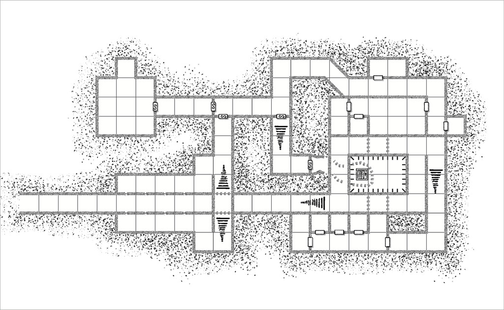
The walls are paler than those in the two previous dungeons in this group, so as to indicate their different character to the typical stonework. The semi-tech setting was going to have plastic-coated metal panelled walls (or something similar), hence this choice of wall texture. While it looks quite straightforward initially, the layout here is actually on three different levels - the rectangular pit in the lower-right quadrant has a raised pathway/passage around it, and a trapdoor access from below into it, as well as two side passageways opening directly into it, for instance, and the elongated side-passages/rooms flanking the long, straight entrance passage (with wall slits into that long corridor) have a bridge accessway over the passage, connecting them to each other and, by secret door, the rest of the complex, though not directly into the entrance route. Took me a while to get to grips with this as well!
While that was all fine, as I was drawing this out, I started wondering about how the semi-tech-world's inhabitants were going to get in and out of here. I'd already drawn-up lists of items and potential denizens from the sources noted back in my first post in this topic, especially the Numenera RPG, and had realized the three layouts would work best with these as workshops, laboratories or a museum. Ultimately, we'll be going with one of each of those. Naturally, some kind of teleportation/transporter beam option was a possibility, for all that felt a little contrived.
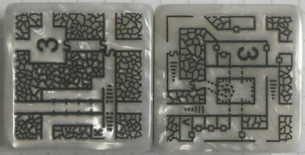
Ordinarily, as explained previously, any segments of the geomorphic dice designs that don't link to the main part of the layout, including the connections off the dice edges, are simply skimmed away in preparing the Atlas version. However, now, I started thinking of adding some or all of those external links to this map too, as passages/doors only the semi-tech inhabitants could see and use. This is a shot of the two Inkwell Ideas Explorer dice designs I was using here to indicate what those possibilities were (from dice "V" and "K", in case anyone might wonder about those letter labels):
And this is how they were drawn into the CC3+ plan:
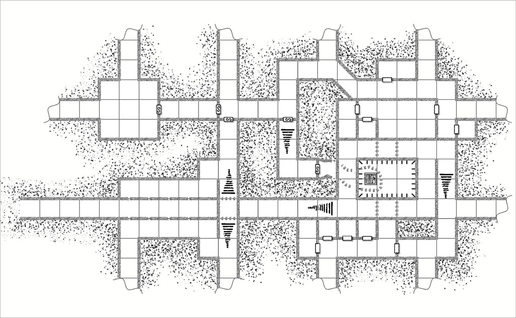
Each new passageway has a wavy line ending it, to show the route goes elsewhere beyond this map, without indicating where that might be, in the semi-tech land that isn't Nibirum. In addition, they've all been set up on the GAME MASTER ONLY Layer, and a series of new Sheets (for the walls, floors, grid lines, and dot-shading symbols), so they can be shown, or not, for each individual layout, something that's intended to be possible via a toggle in the final Atlas version. Each separate layout will have a variable number of these accessways only; the rest will be removed in those final maps. It made sense to draw the set together though, because there is quite an art to doing so, so as not to forget some key element.
While doing this, I next realised the long entrance passage and the rooms/corridors flanking it probably would be in the original Barrow stonework, not the semi-tech walls. This was mostly to avoid the complications of why the semi-tech folks hadn't wandered off into Nibirum at some stage, and more importantly, why they'd have set up a passage with viewing slits to watch for nobody ever coming in down that long passageway! Instead, if this was all the original stonework by the Barrow builders, simple anti-tomb-robber floor pressure-plate traps to shoot darts from magazines that had to be emplaced before the Barrow was sealed, began to crystallize, and were ultimately adopted, as a concept. Thus the wall texture there was changed:
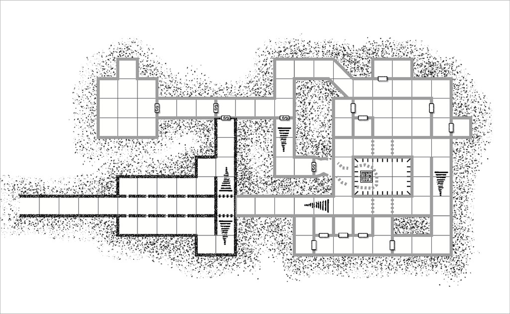
Plus, it no longer made sense to have any linking passageways attached to the semi-tech world from this segment of the layout, so they were removed:
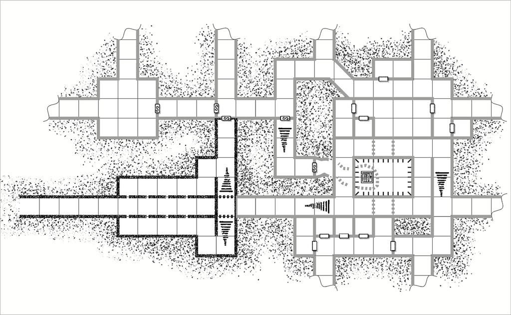
The perceptive among you will doubtless have realised that one other change has been made here, to the semi-tech wall texture. This happened because when I adjusted the new darker wall texture's bitmap scaling, I discovered that, as sometimes happens with the older Annual styles, I had to force the system to use the very high res bitmaps. I hadn't realised sooner that this wasn't happening automatically, partly because the walls lines are quite thin, I suspect. When I did that though, the selected semi-tech texture - the only one that gave a suitably pale appearance - started to vanish into the dot-shading exterior texture in places. This image shows a comparison test, where just the top left room's texture remains as it had been earlier:

Thus I ended up with simple, solid, pale grey wall lines for the semi-tech areas, rather than bitmap-textured ones.
Clearly, this is all still WIP, given that the entrance passageway doesn't go anywhere right now, nor have a blocking doorway to the outside, and the wall around the pit is likely to change too, so it doesn't look like the same solid walls as everywhere else, albeit that may be different for each of the three final layouts anyway. Plus everything needs fitting-out and labelling, something which is still rather in-flux currently, as the lists of items and denizens are allocated and consolidated to their respective layouts. Some progress though, at least!


-
Community Atlas 1000th map Competition - Please Vote (Even if you didn't participate yourself)
As usual with such competitions, there are far too many entries deserving of the top places, and far too few votes available per person to vote for all I might wish!
I do think it's important to emphasize again that everyone who took part deserves our praise and admiration. There's not a single map here that won't grace the Atlas with its presence.
And they'll also have pushed us on way beyond Map 1,000 once they've all been added to the Atlas.
Well done to one and all, regardless of what the final results may show!


-
Topographical map of the Ice bed of Antarctica
Pleased we could help a little here!
I'd forgotten how much information had already been presented on this topic using the BEDMAP2 data - it was all a few years ago now we discussed it first, of course!
With online searching, sometimes it just needs an extra, or slightly different, word, and even then, you've often got to hunt through the list to track down the specific item of most use, assuming what you need is even there at all.
And I REALLY wish I could find the off switch for the dratted AI "findings" Google now insists on stuffing at the top of a search list, given these are almost always pure fantasy (their AI doesn't handle interpretation of factual data at all well, it seems).

-
CC3+ Update Can't Find FCW32.mac File
Not sure if you've seen this FAQ post by Monsen Scott, but it may help.
-
Sticky Note Dreamlands - An Experiment
Thinking more about the new Sticky Note Dungeon Annual just released yesterday, while checking it over and afterwards, it occurred to me that with a few additions, it could be used equally to generate a form of point-crawl overland map too. For those unfamiliar, this is a sketch that links places of interest in a pattern to identify how the various points can be reached, without bothering too much about the exact distances, directions or terrains intervening - except that things such as intervening difficult terrain might mean no direct links, with instead a set of further points bypassing the blocking feature to be encountered along the way.
As an example, I created this map almost ten years ago now for a wargaming magazine article on Jason and the Argonauts, showing a stylized series of overland connections along the western and northern Black Sea shores of Anatolia, into about the middle of that great peninsula, and along the coast north to modern Georgia, ancient Colchis:
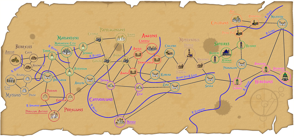
This isn't all that clear at the usual Forum resolution, so I've added a further version at higher-res to my Gallery.
Thus essentially what can be drawn for such a system is a very simplified map, one that here even ignores the coast, and features only the main river lines of significance, chiefly those that cross travel routes, all in a rather abstract manner.
Something that's long been of interest to me has been trying to map the places referred to in H. P. Lovecraft's stories concerning his Dreamlands. I've had a couple of tries at this myself, the first time almost 40 years ago, and another that sadly didn't get very far more recently, using the beautiful E Prybylski Watercolour style from last year's Annual. Several other vastly superior to me artists have created their own versions of such a map over the years too, which all have their pros and cons.
One main difficulty is the details in Lovecraft's tales don't include things such as specific distances, or where different places might lie in relation to those mentioned in one story, and perhaps only obliquely referred to in another. Distances might be given in terms of hours or days sailed or flown on sea or in the air, or overland by yak, zebra or on foot, or might just be stated as being a long way apart. It's possible to estimate real distances by making assumptions, but this still doesn't help in locating where some of the places mentioned, but not passed through, or directly connected to elsewhere, were.
In the stories, as it would in genuine dreams, this all makes perfect sense, since these aren't real places, and Lovecraft was a lifetime lucid dreamer, so was writing more or less from experience. As a mapper though, it quickly becomes problematic.
However, the Sticky Note concept helps here, by generating a means to show places with some details about them, and lines showing how they connect, without worrying about details on exact directions, distances or even the size of a given place.
So I tried a quick version as a test earlier today. Had to create a couple of new drawing tools, and import a bunch of symbols from the SS1 Handrawn Hollow set, but it was all pretty straightforward. I drew out just the places along the Southern Sea coast, heading westwards from the great city of Dylath-Leen, as described by Lovecraft, using an annotated hand-sketch I'd prepared last year when working on the E Prybylski version:
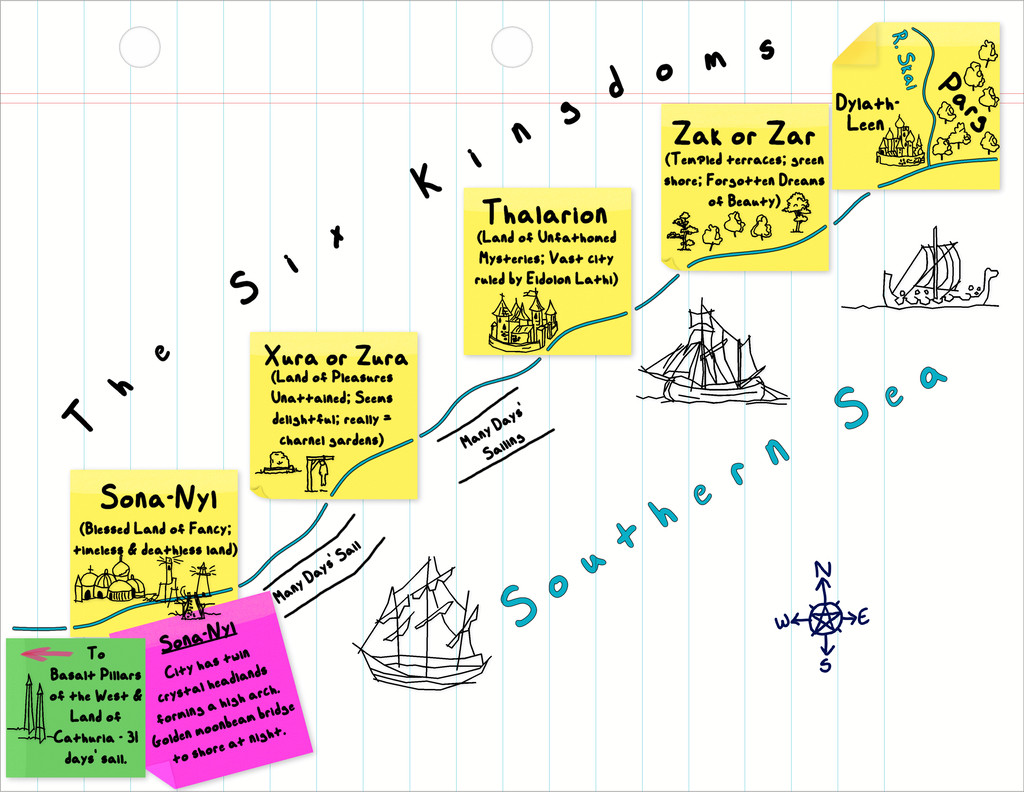
Obviously, a lot more could be done than I've tried here, and this is a bit rough-and-ready in places, but the basic concept seems sound.
These SS1 hand-drawn symbols seem to work quite nicely, although I'm sure none of us would be averse to having a purpose-made set in the C. C. Charon style, should an overland version of the Sticky Note style be offered subsequently 😁!
(We might need an A3 or larger option for the paper to draw world-sized maps though 😉)


