


Wyvern
Wyvern
About
- Username
- Wyvern
- Joined
- Visits
- 3,238
- Last Active
- Roles
- Member
- Points
- 5,516
- Rank
- Cartographer
- Badges
- 24
Latest Images


-
Community Atlas: Kara's Vale, Ethra, Doriant
Returning to Doriant for my next Atlas maps, this time I was heading for somewhere on Ethra, the huge island in the great, almost-landlocked, southwestern sea there:
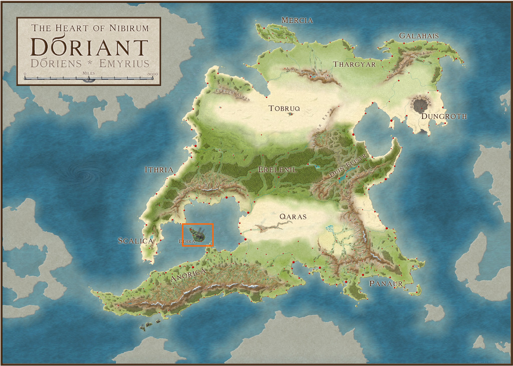
Examining the notes for Ethra indicated the island was split into a series of provinces, although much of those descriptions centred only on the major settlements, so it seemed there'd be plenty of options to slide-in a small dungeon map somewhere unobtrusively, even when surrounded by one of the typical 20-mile-square area maps I've favoured for much of this project. The Inkwell dice-map dungeon layout had already sparked vague thoughts of something alchemical, so a quiet spot might be useful, and while there are plenty of such potential places in the vast, volcanic barrens on Ethra, my eye kept being drawn to a small, labelled area, Kara's Vale;
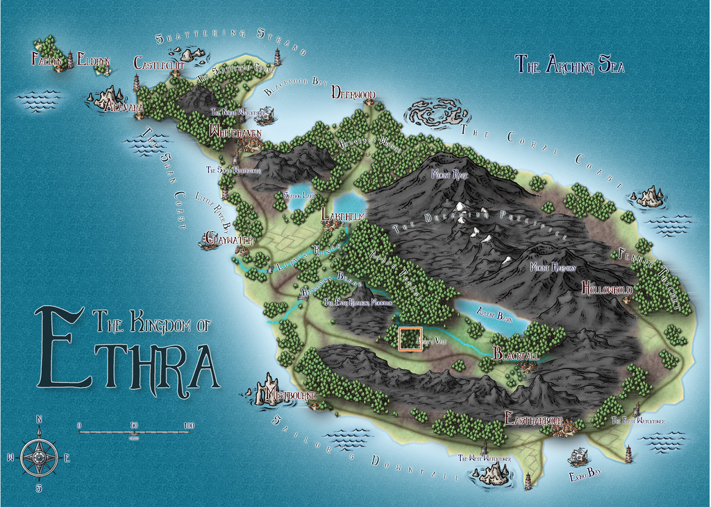
The way this area was mapped intrigued, as the Vale's woodland looked to be sunken compared with the woods to either side, yet had no major river shown flowing through it. With the volcanic nature of the whole island, this made me think of a small rift valley, so that's what it became:
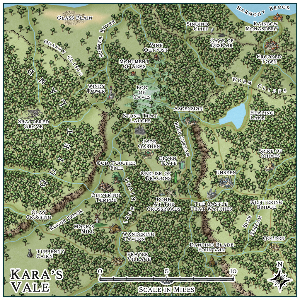
In an effort to persist with using linked mapping styles for this area, I decided on the Mike Schley styles (SS4 for the dungeon and the surface entrance site), something I've not really used much for overland mapping before. While the original Ethra maps showed deciduous and conifer woodland symbols, because the site is in the tropics, around 23°S latitude, here I went with "jungle" style trees instead. As I wanted to suggest higher plateaus to either side of the Vale, there was a bit of a battle to show the north-facing cliffs, as such options aren't available in this style, so I had to use the normal cliffs, and then hide everything except the upper parts with a suitable land-textured mat, something adding a second, lower, cliffline in the northeastern corner, greatly complicated! However, the jungle helps hide most things, one way or another...
The general map design was set by how the shadowed valley and unshadowed woods were shown on the Ethra map, and where the major river, just on the northern edge here, lay, while the specific features were all placed randomly, using my usual grid and dice method, with a one-mile grid spacing. What those places were was determined using or interpreting cards from various prompt decks produced by The Story Engine, a little like last time's for the Selenos maps in Artemisia, except this time also drawing from their "Deck of Worlds" as well as the "Loremaster's Deck" main sets, plus the "Worlds of Myth & Magic", "Loremastery" and "World & Lore Bridge" expansion sets. That's where pretty well all the on-map names came from too.
Map notes expanding on some of the place-names, again largely based on what the cards came up with, will be in the final Atlas version of the map, and also much as last time, the cards inspired thoughts and details beyond what I'd expected, which of course is their whole point. As for where the dungeon layout might be placed, there wasn't a shortage of possibilities. Ultimately, Windy Tower, northwest of the map's centre, won out, as we'll see next time.


 and 1 other.
 -
[WIP] - An audience with the King
You're just throne this out there, aren't you? 😉
-
Add or remove precise amounts with drawtool "edit" function?
Don't forget to keep a separate copy of your original map file too - let's face it, you'll never be that precise by-chance again! - and it's handy in case you end up with something you're less happy with after making some adjustments to it.
-
Wyvern's Wood - A Handdrawn Fantasy Map
Seeing the maps appearing on the Forum using this new style already, it's perhaps unsurprising I've felt the need to join in, as much as anything because the main sample map that comes with the Handdrawn Fantasy Annual style included The Wyvern's Wood!
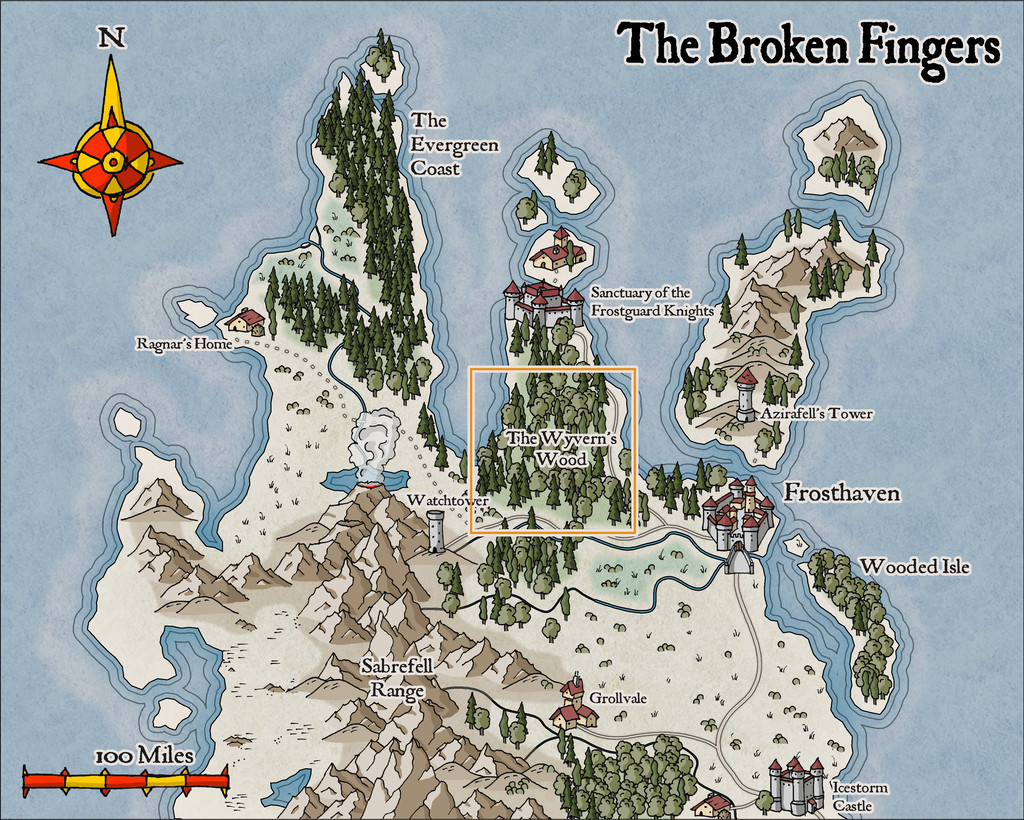
In a break with my usual mapping too, this one isn't intended for the Community Atlas (although it's possible it may eventually feature there, probably in a variant form). That orange outlining square shows the region I picked to illustrate from the sample map.
Having had a long fascination with woodlands for fantasy mapping and scenario designing, I was somewhat spoilt for choice as to which of my previous RPG-related settings to draw upon in creating this map. What I went with was a selection of items from a storyline drafted in 1993. I'd intended it originally as a one-off scenario, run using the Call of Cthulhu rules, for a twice-yearly gaming convention I attended for much of the 1990s. The design though grew into something that needed a longer timescale as a short campaign instead, and ultimately, it was never run at all.
That scenario was a modern-day one, set initially on Bodmin Moor in Cornwall, England, and which included various loosely Arthurian and mythological items, then increasingly introducing horror and surreal elements, rising to a chaotic finale. What I've extracted from it here are specific significant locations, adding them to the new map in no strong order, since the originals were designed to be encountered in only a rough order anyway - and in some cases repeatedly. Most of that detail and pathway structure has naturally been omitted here.
So this is what I came up with:
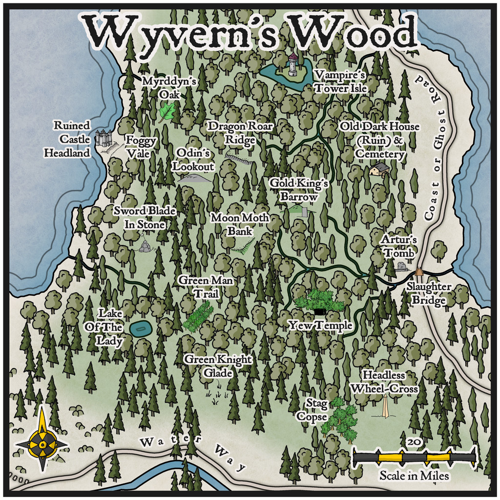
As is obvious though, I had to draw on other handdrawn styles from SS1 in identifying the various features, to highlight them sufficiently, and their sizing is of course hopelessly out of scale, as so often happens with this kind of pictorial map. Maybe though some of these added symbols might give some ideas for future expansions of the new style!


 and 1 other.
 -
Flooring Maps
So, as far as I'm reading, I should be able to have 2 separate maps open, then?
Because every time I try to do that CC3+ crashes.
Are you using a PC with Windows 10 or 11? If so, that shouldn't cause any problems such as you mention, unless there's a problem with one of the files you're trying to open, and that's what's causing the program to crash.
As a test, I opened one CC3+ file I've been using today through Win Explorer - just double-clicked on the file to open it, as Sue said - and then right-clicked the cursor while over the CC3+ icon in the toolbar to bring up the list of recent CC3+ files, picked one of those at random by clicking, and it opened immediately, so I currently have two different maps in two separate CC3+ windows open while I'm typing this.
Again, as Sue mentioned though, you can't open multiple files from an open CC3+ window, as that simply replaces whatever map it's showing with the other one (after asking if you want to save the first one before doing so).


