


Wyvern
Wyvern
About
- Username
- Wyvern
- Joined
- Visits
- 3,238
- Last Active
- Roles
- Member
- Points
- 5,517
- Rank
- Cartographer
- Badges
- 24
Latest Images


-
Community Atlas: Errynor - The Isle of Zaraq
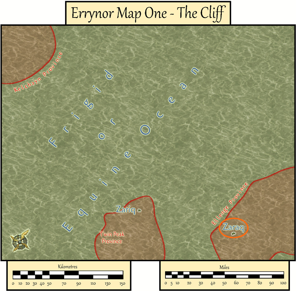
Having tackled its nominal twin Isle of Zariq, it seemed reasonable to follow-up with the other seamount-tip Isle of Zaraq next, set amid the Frigid or Equine Ocean, about 620 km (385 miles) off the northwestern coast of Alarius.
As with Zariq, I based Zaraq's appearance on another randomly-generated island from the Red Blob Games website, altered where necessary to suit what was needed here.
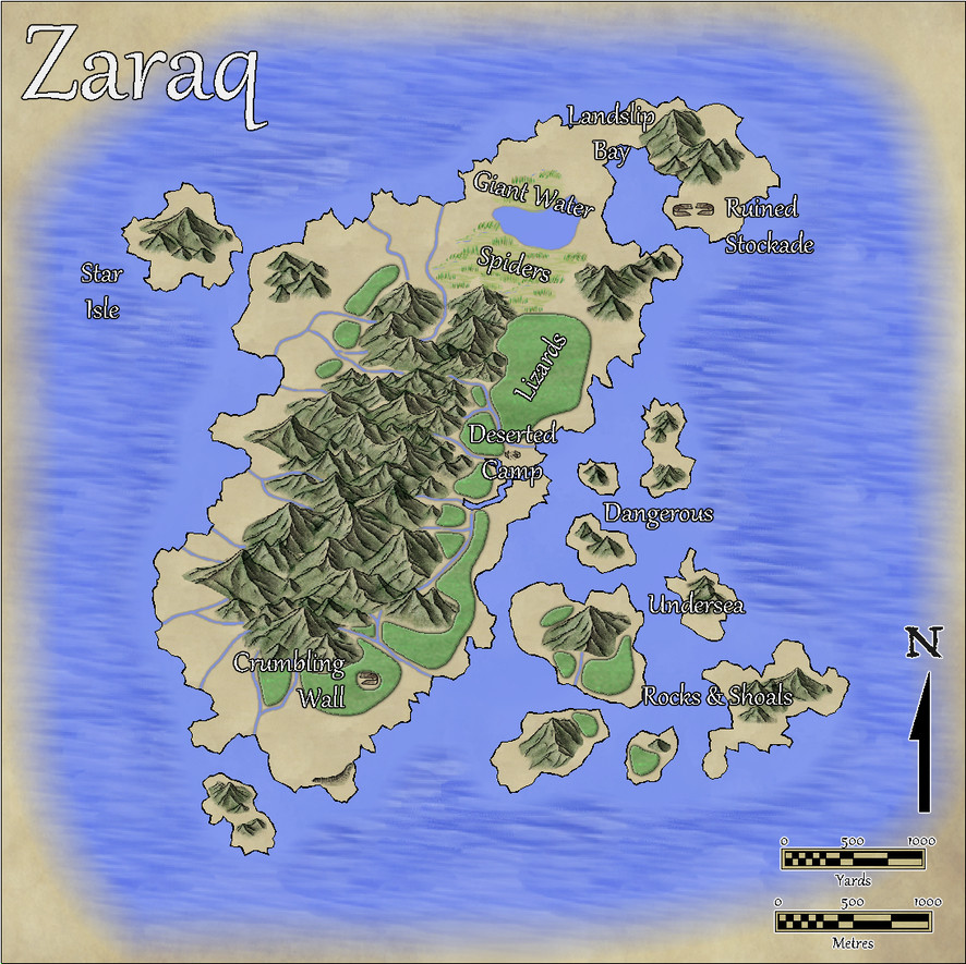
Originally, I'd thought of reusing the Mike Schley overland style from the Zariq map, and reworking that map as the base template for this one. However, part of my reason for participating in the Community Atlas project was to experiment and explore different mapping styles. So this time, I went with the Volcanic Islands style from CA88 for April 2014 instead.
Indeed, I'd intended to use this style for the more volcanically-active Zariq map, till I discovered it doesn't have any actual volcanoes in it! My vision for Zaraq was with a longitudinal volcanic fissure or crustal weak line along the island's N-S long axis, which would only occasionally produce significant fresh lava, more commonly just giving frequent minor earthquakes, small eruptions, or exhalations of smoke and gas.
There were a couple of false starts. This island, like Zariq, is tiny, at about 5¼ km (3¼ miles) long, with "peaks" just 60 m (200 ft) high, so scaling the mountains to look right as sharp-featured hills needed some experimenting. Once that was sorted, the map overall was completed in a fraction the time the Zariq one had needed, largely thanks to the simpler vegetation tools in the Volcanic Islands pack.
That extra mountains-as-hills work had its advantages though, as the look of the symbols reminded me a little of the conchoidal fractures shown by the volcanic glass obsidian, so Zaraq and some of its surrounding islets became endowed with scattered obsidian deposits. These are especially common on Star Isle, which glitters even from a distance, when the sunlight hits it just right!
Apart from the usual wealth of invertebrates, most of the island's inhabitants are seabirds, chiefly when breeding. There are some nasty little lizards with a poisonous bite too, notably in the more northerly of the dense, low-growing, thorny "forests" of the main island, along with some still more venomous giant water spiders that lurk among the marshes surrounding the solitary freshwater lake further north, creatures whose range extends into the northern fringes of the forest cover and across Landslip Bay - they can raft over water using surface tension.
Landslip Bay is the only sort-of safe anchorage for ships, where the best shingle landing beaches lie under the looming cliffs along its eastern shore - hence the name, and remembering the "earthquakes" motif... For some extra spice, there are three deserted structures on the main island's eastern flank, whose natures are noted in the map's accompanying PDF and text-file descriptions. The inhabitants and structures were determined by random rolls using an old set of island generating tables, slightly modified, from the Judges Guild tome, "Island Book One" published in 1978, incidentally.
As for why the structures are deserted, well, the perceptive may recall there was a "Deep-Sea Hag" symbol shown in the lower right corner of Errynor Map 01, which might be related. We'll be coming back to her again, especially towards the end of this set of maps...


![[Deleted User]](https://secure.gravatar.com/avatar/c75d9a245b74d9c59be0999ea81ca541/?default=https%3A%2F%2Fvanillicon.com%2F92add7f8c954488718110edc4896ad39_200.png&rating=g&size=200)


-
Community Atlas - Forlorn Archipelago - Marine map
Interested in the fact you've also used the contours in a different way to how they're usually presented, where the standard system runs: land - green tidal - darkest blue - lighter blues - white, with as many other white contours as may be needed for still deeper areas after that (as described in the Marine Maps PDF mapping guide, for instance).
This isn't a criticism, as I found exactly the same issue when constructing one of my Errynor maps for the Community Atlas last year using this style (we'll get to that going into the Atlas in a few weeks' time, all being well). It felt counter-intuitive to start with dark contours and progress to lighter ones to me, but as I was dealing with the lightless ocean deeps, I have to say I felt no qualms about simply swapping things around, though I decided against using the green contours, and no land (as none of it breached the surface where I was mapping).
I think my favourite discovery was playing around with what could be done with the contour labels in this style, as they'll take text as well as numerals, which meant I was able to label my map using both feet and metres for the contours without needing a key for it.

-
is this type of dungeon wall available ?
You need to change the filename for the bitmap fill that's currently on your new "overlay" sheet to start with "@", as I was originally getting just Red Xs all across the map Jim. I used "@\Filters\Images\CA91 Texture.png" to access the texture, but you don't actually need to do this at all if you just add the Effects to the Whole Drawing, as they don't need a new Sheet adding. If you use Texturize on the Whole Drawing though, you WILL need to use the filename for the texture I gave previously.
You also probably shouldn't be using such a strong Transparency Effect either; 10% opacity makes all the Effects in the list effectively invisible.
Currently, your settings for the RGB Matrix Process Effect give a pale pink colouring to the whole. Was this your intent? I ask, as this is a completely different appearance to that from the OSR Dungeons. I applied the OSR Dungeons RGB Matrix Process effect to your map, and it converts the appearance to a mild sepia greyscale effectively (note - no Texturize or Transparency Effect is in use):
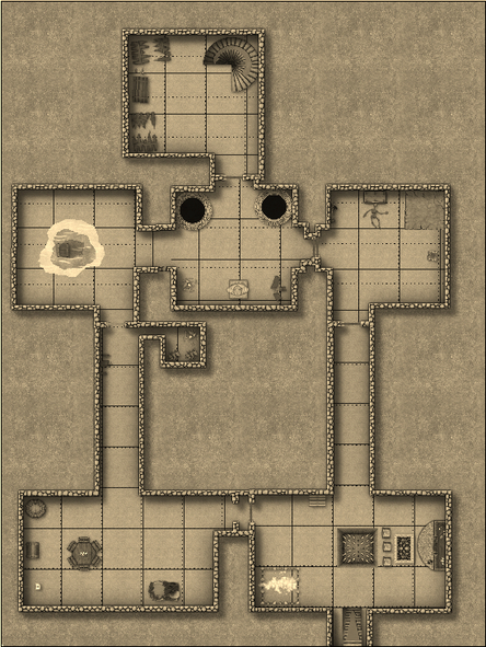
If I add the Texturize Effect as well (no Transparency), I get this:
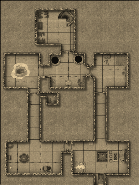
Not sure this is quite what you were looking for, however.
-
Live Mapping: Parchment Backgrounds
Making progress on catching-up with the videos today now!
I've used the Parchment Backgrounds before, so this didn't really show me a lot that was new, but it's always good to see such things being used for real. I imagine now we could use the Color Key Effect to create things like the gaps in the parchment textures, but the video did show the ability of the extant template to hide features like symbols that Color Key won't operate with, so was valuable from that perspective aside from anything else.
Not sure about the new-look "spooky Ralf", though a quick check of this week's video suggests this has now become the thing, and I guess it helps see a little of what the mini video camera screen sometimes hides on these streams. Plus it gives food for comments in the chat!
-
I don't see the Mike Schley elven symbols in my downloads.
According to the PF blog posting, yes it is.
Might have been useful to have set it up in its own docket in the downloads page though, as I can see that CC3+ one getting pretty crowded quickly if these are going to release at one a month regularly.
And it might have been a bit more intuitive to find it in the list, especially if you already have a lot of PF products listed there. I have NO idea how many files are supposed to be under each item there now, so can never spot when anything new turns up there unless I know exactly where to check.
