


Wyvern
Wyvern
About
- Username
- Wyvern
- Joined
- Visits
- 3,238
- Last Active
- Roles
- Member
- Points
- 5,516
- Rank
- Cartographer
- Badges
- 24
Latest Images


-
How Can I Draw Real-World Places in Campaign Cartographer?
- The style choice is obviously up to you, but the original PDF map you shared uses only very simple textures and plain colours for the hexes, and that wouldn't need more than a couple of texture bitmap fill options to accomplish, which the standard CC3+ overland styles could likely provide.
- Once you have your source map as a bitmap image (a simple JPG will be fine), all you need then do is create a new Sheet in your CC3+ drawing, for ease call it "BITMAP", and a new Layer, also "BITMAP", and make sure both layers are active (click in their respective check-boxes, if necessary). Then, using the drop-down menu Draw => Insert file simply navigate to where your source map's image is stored, and click "Open". You'll then be asked to click the "First corner" (in the CC3+ window's command line), so pick a suitable spot in your map, and then enlarge the image to an appropriate size, before clicking to locate the "Second corner". Your map image will then be set-up in your CC3+ map file. Once the image is in-place, you can move, rescale and adjust it by clicking somewhere on the edge of the image (only), when the Command line asks you to "Select entities" for whatever command you want to carry out. You will need to check the map scale is correct once your image is in-place, by using the Info => Distance drop-down menu command to measure between two points on the image whose separation you know (flat to flat of a hex, for example), for simplicity making sure "Snap" is turned off, but "Ortho" is on. If the map image is too large or small for the hex-sizes you want, you can rescale it either by-hand, or (better) numerically, by typing the values into the Command line when prompted (and you can just ask it to multiply or divide with the numerical sizes; you don't need to work that out separately).*
- Not sure why the hex snap grid isn't working for you, assuming you're trying to duplicate the map whose image you showed, because the terrain is shown as per whole hex there, so it'd be easier for you to just work with drawn hex-shaped polygons (created using the hex-corner points in the snap grid), and then place those hexes where required. As long as the hexes are the correct size for what your final map needs to show, this should be fine, and work with the snap grid.
- Curves can be tricky, but you can simply draw lines using the straight path (or polygon) option instead. You'll need to click to add more nodes for lines/polygon edges to still seem curved in places, but it avoids the oddness that using the curved drawing tools can create sometimes.
- You may have the arrow cursor set instead of the crosshairs one (crosshairs show exactly where your cursor is using a crosshair that covers the whole map). To change from one to the other, simply press Ctrl + T (and see this post for another option, as well as a caveat on this command's use).
Without seeing exactly what you're trying to draw, I suspect it'll be hard to give more concrete advice than this, but hopefully this will get you a bit further forward.
* [EDIT: I should also note that when you start to import your map image, you'll be asked what file path to use for the source map's image. For ease, it's preferable to have that source map image in the same folder on your computer as the CC3+ map file, and simply keep the "Store the file's path relative to the current drawing" radio button active - it's the default option for this query panel.]

-
Numbering/Labeling Conventions thread
I don't have any kind of set pattern for this. I simply apply labels where they're needed on a per-map basis. Sometimes those will be letters or numbers, if space is tight, at others actual words. I've used a mixture of both on some maps - as in the topic where the query was first raised, for instance.
In general, and for smaller maps where there are distinct routes that might be followed, like Royal Scribe here, I'd start with the entrance/first area and number in rough sequence from there. As long as your labelling is clear and unambiguous, and makes sense to you, I'm not sure anything beyond that is altogether important.
Occasionally, you'll need to make decisions as to which route to follow with labels first, and some things may need labelling out of sequence if they seem to fit better that way (say, if a label is going to obscure some key point in the room, but by using the next-but-one number, it wouldn't, or something like that).
Sometimes, it'll make sense to follow specific patterns as Ricko mentioned - clockwise/anticlockwise, top to bottom, etc. - but that depends really on exactly what's being mapped, and what purpose the map has.


-
Community Atlas: Hopes Lost, Lampoteuo Region, Artemisia
I was going to say this is probably better discussed as a new topic, but I see Royal Scribe has beaten me to it! The snag is here, anything useful will end up muddled-in with the maps and notes for this topic, making it harder for someone else to find in future.
-
Community Atlas: Hopes Lost, Lampoteuo Region, Artemisia
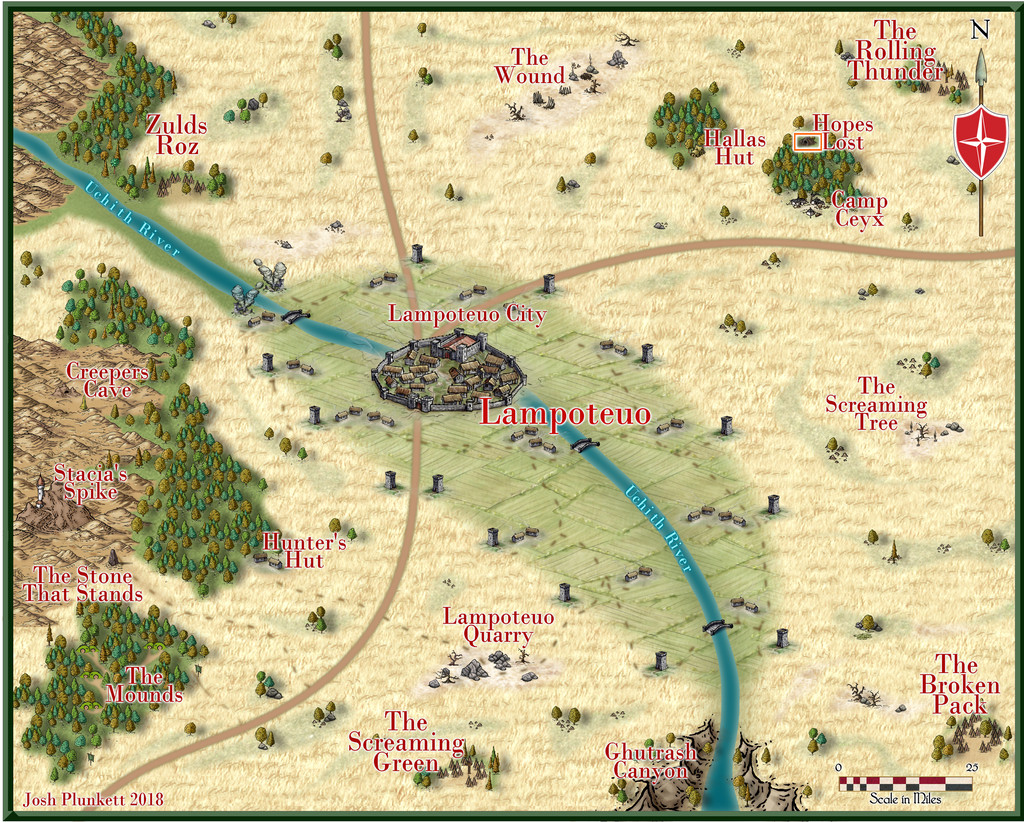
A fresh visit to Artemisia randomly took me off to the Lampoteuo Region in the central-southern part of that island continent:
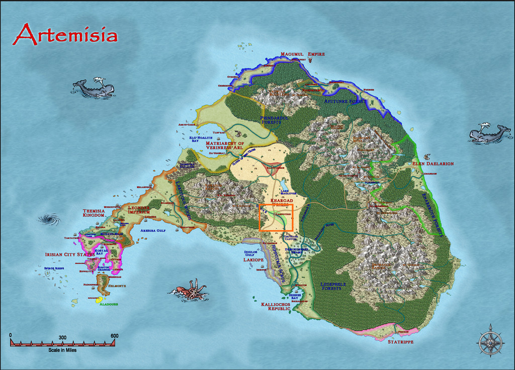
Like much of Artemisia, this area has been mapped at a regional, and often smaller, level already, so checking the existing Lampoteuo area maps narrowed down the options for where this latest small dungeon design could go. After much deliberation, heavily influenced by what I'd determined the contents of said dungeon were to be, I finally selected a cave symbol labelled as "Hopes Lost" here:
Having finally remembered there was a book of scenario suggestions that accompanied the Trailblazer set of Dungeonmorph Dice from Inkwell Ideas, the "Dungeonmorph Book of Modular Encounters: Delver, Trailblazer, & Voyager Edition", when preparing the previous map (Ruins of Shadow Keep), I'd already made use of that here prior to settling on a location. The essentials so-determined were that the place was run by Gnomes, and that it contained a planar nexus, with attendant higher-level magic-users. I reused and amended many of the details from the Inkwell book, as it provided some interesting architectural and decorative options, besides these aspects.
One complication was that one of the three randomly-chosen dice provided an elaborate tomb. Ultimately, that was converted into quarters for the Archmage and the four leading elemental mages at the complex, while retaining much of the design's layout.
A few other amendments were made, as usual, although handily, the Trailblazer set comes with one die of entrances, making an imposing way into the complex. Along the way, I'd decided this was also going to be both a teaching place for elemental mages, and a location people could come to and pay for scrying and access to other planes.
While there are no descriptive notes for the Lampoteuo map, there are general notes for Artemisia touching on who and what is around in this region, which beyond Lampoteuo city-state (central to the second map above), comprises a number of semi-nomadic tribes. Thus a new backstory developed. The complex originally had been a cave system in some rocky hills, in which was an oracular shrine where the local tribes would gather for an annual celebration. Generations ago, a disaster occurred during one festival, killing most involved, with the few survivors left to tell only conflicting tales. All were clear the site could never again be used, as the oracle had been either destroyed, or buried too deeply.
More recently, some Rock Gnome prospectors turned-up, and found there was something magically unusual here. The Rock Gnomes were chosen as having magical and physical expertise in handling rocks, precious stones and general stonework. Gnomes aren't mentioned as major inhabitants of Artemisia, and came just from the Inkwell book's ideas, as well as making a change from the more prevalent Dwarves.
The Gnomes set-to, called-up more of their folk, and reworked/rebuilt the lost caves into the current subterranean complex, reopening the planar gate in the process. So to the map:
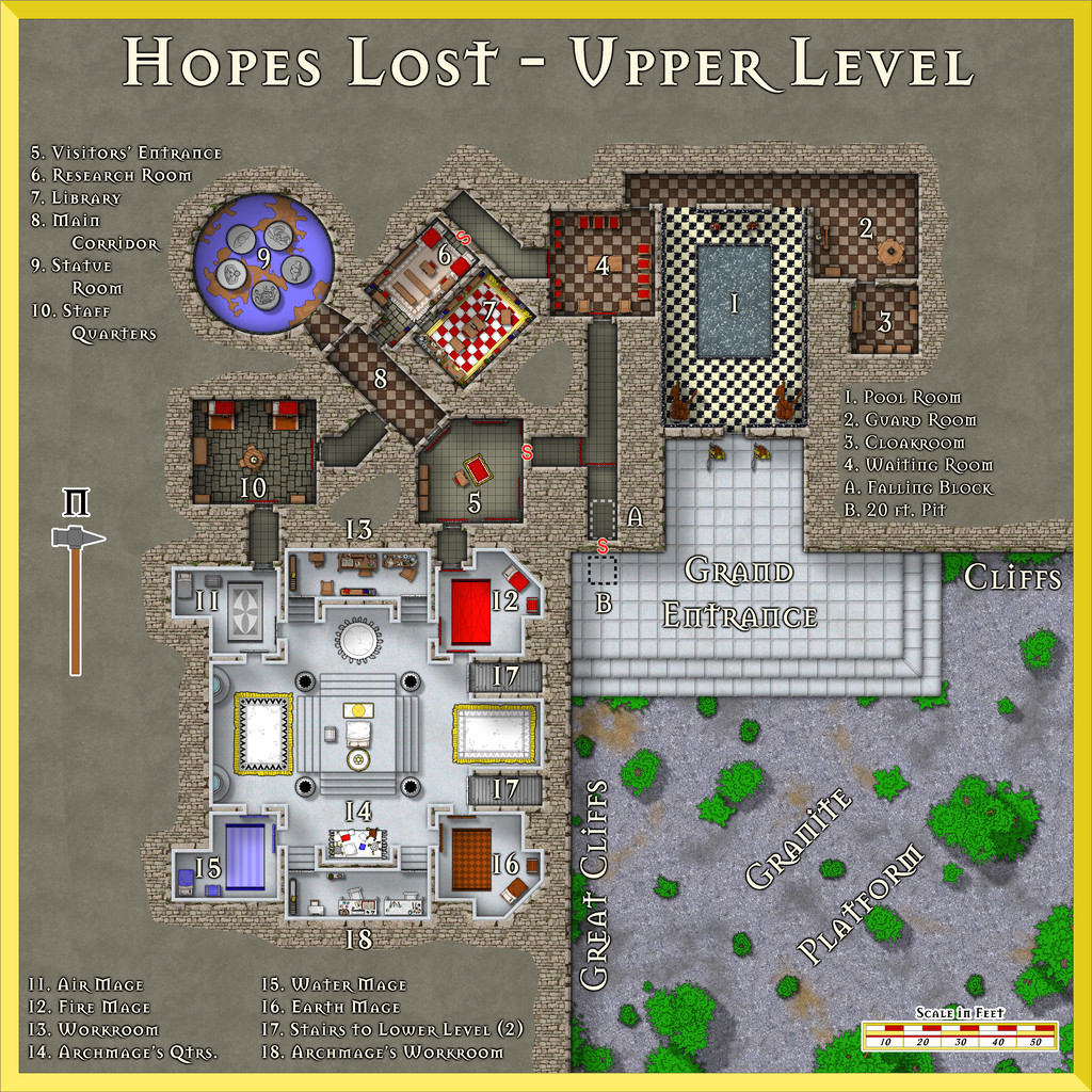
Much in the dice design was strongly rectilinear, so that became a distinctive feature, with straightened rock cliffs faced with granite brickwork, the spilled-over granite-brick fill around the complex hinting at how the former cave area had been reopened and restructured. The area outside then became levelled-off granite, with a great white marble stepped platform leading up to the way in.
I picked the DD3 Dungeon Digital style for the map, only to discover this was quite tricky to use, as rather than presenting the older-style vector symbols (I think from the "Filled" set of DD3 options; that's what I used, anyway), it tended to default to the normal DD3 raster ones instead. It does encourage use of the SS2 set as well, and that was heavily pressed into service. Being vector sets, there are plenty of options for all manner of objects. Dungeon Digital does use the DD3 bitmap fills too, partly why I'd picked it, because I knew there were going to be several square-tiled areas.
For the black-and-white marble in area 1 though, I drew out a series of small squares using the two marble textures, gradually combining them into larger strips to duplicate over the whole floor using the snap grid. I did try the standard chequerboard fill (in areas 2, 3, 4 and 8) with an RGB Matrix Process set to greyscale, but this looked a bit too washed-out compared to the white marble platform, black marble pool base and wall tiling of area 1. Then for the red and white check carpet in area 7, I selected a suitable red rug, enlarged it, and added a series of white, square cushions across it, as they gave a slightly textured look to the whole, more soft-carpet-like than the tile textures. A row of small rectangular white panels were added at the carpet's long ends, because the cushions didn't fit perfectly to both length and width, after a couple of quick trials.
Area 9, the Statue Room, is the planar gate. It has five 10-foot-tall statues in it, each of a different, loosely humanoid, creature from a different plane. When four of the five's "hands" are linked (their arms, only, can be moved and repositioned), this opens the gateway within the centre of their ring. The floor is decorated with a mosaic of an unknown world, as stated in the original notes, so I found a nice vector planet among the Cosmographer 3 designs that didn't have the spherical shading that so many do, and added that. The blue is intended to be lapis lazuli, the browns sardonyx. The Inkwell book provided various options for the planes involved, and I picked five that are a little unusual: Ash (a mix of Fire and Negative Energy), Dust (Earth + Negative Energy), Lightning (Air + Positive Energy), Minerals (Earth + Positive Energy), and Radiance (Fire + Positive Energy). It's also suggested in my notes for the Atlas that these may change, along with the statues, over long periods. I wanted to suggest that whatever had happened in the past to wreck the ancient oracle, was still having an unusual effect here.
The white marble southern part of the subterranean area was a design choice from the Inkwell descriptions for the original tomb there, including the wall-tiling, and it seemed to me the luminous look this gives the whole was delightfully striking. As is obvious, there are two staircases down from it, and they're weirdly located, because they're off the standard geomorphic connection points by 10 feet each. They should be where the two shallow indentations are in the adjacent walls of rooms 12 and 16. This is most unusual among the Inkwell designs, and initially caught me by surprise, as I thought I could simply rotate the design, and have this white marble area be at a lower level than the rest - except of course, the stairs don't fit to the entrances from areas 5 and 10! So that meant I needed to design a Lower Level as well. We'll come to that next time.


-
How Can I Draw Real-World Places in Campaign Cartographer?
Looking at your PDF sample map, it seems as if what you may need are just hexes with three different fills to duplicate it. Two of those are terrain fills, the other is simply the flat colour representing open terrain (I think). If so, you can easily create those in CC3+, providing you have suitable bitmap fills available (either custom fills from the publisher, or ones you think will be suitable from what CC3+ assets you have available). All you need do is draw a hex using the hexagonal snap grid, and then change its fill style, then copy and paste that hex exactly where you need, again using the snap grid.
The river and coastlines may be trickier, because those are all obviously freehand on your sample map (I've drawn this coastline myself before, although for the ancient period, so I know it's not easy!). However, there is a trace option using CC3+ drawing tools that is able to at least approximately follow strongly-defined lines (that is, lines where there's a good degree of contrast) from a bitmap image (such as a JPG) imported into your CC3+ map. (Note though that this is separate to the Trace command the tools allow you to use when drawing with one in CC3+, because that needs a line already drawn in the CC3+ map to follow, not something on a separate image).
Sue's advice is good if you wanted to draw a map with a lot of different terrain types particularly, but those terrain symbols do seem rather different to your sample map's appearance. Hopefully though, some of our comments here will help point you in the right direction!
[And don't be so modest @mike robel 😁!]

