


Wyvern
Wyvern
About
- Username
- Wyvern
- Joined
- Visits
- 3,237
- Last Active
- Roles
- Member
- Points
- 5,515
- Rank
- Cartographer
- Badges
- 24
Latest Images


-
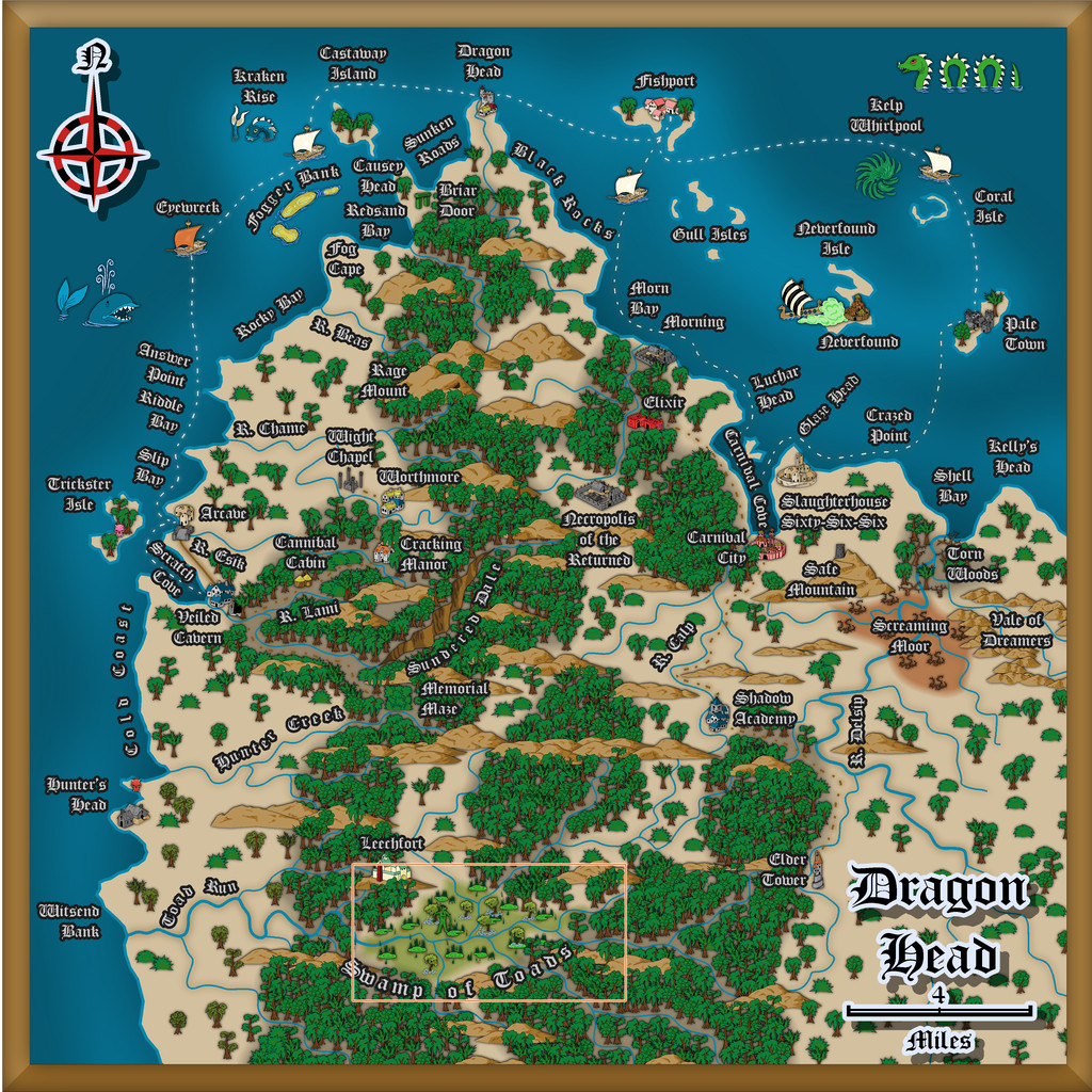
Community Atlas: Dragon Head, Lanka, Kumarikandam
A good deal later than I'd hoped, delayed thanks to various events outside my control, the next batch of maps for my sort-of Dungeon24-25-2... project are finally completed, covering aspects of a small peninsula on the northern shores of the easternmost Peninsula of Lanka, Kumarikandam:
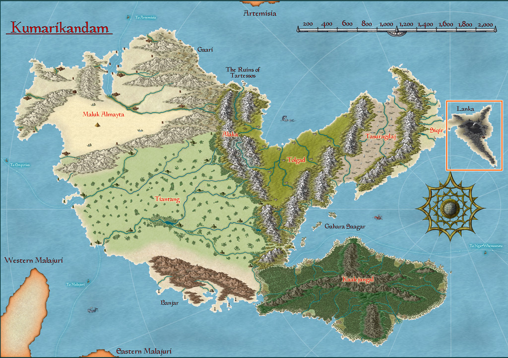
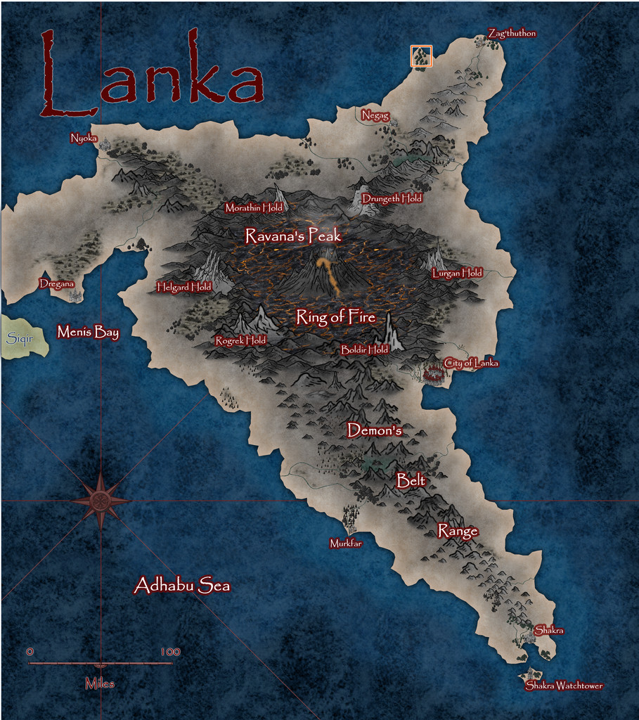
Lanka's pre-existing Atlas notes described it as an ashy, blackened, barren, volcanic wasteland, home to demons, dragons, dwarfs and assorted other (probably inimical) humanoids. However, peering closely at the Atlas map for the peninsula, there are a few spots with trees, shrubs and other hints of vegetation, some of which have settlements marked nearby, so it's not entirely desolate. And it was one of those vegetated headlands that I finally settled on mapping, from this extant base (extracted from the map above):
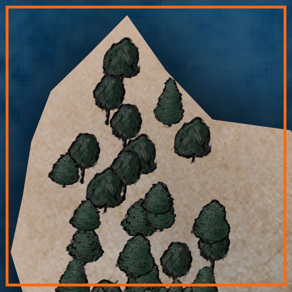
That orange-outlined area is some 20 miles square (30 km or so), to give an idea of scale.
A group of locations where sites of interest could be placed, were randomly assigned, much as usual, and then ideas for what they might be were drawn from, or inspired by, prompts from The Story Engine's "Deck of Worlds" and its expansion card sets, with some from the main "Story Engine" deck and its expansions too, including "Worlds of Blight & Shadow", "Written in Ash & Bone", "Worlds of Myth & Magic", "Worlds of Tide & Tidings", "Heroes' Quests & Fools' Errands", and the "Story & Worlds Bridge Expansion". From which you can tell I was leaning heavily into the "doom and disaster" concepts from the previous map's notes...
With that completed, the map was starting to come alive more, which, thinking about its geographic location - right on the equator - helped firm-up further. I was tempted to run lines of low hills into the gaps in the pre-mapped wooded areas, on northeast-southwest lines, only to decide against that (although hints of that still survive in the final map) as some of the ideas that had begun to coalesce favoured more west-east lines instead, partly based on what and where the random features were placed. These also gave rise to a number of offshore items, many of which were turned into islands too small to be shown on the original (honest!).
Thinking of what mapping styles might work best for this generally "threatening" area brought me eventually to the Dark Fantasy Maps style (CA140), to which were added items from the SS1 Fantasy Color style too, as suggested by the CA140 PDF Mapping Guide. After which, mapping commenced:

To keep things nicely confusing, "Dragon Head" is the name of this whole peninsula area, a coastal village settlement on the peninsula's northern tip, and the name of that headland where the village is sited! More hints of oddness feature in other map names, which the PDF map notes in the Atlas expand upon, as usual. There are definitely Dwarves, Demons, (Demi-?)Gods, Cannibals and Undead in places though, not all necessarily in what might be considered typical forms, along with still weirder things...
Speaking of which, the jungles have been kept deliberately off the hills for a couple of reasons. One is to further enhance the slightly uncomfortable feel of the whole area - rainforest jungle, but maybe the rain here isn't so healthy as it might be (the locals say it's often so heavy, it strips anything less tenacious than grass from the uplands). Plus the land has been tainted by events elsewhere across Lanka that laid waste to so much of it. The other main reason though was because when designing this map, I was also reading a couple of books on the Guadalcanal campaigns of 1942-43 in the Solomon Islands. Those islands are covered in tropical rainforest jungles, yet on Guadalcanal, as period photos clearly show, the hills are bare of anything much larger than scrubby bushes and grass, including from before any fighting began there. That contrast was just so unnervingly striking, it seemed very apt to reuse it here.
The dungeon map was originally going to be located on the western flanks of the narrow, crevasse-like canyon of Sundered Dale, near this map's centre. However, I found I was struggling to find reasons to so-locate it, and exactly how it was going to work there, because part of the design from the Inkwell Ideas Dungeonmorph Dice showed a large clump of trees in an open air circle, in the centre of a large, partly-roofed, temple-like chamber.
Inspiration for where else it might be placed, and just what it might be, came unexpectedly during a YouTube livestream on Free RPG Day 2025 by The Story Engine, creating settings with various guests using their card decks and expansions. One feature option that wasn't immediately spotted by the streamers was "Fence of Toads", and as so often in the live chat, we went off on our own little tangent about that... Then the stream's organiser, creator of The Story Engine decks, Peter Chiykowski, spotted our tangential chat about the point where I'd mentioned I'd then very recently been designing a "Swamp of Toads" (for this Dragon Head map). He said he'd love to see that, half-jokingly, and so was born the decision to expand the Swamp of Toads into a complete, separate Atlas map!
In case you can't spot the Swamp immediately on the map above, it's here, and we'll find out more about it next time:


-
Interesting Political Take on the Mercator Projection
Interesting broader discussion here. The earliest surviving topographical (known-)world maps tend to show the map creator's country/city in the centre, and many are circular around that point. Wikipedia's Early World Maps page has some useful illustrations in this regard. While that may have had a political motive, there's also an eminently practical one, because then you're able to draw the world moving out from where you started.
Into the medieval period, European maps often had the eastern end of the Mediterranean as their central point, because of its significance for the dominant Christian religion there at the time, and were drawn as circles or ovals out from that area.
If the region around your home site ends up larger and more detailed, that's at least as likely because you'll have more, and far better, information about that area than any other, which you might visit - if at all - maybe once in a lifetime for a few hours to days, in ancient to medieval times. So there doesn't always need to have been a political-patron motive there, significant though that undoubtedly was for some early cartographers.
Maps for planning intercontinental aircraft journeys are still prepared with the originating airport at the centre, and extend out in a circle from there, for instance, to allow the selection of the great-circle line required to reach the destination in the minimum of time, using the least fuel possible.
-
Seeking: Feather, scale fills
Royal Scribe asked: Storyweaver Highspace has some scale fills that might work (along with some other really fascinating fills -- has there ever been a Live tutorial using that annual?)
The creator of the HighSpace style, Joe Sweeney, did a series of tutorial videos when this was released (so for CC3, not CC3+), which are still available on YouTube. There is a link in the CA70 HighSpace 2 PDF Mapping Guide (there isn't a Guide for Part 1), but it goes to the wrong place. This link though takes you to the right place on the ProFantasy site, where you can download the videos. If you'd prefer to watch them online, they're here instead on YouTube.
-
Symbols Missing, Floorplans>Wall Features>Modern Fill Wall Feature Cutting
After a bit of digging around (it's actually SS3, not SS2, which confused at first!), the SS3 Bitmap A and B styles both have wall features like doors, so will cut the walls. SS3 Blueprint Floorplans has no door symbol options, so won't have any wall-cutting tools (so that symbol catalogue comes up as blank).
It looks, though, as if you're actually using the Vector style, as in the Symbols > Modern > Floorplans Catalogue are two vector wall features catalogues Wall Features 31 and Wall Features, both of which have wall-cutting features.
For unknown reasons, using the symbol catalogue icon doesn't call-up either of the Vector Wall Features catalogues in a new Modern Vector Floorplan map I did as a test, so at least I can say it's not just your system!
You can navigate to the symbols manually, or you can add either of those files to your map using the drop down Symbols - Symbol Settings... option, which calls up this panel:
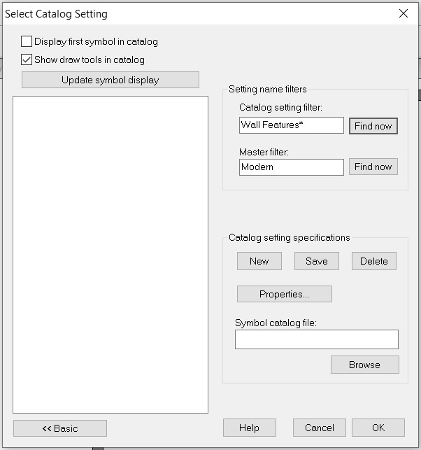
In which I simply added the word "Floorplans" after "Modern" in the "Master filter" box and browsed to the correct FSC file under "Catalog setting specifications", saved that, and the catalogue now shows up when I click the :CC2SYMPATH: icon.
Hopefully, this will help with your mapping.
@Don Anderson Jr. - The line with the horse icon will only show up if you have the various non-ProFantasy symbols from the CSUAC, Dundjinni, Bogies, etc., items installed.

-
Blackmarsh - Another Handdrawn Fantasy Map
As mentioned elsewhere on the Forum, I've again been mapping with this new style recently. So here it is, Blackmarsh (higher-res version in my Gallery):
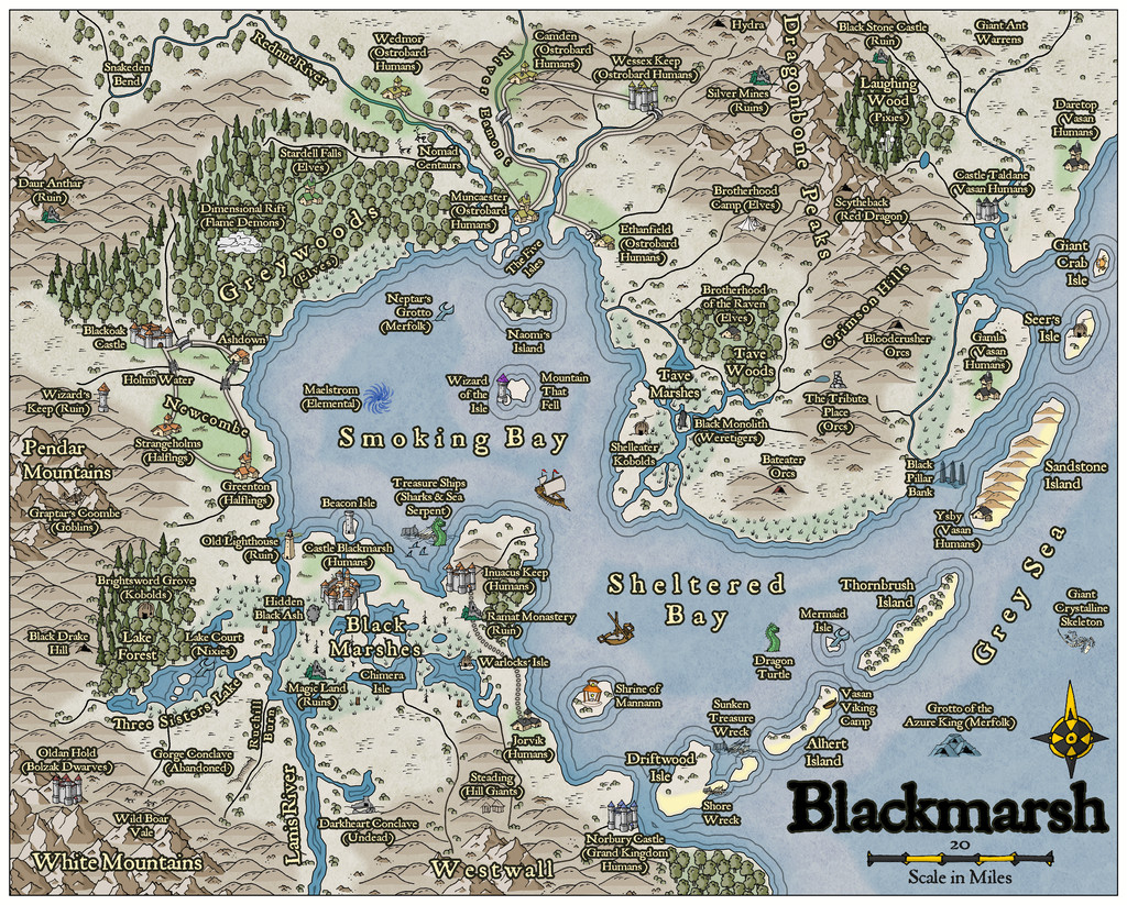
Like the previous Wyvern's Wood map, this isn't intended for the Atlas, since as those familiar with RPG settings may realise, this is actually my own redrawing of the map from the free PDF of the Blackmarsh setting, published by Bat In The Attic Games, and available here on DriveThru RPG.
I've had a soft spot for this for some years (I mean, c'mon, it has undersea features as well as those on land!), as it's heavily based on the old Judges Guild "Wilderlands" maps and settings from the late 1970s. That's not surprising, because Blackmarsh's author, and owner of Bat In The Attic Games, Robert S. Conley, knew and worked with one of the two founders of Judges Guild, Bob Bledsaw (Snr), and until a few years ago, had his own published updated versions of those old Wilderlands settings and maps available also on DriveThru. The fact they're no longer available came about for reasons those familiar with the sad history of Judges Guild after Mr Bledsaw died, will need, nor wish for, any reminders. Those unfamiliar are perhaps better off in that happy state of ignorance.
I've had a print-on-demand version of Blackmarsh for some years, following a Kickstarter run by Bat In The Attic. While I've tinkered around with the setting a little since, I've been prompted to actually compile a proper new map for it now, with some of my own tweaks, because Robert Conley is currently running a fresh Kickstarter for the Northern Marches setting, from his own Majestic Fantasy Realms world. This Blackmarsh area is just one small part of that whole. For anyone interested, it's easy enough to find on Kickstarter without a link here, and the project runs till June 28th this year. It's already doing very well, and for those keen on the older style of simpler setting descriptions and maps (though these latter are more sophisticated than the old Judges Guild style - and they're in colour!), it could well be worth a look. While the original had only hex-maps, I felt this hand-drawn style seemed ideal for this translation.
If you want to find out more about Blackmarsh, the free PDF is the place to go, since all the mapped locations are described there, and you can then discover what the great significance is of that Mountain That Fell...


 and 5 others.

