


Wyvern
Wyvern
About
- Username
- Wyvern
- Joined
- Visits
- 3,238
- Last Active
- Roles
- Member
- Points
- 5,517
- Rank
- Cartographer
- Badges
- 24
Latest Images


-
Community Atlas: Embra - Watery Places
The first two Watery Places were drawn as smaller maps than usual, based on the reduced-size template designed for the Lawn Market map. This was because, as with Lawn Market, both base maps were generated from randomly-selected maps in the old Judges Guild "Temples Book I". As noted previously, this book used a much smaller scaling than the other old JG works I was drawing on for inspiration in creating the Embra maps. The first of the Watery Places then is the Bittersweet Basin Swimming Pool:
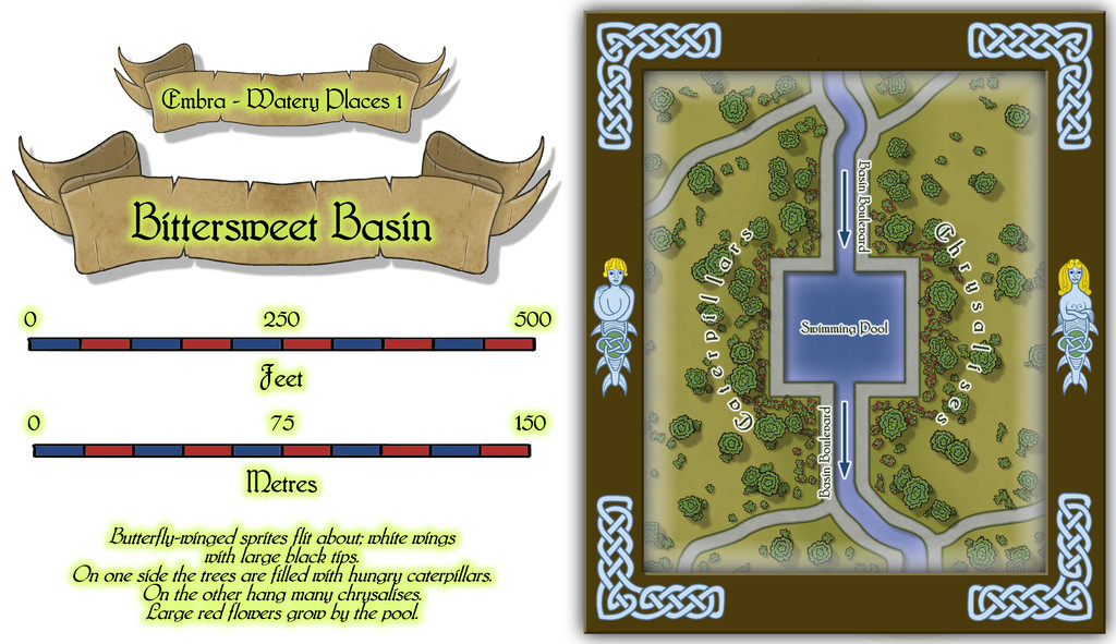
This is a remarkably simple area by comparison with many of the previous Embra Places maps, though of course variety is important in constructing an array of maps of this kind, to prevent things becoming too predictable. The featured text notes were used to add to the details shown here, without taking away any of their oddness. It's perhaps worth noting that as a mapper, it's equally important to have a few maps that are easier to produce like this, again helping avoid things becoming too stale and "samey". Especially as not all the Watery Places maps were going to be so "quick and easy"...


![[Deleted User]](https://secure.gravatar.com/avatar/c75d9a245b74d9c59be0999ea81ca541/?default=https%3A%2F%2Fvanillicon.com%2F92add7f8c954488718110edc4896ad39_200.png&rating=g&size=200)
-
Community Atlas: Embra - Crossing Places
Lastly, the fourth map covers the seven Crossing Places Streets in one:
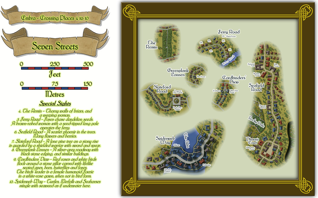
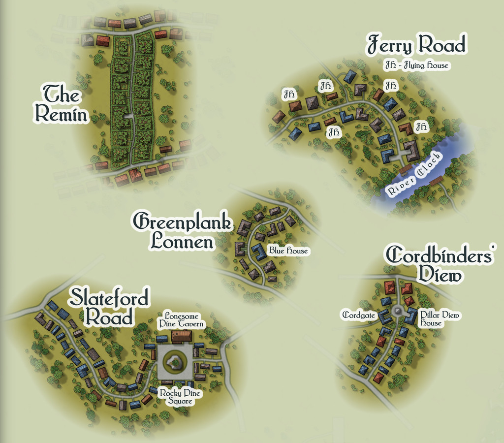
Which of course is tricky to see much detail on at this size, so some closer views might help:
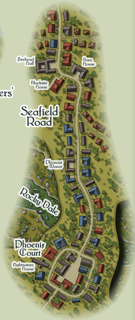
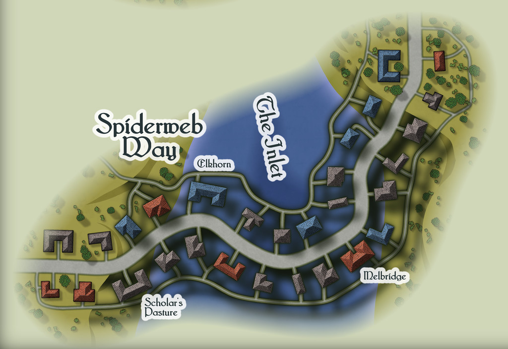
Two of these are obviously bridge-style crossings, albeit in rather unusual ways. Spiderweb Way suspends part of its street, its paths and buildings high above an Inlet of the sea, for all Embra is in the most landlocked part of all my Errynor maps. This is, however, Faerie, so think more surrealist thoughts, and it all starts to make perfect sense. If it doesn't, you just need to think more surreally... Seafield Road too suspends part of itself high above a deep, rocky ravine, although one that nobody ever seems to have managed to get down into. Like the sea Inlet, is it real? Or illusory? Naturally, choosing which Place of this pair was to have the sea inlet was quite deliberate; can't make things too obvious in Faerie always, after all!
One more street, Ferry Road, has a ferry across the River Clack at its end, but the other four are all narrow ways linking broader routes that are completely ignored and unnamed here. For clearly, only the Crossing Places matter in this case! Naturally, each of these smaller streets has features all their own too - the odd, wailing music along The Remin is only one curiosity (yes, that's NOT mentioned in the featured texts, only in the text and PDF files), as the houses there appear to be made of thorny bushes, for instance.
Now we only have five more "Places" groups to discuss...


-
Community Atlas: Embra - Crossing Places
The last of the individual Crossing Places maps covers the part of the Twilight Market here, Slateford Market (with a second view below showing just the map, hopefully for a little better clarity at the typical Forum resolution):
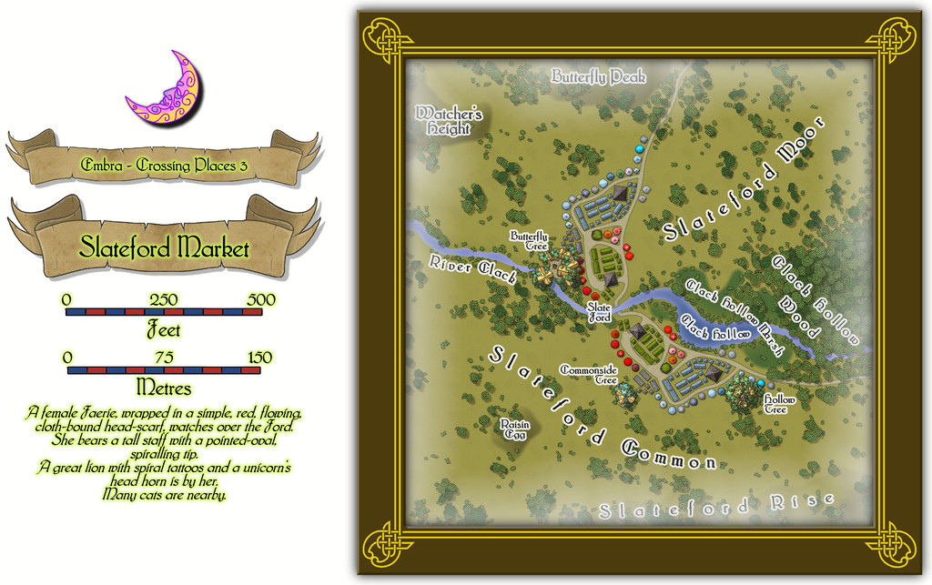
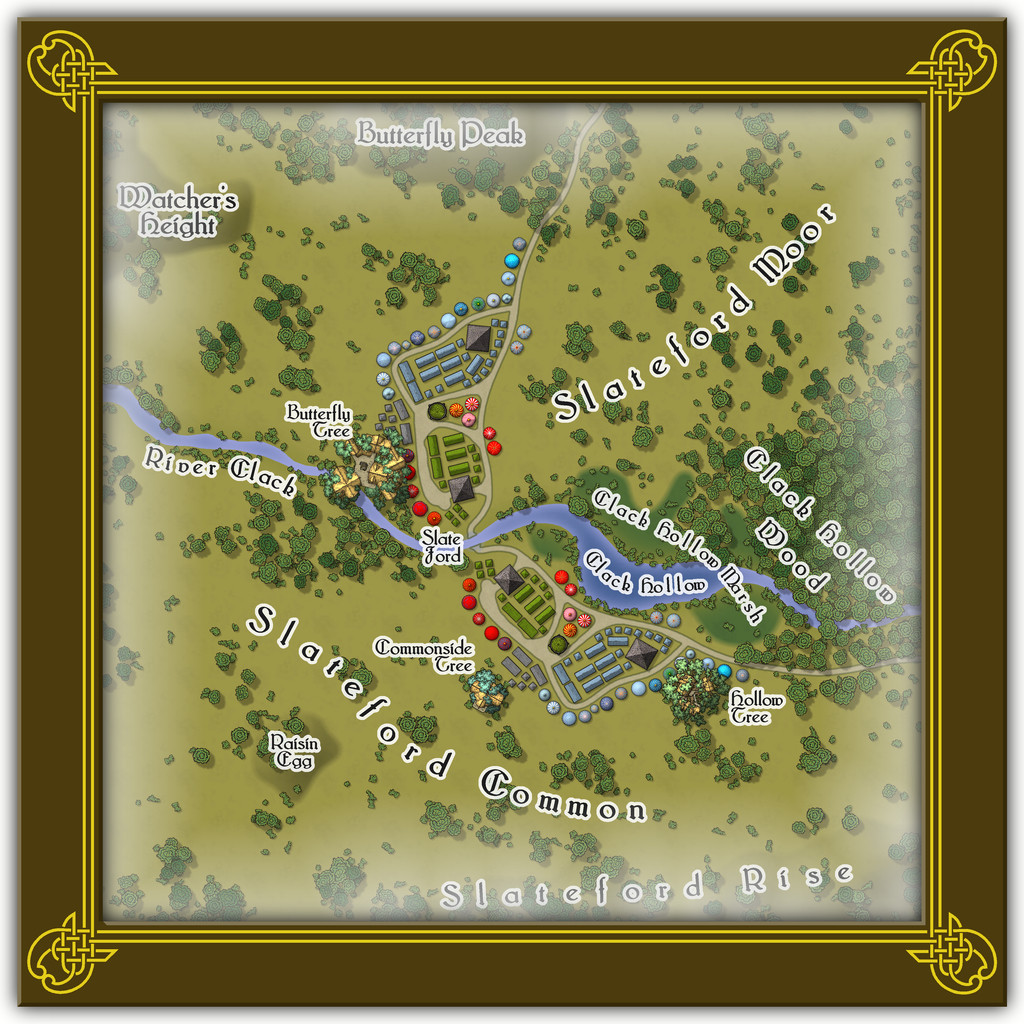
That the road layout and market stall placements look like the wings of a butterfly is not accidental. The original Judges Guild map on which this was based only had the layout on one side of the stream. It was though obvious that a simple ink-blot-style mirror image would produce this more pleasing pattern, thus this segment of the Twilight Market was designed with that in mind. Of course there's a watcher at the ford (from the featured text), and some more of the Mike Schley tree-houses, including an aerial tavern in the bough-structure overhanging the River Clack in the Butterfly Tree, "The Tasty Drop" (also a comment on patrons who miss their footing and end up in the Clack below...).
There aren't any actual buildings here however, simply tents, stalls, awnings, wagons and several open-plan covered spots (including a pair of green-tiled, circular bandstands). The thatched buildings in the treetops are intended as living parts of the trees, so aren't real buildings as such. Or that was my excuse for not providing interior layouts for them anyway!

-
Community Atlas: Embra - Crossing Places
The next Place is Dragon Bridge, which of course is a Bridge along the back of a great sleeping Dragon (what else?):
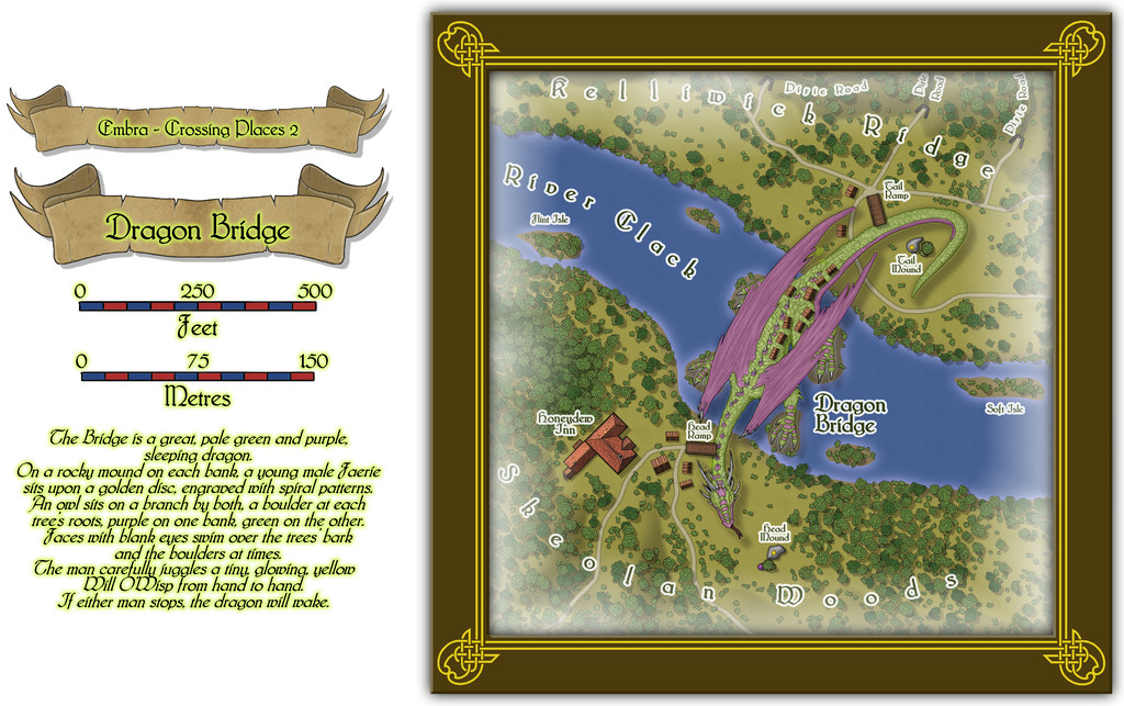
An explanation for how this works is provided by the featured text alongside the map, and the larger elements from that - rocky mounds, golden discs, trees and coloured boulders - have been placed on the map itself. It's clearly been working for a long time, judging by the wooden village that has grown along the Dragon's back, spilling over onto both river banks.
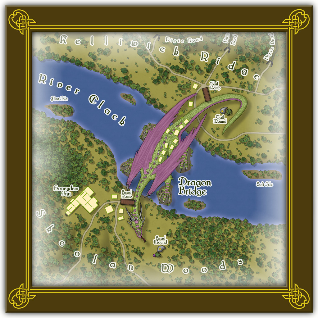
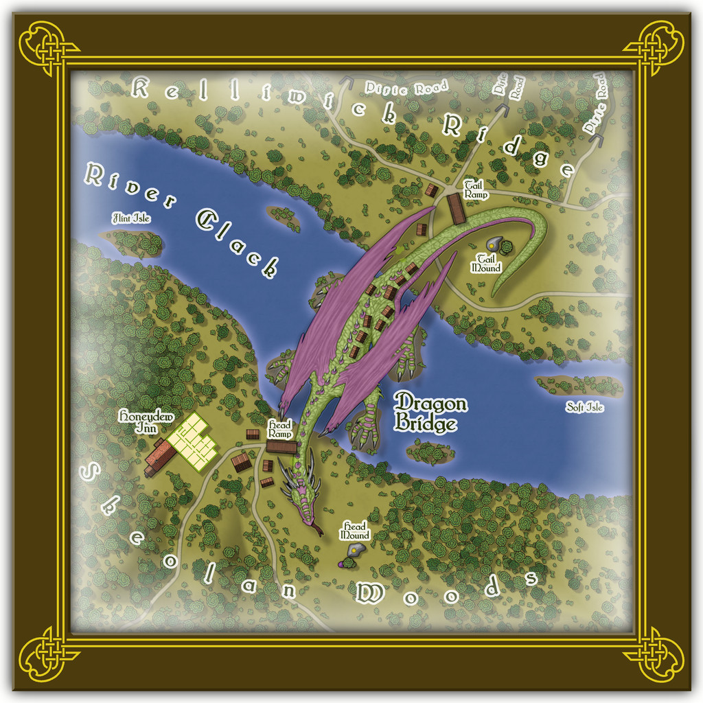
Interiors for the buildings should be available via the usual FCW file toggle in the Atlas (next image), with a second toggle for the upper storey interior of the Honeydew Inn (lower next image):
As commented already, the Dragon is a symbol, from DD3, but greatly enlarged. It's also a varicolor one, with added purple polygons to match the description of the featured text. As ever, there'll be PDF and text file notes available in the Atlas, which will tell you more about those mysterious, subterranean Pixie Roads through Kelliwick Ridge...

-
Community Atlas: Embra - Crossing Places
The first Crossing Place is Fountain Bridge:
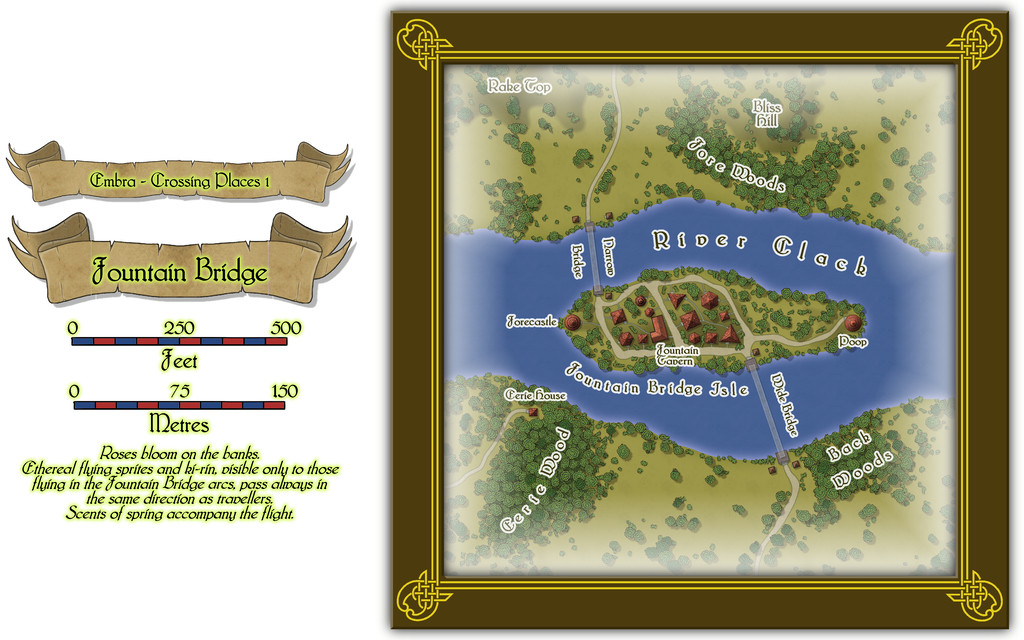
This has a small, scattered village on its central island, for which a toggle in the Atlas FCW file should allow the simple interior layouts to be seen (all have just a single storey):
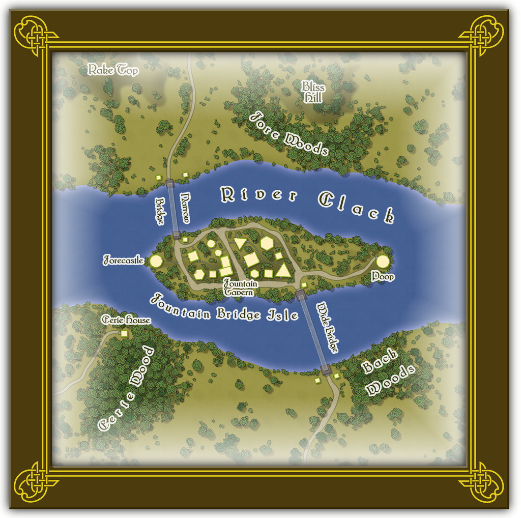
On this somewhat more detailed view, it may be possible to make out that the two bridges seem a little odd - they appear to be translucent. This is not a mistake, as there are no solid, permanent bridges here in fact. Both are literal water-fountain features. The travellers stand atop one of the square stone bridge abutments, and are then catapulted across in a gentle arc by a tremendous pulse of water. They arrive dry and safe a few seconds later on the opposite abutment - unless someone panics, in which case, they may end up getting wet, or even dropping into the river, to be rescued by the omnipresent water faeries, who think such a thing a tremendous joke! Animals - except magical or Faerie types - cannot use the bridges at all, however. Text and PDF files explain a little more, although Eerie Wood and Eerie House remain as mere mysterious names, to be expanded only should GMs wish to do so.

