


Wyvern
Wyvern
About
- Username
- Wyvern
- Joined
- Visits
- 3,237
- Last Active
- Roles
- Member
- Points
- 5,515
- Rank
- Cartographer
- Badges
- 24
Latest Images


-
Annual Old School VC
Like most CC3+ mapping styles, this older-look blue style doesn't have an automatic grid built-in. You need to add it once your map's finished (so you know where the grid needs to be).
To do this, make sure you have the active Sheet set as GRID, and the active Layer as HEX/SQUARE GRID, and that the Layer isn't Frozen (uncheck the "F" box if it is). Also make sure Colour 68 is selected (the default blue colour for this style).
Then open the drop-down menu Draw => Hex or Square Overlay... which brings up this pane:
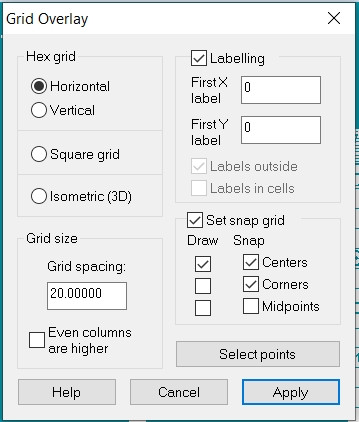
Check the "Square grid" radio button, set the "Grid spacing", and then decide if you want labelling per square or not (if not, just uncheck the "Labelling" box), and decide if you want to add a new snap grid for your grid lines.
You then have two options.
The "Apply" button places the grid across the entire map within the Map Border. For this blue style, that usually works fine, because the grid is located to appear above the white floors Sheet, but below things like the map symbols and text Sheets, so the unwanted part of the grid will blend perfectly into the blue background and not be seen.
Alternatively you can choose "Select points", and then use an existing snap grid - or by eye if you're very confident about doing that - to click once to start placing the grid. Then expand the grid over your map, to fit exactly where you want it to be (even if that's just a room or two). Once the other corner's in the correct spot, click again to complete placing the grid.
As the information pane shows, you can alternatively add a hex grid or an isometric one, if you prefer.
Typically, the grid so drawn will have very narrow, zero-width lines. These often look fine on screen, but in an image export or a printout, they can often vanish, so you may prefer to change that width to something a bit larger, maybe 0.1 feet or more. Make sure the GRID Layer isn't Frozen, then click the :CC2MCHANGE: button (mid-left side panel on the CC3+ drawing window), click on a grid line, and then right click for the information panel, on which click "Do it", which will let you adjust the line width, or any other parameter of the drawn grid.
Hope this helps!


-
Selling maps?
I'd be very wary of trying to sell through DM's Guild. My recollection (admittedly, from some years ago now), was that by selling there, you were effectively signing over ownership of your materials to Wizards of the Coast, such that you could no longer modify even your own original work published there. That was according to a couple of folks I knew online who were thinking of selling that way, and who decided against it for exactly this reason (as it was explained to me, at least). That may have changed since, but I'd be very careful in checking the small print before signing-up to that just in case.
@Royal Scribe - You may find it helpful to contact other small-publishing sellers on DriveThru that sell a lot of products as Pay-What-You-Want - Crooked Staff (papercrafting textures, maps, scenarios, and excellent papercrafting YouTube videos) springs to mind. I know Kris slightly who runs/is Crooked Staff, and he often comments about exactly this kind of matter on his Discord. He also runs a successful Patreon, and that might be another option to consider, assuming you feel comfortable ensuring a regular monthly output of new items.

-
[WIP] Rise of the Crone-Mother
Yes, the numerous areas of white water seem a bit distracting, and make it harder to tell which elements among those might be more important. There are what seem to be a couple of larger falls on the left-hand "vertical" section of river, but it's not clear currently if these are more or less significant than some of the numerous other white-water clusters elsewhere, for instance.
Not sure if the wider riverbed area in the top left is part of a lake, or just a wider section of the river either. If it's a lake, the bed should probably be a bit deeper and the water flow quieter, so it would probably be less obviously boulder-covered (which works fine for shallow, fast-flowing water otherwise). What seems to be a lot of waterfalls just before (and into?) that wider area though makes it hard to be sure.
The paler shadow does indeed seem fine on the latest drawing of the cross-section through the hag's lair, although the heavy dark glow around the cave wall lines and the exterior, also helps settle it down into the landscape more.
-
Numbers Don't Appear on Dungeon Map
If I've understood your query correctly, you're left-clicking the :CC2NUMBER: button and then immediately clicking the left-button again in your map.
What you need to do after clicking the |CC2NUMBER| button is check the Command Line to make sure the number you want to use is correct there - if it isn't, just type in the correct one, and then either press Enter, or right-click your mouse. The number will then appear on a large cross-hair on your map, and you can place it where you want.
As others here have suggested already, you may need to adjust the size of your text so you can see the numeral, and make sure it's going on the correct Sheet as well once you've done this (or better, before doing so!).
-
Is there a way to make a square grid such that the different squares are offset from each other?
OK, maybe try this.
1) Set up a suitably-sized snap grid that'll let you draw squares of the exact size you need, and keep the snap grid turned on.
2) Draw an outline square of the size you require, with the line thickness you need it to be, using the snap grid.
3) Copy that square, and paste it immediately below the first one. Again, the snap grid is your friend.
4) Then paste another line of two squares to the right of the first two, with the half-square offset required. You may need to adjust your snap grid to allow this correctly.
5) This gives you a base of four squares in the correct pattern that you can then copy, making a larger area of squares with the necessary offset. Depending on how large an area of squares you need, once you have a larger part of the pattern available, you can simply copy said larger number of squares to speed things up. If you group the batches of squares too, that will make copying the groups easier.
6) Once you've filled the area you need with the offset squares pattern, save this as your base file that you can then open and re-save each time you want to draw a map using this offset grid.
By using the snap grid and basic commands like grouping the areas of squares, the whole process should be pretty quick to do, and hopefully fairly problem-free.
[Edited this where boldfaced, as I realised after posting that the pattern actually needs a four-square group, not a five as I originally suggested! (Otherwise you end up repeatedly overlapping the column with three squares in it.)]


