


Wyvern
Wyvern
About
- Username
- Wyvern
- Joined
- Visits
- 3,238
- Last Active
- Roles
- Member
- Points
- 5,516
- Rank
- Cartographer
- Badges
- 24
Latest Images


-
[WIP] Atlas Contest: Village of Djayet (Gold Coast, west coast of Doriant)
Scalebars are fine in the Atlas.
You can change the font in any symbols like this in your map by making a new symbol with your preferred font in.
Select the symbol in Symbol Manager (in the Symbols drop-down menu), and Clone it, giving it a new name (this is very important, so you don't overwrite the original symbol).
Then, still in Symbol Manager, select your cloned symbol and click to Edit it. Draw your editing pane and then make whatever changes you wish - all the usual CC3+ tools are available to work on the symbol.
Once you're happy with the new version, click the cross box in the top right corner of the editing pane to dismiss it, and you'll get a terrifying message like this:
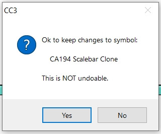
Despite the terror, click "Yes" - it's fine to do so with the cloned image.
Then your revised scalebar will be available to use in that map only.


-
WIP Ettinsmoor and northern Narnia
The main problem Sue is that part over to the west is simply blank, or hidden by a convenient piece of artwork, in all of Pauline Baynes' maps of the area.
There might be the option to add the coastline on the eastern side, as shown on her poster map, although that would be quite a bit of extra work, and would need everything moved west within the current map border. Might be worth considering though, if you felt up to the challenge Helen?
-
WIP: Nirmathas on Golarion
Only thing that occurs would be to make those little illustrative symbol discs for Tamran, Fort Ramgate and Lost Mines larger. It seems a shame not to better highlight those little pieces of artwork. And of course to maybe add more for other places too.
That might mean adding dot-markers for the places, and a line, or two lines, linking to the enlarged "art" view for the places, however, so you're still showing their precise locations, as well as illustrating them, though that may be more map-clutter than you'd prefer.

-
isometric throne symbols
Yes. It maybe there's something in one of the numerous isometric artwork sets available on a download site such as DriveThru RPG that would help, but there are a LOT of those to try to hunt through, and you'd need to convert the artwork to be symbols in CC3+ first, of course.
-
Planet of those Apes
Top down for the mountains would seem the better fit for what you're trying to emulate. Plus that would save you having to draw more symbols, and just set up a drawing tool with some effects!

