


Wyvern
Wyvern
About
- Username
- Wyvern
- Joined
- Visits
- 3,237
- Last Active
- Roles
- Member
- Points
- 5,515
- Rank
- Cartographer
- Badges
- 24
Latest Images


-
A Hand-Drawn Fantasy Map of Jack Vance's Dying Earth
@Royal Scribe : There are four books by Vance that comprise his Dying Earth stories, The Dying Earth (1950), The Eyes of the Overworld (1966), Cugel's Saga (1983) and Rhialto the Marvellous (1984), but if you can find them (try Amazon), you should probably read the tales in their more definitive versions, published in the past few years by Spatterlight Press, as Mazirian the Magician, Cugel the Clever, Cugel: The Skybreak Spatterlight and Rhialto the Marvellous, because these are the Vance Integral Edition (VIE) versions, with amendments bringing the texts back to Vance's originals, rather than what was sometimes published originally. There are 62 volumes with all of Vance's tales in the complete VIE collection (he was a very prolific author!), and you can find more about it on the Jack Vance Official Website here.
[EDIT: And it did finally occur to me that I should have changed this from a "Work In Progress" to a "Finished" topic - so I now have!]

-
Stain Symbols for Maps
@Royal Scribe I think it was who was asking on today's PF livestream about stain symbols on maps, like the ring left by a coffee cup.
I couldn't find anything like this in the two more recent Annuals I mentioned in the livechat, the Sticky-Note Dungeon one, CA214, or the Investigations Props & Handouts one, CA73. However, there are some stain options, like inkblots and multiple circular features, in CA06, Parchment Backgrounds. You can see some in action on this map in my Gallery.
There may be more elsewhere too, but I suspect this Parchement Backgrounds style was what I'd thought of.

-
A Hand-Drawn Fantasy Map of Jack Vance's Dying Earth
I was going to leave a discussion of some of the text items to my closing post on this topic, but since that's not quite ready yet, and as the subject's been mentioned, we can today take a closer look at...
The Kaiin Mutiny*
Using text in Campaign Cartographer can often raise issues, and is typically one of the most complex elements. Aside from variables such as which font to choose, the font size for particular labels (as only one size can be allocated to each text item), suitable colouring and effects, the placement point can often be the trickiest to get right. Text will tend to expand away from whatever placement point is chosen at different screen and image resolutions - if that's "Mid Left", the text will usually hold fast on its left side, expanding away to its right, for example. This can only be fully overcome by using the "Explode" command on the text, to convert it to graphic entities that will hold their positions correctly. While this has advantages sometimes, it has the serious disadvantage that the text can no longer be edited as text, so make any mistakes, and the whole rigmarole must be gone through again.
In this case, I was using two different font sizes, and thus separate text items, for many of the map labels, larger for the place-name, smaller for the notes. The Kaiin label was an especial problem, because at the place-name font size, there wasn't enough room to fit the full text line in due to "The Melantine Gulf" label. So I reduced the font size for "The White City" part, and set-up the two parts of the name-label aligned, but with the intended fixed placement points of mid-right for "Kaiin" and mid-left for "The White City". It looked fine, as this screenshot from the FCW file shows:
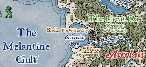
However, rendering the map image as a JPG at the normal Forum resolution, and it came out like this:
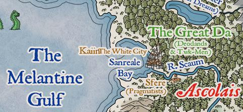
This is unusual, but I didn't spot it right away, hence why it appeared on the map images posted last time (and again in one of the WIP images still to come). Typically, once I think a map's completed, I do a trial printout on an A4 page, so I can check it for mistakes, rather than relying on just on-screen images. Which is where this little "delight" was noticed. Checking the FCW file showed that "The White City" had been given a mid-right placement point as well as the "Kaiin" one, which I'd guess was due to a mis-click on my part; luckily, easily corrected, as this sneak-preview of a later-stage-mapping image shows:
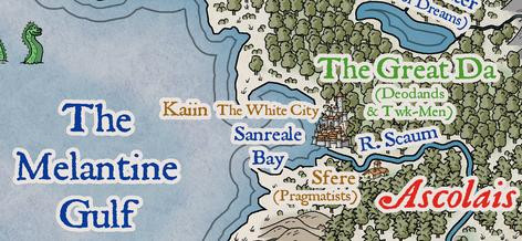
One further point about the map labels should be noted. As often happens with such labels that have effects on them, when placed over mapped features with a very similar to identical colour, that can cause the text to lose definition, or gain unwanted holes and marks. When I spotted that first, for the "Fer Aquila Mountains" label, I decided to duplicate all the on-map texts to a lower sheet without effects on it, which stopped the problem in its tracks. That did though help slow-down the whole labelling process subsequently, both in remembering to do it on a per-label basis, and when the label's placement point, font size, or appearance for multi-line texts, had to be amended after adding it. Which, of course, is partly why the Kaiin Mutiny was allowed to continue for so long 😉!
* A punning reference to the title of an old Humphrey Bogart movie.😎


-
Postcard Maps
Resurrecting this topic, as another, but much larger, map in a similar style has recently come to my attention, as a version of it was recently republished by the H P Lovecraft Historical Society as a period prop to accompany their latest Dark Adventure Radio Theatre audio show, "The Blood Red Sphinx". It's a 1932 pictorial map of the Greater Los Angeles area:
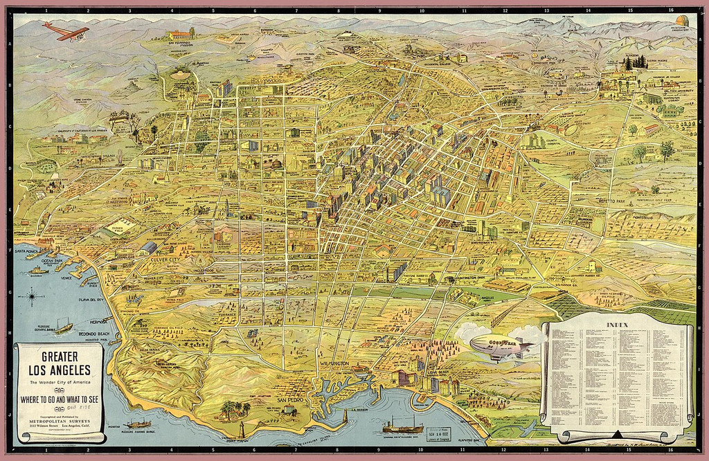
The reason I can post it here, is because this version comes from Wikimedia, and that's where you can find a much larger, higher-res version (albeit the Index list is STILL too small on the largest version to read clearly!). Its colour palette reminds me of the beautiful E Prybylski Watercolour style, from the 2023 Cartographer's Annual. All we'd need is a vast array of suitable building and other object symbols to match 😉😁!


-
Experimenting with wooden stairs
Have you tried CA209 Stairs and Steps? That has some wooden steps and some more generic "brown" steps that will work as wood or stone. If you need some plank lines in places, just draw some on afterwards. Even some of the worn, brown stone steps will work as wood - again add a few plank lines if you wish to fool the eye a little more. Old wooden steps will wear away just as the stone ones do, after all, and might be patched with different colour wood scraps. You could also "carpet" them to hide that middle worn section.
Symbol Set 2, Bitmap A, has some complete wooden stairs, darker though not reddened wood, some of which come without arrows.
With DD3, you might try mixing things up with other wooden furniture - the bench, pew, the sideboard, chests, crates (which latter two both have paler wood colours), and the planks in the Debris catalogue (though those would probably only work with difficulty). You may need to hide the edges or sides with some of the furniture and containers, but they could give alternate options for landings, say, apart from steps.
It'd probably be worth hunting around in a few more catalogues as well, as you never know what else wooden might seem suitable!


