


Monsen
Monsen
About
- Username
- Monsen
- Joined
- Visits
- 660
- Last Active
- Roles
- Administrator
- Points
- 8,858
- Birthday
- May 14, 1976
- Location
- Bergen, Norway
- Website
- https://atlas.monsen.cc
- Real Name
- Remy Monsen
- Rank
- Cartographer
- Badges
- 27
Latest Images
-
WIP: Bleakmoor Harrow - Continent of Estonisch
Birdseye hasn't been added to the image database file yet, so everything from there will show up as unknown. I don't remember if I have added any 2025 annuals yet. It is a manual process to update it.

-
[WIP] Wizard's Tower - Interior
If you need to know exactly what is from which add-on, you can use the IRD command (D stands for Detail).
And that cobble fill is some weird reference that turns up in some templates.

-
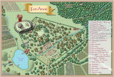
Upgrading old CC2 maps
In most cases, CC2 files can just be loaded straight into CC3+ and they should work. There is one big breaking change though, in CC2, everything on the Common sheet (these are actually things that are not on a sheet at all) displayed on top of everything else, but now these goes in the background.
There is a CC2 to CC3 converter in the File menu, but in this case, unless you want to do more work with them, it may actually be better to skip that, and instead just make a new sheet, then move every entity that is on Common to this new sheet, and make sure it is at the bottom of the list of sheets. This should ensure the file look the same as it did in CC2.
Now, looking at those images (I looked at wholeworld and Karameikos), it does seem like they have been post-processed to add a more textured feel. I can't find any indication in the .fcw's that this texture came from there, neither does it look like CC2 texturing (although I might be wrong). Obviously, replicating that exactly will be tricky, but there are many things that can be done in CC3+ to maybe approach a similar feel if that is what you are after.
The maps have also been drawn with zero-width lines, which was common for these old maps. The issue with that is that the lines will always export as thin as possible (1 pixel wide), so when exporting in higher resolution, this will also make the lines appear thinner compared to those old exports. So here, they should probably be given a proper width instead.
All of this will require some work processing those maps.
Fonts are not embedded into the map files, but as long as you have the right fonts installed on your computer, these should be used to provide the right look here. You can always inspect a text entity and see what font it is set up to use if you use the List command from the Info menu on them.
I am not sure exactly where you want to go from here, so I just leave this as a small introduction for now. Let us know if you need help with any of this and we'll happily provide more detailed instructions, or if there is anything else you are thinking about when you say the maps doesn't look like the images.

-
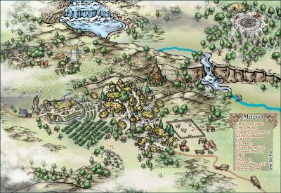
WIP Community Atlas - Mortyn-Goya Confluence
I'll fix it.
Note that the images on the atlas is stored in a distributed CDN system so it can take a while before the new version will be visible after I make a new export.
-
WIP Community Atlas - Mortyn-Goya Confluence
Finally got this into the atlas. Thanks for the contribution @KertDawg


