Avatar

Royal Scribe

Royal Scribe

About

Username
Royal Scribe
Joined
Visits
4,474
Last Active
Roles
Member
Points
1,739
Birthday
February 5, 1968
Location
San Francisco, California
Real Name
Kevin
Rank
Mapmaker
Badges
12

Latest Images

  • WIP: Novarenga MKII

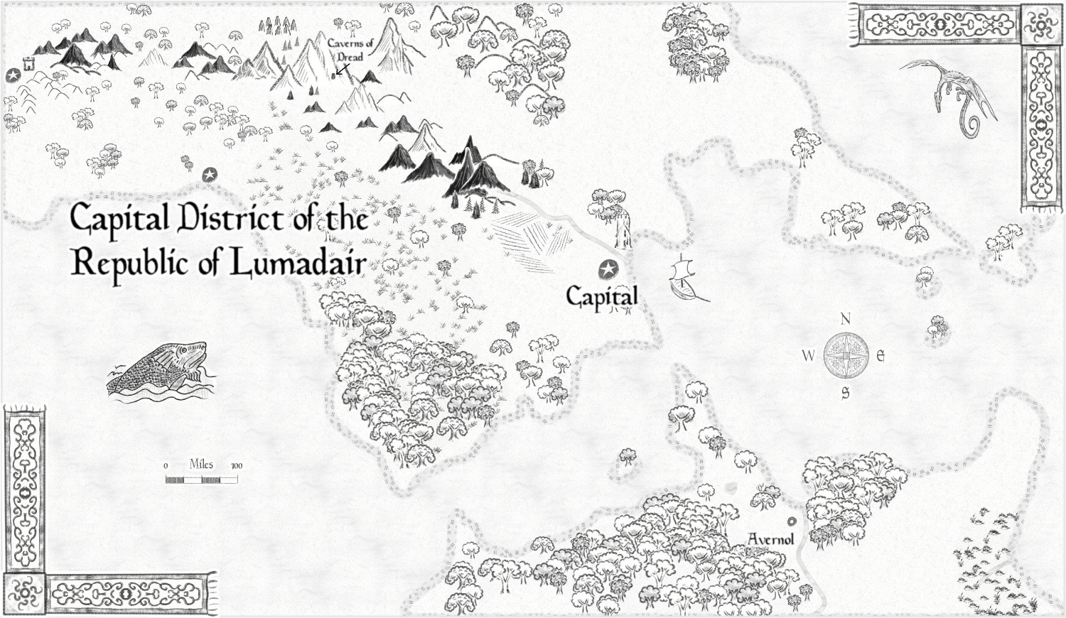
    I am really liking this Parchment style for large-scale maps. I don't think it would suit my campaign world overall, but I can see my adventurers finding an ancient map in this style in some crumbling ruins, or being given one in this style when they consult with a sage or wizard for advice.

    jmabbottJimP
  • [WIP] Greco-Roman Inspired Temple

    I will play with the grass scale to see if I can reduce the repetition. It actually started at a higher scale that was t00 close-up for a map of this size (which is 500' x 400'). I am also open to recommendations of other grass fills that you all think would be suitable and less repetitive. Any thoughts?

    Any recommendations for other park-related symbols that I could use to fill out the area? More trees, of course, but are there other symbol sets to recommend? I looked for things like park benches and gazebos, but the ones I found were for styles that didn't seem compatible. If I don't own the Annuals with the symbols that people recommend, I can consider purchasing them.

    Thank you!

    JimP
  • [WIP] Greco-Roman Inspired Temple

    I’ve been working on a temple inspired by Greek and Roman architecture, and while I think I’ve made some decisions in areas where I was vacillating, I’m open to feedback.

    The temple is for a fictional religion in my campaign that shares elements from Ancient Greece and Rome (in architecture and in how the gods are depicted, like their attire). This temple is therefore not intended to be historically accurate: it intentionally mixes elements that were unique to Greek temples with those unique to Roman temples, and it intentionally deviates from both in certain ways.

    I got to learn some new techniques as part of this. I used the Marine Dungeon from the 2021 Annual in large part because they include my favorite pillars, an essential part of a Greco-Roman temple. I used the color key effect for the first time in an actual dungeon (love the bronze inlay symbols). I made an effective use of layers for the first time, combining all of the roof elements from different sheets onto a single “roof” layer (called the “pediment”), which allows me to show or hide the entire roof by hiding or revealing a single layer – basic stuff, but it’s the first time I really paid attention to layers effectively. I also created my own custom symbols for the first time (for reflections from mosaics on the walls illuminated with luminescent crystals used by dwarves in my world to light their subterranean homes). And I played with lighting effects for the first time.

    Both Greek and Roman temples used the temple’s pillars provide the ratio for the size of the temple. The space between pillars was always double the diameter of the pillars (except that the middle pillars might have an extra gap between them, sufficient to let two people walk through them side by side). The height of the pillars was ten times the diameter. (In my temple, the pillars are five feet wide, so there’s a ten-foot gap between each and each are 50 feet high.) There were always an even number of pillars in the front, from four to twelve, and the number of columns on the sides was based on the number in front. The Greek formula was double the number in front plus one, while the Roman formula was twice the number of pillars on the front minus one. (For the eight pillars in front of mine, the Greeks would have 17 on the side and the Romans would have 15.)

    Greek temples were set on a series of three steps called stylobates, which surrounded the temple on all four sides. The Romans instead had the temple sit on a raised platform called a podium, with an impressive staircase entrance in the front (like the entrance to the U.S. Supreme Court building).

    I intentionally mixed and matched Greek and Roman features to suit my fancy. I put the three stylobate steps at the base but extended it far in front of the temple to create a plaza area where temple priests in my fictitious religion could ritually sacrifice a wild auroch or boar so that the gods could feast on the aromas before the remains were used to feed the poor. I put then put my temple on a large, marble podium, but then used the Greek formula for the number of columns. (I used marble a lot -- are there any styles with granite fills?) I also used double rows columns because it looked cool, though I have no idea whether I used them in a “proper” Greek or Roman manner.

    I also created a fountain or reflecting pool in the plaza, mostly so that I could play with the fun water effects (like the ripples at the fountain walls and the pedestals in the fountain with statues of the gods of the sea). That also gave me a chance to use the submerged bronze inlay effect. The inner wall with ripples had ripples on the outside of the wall, too. I wasn’t sure how to handle that, but I ended up adding an outer wall without ripples as a lower step, and that seems to have worked.


    And I created three “barbecue” pits that temple clerics would use for their rituals.

    The enclosed building of the temple is called a “cella,” from which we get the word “cell” used for where monks sleep (and later prison cells, and eventually the biological term for plant and animal cells). I added a door to the back room to allow priests to go back there without having to circle to the temple’s back entrance. And I added stairs going down to not-yet-designed crypts, which will include a tunnel connecting the crypts to the basement of the rectory, the building in the lower right. (If there’s a more appropriate Greek or Roman term for a rectory, please advise.)

    The niches inside the cella are not historically accurate, to my knowledge. The Greeks and Romans both had rectangular rooms. They niches aren’t meant to be stained glass windows. They have mosaics on the walls that reflect light because they use luminescent crystals that naturally glow.

    Here are some areas where I experimented with different approaches:

    The Pediment, or Roof

    Originally, I wasn’t going to show the roof, but I realized that players might not realize that the portions within the pillars were all under a roof, even the parts not enclosed by walls. So I added a shadow over the portion that would be under the roof, an effect inspired by the trees of the Forest Trail (where you can hide the trees but still show the stumps and the trees’ shadows, so players can know when they are under a tree or hiding behind it).

    But then I decided I wanted to be able to show the temple roof, like when I recreate this for a full city. I experimented with different techniques for the roof’s material, and for allowing one side to be a little shadowed.

    In one version, I used two different shades of stone from the CA161 Rycroft Town template to show the shadowed side. In the other version, and this is the version I’m leaning towards, I used the stone roofing tiles from CA177 Darklands City template on both sides of the roof, but then placed a black rectangle with a transparency effect (20% opacity) over the shadowed side.

    Question: Do you prefer one roof over the other?

    Offering Pits

    For the sacrificial offering pits, I used a molten lava fill as the base, and then piled on some burnt wood from CA177 Darklands City. That template had some great flames, too. (Originally, the only flames I could think of were Mike Schley’s, which are great but in a very different style.)

    The offerings come from the free Bogies Redthorn Tavern symbols, which are great but maybe a little too realistic?


    Question: Are the flames too much? Are there other “barbecue” symbols you’d recommend?

    Lighting

    In a previous thread, I asked if there was a way to have lighting effects without disabling the global sun so that I could have an inside and outside (without having to recreate all of my sheets to have indoor and outdoor versions).

    https://forum.profantasy.com/discussion/13954/adding-lighting-effect-without-changing-global-sun

    The answer was no, so I had three options: (1) revamp all of my sheets so that the outdoor portions were on sheets after the end of the lighting effect; (2) use semi-transparent colored circles to simulate the effect of the glow from colored lights; or (3) create a separate copy of


    That’s what I have so far. Any suggestions? (It’s my birthday, so please be kind!)

    Oh, here's the FCW file if you're interested.


    MonsenQuentenLoopysueJimPEdERicko Hasche
  • Adding lighting effect without changing global sun?

    I am working on a map in which a statue is holding an object that is glowing. Elsewhere in the room there's a candle partly in a wall's shadow. Is there a way to add a lighting effect that is in addition to, rather than instead of, the global sun?

    I've watched and rewatched Remy's Night & Day video of July 2020, and Ralf's Dungeon Lights video of a few months ago, but I still haven't figured it out. I might be missing something obvious. When I tried adding a lighting effect, everything was plunged into blackness because it overrode the global sun. In another thread, Sue said that the parts of the map not affected by the lighting effect should be on sheets that are below the sheet where the lighting ends, but I'm hoping to avoid that since it would entail a massive revamp of the map. Also, that may not be the same issue for me, because I'm not trying to have dark areas and daylight areas, just extra lighting that is in addition to the daylight.

    I tried an alternate approach by putting a yellow circular polygon on the object and using transparencies and glows to make it simulate a light, but that doesn't affect nearby wall shadows, and I couldn't get the glow and transparency settings to look good. I'm okay with it not affecting wall shadows if I can at least make it look like it's glowing. If the yellow polygon approach is the best, can anyone recommend some good settings for transparency/glow/edge fade/blur/etc. effects?


    Thank you!

    EdE
  • Castle in a Cloud

    Thank you, everyone, for your help.

    After a bit of wrestling (and an evening of downloading massive files), I was able to install the Dundjinni symbols that Wyvern recommended. I added a griffon and a dragon with a rider. I also swapped out the giant hawks in the lower right side for a pair of eagles from the Mike Schley Overland that I missed. My flying creatures are a bit oversized compared to the castle, but I figure it's a bit of forced perspective, with the flying creatures coming in from above and closer to the viewer.

    (I also trimmed back some of the farmland on the right side so that it's now mostly around the towns and cities.)

    I belatedly discovered that Mike Schley's clouds also have a vericolor version, so I could add in some light gray ones to add a little texture, but I haven't done that. I will get the 2014 Annual with the Alyssa Faden clouds in a few weeks and try them on a whole new map from scratch.

    Ricko, I am enjoying your tutorials. Thank you.


    Ricko HascheQuentenMapjunkieGlitchMonsenWyvern