Royal Scribe
Royal Scribe
About
- Username
- Royal Scribe
- Joined
- Visits
- 9,535
- Last Active
- Roles
- Member
- Points
- 3,353
- Birthday
- February 5, 1968
- Location
- San Francisco, California
- Website
- https://legacy.drivethrurpg.com/browse/pub/31814/Royal-Scribe-Imaginarium
- Real Name
- Kevin
- Rank
- Mapmaker
- Badges
- 16
Reactions
-
[WIP] Elves v. Dark Empire
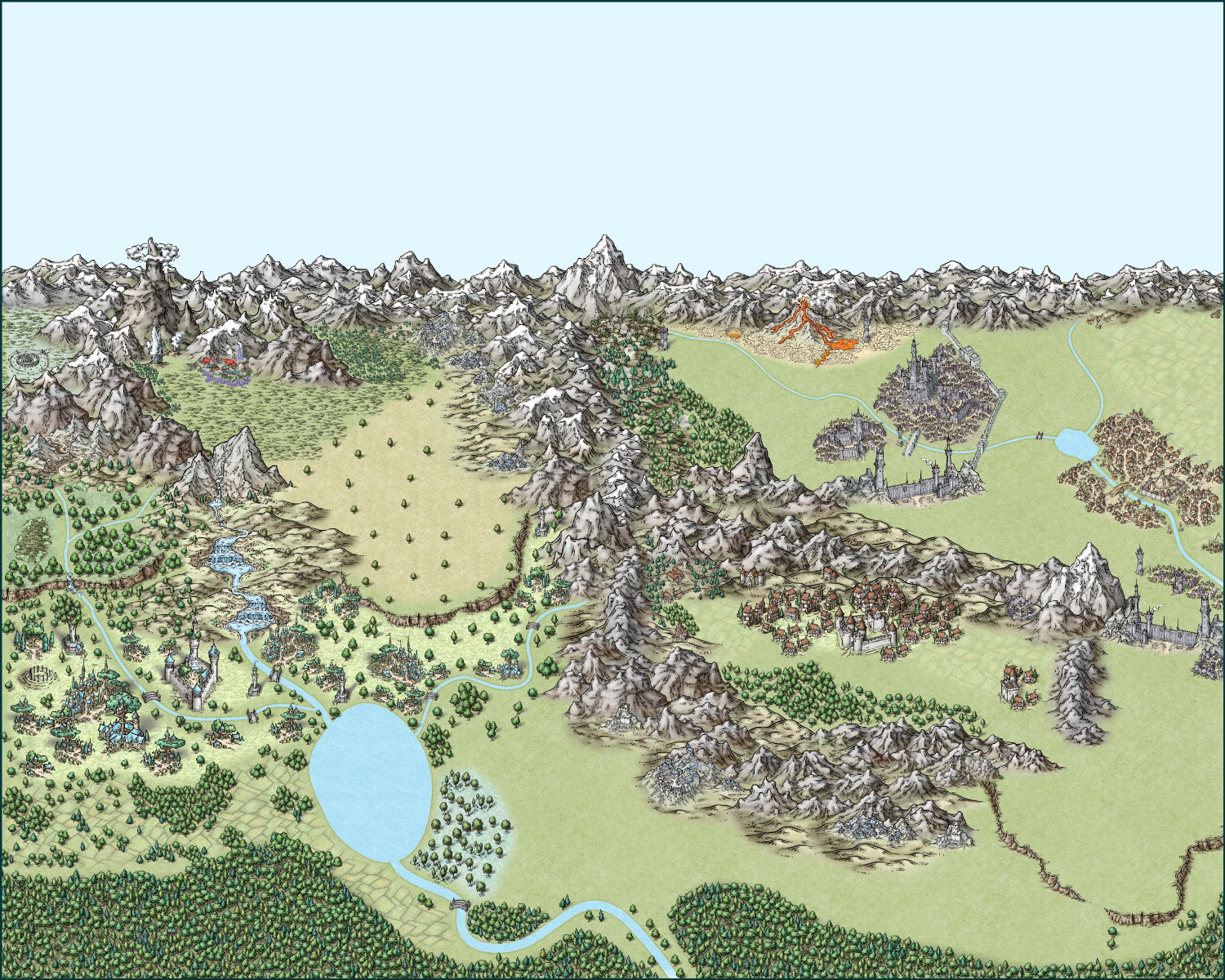
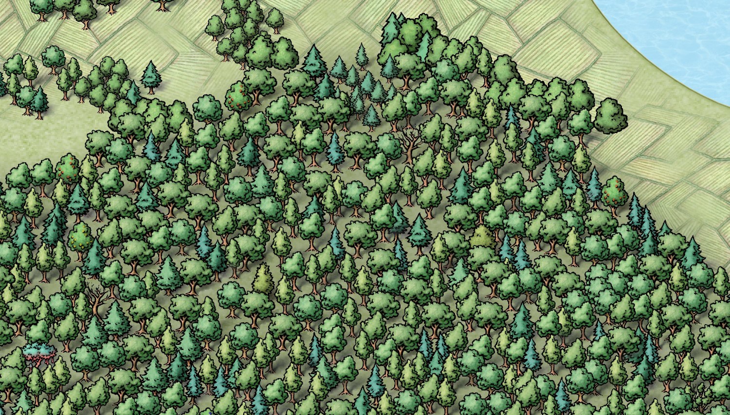
I redid the southern forest for the first map. I deleted the original blocks of mixed forest trees but kept the semi-transparent gray forest background, and then added a few thousand individual trees. Mostly deciduous and pine, with a healthy smattering of different-colored fruit trees along with a handful of barren trees and a surprise or two. There's something very peaceful about placing all of them individually -- though maybe that's easier to say when there's "only" 2,371 trees and not 41,000!
Here's a close-up of a bit of the forest.
On to the other map!
-
[WIP] Elves v. Dark Empire
-
[WIP] Elves v. Dark Empire
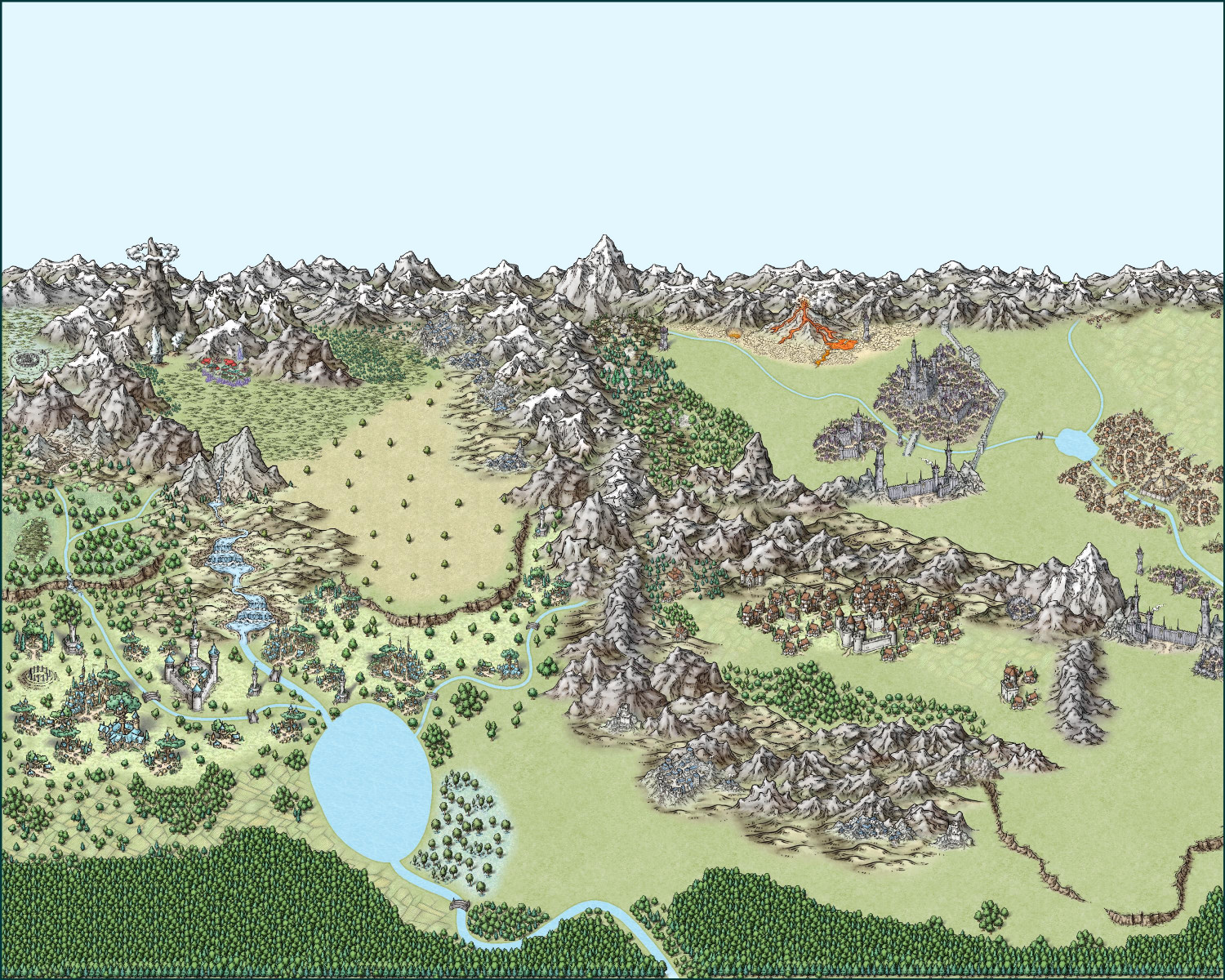
Inspired by Ralf's tutorial a few weeks ago, where he combined the latest Hive symbols to create a sprawling Hive Metropolis, I wanted to also create a big city combining unwalled settlements into one big city. I decided, though, that I wanted to focus on the elven symbols, but as I was mucking about, I then decided to add an antagonist: the Dark Empire.
This was all just for fun, without a specific goal in mind. I find that mapping is a good way to clear my head. Maybe it's because it's simultaneously exercising the left and right sides of my brain, as I am creating a work of art but also having to do some analytical stuff with ordering sheets and working out effects.
Version 1: 4x5 Ratio
This first version uses a 1000x800 map, though symbols get resized so it's really just a 4x5 ratio.
It ended up being a little too zoomed out a little too much, but it did allow me to include some human, dwarven, orc, and magical plant communities. I ended up putting an ocean behind the land (but above the sky, which is the Background) and then using the Color Key Cutout effect to create lakes and rivers. I wanted the lake and river colors to more closely resemble the colors of the water in the waterfall symbols.
I will also put this, and some zooms of it, in my galleries so you can get a closer look.
Version 2: 5x7 Ratio
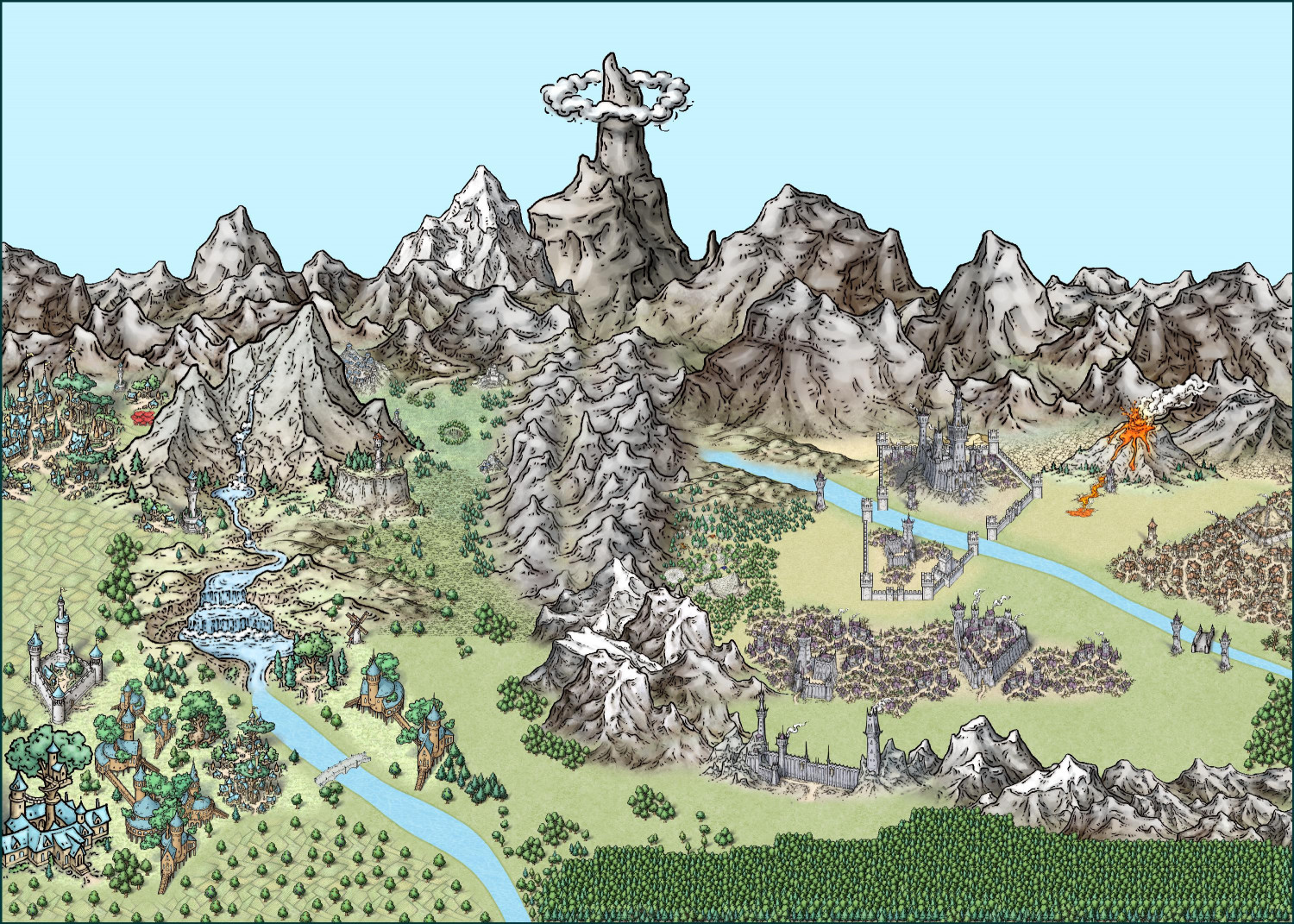
This one used a 500x700 map in order to get a 5x7 ratio, a good size for printing notecards. Here I tried to make the symbols bigger to have a more close-up look. With the elves, I also used some of Mike Schley's SS6 isometric city symbols.
Maybe I will add in some clouds to add a bit more to the skyline.
-
Annual Wish List - Castle Construction
In the recent Bird's Eye Overland development discussion thread, @HelenAA suggested of a set of castle symbols that could be fitted together to form different kinds of castles. I like that idea -- it's like the top-down version of the 3D symbols from the CA149 Beaumaris Castle annual.
Since the subject has been broached, I thought it might be a good opportunity to piggy-back on it and share a list I've been keeping of a "wish list" for a future Castle Construction annual.
The scope of this might require a two-part annual: one for the exterior structure and grounds, and another for the interior.
Anyway, here are my musings...
Fills
1. Metals (gold, silver, polished copper, tarnished copper, steel)
a. One set has the light reflection on it, like the Brass Inlay fill from Marine Dungeons
b. Another set that’s just a plain fill without the light reflection (better for creating roofs, roof ridges, railings, etc.)
2. Flower beds (flower fills that can work with flower symbols like how the heather fill and heather symbols work together in Forest Trail)
Exterior
Castle Grounds
1. Rocky cliff symbols with compatible fills (kind of like the outcrop rocks in Darklands City) – good for building a castle on a hilltop, bluff, or mountainside
2. Hill symbols (good for perching the motte on with a motte-and-bailey style castle)
3. Heroic statues (male and female)
a. Statue of royal/noble figures
b. Statue of a knight on a rearing horse
c. Statues of major D&D player character classes (male and female):
i. Fighter with melee weapons
ii. Mage with a staff or wand
iii. Cleric/priest/holy person
iv. Rogue type (hooded & cloaked person)
v. Archer
vi. Bard/musician
d. Pedestals separate from statues so you can mix and match base and statue
4. Topiary – Bushes/shrubs trimmed into shapes of animals and mythological creatures
5. Flowers
6. Flower bitmap fills (like how the Forest Trail heather fill and heather symbols work together)
7. Fountains
8. Equipment for a tiltyard (where jousts were held or knights are trained)
a. Quintain – shield or board on a pole (sometimes a mannequin) that would spin around the pole when struck by a jouster. Often a sandbag would be attached to the other end of the pole that would swing around and strike the jouster if they weren’t nimble enough.
b. Pell – A post or other target using for practicing sword strikes
c. Suspended ring – Hung from a string from an extended pole that jousters would attempt to put their lance through as they rode by. The string was weak enough to break if the jouster succeeded in snagging the ring.
Structure
1. Connecting walls-with-built-in-crenellations tool (or, alternatively, walls tool with separate crenellation symbols that can be dropped on it like in Marine Dungeons)
2. Turrets with different kinds of tiles, from Disney fairy-tale perfect to decrepit ruins
3. Fills with the same tile options as the turrets
4. Multiple drawbridge options (raised, lowered, broken…)
5. Flagpoles
6. Flags (varicolor) that can be “attached” to flagpoles
7. Spires
8. Elven latticed domes (like Rivendell in Peter Jackson’s LOTR)
9. Vines that can be added to the sides/tops of walls/roofs
10. Gargoyles and grotesques
11. Machicolations (“murder holes” on defensive walls)
12. Siege equipment
13. Architectural “frills” (like the tops of art deco arches or other decorations on the sides of buildings)
Interior
1. Magenta (or varicolor) cutouts for windows, doorways, arrow slits
2. Thrones (different options: ornate, shabby, “evil,” different materials (gold, stone, wood, ice, skulls), etc.
3. Ornate staircases (like for grand ballrooms)
a. Maybe modular staircase pieces, with symbols that can work together (but not as connecting symbols) to create different styles (winding down, fanning out at the bottom, branching at the top, etc.)
b. Different styles: marble, wood, etc.
c. With and without varicolor carpet runners down center
4. Musical instrument symbols
a. Upright and laying down
b. Harps, lutes, pan pipes, drums…
c. Pipe organs
5. Carpet symbols and/or fills
6. Varicolor vector symbol outlines of animals, mythical creatures, heraldic weapons, magical glyphs, runes, zodiac symbols, etc. to be used as floor inlays, “embroidering” on carpets/flags/table runners, etc.
7. Bells (large single bells for bell towers, and a row of glockenspiel bells)
8. Clock hands (above view, for clock towers)
9. Interior architectural frills – curlicues as engraved or embossed patterns on stonework?
-
De Rust + Alyssa Faden clouds


