Royal Scribe
Royal Scribe
About
- Username
- Royal Scribe
- Joined
- Visits
- 9,534
- Last Active
- Roles
- Member
- Points
- 3,353
- Birthday
- February 5, 1968
- Location
- San Francisco, California
- Website
- https://legacy.drivethrurpg.com/browse/pub/31814/Royal-Scribe-Imaginarium
- Real Name
- Kevin
- Rank
- Mapmaker
- Badges
- 16
Latest Images
Reactions
-
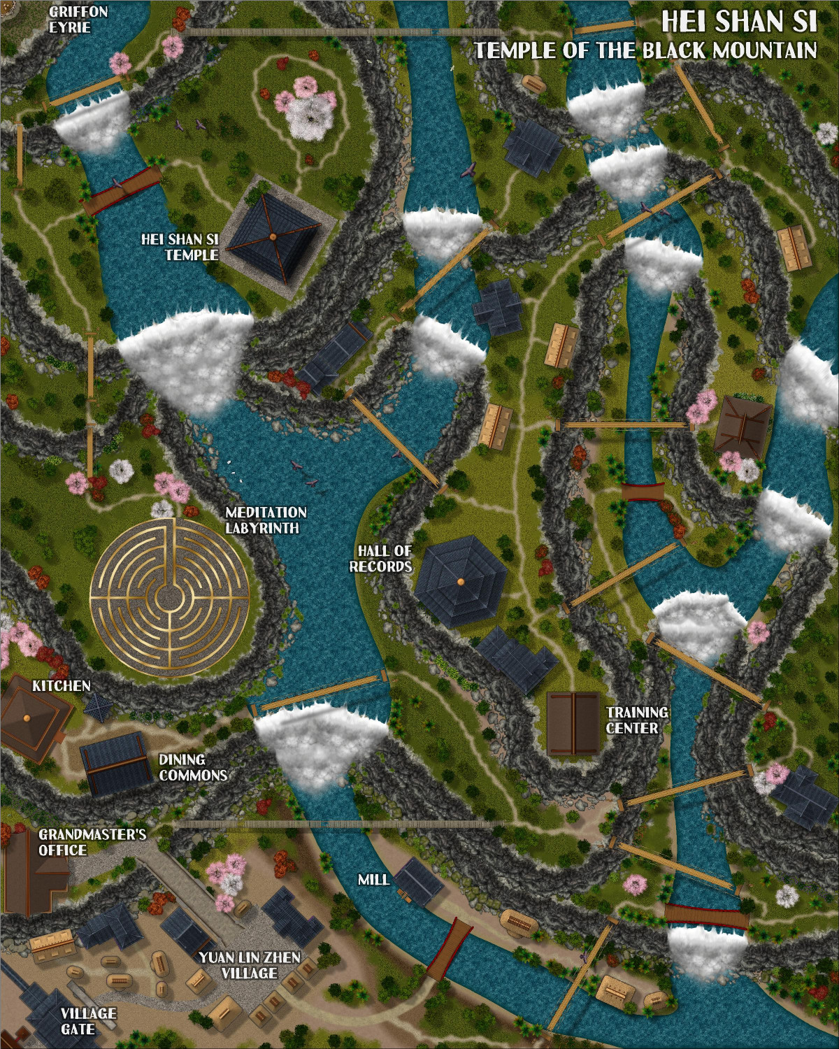
[WIP] Hei Shan Si monastery
This is the second of three monasteries that I am collaborating with Ricko on. The ideas and text description are Ricko's. The mapping is from me, with his advice, but he is currently traveling and hasn't had a chance to see a lot of the newest stuff. Since he won't be back for nearly a week, I figured I would solicit feedback here in the meantime.
(Also, I have not yet added the clouds that Ricko includes so beautifully in his maps. I will be experimenting with that next.)
There's a full description that will be included when it's submitted for the Atlas, but for now, here's a synopsis:
The Sacred Path of Hei Shan Si
In the heart of the Black Mountains and surrounded by the Ancient Forest, amidst peaks that touch the sky, stands the Hei Shan Si Monastery (Temple of the Black Mountain), a sanctuary of spiritual peace in contrast to the chaos of the surrounding region. Founded by an anonymous sage, the temple is said to have been built with the help of divine forces, its black walls harmonizing with the eternal shadows of the mountains.
The Challenging Path
The road to Hei Shan Si is a test in itself. It begins in the fertile valleys, and ends at the final stop in the village of Yuan Lin Zhen, passing through the living heart of the forest, steep cliffs and narrow trails that wind dangerously through the mountains. Incessant rain, dense fog and biting winds are constant companions of travelers. Worn rope bridges span unfathomable chasms, and legends tell of guardian spirits who punish those who disrespect them.
I didn't have a lot of birds to work with, but I did use the cartouche from Forest Trails and a few other birds from Dundjinni Archives. Like with the last monastery, Chuan Bei Si, the monks use a labyrinth path for meditation (similar to the Labyrinth at the Cathedral of Chartres). But while Chuan Bei Si's stone-and-tile labyrinth is poorly maintained, cracked and worn, the brass-and-tile labyrinth at Hei Shan Si is immaculately maintained.
Clouds are coming, but that will require some experimentation to get it right. They will be on a separate layer that can be toggled on and off.


-
Is there a runic font?
The funny thing is: although I am not an attorney, my day job in the business side of publishing requires me to be involved in copyright permissioning on a daily basis. Fonts, however, are a new wrinkle for me.
-
[WIP] Community Atlas: Kumarikandam - SE Tiantang Region
Ricko invited me to design some monasteries in this area. The concept and write-up are entirely from him. The mapping is from me, with extensive feedback and advice from Ricko. Would it be possible to publish it as joint authors? Here is the description, followed by the FCW and a JPG.
Chuan Bei Si – The Monastery of the Drunken Cup
In the shadow of the walls of Tiang Long Du, the capital of the Kingdom, stands the peculiar Chuan Bei Si – Monastery of the Drunken Cup, a place whose fame derives less from its spirituality and more from its supply of spirits. Founded by a renegade monk called the Eternal Drunken Master, the place attracted a coterie of individuals seeking less divine enlightenment and more the bottom of a good cup.
Legend has it that Shui Zui Chang had a divine vision while staring at the bottom of a baijiu barrel: he believed that true wisdom came from fluidity of movement and the ability to remain upright while the world turned – a concept he dubbed the “Drunken Way”. Thus, the monastery became a training ground where drunken monks practice their staggering martial arts, transforming awkward falls into lethal blows and hiccups into battle cries.
The proximity to the capital is convenient: the liquor arrives fresh, and the monks can replenish their supplies quickly. They often make “spiritual pilgrimages” to local taverns, always returning with full barrels and wild stories about how they had “purified the spirit” of some unsuspecting merchant in a game of dice.
Rumors about Chuan Bei Si are as numerous as the legends of Tiang Long Du. Some claim that in battle, the monks can defeat armies simply by staggering through rows of soldiers. Others say that the monastery houses the mythical Infinite Barrel, a relic that never runs dry.
Hedonistic and unpredictable, Chuan Bei Si is an anomaly within the kingdom – a reminder that even in the dark, there is room for a sip (or two) of levity.


-
Ideas and Wishes for Monthly Dungeon Symbols
I am so glad you asked, because you know I've been keeping lists! You can check out some of my ideas in this thread, but here's a recap of some highlights:
Interior
- Thrones - Ornate metal and stone; "elven" (wooden with art nouveau flourishes); "evil" (skulls, spikes, etc.)
- Regalia - Crowns; scepters; orbs
- Couches - Both "regular" and Roman-style (I think SS4 only has chairs that I make extra wide for couches)
- Mage/Sage Furnishings - Globes, astrolabes
- Ornate Staircases - Maybe modular so you can construct your own (left, right, and center for bottom, middle, and top, in stone and wood, with and without varicolor carpeting)
- Musical Instruments - Upright and on their side (lutes, harps, harpsichords, drums)
- Ancient Tombs - Think Indiana Jones-style stuff, like idols
Exterior
- Gardens - Varicolor flowers, rose bushes, berry bushes, exotic/carnivorous plants
- Tiltyard - Quintain, pell, horse armor
- Topiary - Bushes trimmed to form the shape of animals and mythical creatures
- Statues - Riding and standing free. Royalty plus archetypical character types (sword fighters, archers, mages)
Building Construction
- Flagpoles - Upright and on their side, separate from flags for flexibility
- Flags - Varicolor top-down and on their side
- Gargoyles and Grotesques
- Clocktower - Clock hands on side of building; bells for belltower
- Spires
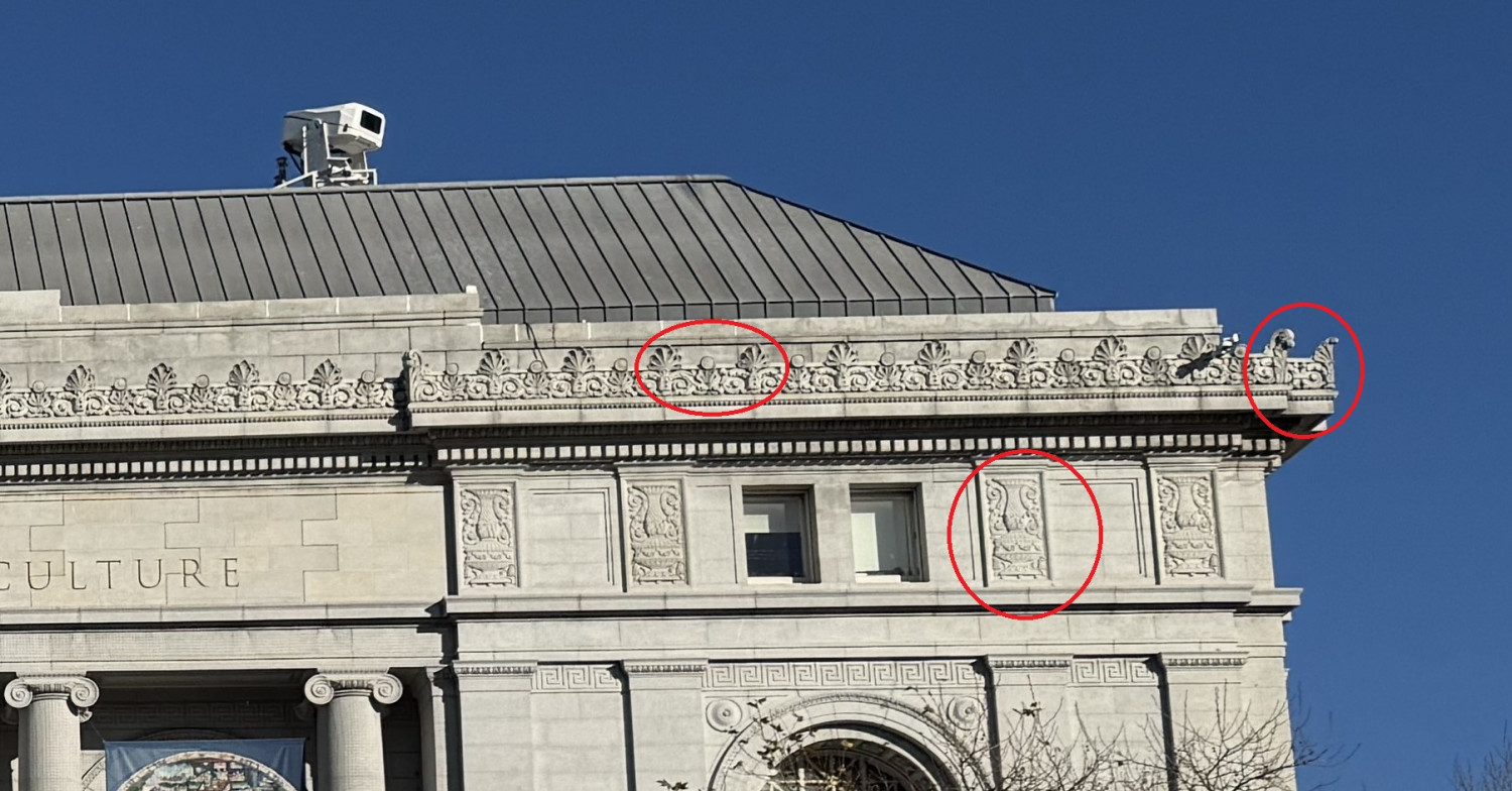
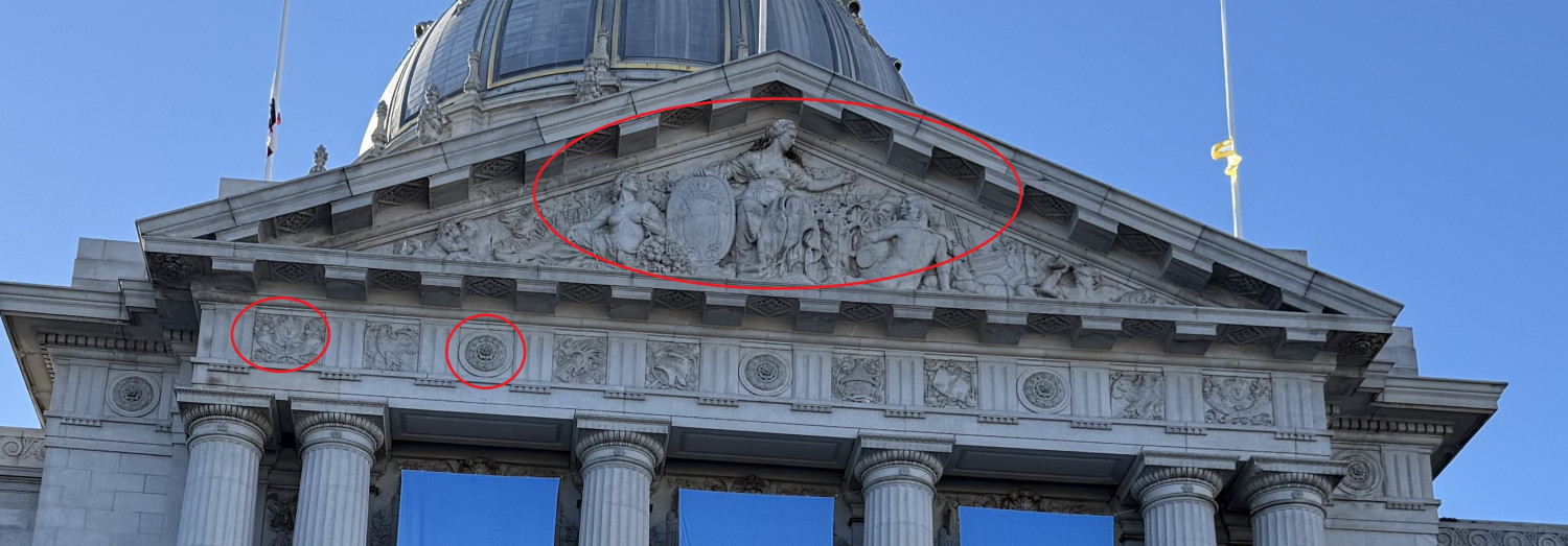
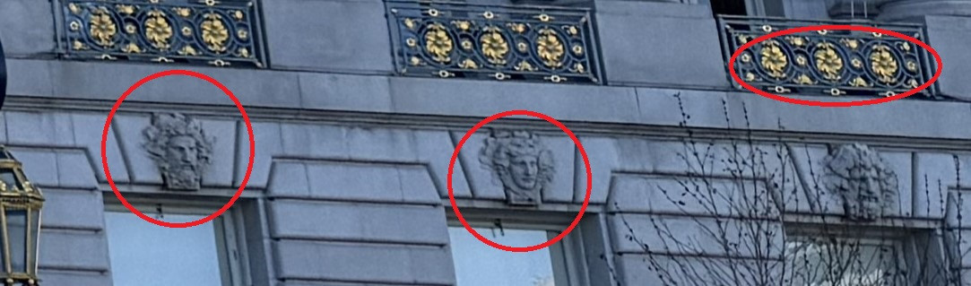
- Façade Ornamentation - I don't know the proper term, but here are some pics I took to illustrate

-
An alternate way to draw elevation changes
Very nice.
Ralf shows another approach in this Height Transitions video as well