Royal Scribe
Royal Scribe
About
- Username
- Royal Scribe
- Joined
- Visits
- 9,530
- Last Active
- Roles
- Member
- Points
- 3,353
- Birthday
- February 5, 1968
- Location
- San Francisco, California
- Website
- https://legacy.drivethrurpg.com/browse/pub/31814/Royal-Scribe-Imaginarium
- Real Name
- Kevin
- Rank
- Mapmaker
- Badges
- 16
Reactions
-
Volcanoes
-
Printing maps from PDF?
I think I found a good approach.
- Save a high resolution PNG file following the VTT specs Remy laid out in this blog post from 2020.
- Upload the image to an image splicer app that can automate splicing in a grid that you specify with customizable horizontal and vertical dimensions. I used Imagy.app.
- Take the spliced images and drop them in a desktop publishing or word processing program. I tried it in MS Word with margins set at 0.25", but with the images centered. Printed perfectly (nothing cut off and every square is 1 inch by 1 inch.)
So helpful with larger maps, like a town where you never know where the battle may go.
-
Wish List: City/Dungeon Top-Down Mountain Peaks, Ridges & Crags
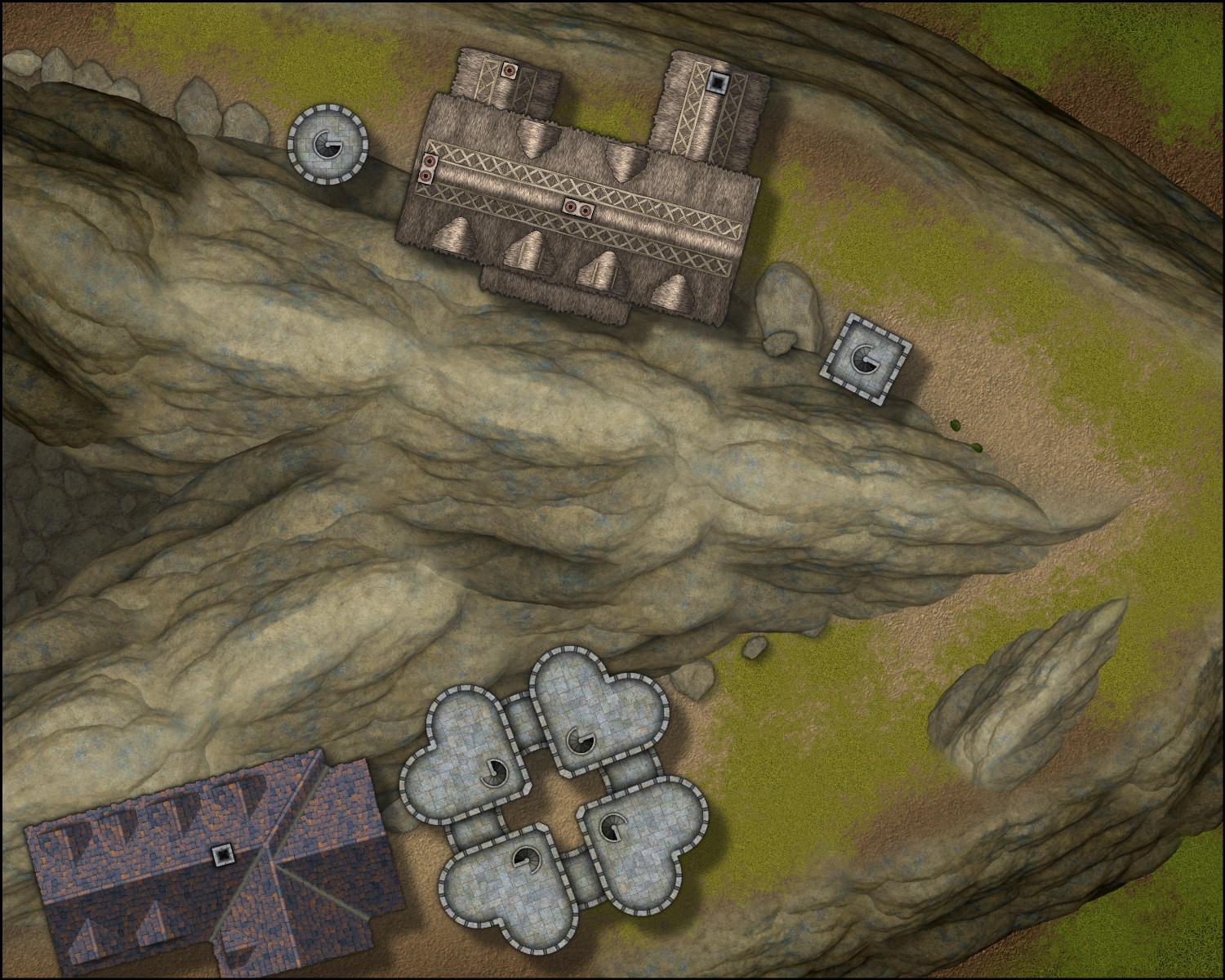
So when Sue asked if I had tried stacking cliff symbols, I had...but always in the same direction, which gave me elevation but didn't give me ridges. I just tried flipping the Forest Trail cliff symbols so they're back-t0-back -- and these are exactly the sort of ridge lines I was imagining.
These symbols blend together so beautifully. Truly amazing, Sue! Very excited to start planning a mountain village.
-
Trouble with Layers, priority, etc.--help?
In fairness, it's an awfully long manual. It's great for reference, but I struggled when I tried to learn the software with just the manual. For me, the video tutorials were very helpful.
One of the things I struggled with, and this may be the same for you, was understanding how layers and sheets differ, and how layers differ from the other art design and desktop publishing software I was more experienced with.
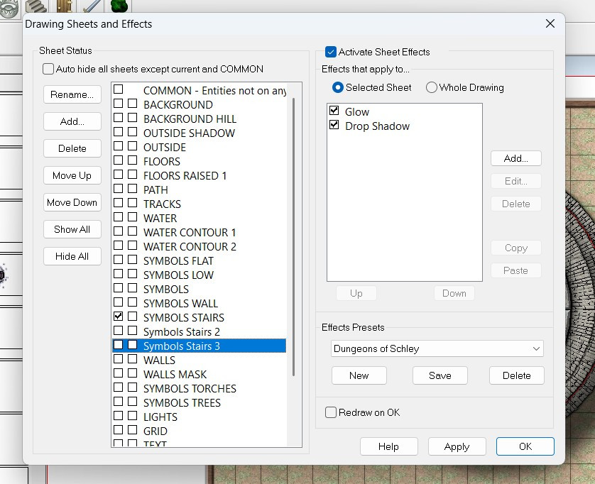
In CC3, layers help with organizing similar things so that you can hide, reveal, or freeze them, but they have no impact on the order in which things are shown. You'll notice that the layers are all listed alphabetically because the order they appear in the list doesn't affect anything.
Sheets have the big impact here. The software renders things in order they appear on the list. In this screenshot, the BACKGROUND would render, then BACKGROUND HILL, then OUTSIDE SHADOW, etc.
This allows you to control in how your symbols and drawn polygons sort, so that your floor will always be below your furniture, for example.
The Move to Front command only affects things on the same sheet (regardless of layer). If you have two symbols on the SYMBOLS LOW sheet, then the Move to Front command could force that symbol to be on top of the other one. Both symbols, however, will be above any other symbols on the SYMBOLS FLAT sheet (because the SYMBOLS FLAT sheet would render first, and then the SYMBOLS LOW). And both symbols would be below the regular SYMBOLS sheet, because it will render after the SYMBOLS LOW sheet.
Screen captures are always helpful, but I hope this gets you on the right track.
-
Treetop village?
Hello Mr. Red!
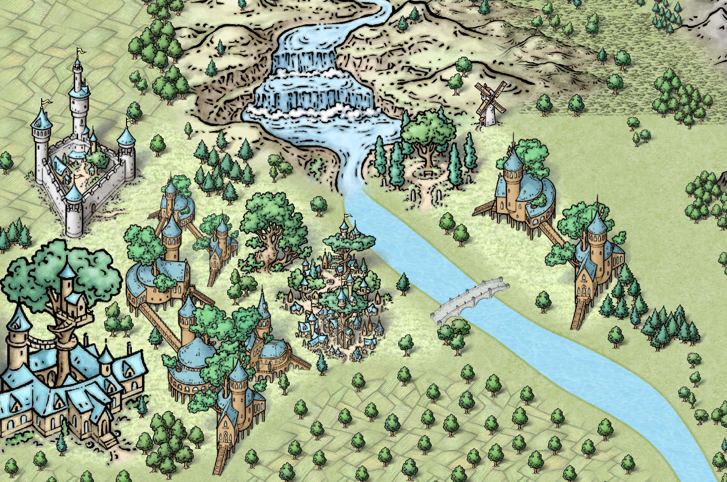
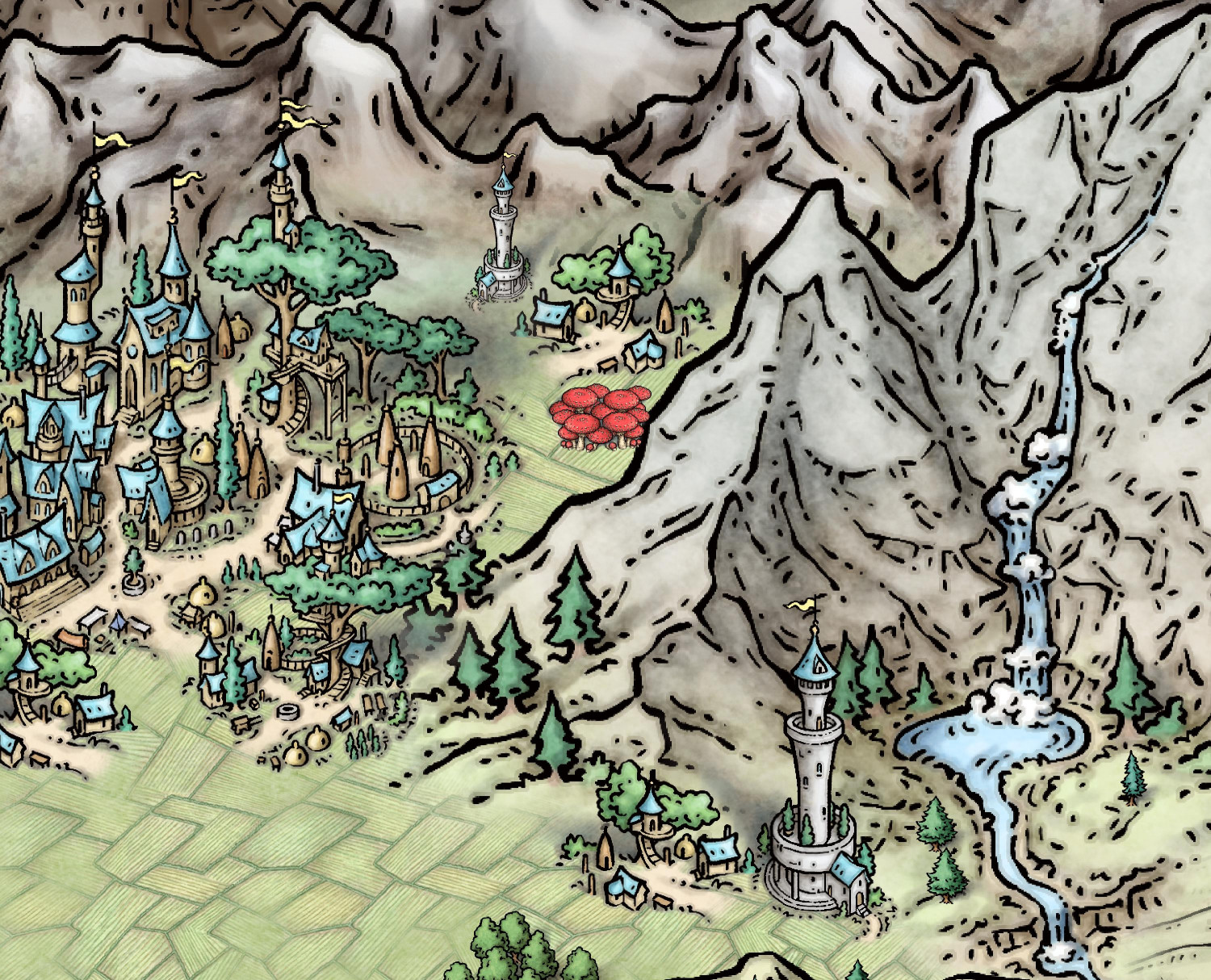
In addition to the top=down elven structurers that Ricko showed, Mike Schley also has isometric versions (like looking down at a 45 degree angle) in both his isometric cities (Symbol Set 6) and his overland symbols.
Here's some portions from a map I did using SS6:
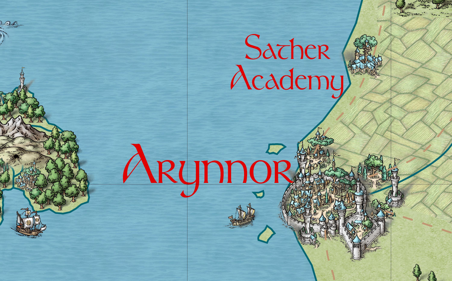
And here's a bit of an elven city using his overland symbols, which come with CC3+:
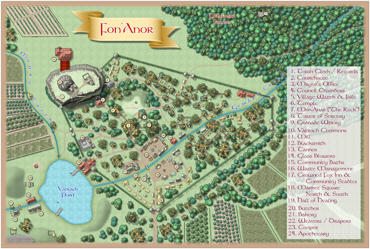
Here's an elven village using the top-down symbols that Ricko showed:
You can find that in the Atlas here:
https://atlas.monsen.cc/Maps/fon'anar
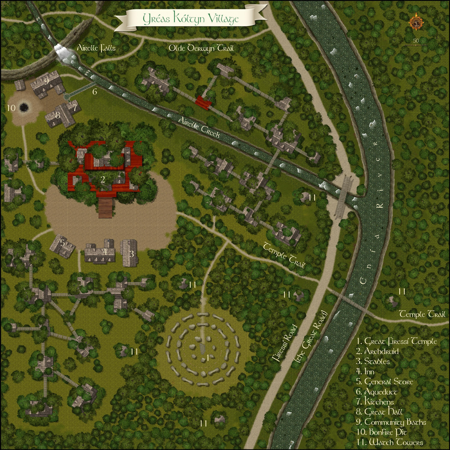
But I also did an elven village using Darklands City and Forest Trail, where I drew platforms in trees, placed thatched homes on those platforms, and then put more trees above the houses -- with trees above and below, they look like tree houses.
https://atlas.monsen.cc/Maps/yr%C3%A9as%20k%C3%B3ltyn%20village
You can download the full FCW file from the Atlas if you want to see how I did that.


