Quenten
Quenten
About
- Username
- Quenten
- Joined
- Visits
- 8,067
- Last Active
- Roles
- Member
- Points
- 3,090
- Birthday
- November 29, 1950
- Location
- Australia
- Real Name
- Quenten Walker
- Rank
- Mapmaker
- Badges
- 16
Reactions
-
Long Time Mapper, First Time Poster
-
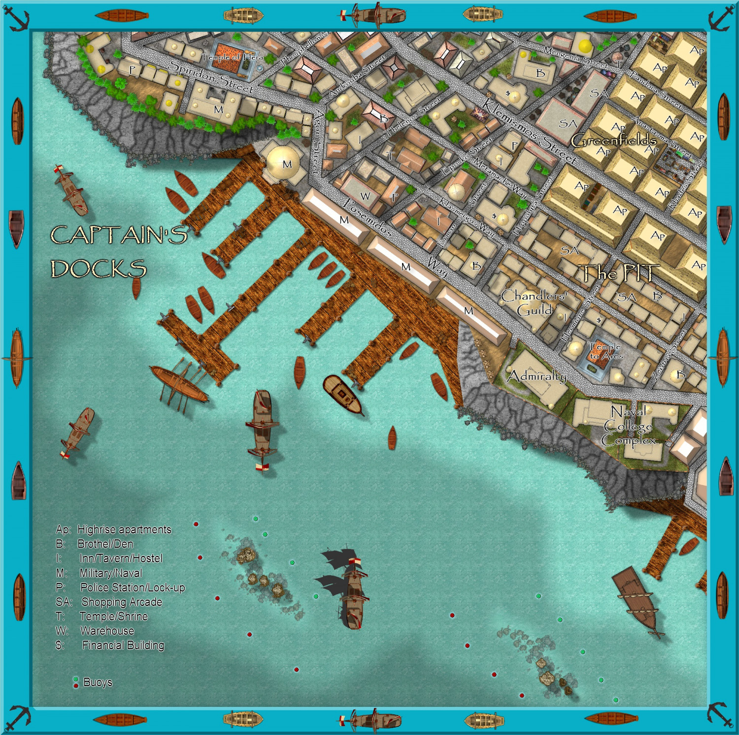
Community Atlas - Stromphe City - Captains Dock District
-
Community Atlas - Stromphe City - Captains Dock District
Finished at last. Here is the FCW for @Monsen if he wishes to add it to the atlas before the competition begins.
-
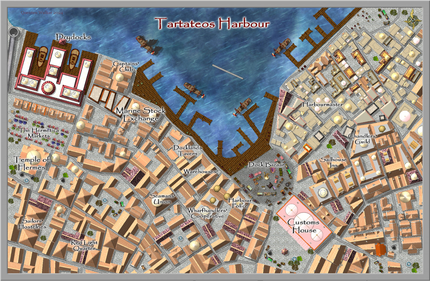
Community Atlas City of Tartateos - Shipyards District
Is this better @AleD ? I have also changed the location of the Customs House to match the parent map.
-
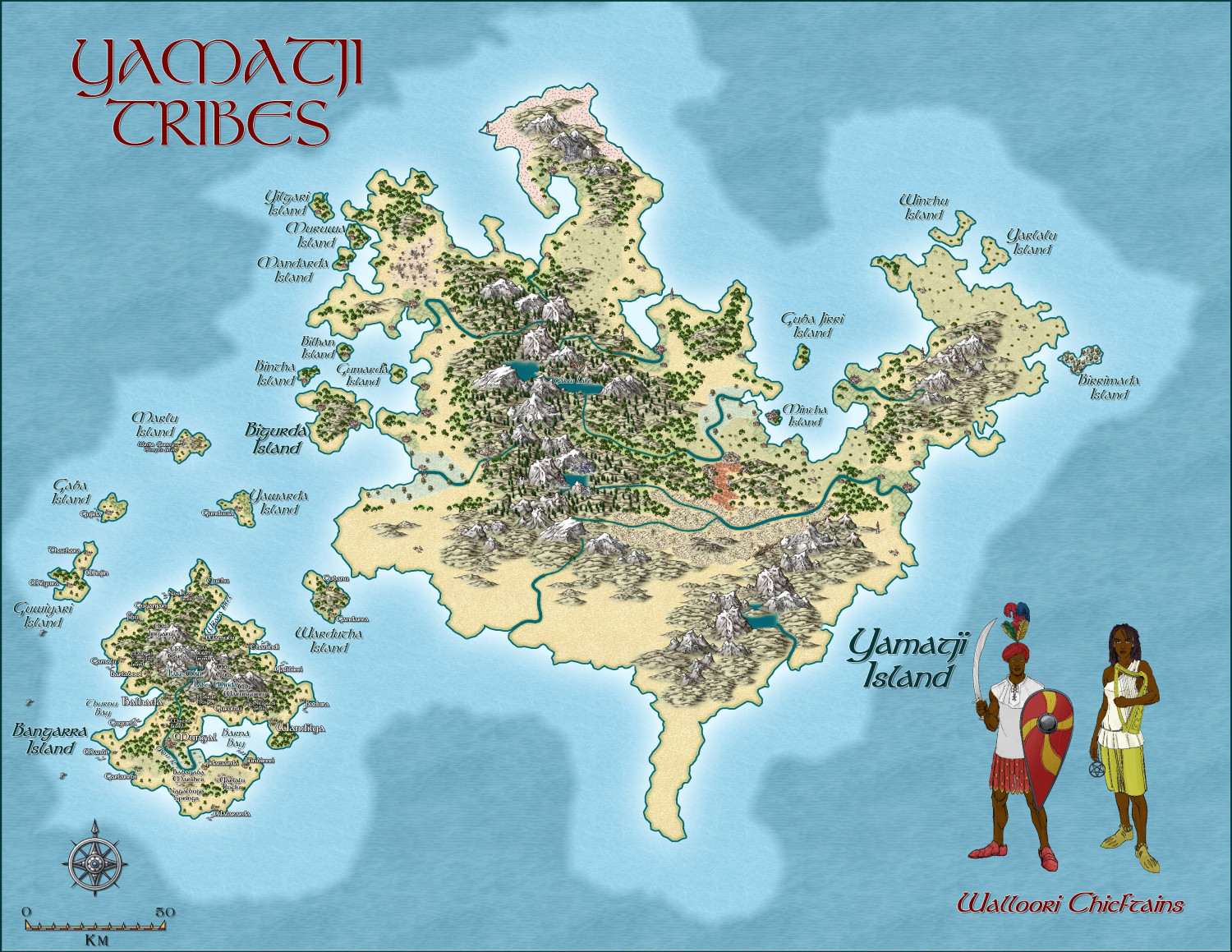
Hardin - Yamatji tribes
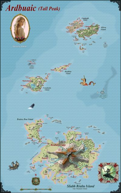
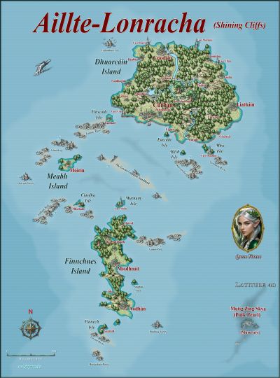
Here is an other island group in the Hardin region. Still a WIP.
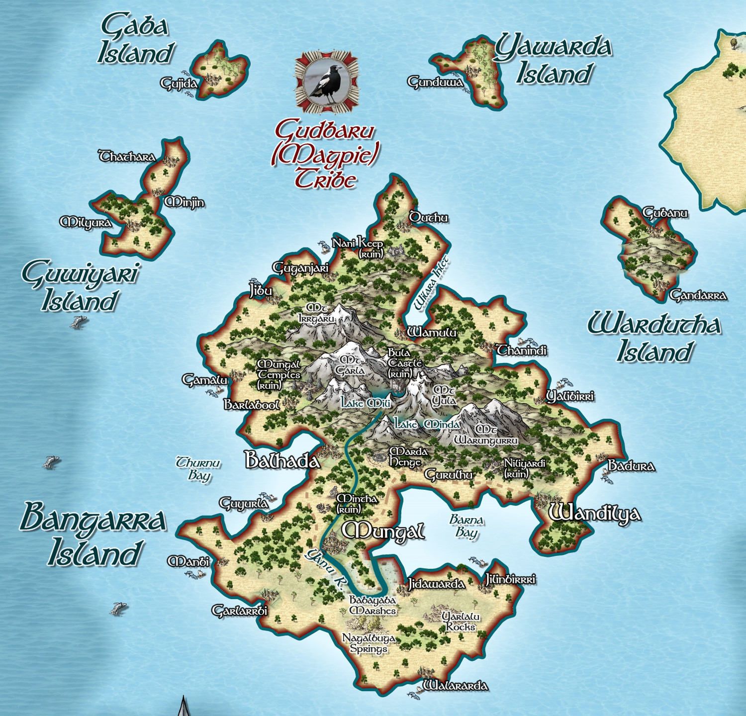
It is a collection of Walloori Tribes, some civilized, some not, with Grim (orcs), Davarin (dwarves) and Aiefa (elves) also present. The names are based on the Yamatji people of the region I now live in, Geraldton, Western Australia.
Here is progress to date, plus a blow up of an area fully done (Bangarra Island). I have made extensive use of the trees from Spectrum overland - great gums, and scrub trees, better than Schley whose style this otherwise is.
The actual outline of the map is based on Groote Eylande in the Gulf of Carpentaria, part of the state of Queensland, Australia.


