Kertis Henderson
Kertis Henderson
About
- Username
- Kertis Henderson
- Joined
- Visits
- 2,327
- Last Active
- Roles
- Member
- Points
- 147
- Birthday
- February 16, 1978
- Location
- NC, USA
- Website
- https://playbyweb.com
- Real Name
- Kertis Henderson
- Rank
- Surveyor
- Badges
- 2
Reactions
-
Sci-Fi Perspectives?
-
One Page Dungeon Contest - Cave Map
-
Family Man with a technical background and enthusiastic world builder kids.
Hello, Jolly. I don't intend to be mean, but I wonder what your intent was. Was it simply to join the forums dedicated to a particular piece of software and then complain about it? I don't see the goal or the potential reward. Are you trolling?
Again, no offense intended. I'm sure there are others here that are equally confused.
-
Encounter map - Where does that cave entrance go?
-
One Page Dungeon Contest - Cave Map
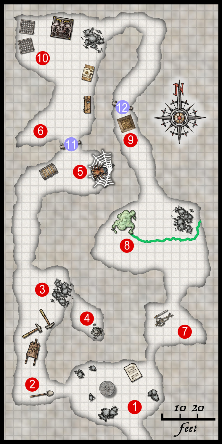
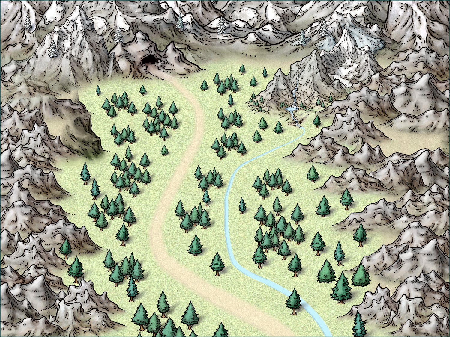
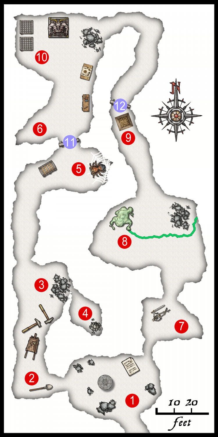
Greetings! I mentioned a little while ago that I planned to enter the One Page Dungeon contest this year. Since cartography is a favorite hobby of mine, I wanted it to have some map elements to it. I have a few versions worked out, and I'm pretty happy with the progress. I wanted to show off some maps that I plan to use.
The first map is an overland map of the path to a cave. Since the entire work has to be on one page, there's not much room for such a map. I decided to make it light and in the background like a watermark. The map is cropped vertically on the page so that the path and cave are on the left half of the page. That puts it under the description text and monster information. Again, it's light on the page, but it shows some of the theme.
The second map is that actual "dungeon." In this case, it's a cave. I realized that each little bit of space I have on the page is very valuable. I chose to make this map about one half of one column, so roughly a quarter of the page. So, I had to keep things very clear and simple. I'd have loved to add tracks, rubble, and more mise en scène, but it just made the final page busy and unclear.
I hope the explanation of the use of the maps make the design clearer.
I'll post the entry when it gets submitted in July!


