KertDawg
KertDawg
About
- Username
- KertDawg
- Joined
- Visits
- 2,706
- Last Active
- Roles
- Member
- Points
- 188
- Birthday
- February 16, 1978
- Location
- NC, USA
- Website
- https://playbyweb.com
- Real Name
- Kertis Henderson
- Rank
- Surveyor
- Badges
- 3
Reactions
-
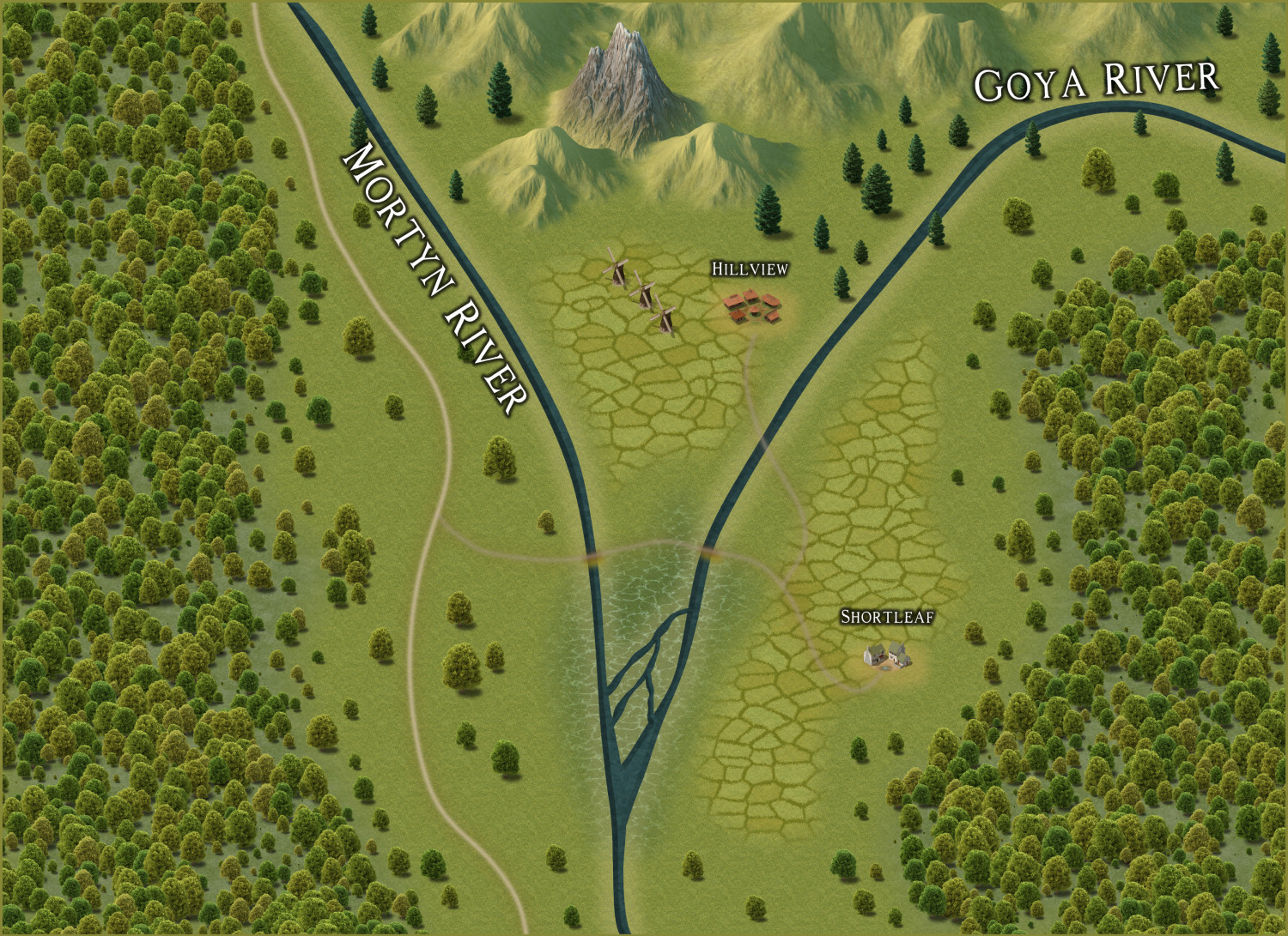
WIP Community Atlas - Mortyn-Goya Confluence
This is my first community atlas contribution. I ask for input. What do you think should be added? I tried a few things like fishers, hobbit (or baddie?) holes, and wizard towers. These things did not seem to fit well. I have creator's block!
(Yes, I see the need to clean up the text. That will come.)
What do you think might be in the woods to the west, for example?
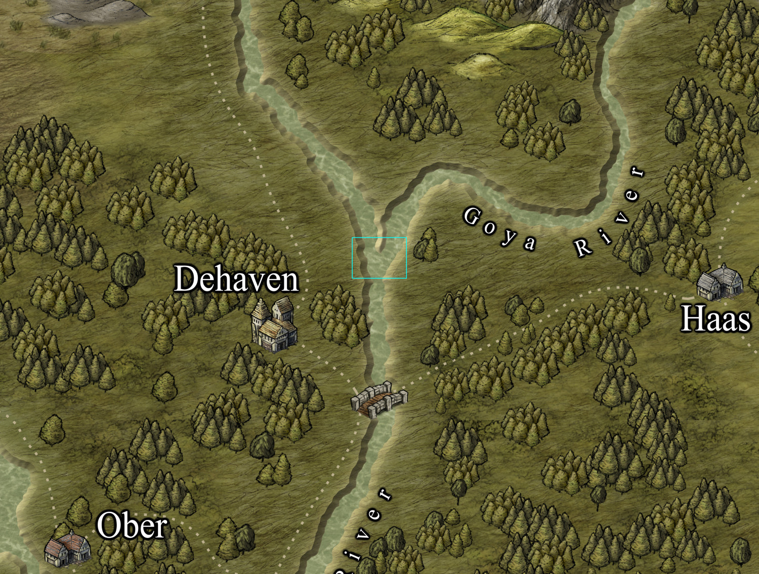
For reference, here's the parent map:
Thank you.
-
Dialog Resizing - Testers Requested
Introducing CC3 Dialog Tool!
After yet another thread about the size of dialog boxes, I worked on an XP add on that can change the sizes of these dialogs. I created CC3DialogTool, an open-source project on GitHub. I ask for people to test this early version. It can only resize one dialog, the "Custom Drawing Tools" dialog, at this point. If things go well, more dialogs can be added. It doesn't save your settings yet, but that can also be added, too.
To test, get the installer from the GitHub releases page below, and give it a test. DO THIS AT YOUR OWN RISK! I tested it myself a number of times, but please be cautious. Then, let me know what you think. Any feedback, good or bad, is welcome.
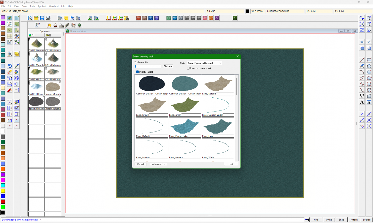
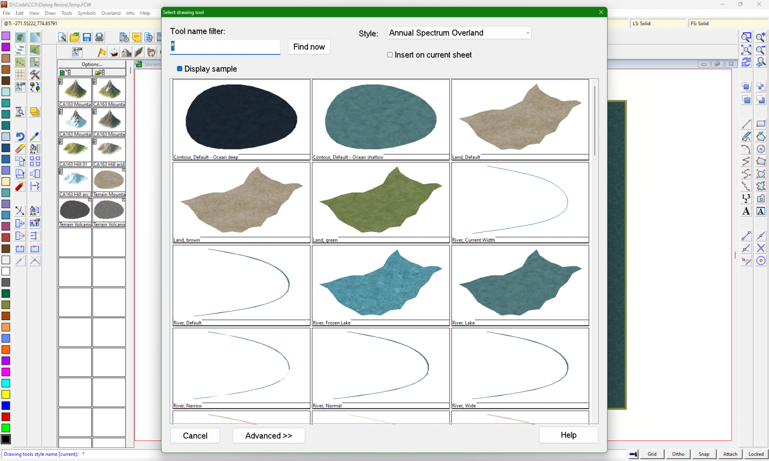
The original dialog looks like this:
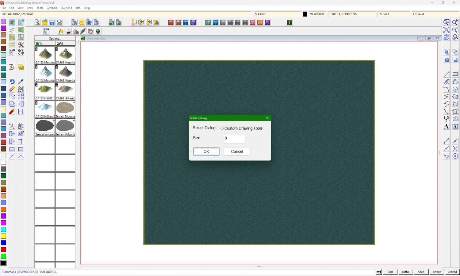
Type the command "DIALOGTOOL" and hit Enter:
Right now, there's only one dialog affected. Enter a new size. The default is 8. Try 12, 14, or 16 to see what works best.
Thank you!
-
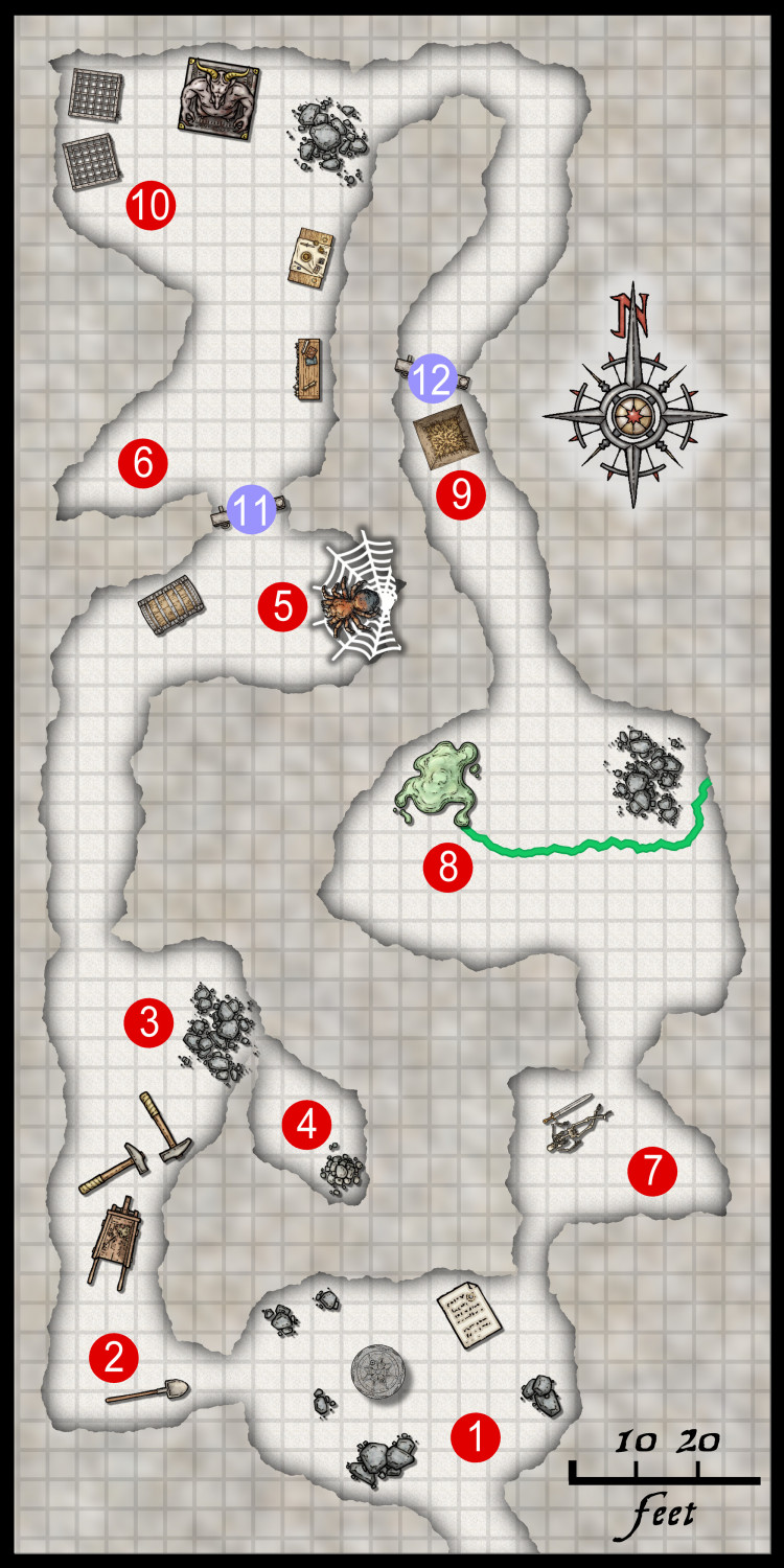
One Page Dungeon Contest - Cave Map
-
XP - Solar Legends Map Generator
I present a map generator for my own RPG: Solar Legends
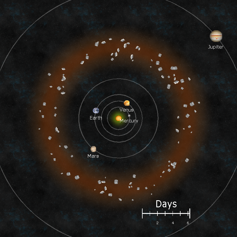
The game uses a solar system map that is updated as the campaign goes on. On one day, the distance between Earth and Mars might be a quick trip, but the next month it could be a long journey. This XP add-on calculates the orbits and draws them out. You can zoom in/out, pick specific planets, and scale everything.
I have the code at:
My next effort will be to package it so that you don't need Visual Studio to run it. I'll probably ask for advice soon. Thanks everybody!
-
Show me your science fiction maps!
I have been working on an XP command to generate a system map for my conversion of Buck Rogers XXVc to D20. It's coming along, but it's not complete. The game relies on dates so that distances between bodies changes, and thus so do trade and politics. I'll share this once it's finished.
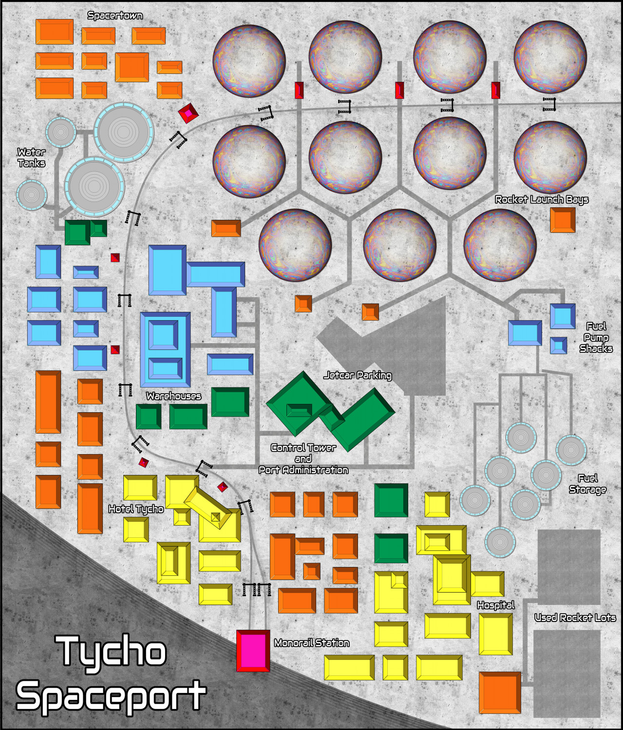
I know you weren't asking for surface maps, but I do have a remake of a spaceport from that game. (I just noticed a few mistakes, so sharing this might be a good thing.)


