EukalyptusNow
EukalyptusNow
About
- Username
- EukalyptusNow
- Joined
- Visits
- 660
- Last Active
- Roles
- Member
- Points
- 1,248
- Location
- Germany
- Rank
- Surveyor
- Badges
- 8
Reactions
-
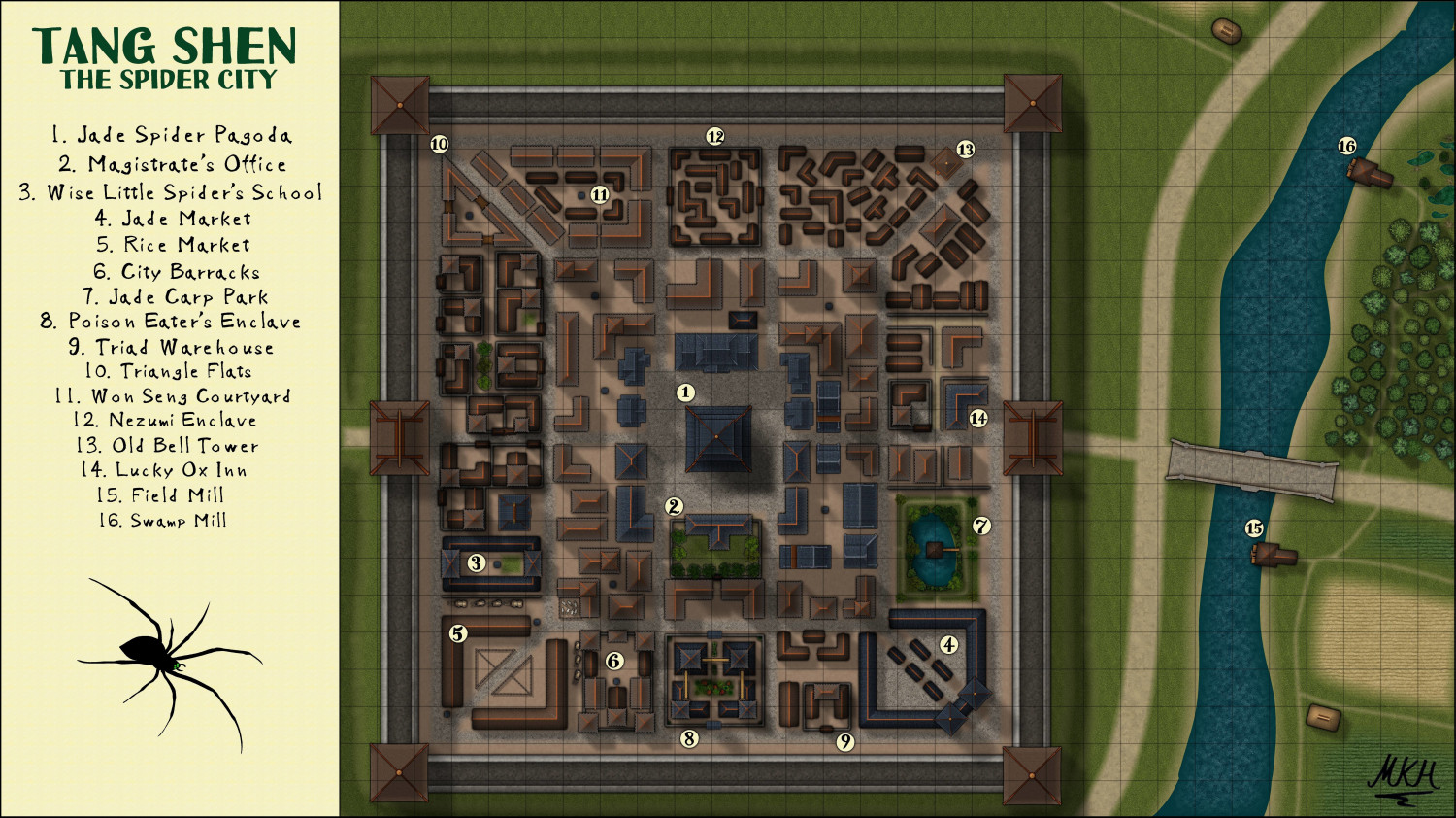
Tang Shen - The Spider City
Thanks @Wyvern
Come to think of it, there's more resindences in town than I initially initially realized.
The Triangle flats and the outer ring of Won Seng Courtyard are high density housing for poorer but not destitute citizens, with a bit of rivalry between the inhabitants of the two blocks.
Also most of the inner ring buildings are dual use, with businesses on the ground floor and the flats of the owners and maybe a rented out room or two above.
The two enclaves are mainly residential too, if not exactly regular.
-
Tang Shen - The Spider City
My first attempt at using the CA143 Asian Town-Style
Had this map lying around for a while, until I managed to sort our the gras texture's "Transparency-Acne"-Issues in another map (Thanks again Loopysue).
I drew the spider in CD3, using a free to use photo as source and then adding the mandibles and eyes.
Think that the town is a bit "special-heavy" (too many special buildings and not enough normal residences) - but I still like it and my players seem to prefer "a bit unrealistic but fun" to "totally acurate but more dull".
What do you think about the map?
-
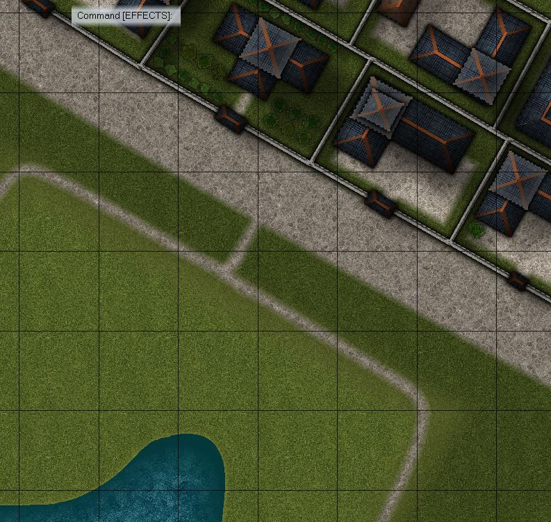
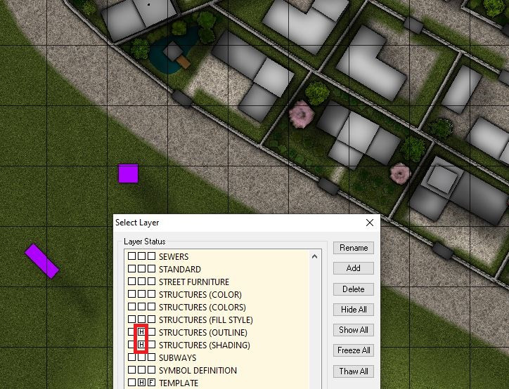
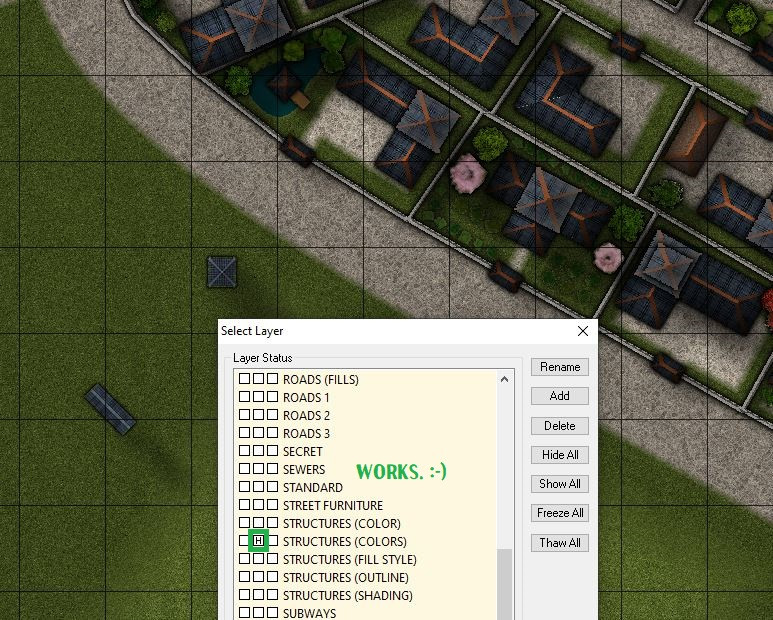
CA143 Asian Town - Eliminating TA & purple box issues
Was struggling with the gras but found a satisfactory solution in the end.
Even when I made the two sheets overlap exactly and choose a far "broader" greater edge fade for the monocoulored separation sheet, some colour kept bleeding out from under the gras.
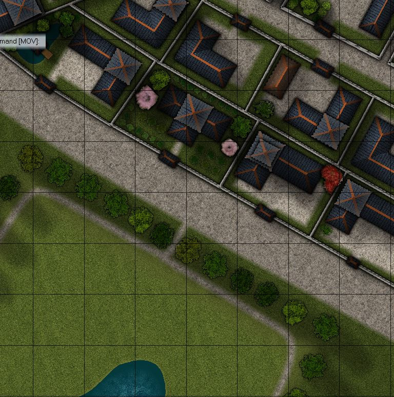
In the end, I solved that by selecting a very light brown for the separation sheet - and making the path around the park go across the "faded edge".
The trees also helped. Here's the beginning of my TA-free park.
Thanks again.
-
My First Attempt at Village Scale...
Hello Jim,
you might try adding some shadow effects to the keep tower to make it more apparent that it's higher than the other buildings. Maybe similar to the shadows on the "normal buildings" but on a higher sheet.
The stone "main road" in the "South" looks a bit too "separate" from the ground to me. Maybe a very slight edge fade or mud from the "castle path" at the join might help.
The font used for the description might be slightly larger. My old eyes... ;-)
Apart from that, I really like the map, especially the the colour scheme and spacing.
-
CA143 Asian Town - Eliminating TA & purple box issues


