EukalyptusNow
EukalyptusNow
About
- Username
- EukalyptusNow
- Joined
- Visits
- 660
- Last Active
- Roles
- Member
- Points
- 1,241
- Location
- Germany
- Rank
- Surveyor
- Badges
- 8
Reactions
-
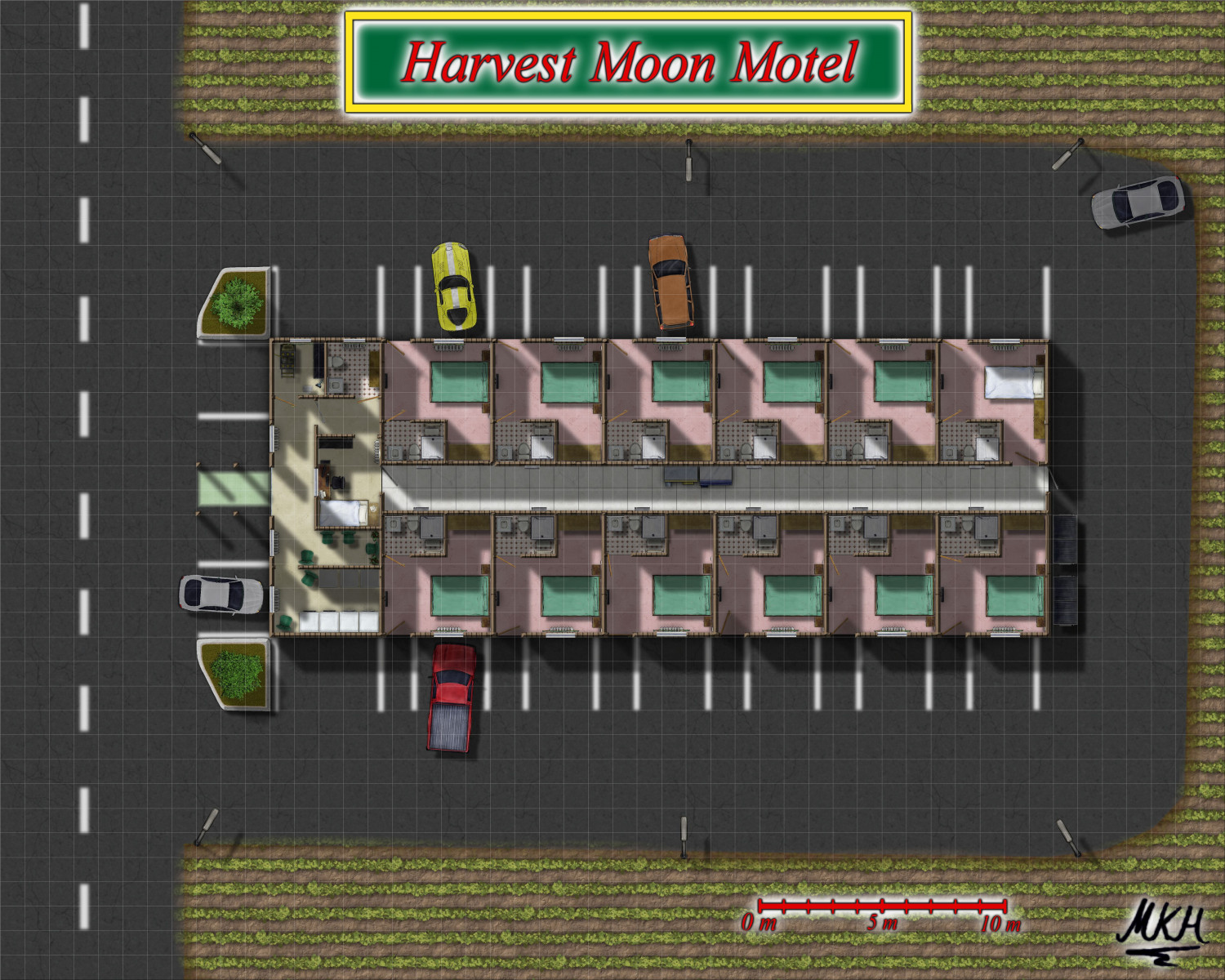
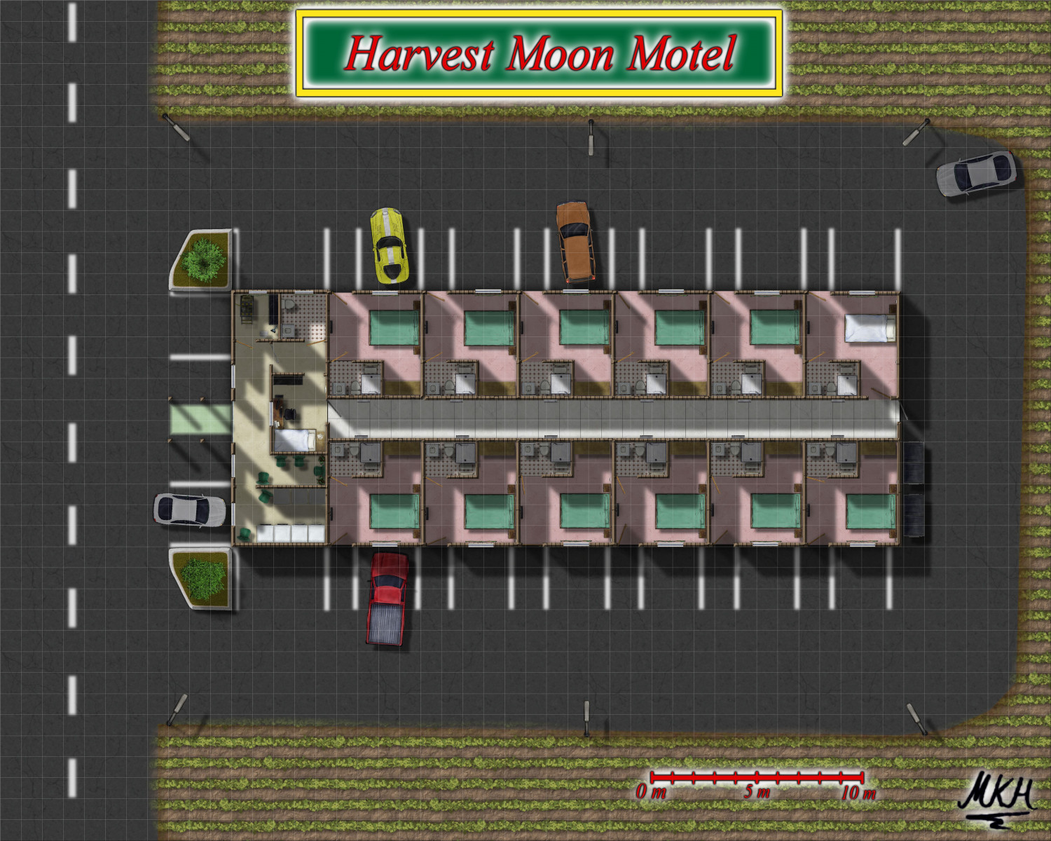
The Harvest Moon Motel - a floorplan attempt
@JulianDracos Kind of both: There are drawing tools and a sheet for road lines (with a slight edge fade effect).
The "dashed line tool" did not work properly for me, so I drew one dash and copied it, to draw the road middle line.
For the parking lines, I drew a single line with the tool, then copied them while having the "ortho"-box at the bottom of the creen checked, so they were aligned.
@DaltonSpence Most of that is included:
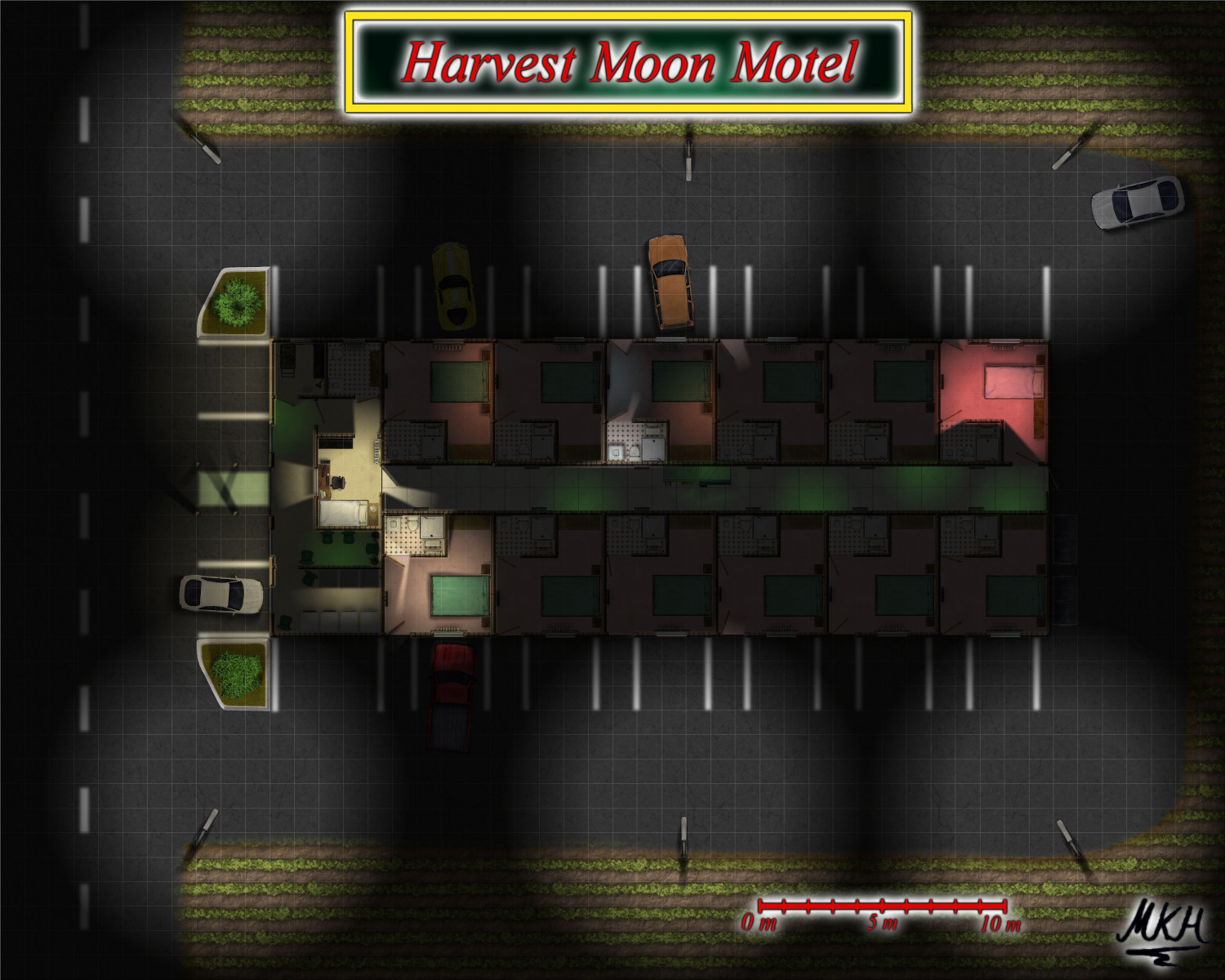
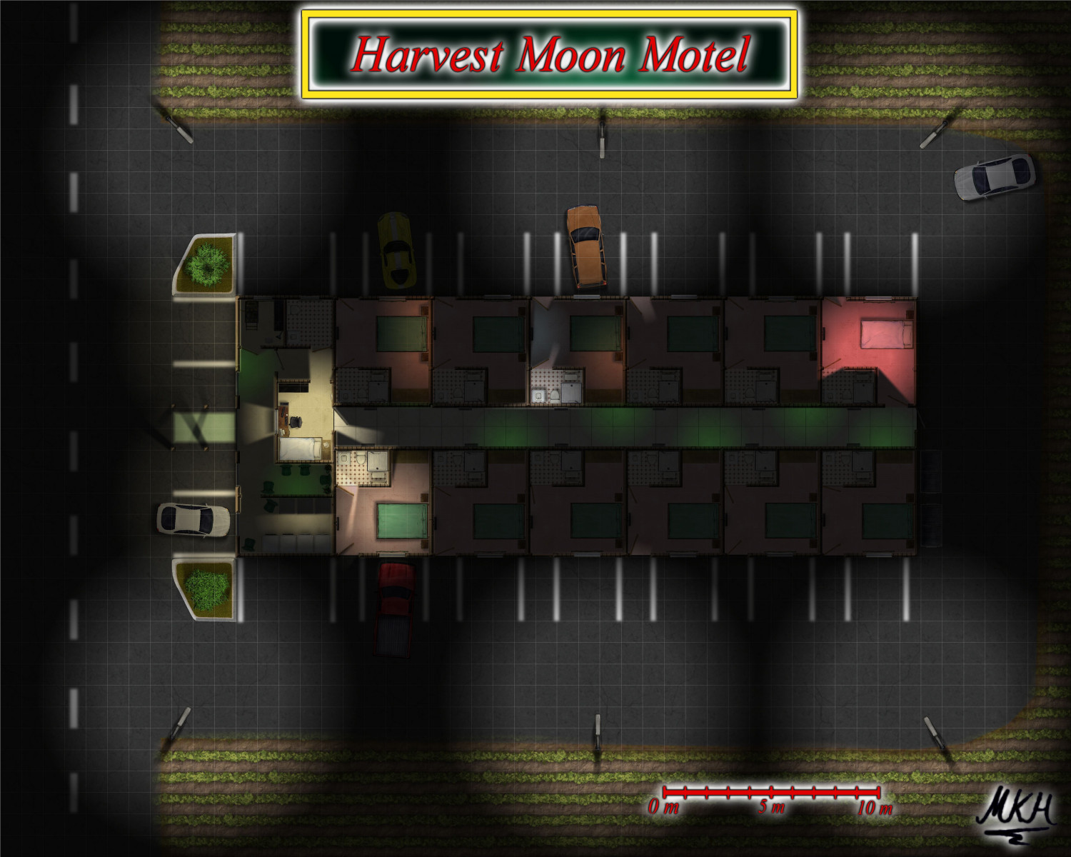
- The Check in Office is at the western side of the building, near the "green carpet"-entrance. You can see the light shining through the counter window in the night version.
- A room with vending machines, washing machines and dryers is to the South of the Check in Office. The three dark boxes emitting a faint light at night are the vending machines, the light boxes are washing machines and dryers.
- There's some appliance boxes in the central corridor, but there should be more, and a central heating/ utilities room would make sense - I was a bit puzzled there was none in the original plan.
- Thanks a lot for pointing out that I had forgotten the heaters...😏 will correct and see what I can do about utilities.
Update:
Added heaters, installation in the central corridor and some additional furniture:
I've also updated the gallery images.
-
The Harvest Moon Motel - a floorplan attempt
-
The Harvest Moon Motel - a floorplan attempt
Wanted to try around with the "modern" floor plans a bit. This is based on a real motel floor plan that we once used for a World of Darkness Game.
Overall I'm not the biggest fan of the floor plan styles. They could use more symbols and some textures appear to be very low resolution. I ended up rescaling the indoor textures and using Darklands City and Creepy Crypts for some outdoor textures.
Will try creating a lighted night version next.
A larger version is in my gallery.
-
A small cave complex for a side quest
-
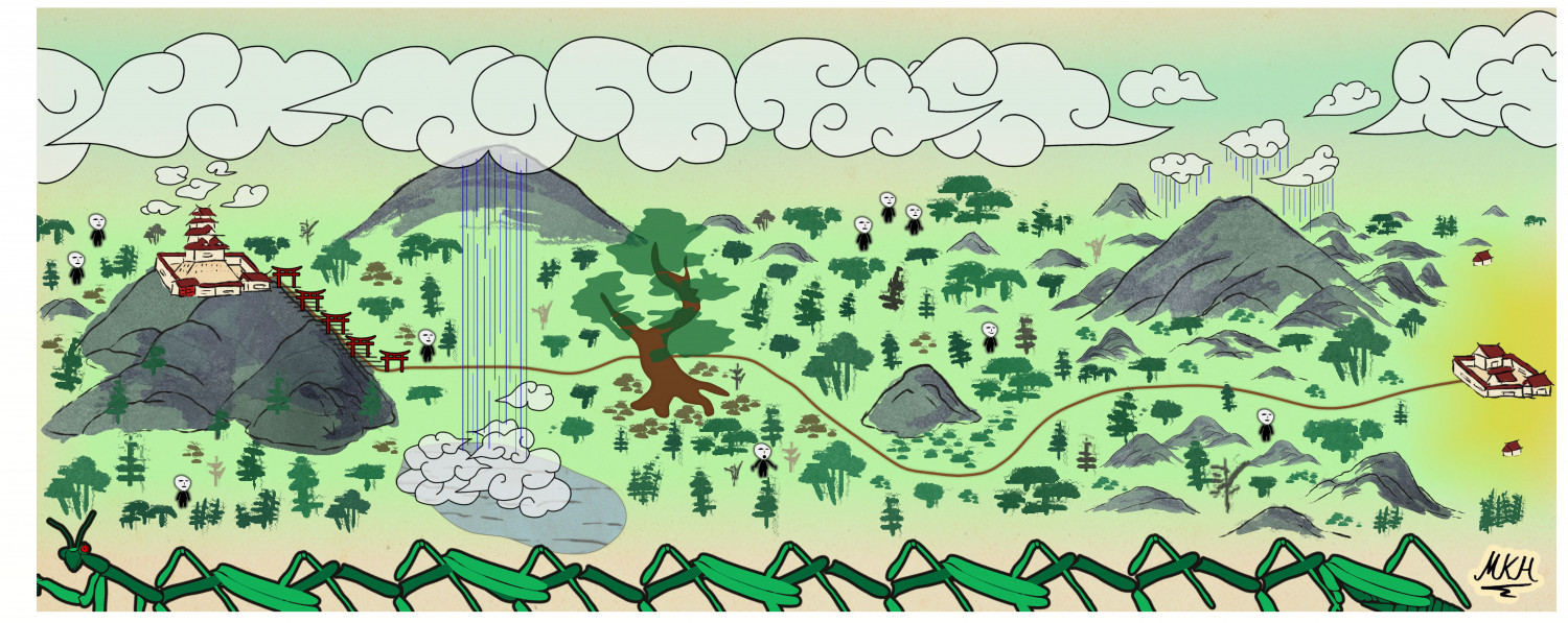
Path to the Temple of a Thousand Gates
Since the in game map for today's adventure contained a few spoilers and since I wanted to do an Empire of the Sun map anyway, I recreated it with a few embellishments:
The work was fun, but the style could really use some "Japanese style clouds" (if these already exist in the style, please point out where they are so I can have a laugh, too ;-) ).
A larger version is in my gallery, as usual.


