EukalyptusNow
EukalyptusNow
About
- Username
- EukalyptusNow
- Joined
- Visits
- 660
- Last Active
- Roles
- Member
- Points
- 1,248
- Location
- Germany
- Rank
- Surveyor
- Badges
- 8
Reactions
-
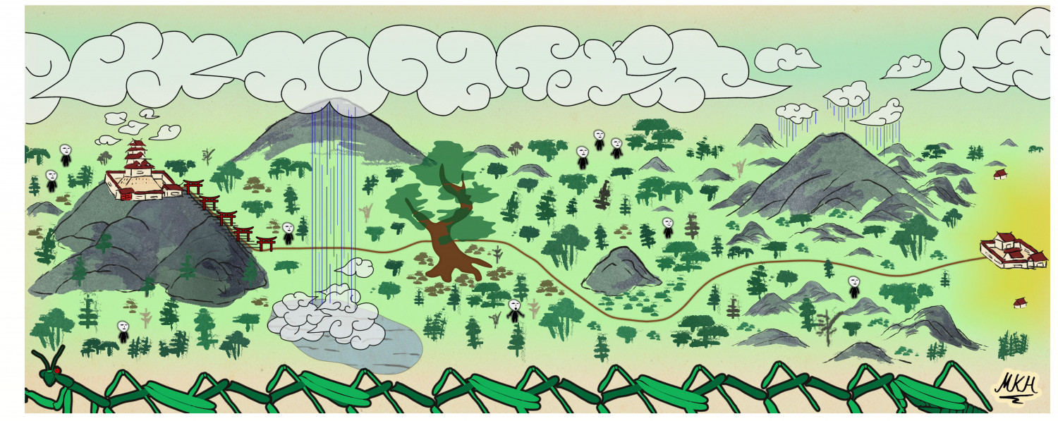
Path to the Temple of a Thousand Gates
Since the in game map for today's adventure contained a few spoilers and since I wanted to do an Empire of the Sun map anyway, I recreated it with a few embellishments:
The work was fun, but the style could really use some "Japanese style clouds" (if these already exist in the style, please point out where they are so I can have a laugh, too ;-) ).
A larger version is in my gallery, as usual.
-
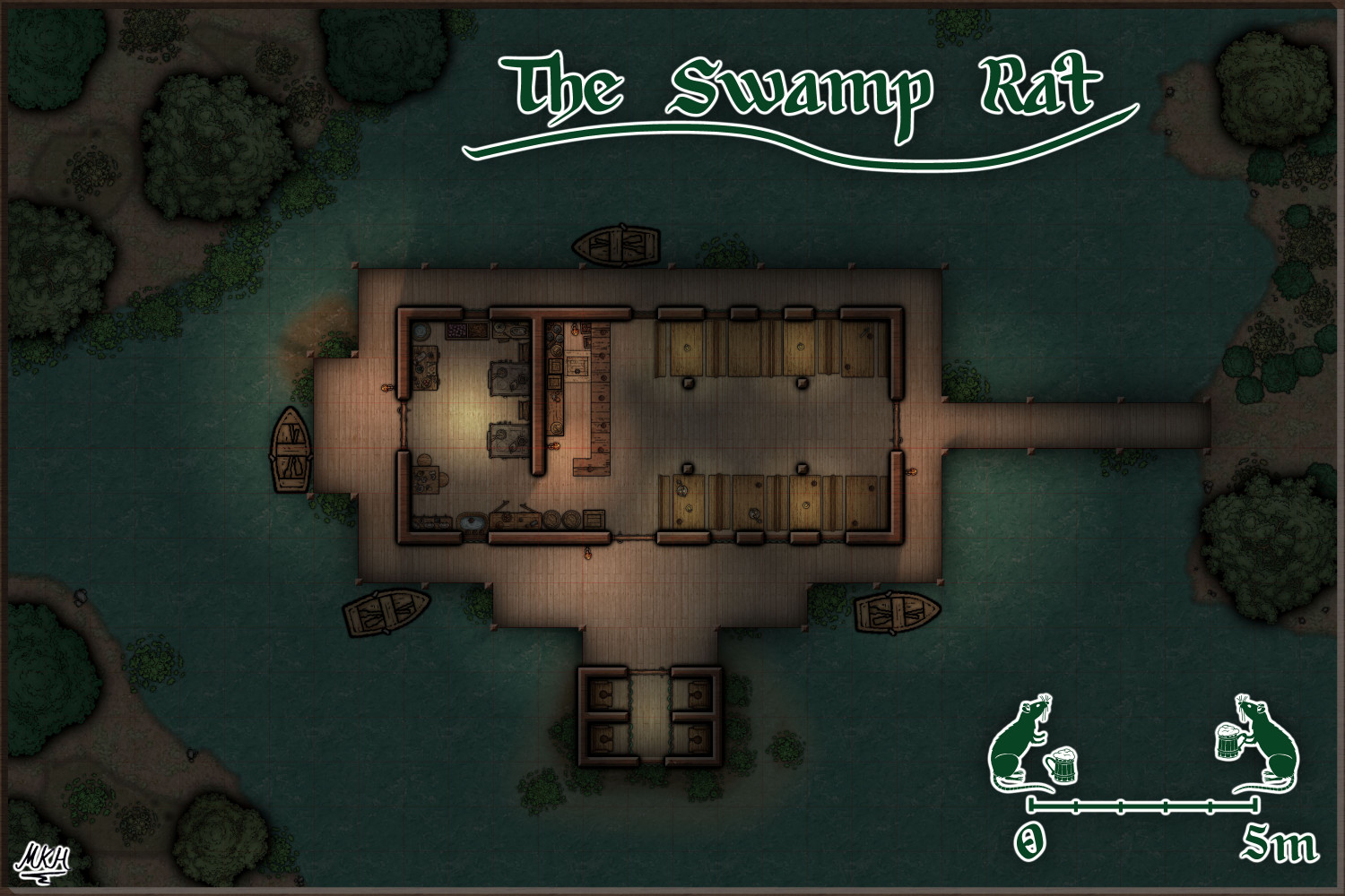
The Swamp Rat - Playing around with Lighting
Thanks a lot, Sue.
The Shadow-Blur function was what I was looking for. Had forgotten how to find the Global Sun settings...
Also found out I had added an infinite shadow lenght to the bar by mistake.
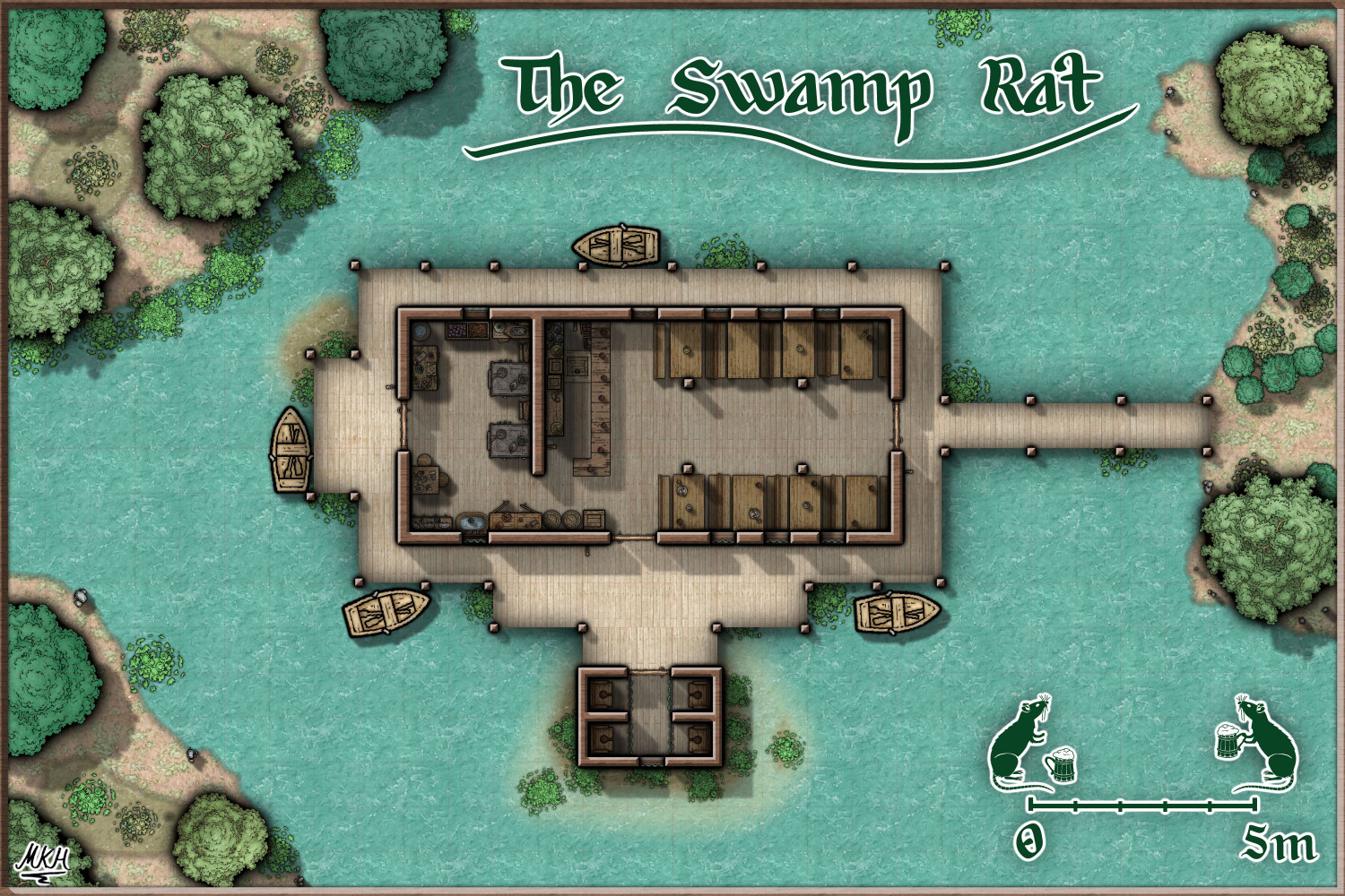
Here's what it looks like now, with added ceiling lights for the kitchen and toilets and a "dishwashing station" in the kitchen.
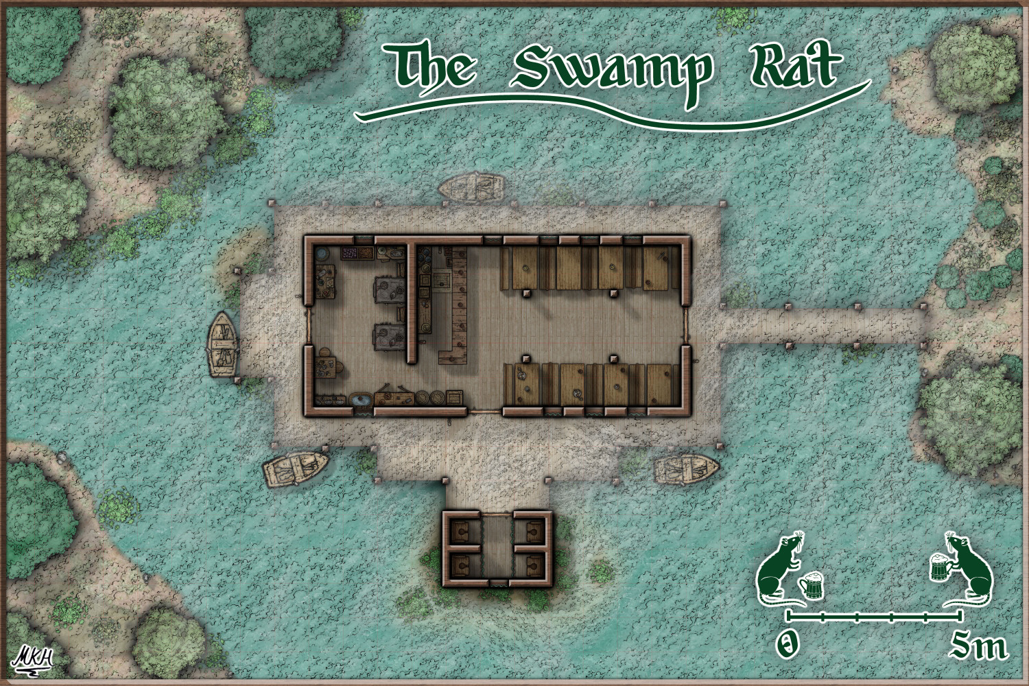
UPDATE: Here's the midday version, Think I got the shadows sorted out now.
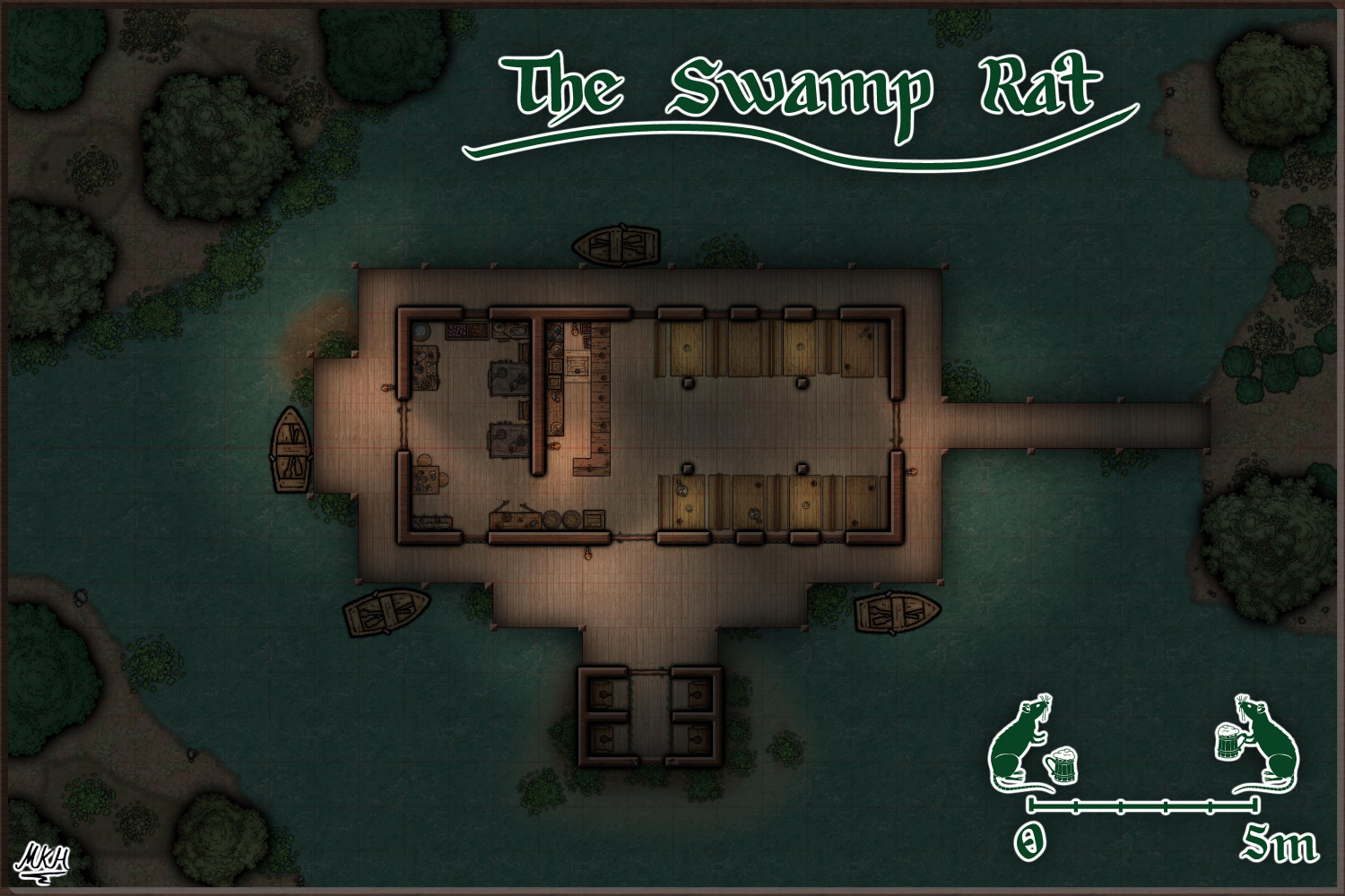
Update2: And here's the "House of Swamp and Fog" bonus version.
-
The Swamp Rat - Playing around with Lighting
Starting to play around with dungeon lighting a bit.
Not 100% happy yet, but it's decent.
The daylight version of this map is still a mess of overlapping wall shadow effects - will probably add it later.
Larger version is in my gallery, as usual.
Cheers! :)
PS: Added a slight outer glow around the bar and piers, compared to the initial post.
-
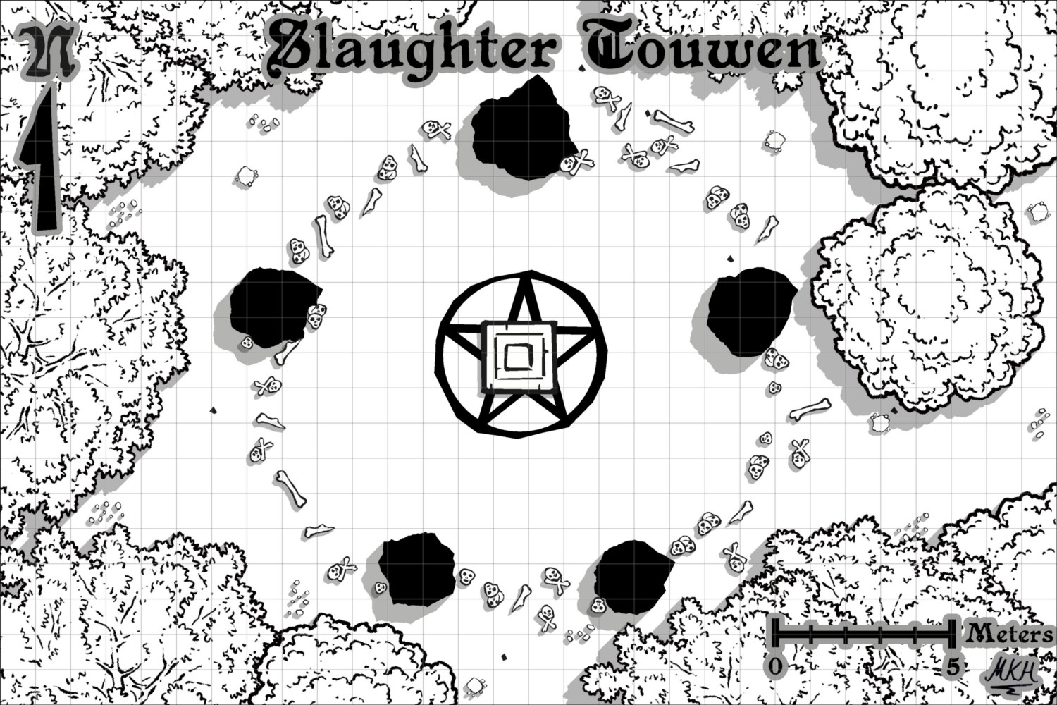
Slaughter Touwen - Just a small battlemap
"Nah, Nothing to see here, move on..." 😇
I was thinking about filling the stones with a hatching pattern, but I like the solid black.
It kind of adds to the "brutal" feel of the map, and I fondly remember old b/w RPG maps (probably MERP/Rolemaster) with black standing stones like this.
The only slight change I made was fractalizing the stones a bit. They looked slightly too smooth.
-
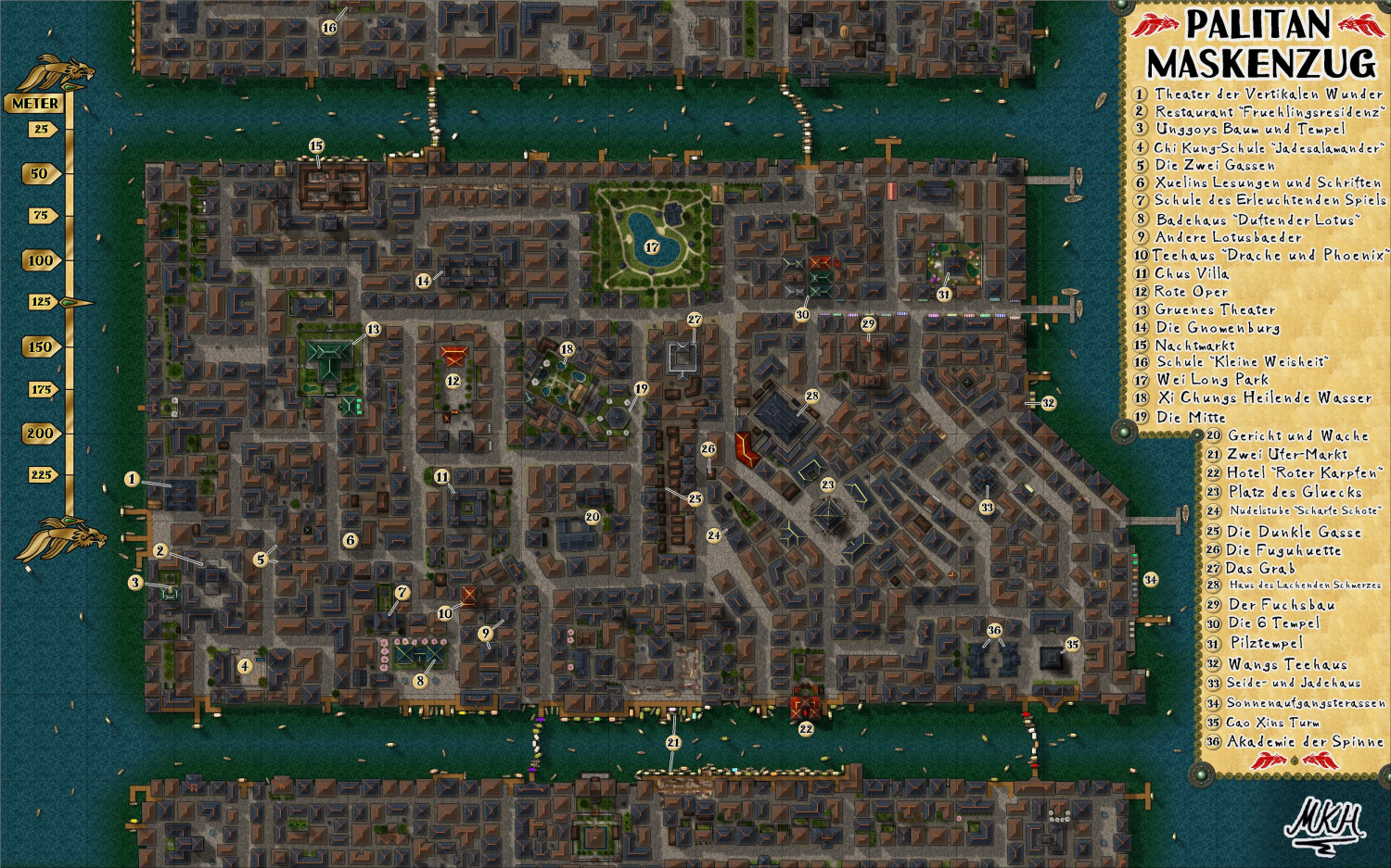
WIP - The Pink Lantern Quarter - A Kowloon Walled City Style Asian town map
Thank you @Wyvern
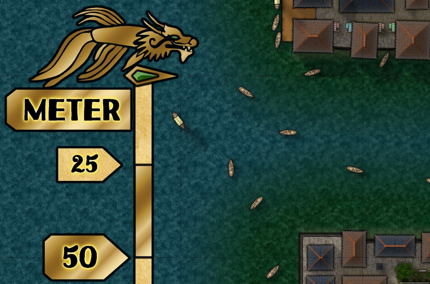
Yes - it needed a scale bar.
Used the Dragonfish polygon from the map key to create the decorations. Might try creating a few more of these "Crest-Polygons" - they're very versatile.
Large version in the gallery is also updated.


