EukalyptusNow
EukalyptusNow
About
- Username
- EukalyptusNow
- Joined
- Visits
- 660
- Last Active
- Roles
- Member
- Points
- 1,248
- Location
- Germany
- Rank
- Surveyor
- Badges
- 8
Reactions
-
Dark Water Monastery - Style mix village scale map
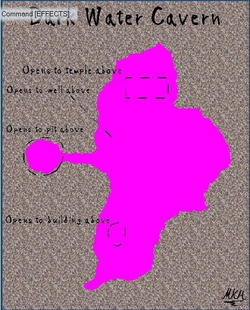
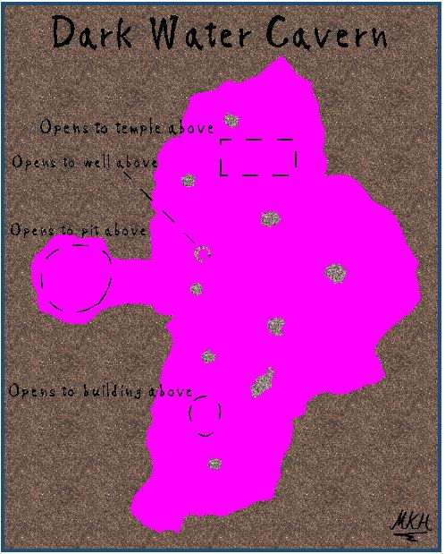
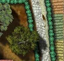
Yes. That's a wall shadow effect. I created this cave by using multiple sheets with colour key "cutouts" and an edge fade "inner effect" on the larger cutout:
Detailed explanation:
Create the cave, by first filling the whole map with a Wall sheet rectangle (using the gravel texture).
Then add a colour key effect on top of the wall sheet effects and cut out the cave, using a fractal polygon.
If required, create a duplicate of the wall sheet, (called "Rock columns" in this example) to be able to add the columns and walls inside the cave.
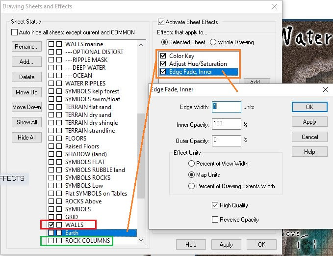
For the Earth around the cave, create another sheet called "Earth", with edge fade (inner) and colour key effects. Create a map-filling rectangle using an earth-texture, (same procedure as for the "Walls"-sheet).
Put the "Earth"- sheet beneath the "Walls" sheet (with effects turned on) to be able to see the cave. Then draw a slightly larger colour key cutout into the "Earth"-sheet, around the cave (also using a fractal polygon).
Now adjust the sheet order so that the "Earth"-sheet is above the "Walls"-sheet and fine-tune effects as desired.
Here's the final sheet order and effects on the "Earth-Sheet". The "Adjust Hue/ Saturation effect can be useful to darken the earth texture.
Edited for clarification.
-
Community Atlas - Forlorn Archipelago - Poncegraf Village - Church
Great style mix - love the vivid, slightly psychedelic colours and the generall mood/impression of the map.
The only things bugging me are the entrance gate to the left-side fields (Shouldn't the posts touch the hedge?) and the right side of the main path, where there seems to be a piece of "churchyard-texture" on the right side of the path.
Maybe some slight edge fade on the paths would also make them blend in a bit more.
-
[WIP] Community Atlas - Kumarikandam - Xinxing - Ylangxi City
Very good. The new fields look a lot better, and the intersection is fixed.
Numbers on the map could be a bit more visible (especially 1, 2 and 3), but think they're ok when viewing the map full screen.
However, the colour scheme and transparency effect on the map key look "off" to me. Maybe remove/ change the pinkish transparency background and turn the letters pink to match the actual map?
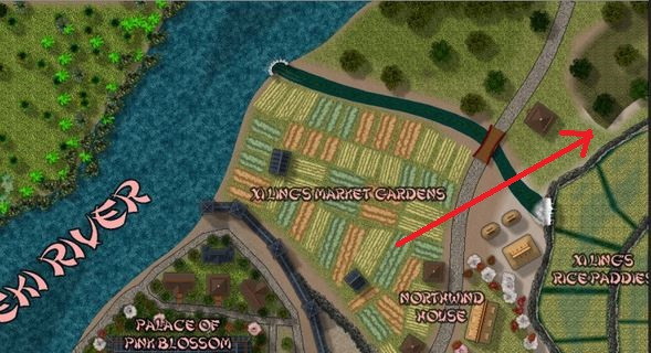
And there's also still this corner (sorry to red-mark - was the quickest way to point it out).
-
[WIP] Community Atlas - Kumarikandam - Xinxing - Ylangxi City
Very cool map. Thanks a lot for sharing it with us.
Features I especially like:
- The overall layout of the city. Interesting and "organic-believable".
- In particular the layout of the docklands and the area between the Heart Markets and the Temple. The narrow garden with the pond and white tori gate is also nice.
- The subtle texture-work in the "non road-sections" (can be seen in the blow-outs and gallery image)
Thinks I might do differently:
- Dont' fancy the look of the market gardens (bright green rectangles with brown stripes) but that's more personal taste. Maybe I would have experimented with a bit of "small, fuzzy brown outer glow" and/ or slightly fractalize the borders. Or just stolen some fields texture from the Darklands style anyway...
- "Little nitpicky spots"quickly fixed: The T-intersection "East North East" of the palace next to the castle wall has a small joining issue. And the swampy Area northeast of the waterfall has two quite sharp "nonorganic" corners (might just be the render too, though).
Other remarks:
The smaller text looks a bit small/ pale in the 1000x1000 picture in here, but good in the larger gallery image when zoomed in a bit.
Same with the textures. Some look a bit "nervous" in the smaller picture but fine in the larger version.
One question at the end: You mostly used ready-made house symbols for this map. was this mainly a question of speed, or did you just prefer the look, compared to the "custom ones"?


