EukalyptusNow
EukalyptusNow
About
- Username
- EukalyptusNow
- Joined
- Visits
- 660
- Last Active
- Roles
- Member
- Points
- 1,248
- Location
- Germany
- Rank
- Surveyor
- Badges
- 8
Reactions
-
Forest Trail project - part 2
@Loopysue They look a bit like cobwebs in the example picture, which is probably due to the green water and rocks underneath.
Also, the contrast between rapid, foaming water and perfectly still, clear water in between looks unnatural, as do the sharp "non wavy" water edges towards the lower left of the screen.
The rocks under water look great, but maybe some kind of blur - effect and "rougher" edges would make the water look more "flowing".
-
Parallel Lines close to Darklands City Roof Edges
Many thanks, Sue. My houses are now correctly slated again. :)
I was able to reproduce how CC3 switched to the "merge" layer:
I had placed the stairs on the left side just before the "lined" buildings.
The stairs are from Dungeons of Schley.
Whenever I switch to a different "program" from City Designer 3 (Dungeons of Schley in this case), and then click on a symbol category icon, the layer changes to "merge".
Maybe this happens when it wants to select a layer that's not present in the current map. It switches to "Vegetation" when is select the "tree" icon from an overland style, for example.
Once I select an item category, that has a layer present on the current map, the layer seems to switch to it. I can - sometimes - switch it back to "Building", by clicking on a precreated house icon.
-
How to Create Decorative Symbols by Tracing
This is a tutorial for creating vignettes / decoration symbols out of rounded polygons by tracing existing images.
I've more or less stumbled upon this method, after I wanted a spider to decorate a map and could not find one exactly like I wanted, so I drew/ traced it.
Step One: Determine what you want for your map.
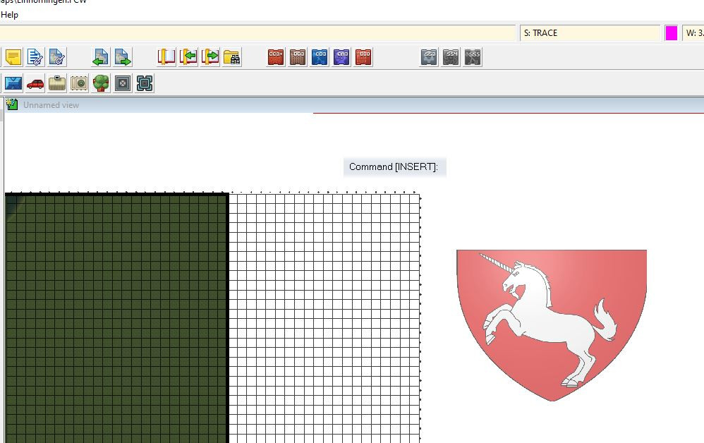
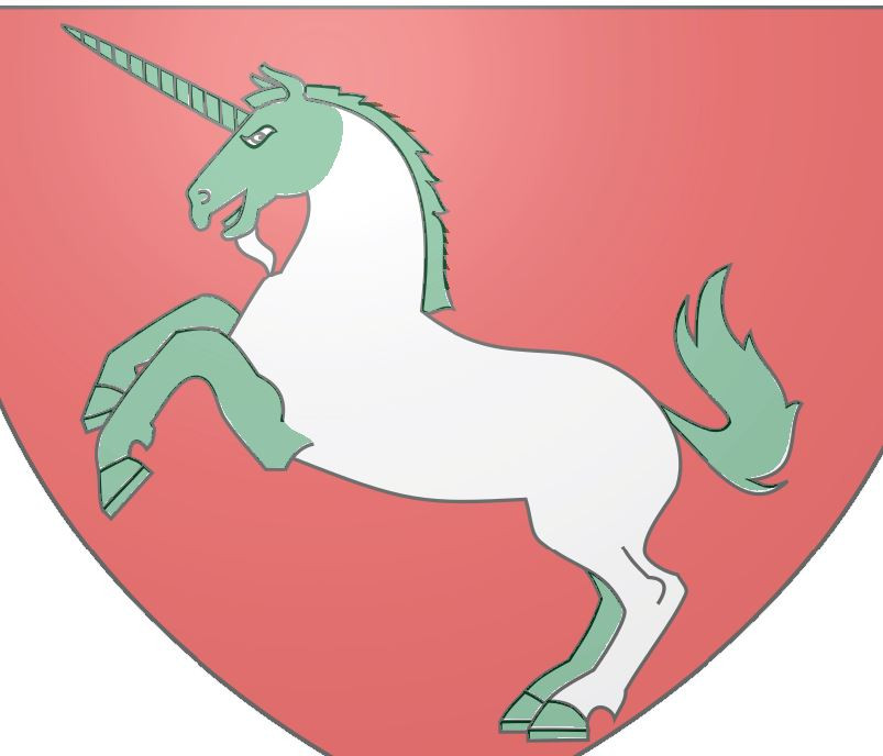
Based on the opinion of a certain younger member of our household, I'm going to use a unicorn as an example. It should be suitable as a crest, stamp or as a general map decoration.
Step Two: Find a suitable source image:
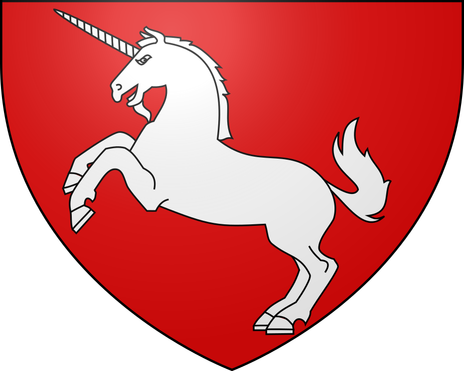
This image could be any drawing, picture or even photo. The most important thing is that the general shape of what you want to trace matches what you want.
Please keep copyright in mind if you are planning to use the created symbol for a map you are going to publish. I try to use public domain images whenever possible.
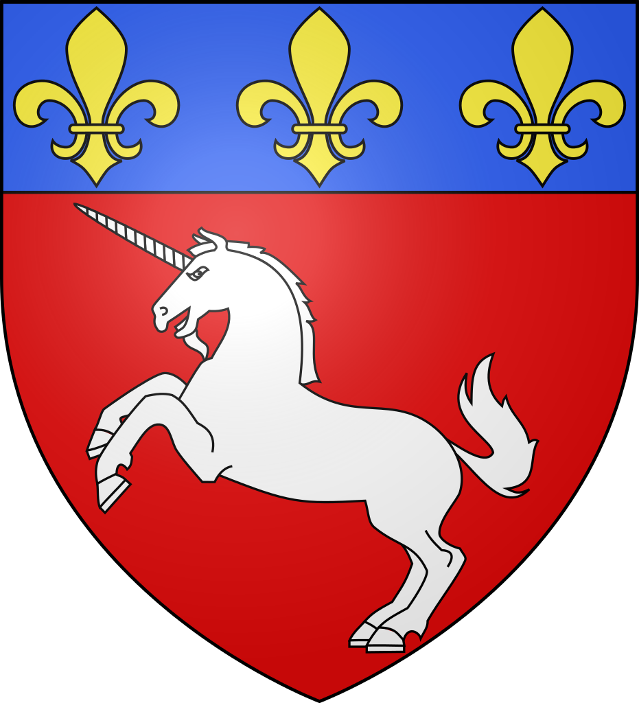
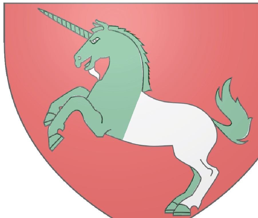
After some searching around, I've found this public domain crest on Wikipedia:
https://en.wikipedia.org/wiki/File:Blason_ville_fr_SaintLo_(Manche).svg
Step Three: Think about any possible changes you'd like to make:
You can mark these changes, or just keep them in mind.
I don't really fancy the „beard“ of the unicorn, so I plan on leaving it out. Also, I'm thinking about modifying the mane, so that it has more „folds“.
Step Four: Prepare the trace and upload it into your map
Cut away any parts of the image you don't need for tracing.
Open the map where you want to put the symbol
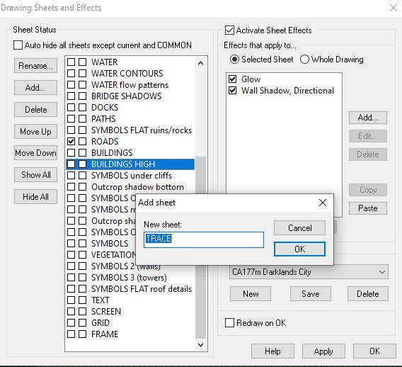
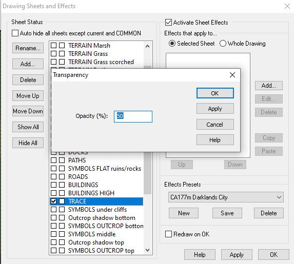
Create a new sheet „Trace“, with a transparency effect (50% usually works well).
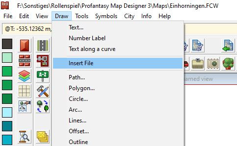
Put the trace image into your map by using the „insert file“ option of the „draw“ menu.
If you are working on a map that's already filled with other objects, put the trace image outside of the map boundary, so that you have a clear workspace
Make sure that the image is on the „trace“ sheet.
Step Five: Set up a separate sheet/ layer for what you want to trace
This can be skipped (Sometimes I just put my vignettes on the text sheet, if they share the same effects), but it will help selecting your traced image.
I create both new layers and sheets, named „Unicorn“ and "Unicorns".
Step Six: Select initial setting for your traced image.
Choose a solid fill with a colour that's different to the colours in the trace. I've chosen dark green.
I also put a Colour key effect on the unicorn sheet, because I want to use it while tracing.
I put the „Unicorn“ sheet just beneath the „Trace“ sheet. You can put it above the trace, if you prefer.
Step Seven: Trace!
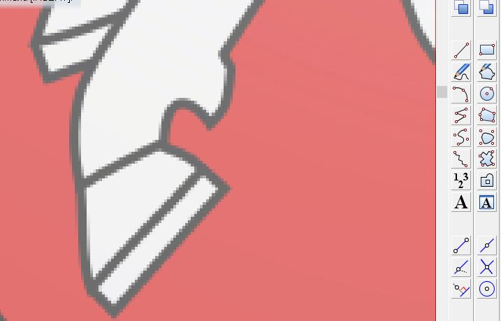
Select the „Rounded Polygon“ tool and fill the trace with rounded polygons, separating it into manageable sections.
Tips for this:
- Zoom in as closely as possible
- Draw individual parts, so that there is a blank space between them.
- Draw around/ between the fill lines, not on them.
- Split large, complicated parts into individual, overlapping rounded polygons
- Start with small, easy sections and work your way up to the more complex ones.
- Keep in mind that you can make the next point of the rounded polygon a corner by pressing „C“
- Don't mind small irregularities – they will most likely be unnoticeable in the smaller, final image.
- If you are not happy with a rounded polygon, just delete/ undo and draw it again. Trying to correct the polygon by moving individual nodes is usually more complicated and time-consuming.
- Colour key can be useful for creating cut outs, but it will complicate things when changing the colour of the sections.
Example:
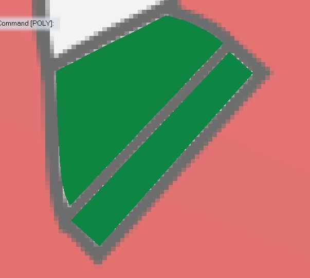
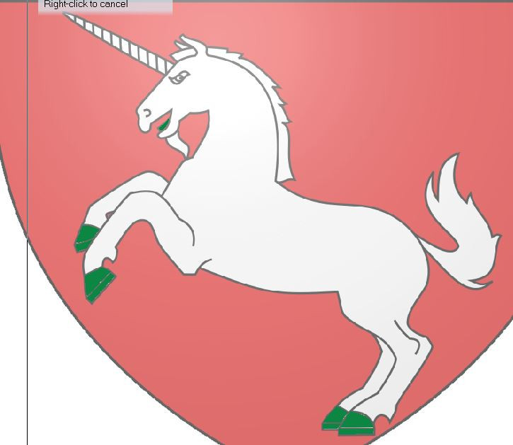
Start with the hooves. Zoom in.
Draw green rounded polygons.
Keep drawing, moving from simple to complex.
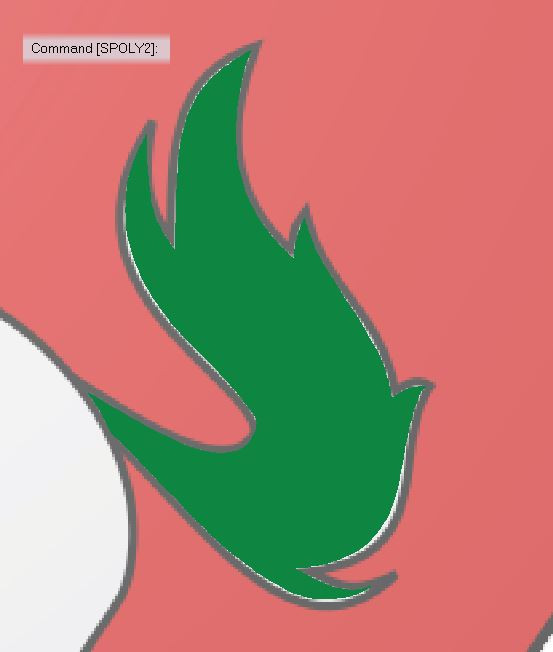
The tail.
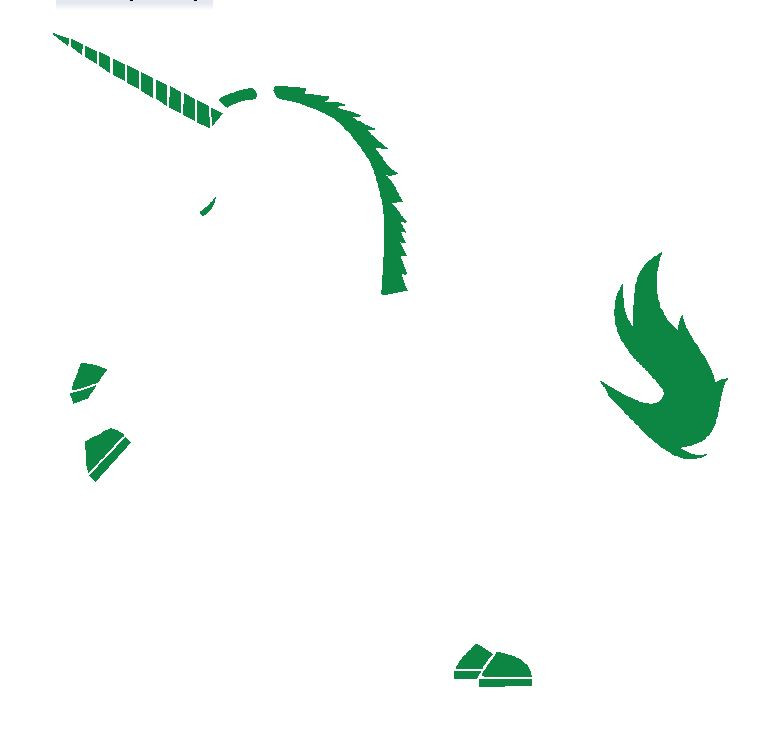
Mane and some horn sections. Note that I've added a few more „ mane folds“, compared to the original image.
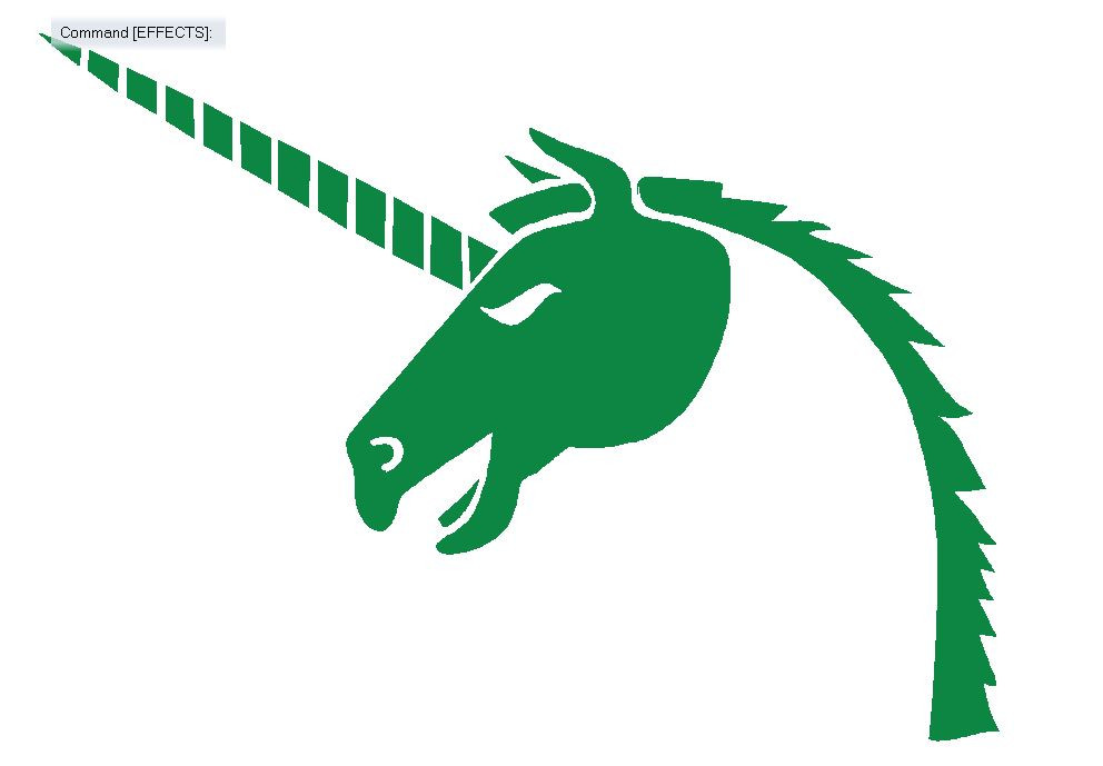
This is how the image looks without the trace so far:
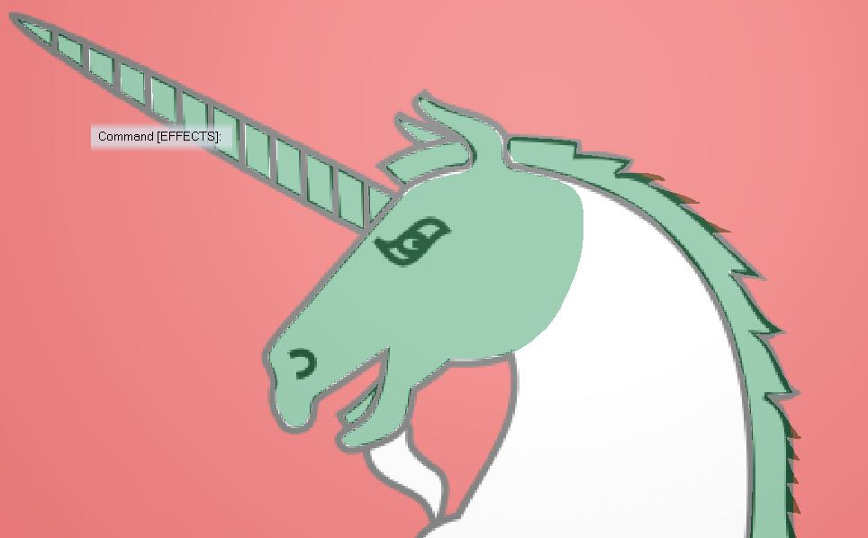
Starting with the head
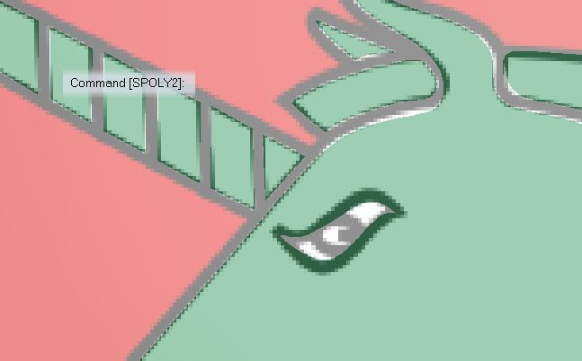
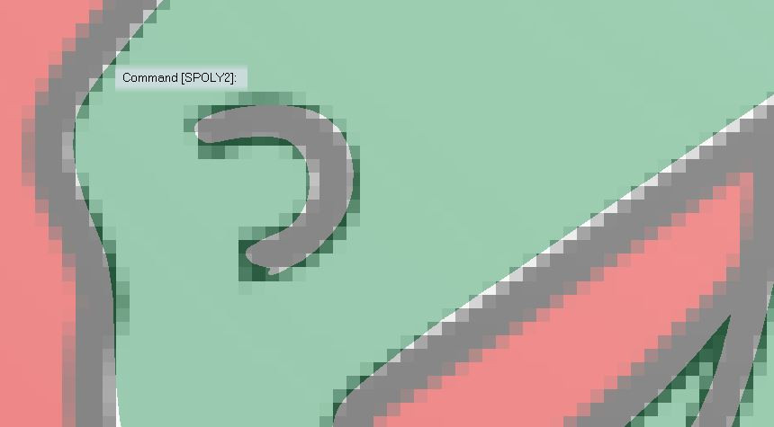
Cutting out the eye and nose using colour key. I used a polygon instead of lines for the nose, because I think this will work better when rescaling.
The show so far:
I continue tracing separate, slightly overlapping sections of the body, adding another colour key „cut out“ in the hind legs.
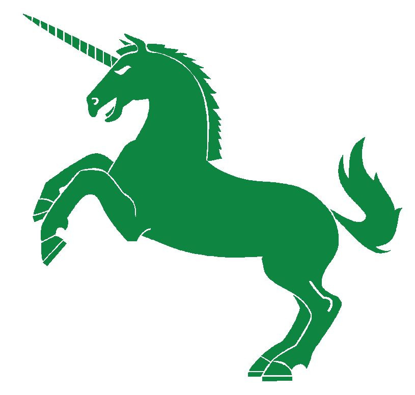
The completed 37 polygon image:
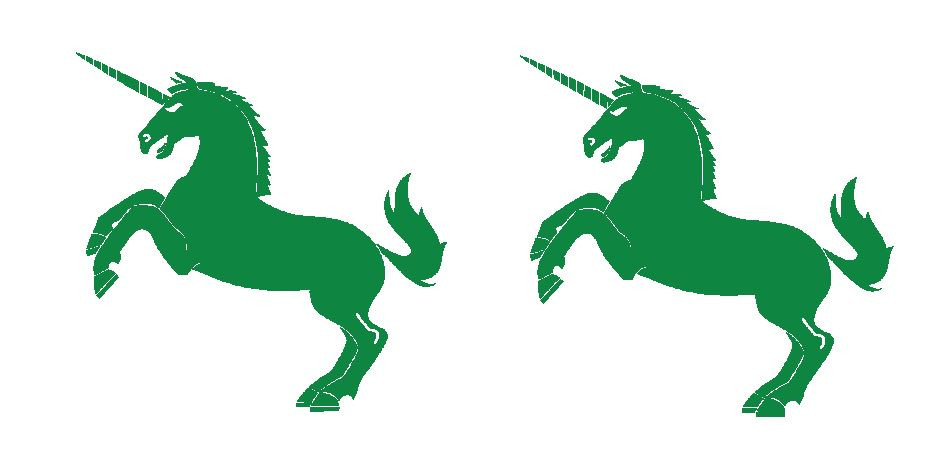
Step 8: Copy/ mirror and add effects
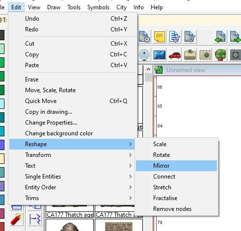
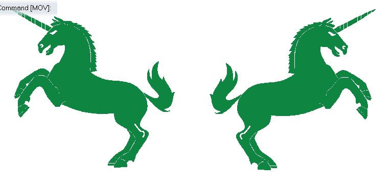
To create a mirrored copy of your image, copy the image first, then use the „mirror“ option under „Edit – Reshape“.
Clicking the „Ortho“- icon in at the bottom right of the screen helps to draw a perfectly vertical mirror line.
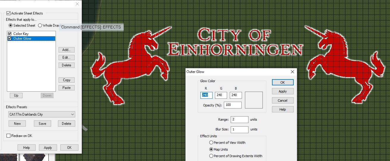
Since the image consists entirely of polygons all kinds of effects can be applied to it.
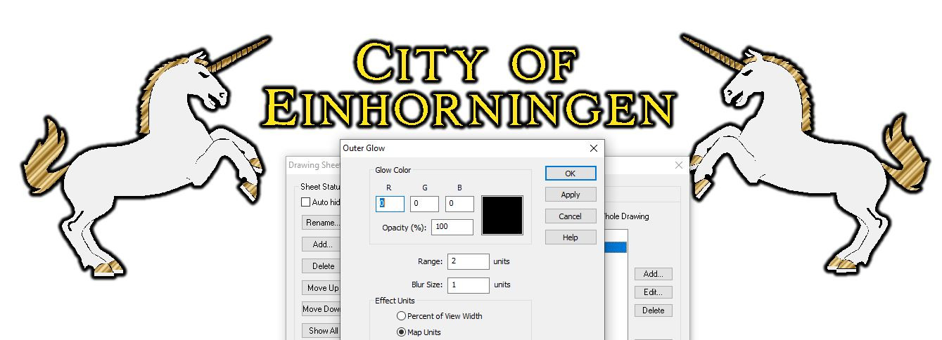
I've found Outer Glow and occasionally Bevel the most useful.
Examples:
White outer glow, matching the text:
Black outer glow and different fill styles (using Bronze from Maritime Dungeons 2 for some parts):
Black outer glow, stone texture and bevel. This creates trouble with transparency acne, but looks promising otherwise.
This is how the symbols look on a Darklands grass background.
And here's the FCW if you want to take a closer look.
If you have any questions, or suggestions on how to improve the process or manual, please type away!
-
My First Floorplan: Cybperpunk Club
Cool :) I need to do something modern, too - haven't really gotten into the modern floorplans yet.
You might want to go for broke and activate lighting.
Add the "Wall Shadow, point light finalize" effect to a rather "high sheet" like the map border, then start adding coloured light sources (turquoise around the "neon furniture" and maybe a different colour behind the bar/ near the entrance).
-
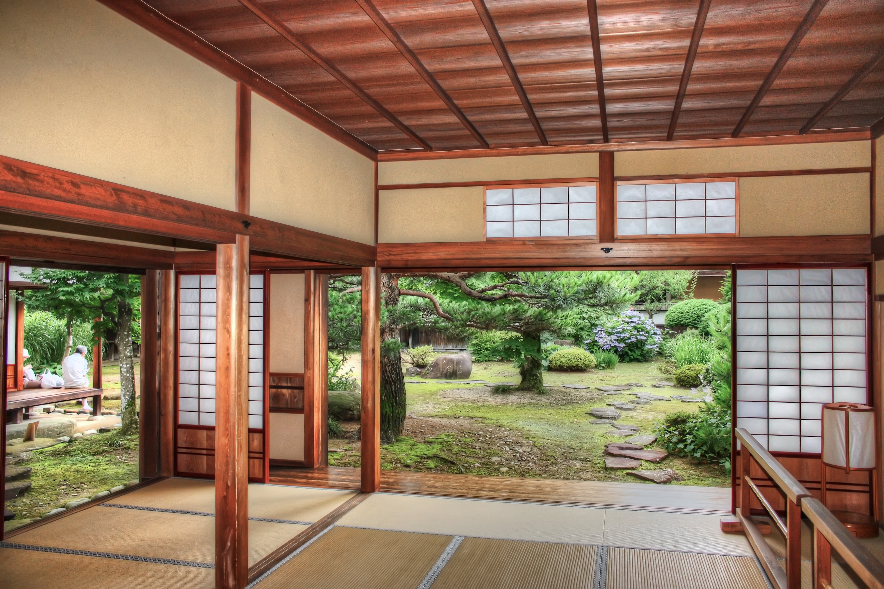
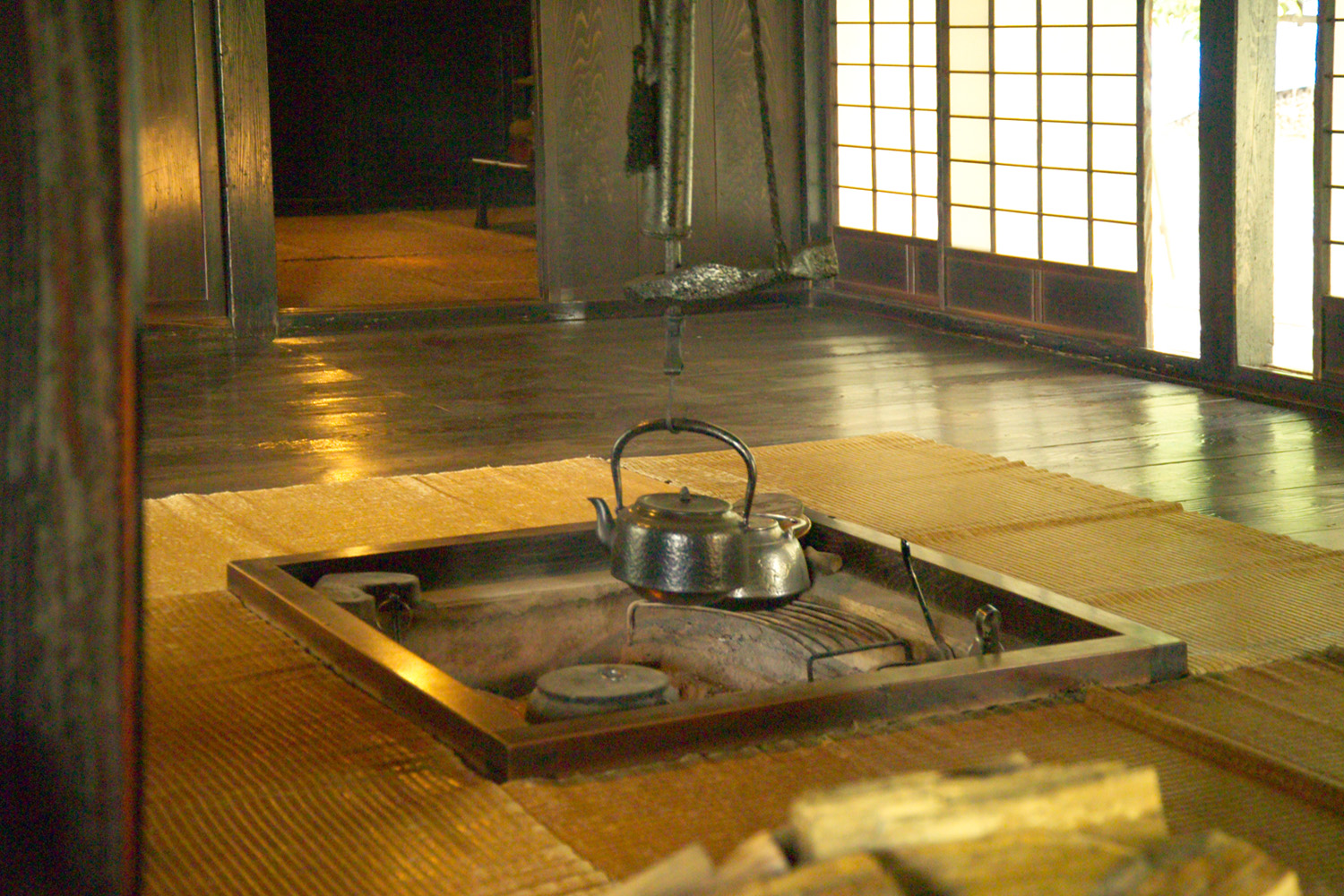
Style Request: East Asian Floorplan/Dungeon


