Loopysue
Loopysue
About
- Username
- Loopysue
- Joined
- Visits
- 9,982
- Last Active
- Roles
- Member, ProFantasy
- Points
- 9,863
- Birthday
- June 29, 1966
- Location
- Dorset, England, UK
- Real Name
- Sue Daniel (aka 'Mouse')
- Rank
- Cartographer
- Badges
- 27
Latest Images


-
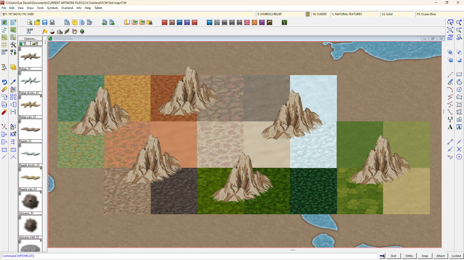
CC4 Overland Development Thread
Yes, I have been thinking of ranges. These models are basic inspiration and could be combined in a range symbol once I get past the basics of how big to make them and how much to modify the general appearance.
The smoother hills are a popular request.


-
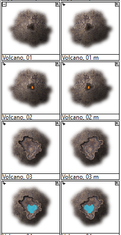
[WIP] - Lumadair: Birdseye Continental
It's one of the volcano collection.
-
WIP: ESTONISCH CONTINENT BIRDSEYE
Ah ha!
I forgot to switch off the antialias.
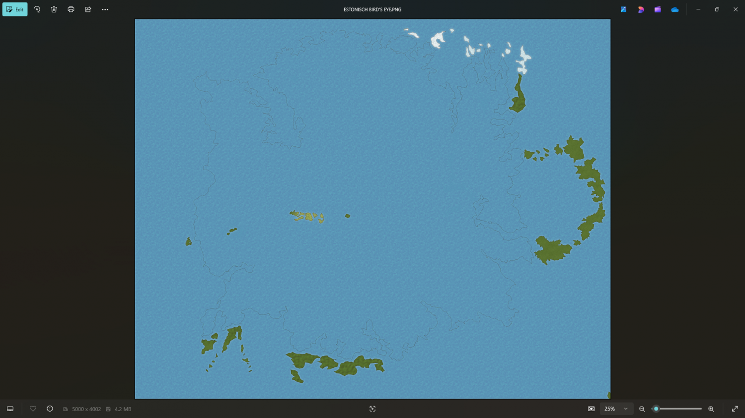
For some reason you need to have some antialiasing going on.
Try about 20-33%
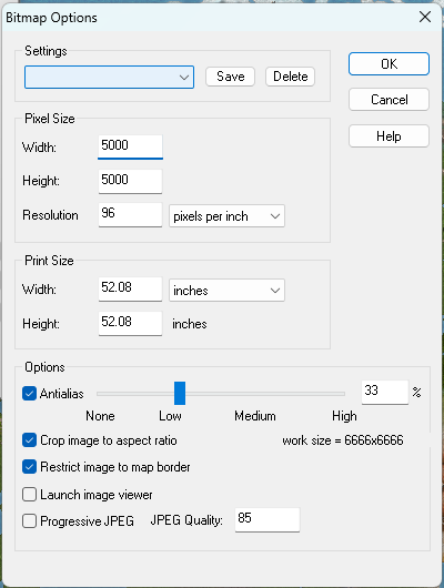
That definitely shouldn't be happening at zero antialiasing. Please can you report it to TS for me?
-
WIP: need some help with making text more visible
Hi Brian! :)
The most important thing to remember with lables is contrast. If you turned your map black and white the map itself would be all shades of grey, ranging from a very dark grey to a very pale one. To make text stand out from it chose either a very pale label colour with a very dark glow, or a very dark colour with a very pale glow. The kill-all solution is to use the palest and darkest shades of grey - one for the text and the other for the glow.
Drop shadows don't generally work very well for readability, but can look good on a title sometimes.
Your labels are pretty much mid-tone, which is the most difficult colour to make stand out, even when you intensify the native white glow.
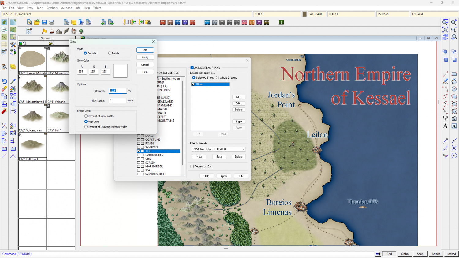
I recommend picking lighter or darker labels, and maybe using an Outer Glow instead of the slightly less tidy Glow, like this.
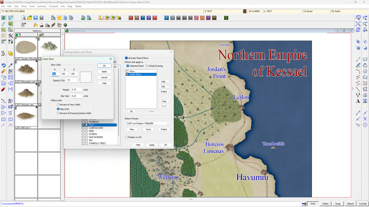
Or like this.
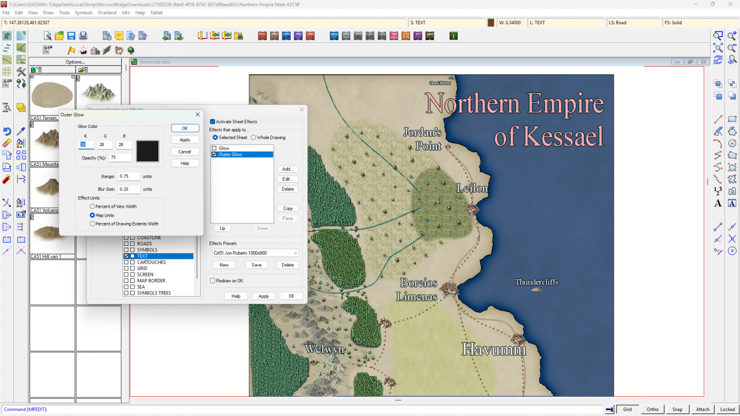
You could use both on two TEXT sheets - one way for the title and the other way around for the map labels.

-
Community Atlas: Barrows of the Ferine Magi area, Feralwood Forest, Alarius
Oh aren't they?
Well, wonderful work by the original artists :)

-
WIP: need some help with making text more visible
The Herwin Wielink colour palette on your map isn't really helping you, with only a single row of relatively dull blues to use, so here it is again with a more balanced colour palette attached to it - to give you more choice with your labels (and only if you want it with this modification).
-
CC4 Overland Development Thread
Here is the first mountain draft dropped down on isometrically scaled borrowed Birdseye Continental textures. There will be new textures specifically for CC4 Overland, but the colour scheme will be much the same.
There are several things wrong with this first draft, like the base shape (which should be level rather than tilted) and the mountain colours (which definitely won't be kind of brownish), but the painting style is more or less the one that's worked best so far - no inking, but everything drawn with ink-style lines, but instead of drawing in black they are drawn in colour.
What do you think?

-
What B&W Styles are Suitable for Large Maps?
Here are two ideas from the annuals:
https://www.profantasy.com/annual/2010/august10.html
https://www.profantasy.com/annual/2013/july13.html
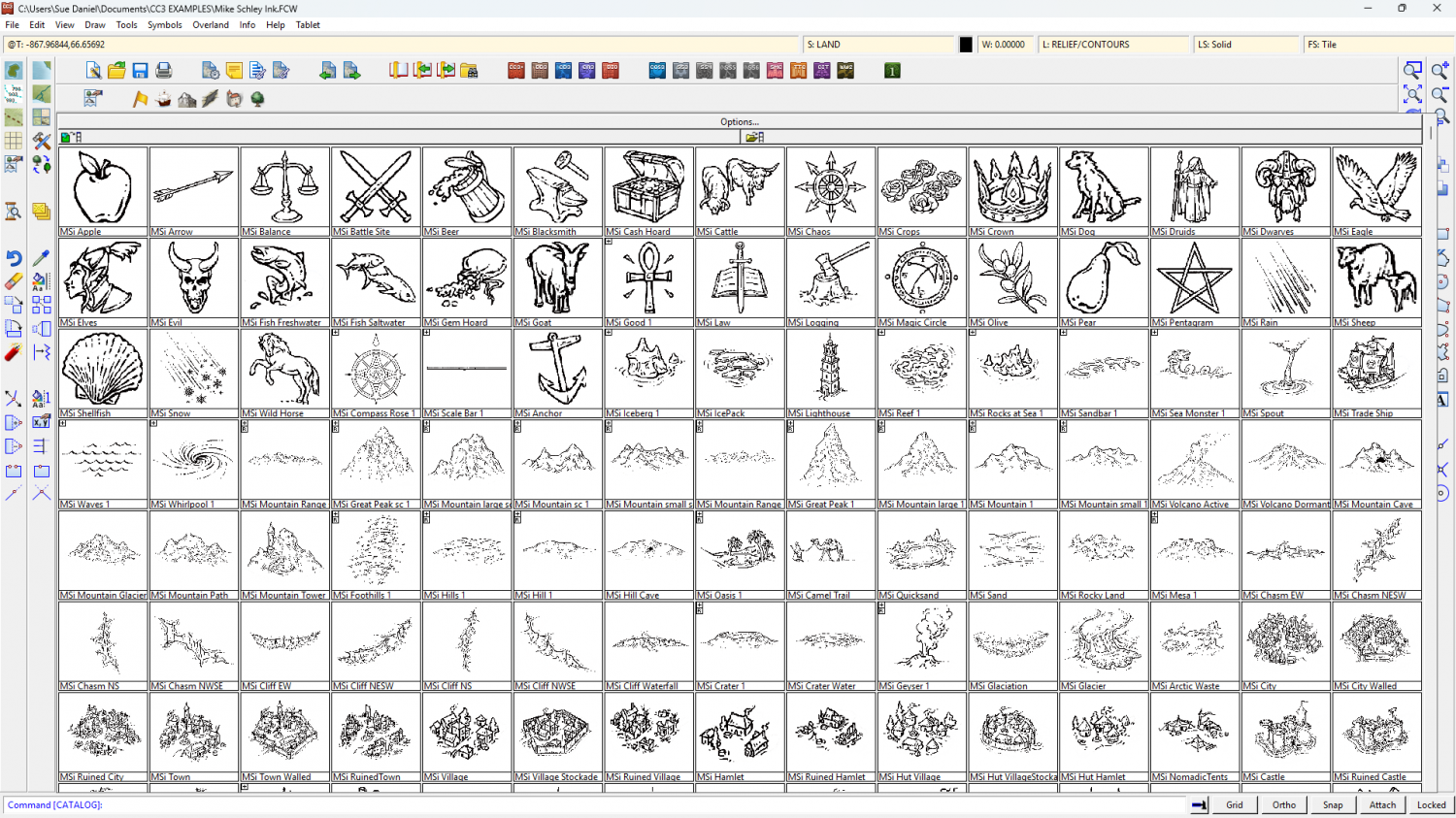
Or you could use Mike Schley's Ink overland style? It's the same as the main style, but black and white.

-
Mr Tumnus’ cave
I think (but am not sure) that should be 'loosely'.
It's a good map :)
There's a slight horizontal bar running across it about 2/3rds down. That's almost certainly caused by the lighting and having 2 passes on the render. If you type EXPORTSETMPPP and get a result of just 4 million (4000000), type 40 million (40000000) and hit return. That should get rid of the mark by reducing the number of passes to 1.
And thanks - you're welcome. I fiddled around with the lighting tech, that's all.
-
Forum vs Product Registration
They're completely separate, Slither, so you will need to register an account if you make a purchase to be able to download your software.
This is the login/register page https://secure.profantasy.com/service/entrance.asp