


Loopysue
Loopysue
About
- Username
- Loopysue
- Joined
- Visits
- 9,982
- Last Active
- Roles
- Member, ProFantasy
- Points
- 9,863
- Birthday
- June 29, 1966
- Location
- Dorset, England, UK
- Real Name
- Sue Daniel (aka 'Mouse')
- Rank
- Cartographer
- Badges
- 27
Latest Images


-
Live Mapping: Satellite Streets
Hi Everyone! :D
In this week's Live Mapping session Ralf will be trying out the latest Cartographer's Annual issue (November 2024) with the Satellite Streets style.
Come along and join us live on Youtube to join in the chat here:
https://www.youtube.com/watch?v=uJ4g_hhSgGU
Or you can watch it here later if you wish.


-
Disappearing polygons in Pencil Sketch annual
The sea tools draw on the CONTOURS (SEA) sheet, and are therefore hidden by the land.
You can find the ones you've already drawn by hiding all the other sheets, so you can use the Change Properties tool on them to move them to the WATER/RIVERS sheet.
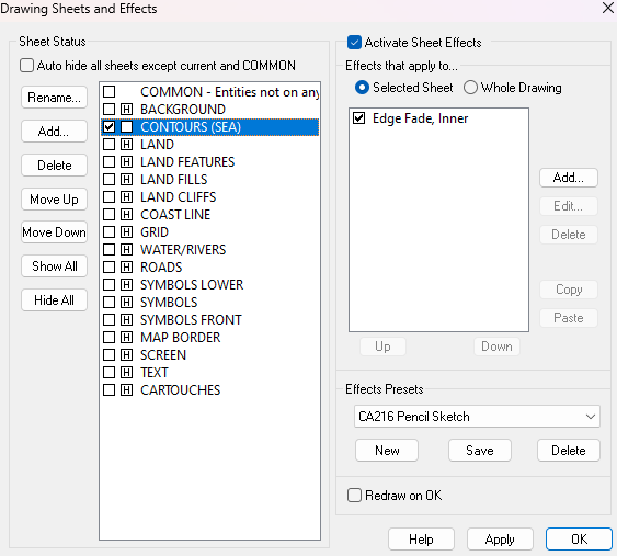
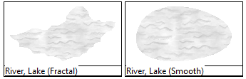
There are better tools to use to draw more rivers and lakes in the future. Try using one of these two.

-
Creating large cities without crashing
The two level mapping is probably the best idea.
You can (if you don't find it too awkward constantly hiding and showing different layers) do largish cities in one map by putting each district on it's own layer and only having the layers you are working on visible.

-
Birdseye Continental - style development thread
Yes, things are a bit minimal at the moment, but you are largely correct. This will be more of a large region scale... I think.
However, the suggestions made do still shape the decisions I have to make about what to try for ;)
I still think the castles idea would be much better done as a city style, where you can see such details as differences between 2 castles. However, since this is a top view style there's no reason you can't combine structure symbols to make mega cities.
At the moment I'm working on the textures. They always come first, no matter what style I'm working on.
This is a prototype grassland fill. The trick is to get it textured enough to look like what it's supposed to be, but not so detailed that it becomes a fizzing mash of dots. It has to be a suggestion of grass, rather than the grass itself.
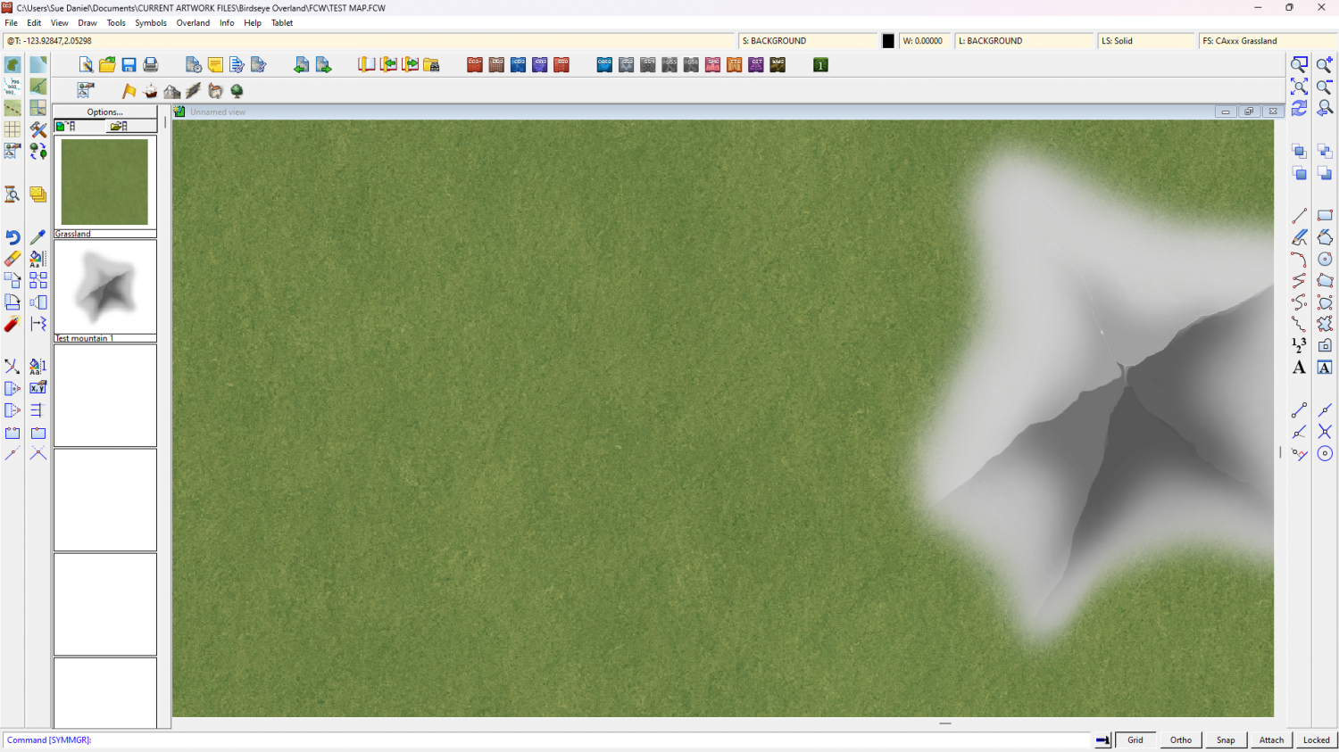
Remember the test mountain is the size of a mountain.


-
Birdseye Continental - style development thread
If course. I was already considering it - to keep that supervolcano-sized lava flow under control.
-
Live Mapping: Ancient Realms Revisited
In the first livestream of the year Ralf will be showing off the Cartographer's Annual January Issue's overland style "Ancient Realms Revisited".
Come and join the live chat and ask questions or make suggestions on Youtube.
Or if you prefer you can watch it here on the forum*.
*There's no live chat on the forum.

-
Birdseye Continental - style development thread
Wyvern - I was just thinking about the ridges. I put the mountain shape on the hill shape sheet instead, which has a much softer blur.
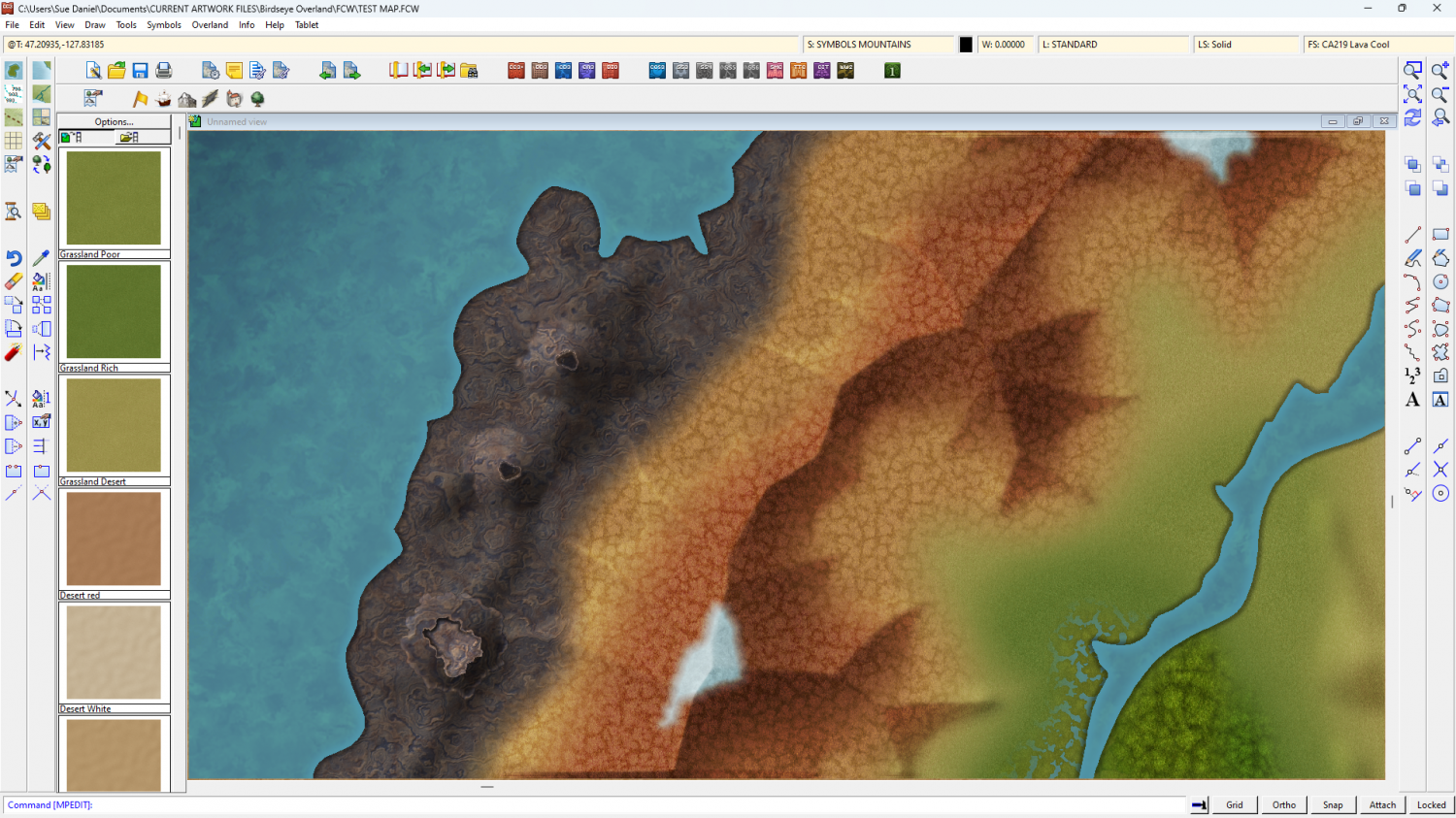
There will be a range of volcanoes to play with - most of them smaller than these. These are supervolcano size.
Calibre - That's a shame. I wouldn't change it too much - the volcano symbols won't match. But on the bright side, these are mapped symbols, so as long as you have them on a sheet of their own you can use colour changing sheet effects on them too.
-
Birdseye Continental - style development thread
My experience of volcanoes is limited to recent Icelandic and Hawaiian erruptions - the last 4 years of them anyway, so the fill reflects at least the mood of what I've seen of the relatively flat ground around those eruptions, which seems to be surprisingly pale except where vehicles off road and turn the surface to reveal the darker colours, but I'll keep it for something else and try a volcanic-coloured version of the tundra fills.
Another reason for making it relatively pale is that the darker the fill is, the darker the symbols have to be, and the darker the symbols are, the less effective the map files are, to the point where you can hardly see any shading at all. Map files work best on mid-tone symbols like rooftops. We'll be ok with the regular mountains because they aren't as dark as volcanoes, but the volcanoes are certainly proving to be quite a challenge.
-
Birdseye Continental - style development thread
Hi everyone! :D
I'll be working on a new top view overland style for the Cartographer's Annual in 2025. If you would like to make any suggestions about what you would like to see, or just want to chat about the possibilities, please feel free to do so on this thread.
Thanks in advance for your contributions.
[Images to come]

-
Birdseye Continental - style development thread
Thanks Don :)
This is Affinity Designer, which is a vector graphics app that can also do most things Affinity Photo can do - if you pick the bitmap mode instead of the vector mode. Everything except the warping of bitmaps, and since that is such fun I also have Photo.
I used Krita to do nearly all of the Ferraris Style, but I don't use it that often these days now that Affinity has taken over most roles. The only thing I can't get it to do is, ironically, the really simple stuff, like alpha mask. For that I export a png and work in GIMP.
It pays to have a wide range of tools in your toolbox for making new assets. I sometimes use CC3 to make new seamless textures from symbols like trees.
The only kind of app I don't have in my toolbox is rental apps, like PS.


