


Loopysue
Loopysue
About
- Username
- Loopysue
- Joined
- Visits
- 9,992
- Last Active
- Roles
- Member, ProFantasy
- Points
- 9,868
- Birthday
- June 29, 1966
- Location
- Dorset, England, UK
- Real Name
- Sue Daniel (aka 'Mouse')
- Rank
- Cartographer
- Badges
- 27
Latest Images


-
Tile issues with bitmap.
If you want to rotate the fill in a filled polygon in the map you can use Shaded Polygon (Angle by Edge) from the right click menu of the Polygon tool in the right hand toolbar.
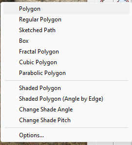
This will also give the polygon a roof pitch, which you can remove using the EDITSHADING command. Check the "Shade Only Copy" box and ok.
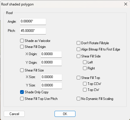
While it may be an advantage to rotate the fill this way, the problem with creating these shaded polygons is that they are no longer editable and have to be exploded and recreated every time you want to move a single node - a bit like multipolies.

-
Reinstalling - query re Symbol Set 3 modern & Cosmographer Pro
Since you already own the older versions it might be an idea to contact Profantasy and ask if there is any upgrade price. Since I wasn't around when they were upgraded I don't know if there were or were not.
Try the 'General Manager' on the Contacts page. That's Ralf. He will know if there was any reduced price upgrade and if it still applies.
EDIT: He might be a couple of days getting back to you, though, since he's currently at Gen Con.

-
What is Steampunk...
Hi Everyone :)
I am thinking... (and that is only thinking at this stage), of doing a kind of Steampunk City, or a set of symbols that can be added to existing city styles to make it look and feel steampunk.
So the question really is - what makes a city map a steampunk city map?
-
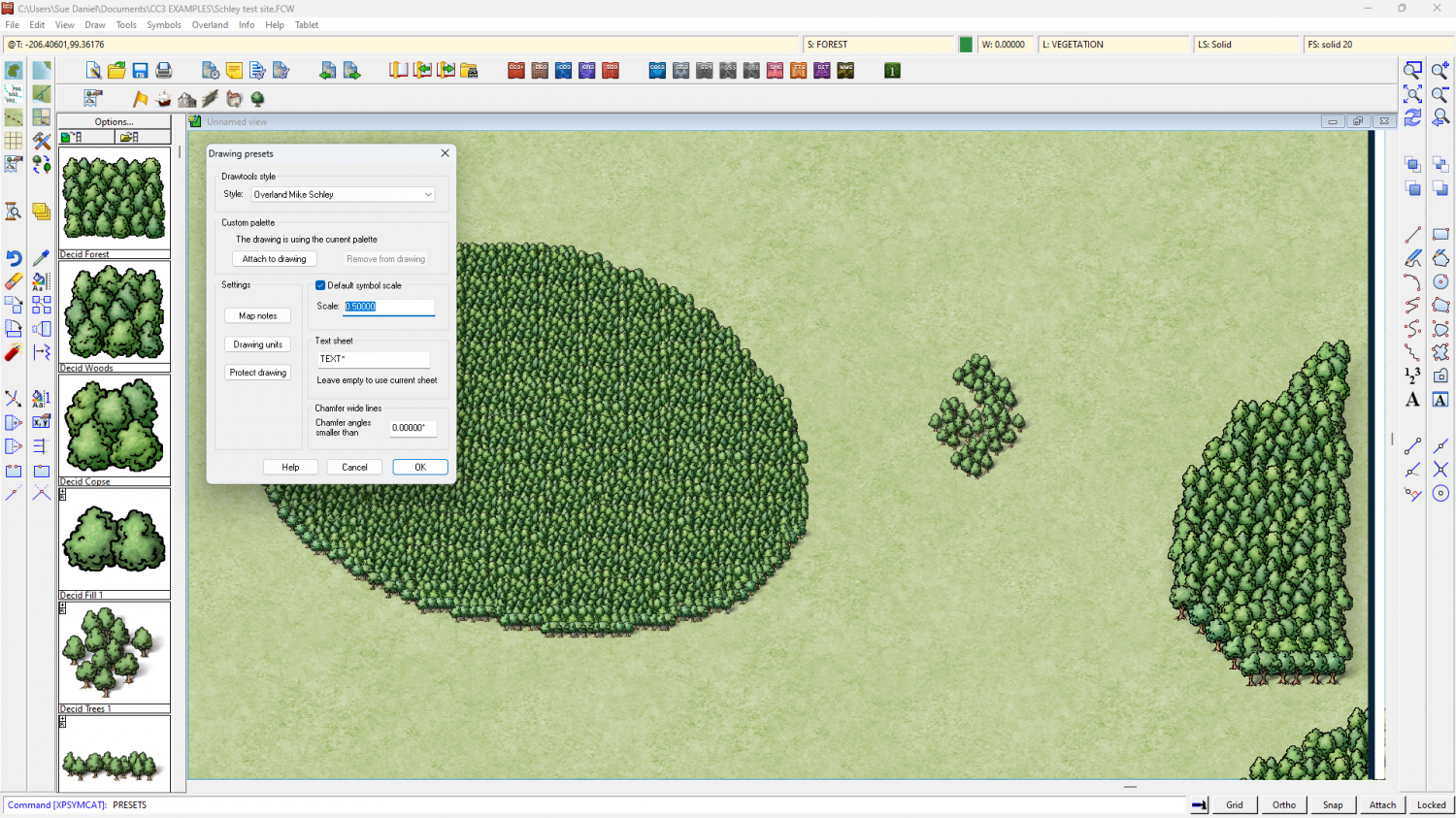
Scaling a forest tool
The easiest way is probably to pick a single tree symbol and scale it to the size you want all the trees to be (without actually pasting it). Then right click with the tree still on your crosshairs and note the scale you are at. Here, below the scale is 0.2.
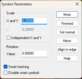
Then click Finished and go to the Drawing Properties button and set the scale in the Drawing Presets that it opens to be the same as the scale of the single tree.
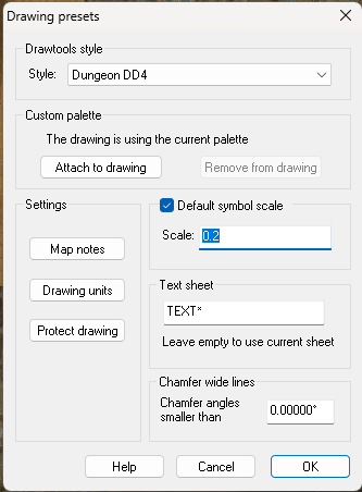
Then, delete the forest you've just drawn and redraw it. The new default symbol scale will cause the trees used by the tool to be rescaled to the size you want them to be.
In this test map below I set the default symbol scale to be 0.5 instead of 1, then drew a new patch of forest on the left. The existing patches of forest on the right remain at the original default scale that was set when they were pasted (1). That is why you need to delete and redraw the existing forests that are the wrong scale.

-
Making outlines thicker?
Yes. But every last one of those several contours would have to go on it's own sheet.
At a rough count that would be 12 more sheets than current.
-
Cannot locate fill style OR resize map
I first had to delete all the copies of everything to make it easier. There were 5 backgrounds and 5 frames, multiple pieces of screen that didn't match up with each other, and so on. In the end I used the properties picker tool to grab the properties of a thing and redraw it.
I also had to delete multiple copies of all the map notes. Maybe that is why Resize didn't really work?
Anyway - I hope it's the right size for you now.
I've frozen the MAP BORDER, BACKGROUND and SCREEN layers for now, so if you want to change anything by hand you must first unfreeze them.
-
Live Mapping: A Not-So-Peaceful Village
Hi everyone! :D
Ralf will follow in Remy's footsteps in tomorrow's live mapping session, and create a village map for the Community Atlas 1000th map Competition.
Come join us live on Youtube and join in the chat here:
https://www.youtube.com/watch?v=Al6R2xhqfl4
Or watch it later here on the forum.
We look forward to seeing you in the chat :)

-
Dialog sizes
Oops!
Guilty...
Sorry!

-
Live Mapping: A Not-So-Peaceful Village 2
Hi Everyone :)
In this week's live mapping session Ralf will continue working on his village map for the Community Atlas Project and its 1000-maps celebration.
Come and join in the chat with the live session on YouTube here:
https://www.youtube.com/watch?v=PBzOFXIk1Wk
Or you can watch it here later if you wish:
Date and time shown in the side bar of the forum, or on YouTube if you follow the link.
-
[WIP] Community Atlas - Eknapata Desert
It's looking good so far.
The glows don't have to be really loud to work. As long as they make the text clear enough to read that is fine. With the labels 2 different colours this can be a bit tricky, but I assume that the brown labels are not as important as the black ones, so they don't have to be as eyecatching.
So, how about this?
I switched off the effects on the Text Outlined Light sheet because the text itself is so large and so pale it doesn't really need a glow.
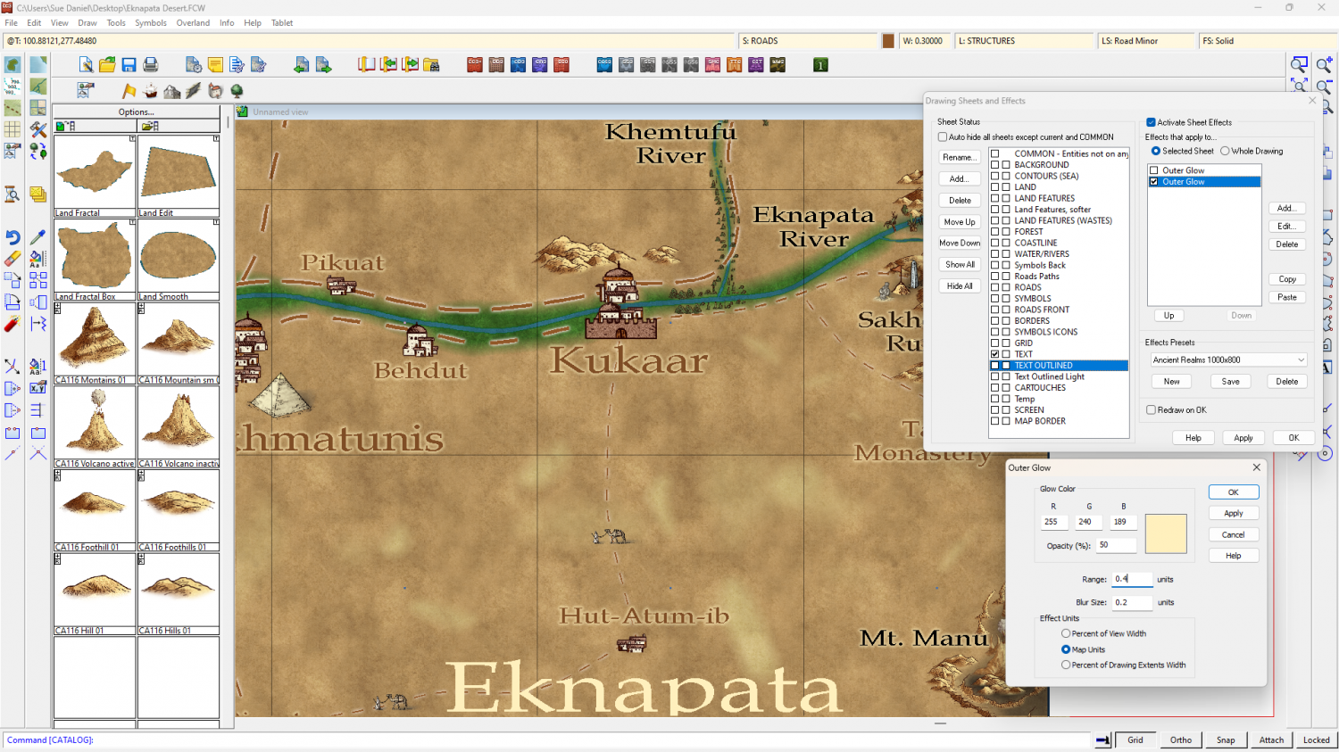
You might want to make them a little more opaque, but that's part of personal taste.
A little tip: Using a ranking system of different sizes is ok, but try not to use too many different sizes if you can avoid it.

