Jeff B
Jeff B
About
- Username
- Jeff B
- Joined
- Visits
- 5,899
- Last Active
- Roles
- Member, Betatester
- Points
- 1,238
- Location
- Fairbanks, Alaska
- Website
- https://www.akbattletech.us/endoria/
- Rank
- Surveyor
- Badges
- 9
Latest Images
Reactions
-
[WIP] August Mapping Competition -- Vertshusen Distillery
I don't see any useful symbols in Munsen's Mine. I have not found many symbols to use for the vats so I combined symbols. There were some good options in the Forgotten Adventures MapMaking Pack but that cannot be used for the atlas and Remy did not intend it to be used for the contest so I dropped using them.
I think what I'm doing for the floor plan is following the basics as best as I can with what I have to use and my skill set. It is a good learning experience and that is why I entered the contest to challenge myself to get out of my comfort zone.
Thank You for your input.

-
[WIP] August Competition - Vertshusen Town Hall and Tax Office
They just had a meeting about raising taxes and people got a little upset before they were hauled off so the room is a bit of a mess.

-
City of Torlok
Sue my problem with the cliffs is the tools are made for cliffs that are closed or run into the screen. The cliffs which are not closed are the issue. I'll look up Ralf's video this weekend and watch it. I good with the way the map is right now but would like to do a better job on the cliffs.
Next map a regional map of the world map of Endoria I'm working on, After I get that one done I'll revisit Torlok. (Well I had to go fix the docks - fixed version in gallery)
Thank you for the comments and the help.
-
[WIP] August Competition - The Southern Gatehouse
Just turn the frame border off and crop to the image size, or change the screen color to black and crop just outside the image and have a plain black border.

-
My First Floorplan: Cybperpunk Club
Try increasing to 80000000 - helped on my aurura image. what is your anti alias set at it should be at least 35% but don't go too high.
-
SS6 - Isometric Cities
I like the Mike Schley dungeon style and the city style is growing on me but not a fan of the overland style. Even though I may never use this style for a project I will buy it for two reasons.
1) Never say never it may actually get used in a future project.
2) To support Profantasy and if sales are good it should encourage them to add additional symbol sets in other styles and hopefully in a more modern / SciFi setting.
-
Text inside a box
I think I know what the answer is going to be but I need to ask. I'm trying to put text inside a polygon on a map I'm doing just like Maidhc O Casain did in his Callum's Curiosity map for the contest. I've read through the tome but it really doesn't say much. I'm guessing that in multi line mode I just have to guess where to put the returns to start a new line to get the text inside the area I want the text to appear, like I did for my contest entry which was only a list and not a couple paragraphs of text.
Is there an easier way to do text?

-
Need Style Suggestion for Azeroth (World of Warcarft) Map
Think the suggestion would work for maps 1 & 3 but think about the parchment from darklands overlands style for the second. I would create a different overlay from the bloody one that comes with the style to more closely mimic the style of map 2.
-
WIP - My New World - Myrrhina
It also depends on what look you want. I’m working on a large map (3500 x 2400 miles) and I’m using smaller fonts as I want them visible in a high res version when zoomed in but in standard res version don’t really care if the text is readable. As the text is a distraction from the map it self if the text size is readable.
personnel choice as to what your looking for and what you want to bring attention to. The text or map it self.
With that said it is possible to find a happy medium for text size depending on the size of the map.
choice of font and color makes a big difference also. Don’t be afraid to use a more readable font for small text like on your borders. It doesn’t have to match the more fancy text your using for the other areas.
-
WIP - My New World - Myrrhina
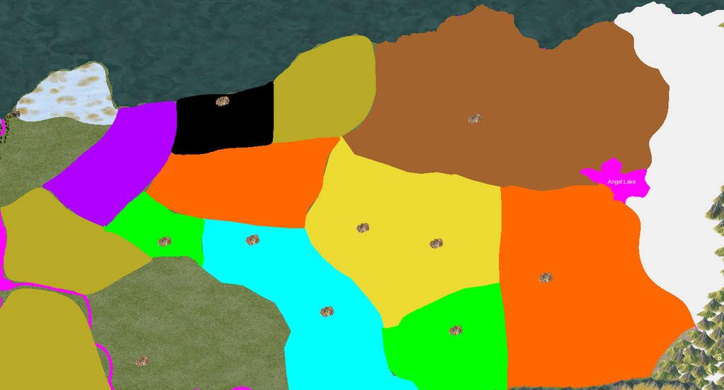
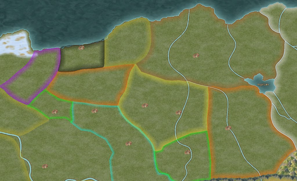
I would try changing your political boundaries to different colors for each area. You can have two or more areas with the same color boundary but just not next to each other. That would separate the boundaries better and make it easier to see where the boundaries are. I would also use polygons for the area with a filled color and a sheet effect to just show the boundary edges. after you use the smooth poly tool to make the boundary. then use the smooth to straight command to turn the area into a straight poly then you can use the trace command to trace the border of the neighboring region. Once your all done you can leave them as straight or change them back to smooth polys by using the straight to smooth command.
Just an idea for you to think about.
sample below - not all done but this is what I'm currently working on