Jeff B
Jeff B
About
- Username
- Jeff B
- Joined
- Visits
- 5,899
- Last Active
- Roles
- Member, Betatester
- Points
- 1,238
- Location
- Fairbanks, Alaska
- Website
- https://www.akbattletech.us/endoria/
- Rank
- Surveyor
- Badges
- 9
Reactions
-
Cc3+ text on non cc3+ map versus photoshop?
-
Community Atlas - Berenur - Temple of Aeniar
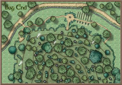
@Ricko Hasche - Thank You for the suggestion I changed the water contours like you suggested and increased the edge fade.
@DaltonSpence - The Island is on a lake so minimal tides if any. The tree line just represents where the trees start to grow beyond the shore line. But thanks for the suggestions. As far as the cave idea goes I'm sure that what ever adventures visit the island they may find a cave if the venture into the shoreline area and if not maybe they will find the secrets of the Temple or the haunted forest.
Updated map posted in gallery.
-
Live Mapping: Classic Fantasy
For the profantasy videos what I do most of the time is play them as background noise and when I hear something that interests me or is some tip I haven't seen or want to use I'll pause it, back it up, watch it, try it out, then go back to the background noise mode. Works really well for me. Written stuff I really like in paper form but now a days they are all PDF's which works. I can blow up the display scale for my old eyes and can do searches but still like paper better as I can have it in front of me while I'll doing it instead of jumping between windows or digging my ipad out to read them on it.
-
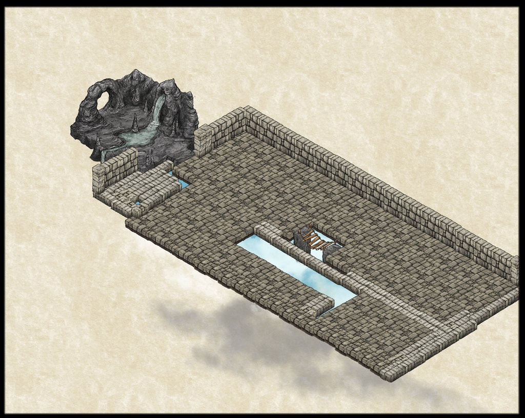
an experiment in iso/perspectives
Are you trying to make it look like water or sky with the clouds?
I changed the Art2 fill as the one you choose is what is blocky and added an blend mode for the sky effect.
Don't know if either of these are what your looking for. Hope this helps.
-
Stop teasing us Ralf !! :)
-
Campaign Cosmographer Insert template
Ok there is something wrong with your file. I was able to insert the png. But I would start over from scratch. Unzip the file below and keep the ,FCW file in the same place as the .png and you should be able to see the drawing. I have placed it on the trace sheet and given it a 50% transparency.
-
Deepzoom images for web display
-
Community Atlas - Berenur - Temple of Aeniar
-
Looking for Symbols of D&D style Dice
I looked and could not find any quickly but if you find a jpg or png image you could follow @EukalyptusNow tutorial (link below) and create your own. It doesn't really take that long to do.
https://forum.profantasy.com/discussion/12954/how-to-create-decorative-symbols-by-tracing
-
Need Style Suggestion for Azeroth (World of Warcarft) Map


