


Wyvern
Wyvern
About
- Username
- Wyvern
- Joined
- Visits
- 3,239
- Last Active
- Roles
- Member
- Points
- 5,517
- Rank
- Cartographer
- Badges
- 24
Latest Images


-
Fireplaces in Interior Colour
Is this from the non-ProFantasy Harn Style of CC3+ mapping developed by Roy Denton? I don't actually have this installed, so can't really help, but if it is, I know a few of our longer-standing Forum contributors do, so can hopefully assist.

-
Community Atlas: Temple of Nidag, Stormwatch, Emerald Crown Forest, Alarius
Thanks Sue! Of course, it's my own fault for making the mapping this complex in the first place, but that doesn't help at the time!
And it's another lovely mapping style, not entirely dissimilar to Ralf's current Hand-drawn Dungeons one, expanded by the new Annual issue, as shown-off in yesterday's livestream. Indeed, I think if that latter style had been available back when I was wondering which to use here, I might have gone with that instead. Now I can try it another time though 😊.

-
[WIP] Cymril City
I'm not familiar with Talislanta or this city, but the few other maps of Cymril I've found online suggest either following a more detailed view of the various internal city blocks (the official map, I think), or a more abstract view, a little like the Watabou technique for showing city blocks, rather than the loose mix of both you have here. Obviously, I don't know what significance the more detailed areas you've shown may have in your own campaign, but I do wonder if this mix is what's not helping you retain the impression of the vastness of the city. Possibly adding some vegetation within and/or without the city - trees especially - might help give a different impression of scale too?
However, what you have now seems pretty impressive in its own right, and also seems to be doing its job well - identifying what's where clearly within the city.

-
Community Atlas: Temple of Nidag, Stormwatch, Emerald Crown Forest, Alarius
First order of business on resuming the mapping was, of course, to shrink that northeastern pair of chambers:
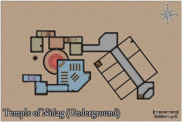
Having also fitted it with the same grey flooring as the connecting areas though, I was having doubts about persisting with that, as it started to feel too much that it was segregating the whole northern segment from the rest, and wasn't really continuing the level-colour idea I'd begun with. So I changed it back to the green tiling, and once the rest of the northern area flooring was completed, that slight mismatch angle in the linking area didn't seem as noticeable (hopefully!):
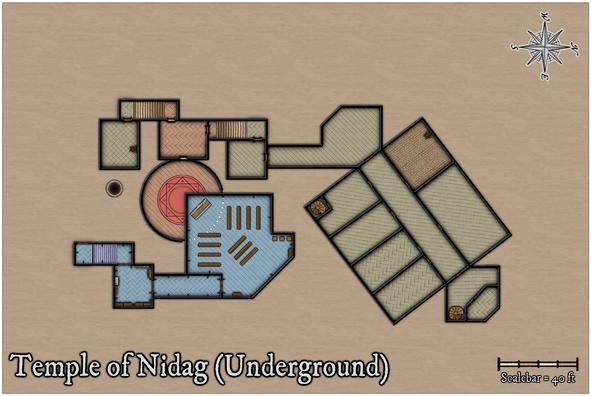
I have made one concession to "reality" here, however, in giving what will be the lower kitchen, and upper kitchen's cellar, a cobbled floor, as hard-wearing and less fancy seemed much the order of the day for such a place.
With the main structural elements complete at last, it was time to start adding the decorative ones, furnishings and the like:
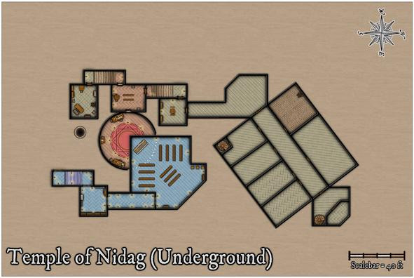
One notable amendment here was adding glow symbols for all the wall torches, and candles in the great circular temple chamber. This makes them easier to identify, and provides some further indication of the difference between the two temples - fewer torches in the lower section. This happened almost by-chance, as I'd missed seeing the glows sooner, given they're at the end of the furniture collection, with the candles, rather than in the wall features catalogue, where the wall torches are. Needing to add candles to the lower temple meant I found them - eventually!
Pressing on into the northern segment, I wanted to add quite a few bits of scenery in the Kitchen/Kitchen Cellar particularly, which included a couple of stoves by the northwest wall, where an unseen flue would link to the surface chimney outlet, a couple more stove-lengths beyond the nearest wall (as a quick check with the otherwise hidden chimney bitmap sheet in the map indicated):
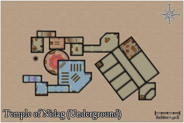
This also made me realise there needed to be a connection between this Kitchen and the adjoining large Dining Hall just to its northeast. I toyed with a serving-hatch notion before opting for a full double doorway - it's a big room, intended to have three tables in it from the Inkwell book-inspired notes, so easy access for staff and foodstuffs would be essential. This res likely won't show that doorway though.
Proceeding on, the Dining Hall was next, where I thought it would be interesting to add some extra floor decoration, and also in the long corridor. In the Inkwell descriptions, both are rather fancily-appointed, so I wanted to hint at that:
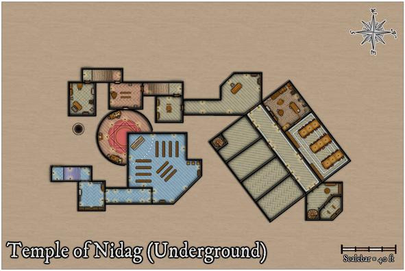
While all I did was add a few pale lines, using the blue water bitmap texture, as it looked quite like pale marble at a sufficiently high res (if not so clear in the narrowness of the final lines), that proved quite tricky, because of the off-axis angle of the whole northern segment. What I did was copy the floors, and realign those copies to the standard grid lines, so I could use the snap grid to draw the decorative lines to the right sizes. The final placement of the new lines had to be done by-eye though, any remaining misalignments of which were something the corridor torches and tables were intended to help disguise!
That turned out to be quite time-consuming, so the rest will have to wait for another day...

-
Long time wannabe
Hi Jeff!
Perhaps the key thing once you're past the initial "how do I do this again?" phase is to make more maps, and keep making them. That way instead of trying to remember how to do too many things every time, a lot will become second nature, mapping will speed up, you'll start to develop your own way of creating maps, and it will stop feeling like a chore.
For some context, I got the program (CC3 then) back in 2013, tried it out and hit a wall with it, because I needed to generate some maps for publication, and wasn't making fast enough progress learning the program to do so. I only really started again in 2016, when I watched a lot of the video tutorials, and worked out what I needed to be doing, after which things became a lot more practical. And I'm still learning now 😁!


-
Community Atlas: Temple of Nidag, Stormwatch, Emerald Crown Forest, Alarius
The PDF notes are at last ready for these maps, and the whole package has been sent off to Remy for the Atlas now, so I can finally change the topic from being a "WIP" to "Finished"! For those interested, the two PDFs are attached below here as well:
For the next maps, I'm on a return visit to Kumarikandam, and somewhere in the Xinxing Region there, in the central-southern part of that continent...
-
A Hand-Drawn Fantasy Map of Jack Vance's Dying Earth
The one downside is you need to remember to have a sea/water sheet below the land sheet you're cutting through, of course! This is an issue if you're doing a landlocked map, and changed the default sea-fill background to a land one during the New Map creation process. Not saying I've done this, but, y'know...😊
I have become very attached to this Hand-Drawn overland style; just something about it that's very appealing overall. I think my next Atlas maps are going to stick with it for a while too.
-
[WIP] Community Atlas - Town of Shessaria
"I've forgotten what I had intended for many of them, so I'll have to wrack my brain to either remember, or come up with new ideas."
Best I can suggest is to keep written notes, and then hope you can remember what they meant when you come back to them however long it may be later! 😊 I look at my notes sometimes and think, "What was that again..."
-
Problems with Ferraris Style Example Maps Crashing - Solved
As I noted on the Forum yesterday, in trying to help resolve a different issue someone was having with the Ferraris Style (from Cartographer's Annual 158), I ran into issues with the program crashing if I tried to open the Vegetation.fsc catalogue. Rather than continue hijacking that topic here, I felt it better to start a new one instead.
The key elements of the problems I had, as extracted from that other topic below here, were all discovered just using the two example maps from that CA issue:
The Village of Greythorne map opens, but if I try to access the vegetation catalogue, the program crashes and auto-closes-down. If I try opening The Ferraris Style Legend.FCW, it starts to open, then crashes and closes too. I've done a full repair reinstall, with exactly the same results.
I have created a new map in the style as a test. If I click to open the vegetation catalogue by the button, or navigate to it using the right-hand symbol pane button, it crashes. If I open the "All" symbols catalogue, it's fine, and I can see and access the vegetation symbols perfectly OK. There seems to be an issue with the Vegetation.FSC file for some reason. I can also navigate to the two example files in the style using the opened new map file OK as well - as long as I don't click the vegetation catalogue button! However, if I try to open the Legend example file directly from the Program Data => etc. option, it crashes after opening.
As our resident Forum expert Sue Daniel was unable to recreate the problem, she suggested I contact PF Tech Support, and having done so, I had a reply from Ralf this morning. He WAS able to reproduce the problem, and sent me a replacement Vegetation.fsc file to test, and that HAS solved the issues, so the program no longer crashes. However, he mentioned too being uncertain as to what was causing it; possibly something to do with one or other macro implemented with the drawing tools.
If others run into the same issue, at least you'll know it can be solved, and can hopefully be resolved in the download file before long as well. Providing this solution hasn't thrown-up another problem I've not spotted yet, at least!
-
Stain Symbols for Maps
I think you missed out the "yet" at the end of, "There's not enough there for an annual - YET!" Sue 😁!

