Wyvern
Wyvern
About
- Username
- Wyvern
- Joined
- Visits
- 3,239
- Last Active
- Roles
- Member
- Points
- 5,517
- Rank
- Cartographer
- Badges
- 24
Latest Images


-
Dungeon Level Symbols - Celtic Revival Room by Room
Naturally 😁🐲!
Things that immediately occur in this regard include having symbols prepared as Sue did in Marine Dungeons 2 as Colour 6 shapes for use as cut-outs, showing her metallic textures beneath as inlaid floors - which would of course allow any other underlying inlay texture to be used as well - such as different coloured stone or wood.
Also, having the symbols available as outlines using the Solid 10 bitmap fill, so they can be used immediately to produce low-relief indented or inscribed designs, as Remy showed back in 2020 in this blog post, but without needing to explode the symbols first.


-
WIP: New Dungeon Commission
Yeah, it can be a real challenge to work on large, complex layouts like this, and I suspect it's easier if you're doing it for yourself, rather than someone else (even if they are paying you for it). Closest I've come using CC3+ is the Dendorlig Hall map for the Atlas, and that took me ten months to finish, so I don't think you've done too badly here!
Prior to that, I'd only done a couple of twelve-level random dungeons by hand, the more recent of which was about thirty years ago, using the original D&D DM's Guide random dungeon design mechanic. Neither of those took anything like so long (the more recent took about five months), but being younger and with fewer commitments/health issues back then, things flowed more smoothly, of course...
Hope your client's as impressed as we are!

-
[WIP] Rise of the Crone-Mother
Yes, the numerous areas of white water seem a bit distracting, and make it harder to tell which elements among those might be more important. There are what seem to be a couple of larger falls on the left-hand "vertical" section of river, but it's not clear currently if these are more or less significant than some of the numerous other white-water clusters elsewhere, for instance.
Not sure if the wider riverbed area in the top left is part of a lake, or just a wider section of the river either. If it's a lake, the bed should probably be a bit deeper and the water flow quieter, so it would probably be less obviously boulder-covered (which works fine for shallow, fast-flowing water otherwise). What seems to be a lot of waterfalls just before (and into?) that wider area though makes it hard to be sure.
The paler shadow does indeed seem fine on the latest drawing of the cross-section through the hag's lair, although the heavy dark glow around the cave wall lines and the exterior, also helps settle it down into the landscape more.
-
How Can I Draw Real-World Places in Campaign Cartographer?
Looking at your PDF sample map, it seems as if what you may need are just hexes with three different fills to duplicate it. Two of those are terrain fills, the other is simply the flat colour representing open terrain (I think). If so, you can easily create those in CC3+, providing you have suitable bitmap fills available (either custom fills from the publisher, or ones you think will be suitable from what CC3+ assets you have available). All you need do is draw a hex using the hexagonal snap grid, and then change its fill style, then copy and paste that hex exactly where you need, again using the snap grid.
The river and coastlines may be trickier, because those are all obviously freehand on your sample map (I've drawn this coastline myself before, although for the ancient period, so I know it's not easy!). However, there is a trace option using CC3+ drawing tools that is able to at least approximately follow strongly-defined lines (that is, lines where there's a good degree of contrast) from a bitmap image (such as a JPG) imported into your CC3+ map. (Note though that this is separate to the Trace command the tools allow you to use when drawing with one in CC3+, because that needs a line already drawn in the CC3+ map to follow, not something on a separate image).
Sue's advice is good if you wanted to draw a map with a lot of different terrain types particularly, but those terrain symbols do seem rather different to your sample map's appearance. Hopefully though, some of our comments here will help point you in the right direction!
[And don't be so modest @mike robel 😁!]


-
Community Atlas: Hopes Lost, Lampoteuo Region, Artemisia
I was going to say this is probably better discussed as a new topic, but I see Royal Scribe has beaten me to it! The snag is here, anything useful will end up muddled-in with the maps and notes for this topic, making it harder for someone else to find in future.


-
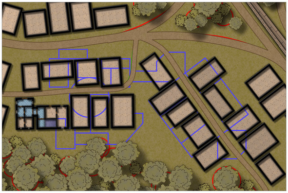
Community Atlas: Temple of Nidag, Stormwatch, Emerald Crown Forest, Alarius
With the style selected, it was time to copy over the linear elements to a new map, after a few further minor changes (mostly to avoid copying the symbols for the town wall again):
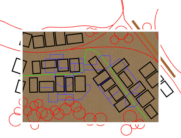
The building walls have already been changed closer to the new map style, although without any sheet effects on at this point. The dungeon design lines have been changed to blue as well. Several copies of this CC3+ drawing were saved, in case of later problems, and so the above and below ground map designs would match.
Next, the roads, town wall and main vegetation were all added for the surface map:
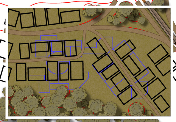
The background bitmap fill has been changed too, as the roads were getting a little lost in the earlier dirt brown default fill. Effects have been tweaked here to outline the pathways better, although the trees and bushes still need a bit more work.
Now, the building outlines have been switched to the WALLS sheet, and the first pine floors added (using angle-by-edge on the flooring polygons, and adjusting the shading's pitch and angle to tone-down the wood-plank colouring, although this felt too dark and similar to the surface cover, which meant further experimentation with several aspects of that pine plank fill to reach this stage:
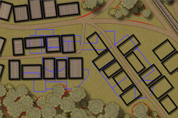
Still not 100% sure about the floor colouring, but I can see what's happening in the buildings now at least (particularly with the BITMAP sheet outlines all hidden). The vegetation has been adjusted by adding a further TREES sheet, and moving some of the taller trees onto it. All still subject to further tweaking, of course, though the tree cover looks less 2D now, at least.
Next began a trickier stage (given virtually none of the mapped wall lines work with the "Ortho" setting), the process of showing what the buildings contain, and how they link to the subterranean features. New floor textures (and a tweaked pine floor one too), wall-lines, doors, windows, stairs, etc., were added, in a limited section only at this stage, which gets us up to date with progress on this map:
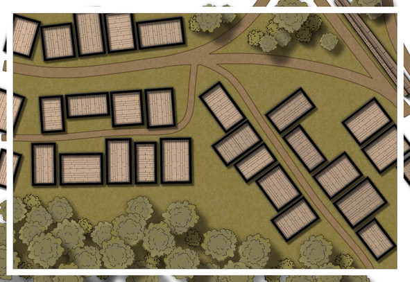
The BITMAP lines are back, so I don't start fitting the stairs and entryways to the wrong properties, (in theory). The two buildings done so far are the main public access points to the underground temple, and as you can see, I've already taken slight liberties with the original Stormwatch map, by connecting two of the surface buildings to better work as such. Lots more to do, however, not least the fact I'd forgotten to copy over where the chimneys are before starting these interiors, so there may be even more tweaking by next time!

-
Live Mapping: Cosmographer System Map *** NEW second attempt ***
Changing/adjusting line styles is one of those things that might be worth demonstrating in a video too, though, as it's one of the trickier elements to adjust and get right quickly, I've found.
And glad to see I didn't jinx tonight's stream by being able to turn up for it live for once 😊!
-
[WIP] The Candle & Kettle Inn in the village of Mapleford
Yes, those dormers come in very handy for hiding unwanted chimneys; done this myself before for a tropical settlement map in the Atlas!
-
Maps failing to export as any image type.
That's just the default option that comes up when you start to save, but it shouldn't be the one you ever choose to use. Just navigate away from that default to save your image files where you need them to be - I use a special set of folders in my Documents folder for ease, for example.
Glad to know you'd got the problem of saving images sorted now at least!
-
Change Default Sea Colour
If you're wanting to darken the entire map, it may be possible to achieve something approximating your second image by setting up the effects as Sue was showing, but using the "Whole drawing" radio button, instead of just for one selected sheet. This can have unwanted consequences, depending on what your original map was like, but it is probably experimenting with at this early stage.