


Wyvern
Wyvern
About
- Username
- Wyvern
- Joined
- Visits
- 3,237
- Last Active
- Roles
- Member
- Points
- 5,515
- Rank
- Cartographer
- Badges
- 24
Latest Images


-
trace map aligning to grid
For scaling, the option I use is the drop-down menu command: Info => Distance. Make sure "Ortho" is active, but that "Snap" is off (buttons at the lower right of the CC3+ window), and zoom-in so you can see the grid squares on your image very clearly.
Then use the Distance command to measure the separation between the horizontal and vertical grid lines for a single square. "Ortho" will ensure you're only able to measure in the true vertical or true horizontal directions. (Although both should be the same, sometimes a minor distortion in the map image, especially if it's been scanned, means they're not exactly equal, and your own by-eye estimates can be a few pixels, or more if you're me, out as well.)
That will give you an overall value in map units (feet or metres for dungeon-scale maps, depending on which option you're mapping with) for the size of the grid squares on your image. If that doesn't match with the size of the snap-grid squares in your CC3+ map, then yes, you'll need to rescale the image.
To do this, use the :CC2SCALE: command (button to the mid-left side of the CC3+ window). Click the button, select the image using one edge of it that's free from other entities in your drawing, then click "Do it".
The Command Line will ask you to pick a scale origin (I often use the bottom left corner of the image, but pick whatever point seems best to you), and then it asks "Scale to" with a couple of further prompts. The easiest option here though, is simply to type in the value of the image's grid size, as just measured, and the size you need it to be, the two values separated by either the multiply or divide keyboard options, as appropriate. For example, if the image's grid is showing as 9.4 feet and it should be 10 feet, use 10/9.4 to make your image larger (if you get it wrong, just use the :CC2UNDO: command!).
Then check using the Distance command again, to see if this is now the correct size (or closer to it - sometimes, because of the decimal places involved, it won't be exact, but close enough is usually good enough, though you may need to adjust your CC3+ drawing in places to accommodate any differences). If it's still some way off, just use the Scale command again.
Good luck and good mapping!


-
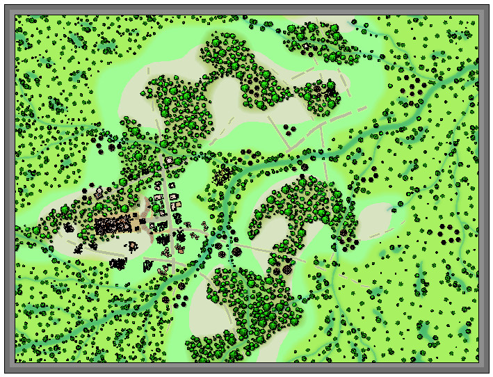
Community Atlas: The Hall of the Seer, Glaciär Kristol, Ezrute
Somehow, I've seemed always to distract myself away from the primary focus of this sort-of Dungeon24 project, which was meant to be simply mapping small, underground complexes for the Atlas regularly and quickly (ha!) through the year. This latest item, the last of the four based on the random rolls from the "Explorer" dice set in the Inkwell Ideas Dungeonmorph Dice range, is a case in point. One little subterranean map has grown into three - a surface region, a settlement and the underground complex. Or "under-ice" complex as it became.
The latter does make it seasonal for northern hemisphere readers here, at least, strange in itself, given the location was determined almost a year ago now, quite randomly. That site was to be in the Glaciär Kristol region, the heart of Nibirum's small, frozen, southern continent of Ezrute:

When I checked the area map, I discovered quite a number of places had already been developed there, mostly towards its periphery. Examining those, none quite fitted what I had in mind for this small complex, which - in-keeping with the other "Explorer" dice-based maps - was to be tied-in with ideas from the Shadowdark RPG. One of the supplementary 'zines published by The Arcane Library for Shadowdark, "Cursed Scroll #3: Midnight Sun", deals with fantasy-Scandinavian-style sea-borne raiders, peoples and places, from which I took the concept of an oracular seer as the base theme for this Dungeonmorph map. And since everyone else had so kindly left the central area of the regional map unexplored, I picked a suitable spot by a crossroads there for this "Hall of the Seer" one:

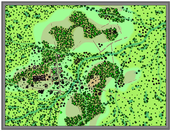
I've reduced one of the effects on the roads in this image, since at the normal Forum resolution, the lesser trails especially simply vanished. That little orange square is six miles per side, and based on how other maps in this region had been tackled, I thought initially simply to place the dungeon map there with no others to zoom-in step by step. However, ideas had developed around this map by then which wouldn't let me alone, hence how I decided on an overland area map, with a small settlement by the underground complex as well.
Partly this development came from the region's location. The Hall map is at roughly 72°S latitude, which puts it well inside Nibirum's Antarctic zone, with constant daytime in midsummer, constant night at midwinter. When I checked the geomagnetic map for Nibirum, I realised this spot also lay almost directly under the midline of the southern polar auroral zone (I've highlighted central Ezrute with an orange ring here):

That means those winter nights aren't always so dark as might be thought, with frequent auroral events to brighten the landscape a little - and spread their magical influence over the surface too, of course.
Looking over the written notes for a couple of the existing maps in this area that had them suggested the possibility of more unusual elements at play nearby, which fed into the base-map designs for all three in my small group, where ideas sparked by one map bounced into the others.
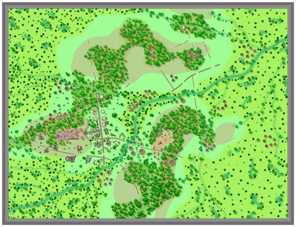
For the first map, covering that six-mile square, there was a mild complication, since I wanted to continue the black-and-white hex-map style I'd used previously in these "Explorer"-design-inspired map sets. Only being hexes, that meant the area was best-served by a map six by seven one-mile hexes in size... Random rolls on tables from "Into the Wild - Omnibus Edition" by Third Kingdom Games, as used previously in the Barrows of the Ferine Magi maps, coupled with some from Shadowdark and Cursed Scroll #3 followed, in setting up the contents for hexes within the area, after which the mapping could proceed:

This time, I decided to let the terrain spill out for another couple of miles beyond the hex-mapped zone, to allow for better context, and also to make the labelling clearer, without cluttering the centrally-mapped part. Could not quite believe the random rolls had generated two ley lines in such a small place, as they're not that common to roll-up. They did fit perfectly with what I had in mind from the extra-magical auroral effects hereabouts, however.
The map description notes have details on what's where, although I deliberately scaled-back on the significance and size of many features, to better suit this little area. There's an old temple with guarded treasures that nobody here knows about in hex 001, minor terrain oddities sprinkled here and there (including a sheltered vale where the mammoths like to hunker-down when the weather turns bad - hex 104 - and where arctic smilodons come a-hunting!), a small frost giant homestead in hex 101, and Seer's Hall Village in hex 204, which enjoys a milder microclimate thanks to being in the fringes of the small Redwoods forest, on whose northern side is the great 200 ft (60 m) ice tree Ylvabrand (hex 302). There are some ancient, worn statues along the Skorra Road in hex 502, commemorating an ancient battle nobody now recalls (which weirdly ended-up randomly in the very spot the road and ley line almost converge), Ice Kraken Hill, where the ley line nexus is (yes, that's a living, albino kraken in an ice hill right there; favoured as a deity by a secretive cult, naturally 😉), a crevasse in hex 605 in whose depths the temperature somehow holds-up around 20°C (70°F) year-round, shunned by the locals because a group of buried Dwarfs there have become undead Ice Zombies or Draugr, who can swim through frozen ground and rock as if it were water (luckily, they can't abide the ley lines), and what seems to be an oval ring of granite menhirs on the line of one ley line in hex 606, that are really upstanding pieces of granite from a ring-shaped surface outcrop in actuality, all of which seemed suitably odd.
Fun times! Village map next.


-
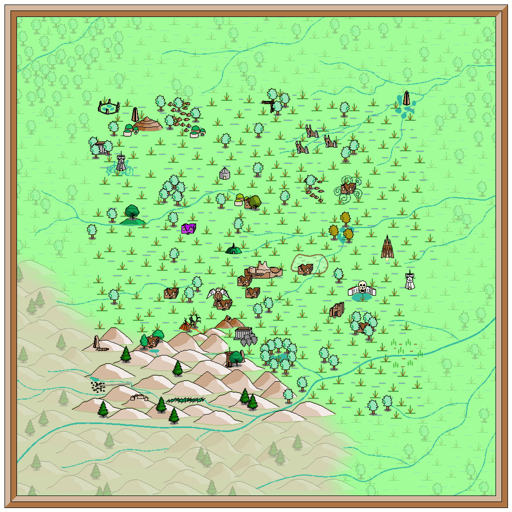
[WIP] Community Atlas: Snakeden Swamp, Lizard Isle, Alarius - Dedicated to JimP
Here we see the first segment of "new" ruins being added, around the originating dice-map segment in the lower centre-left:
It was at about this point I realised it was growing harder to define the road lines, and where the hill contours were, a problem that worsened when the vegetation scatter began to be added around those previously clearer areas. Thus a lengthy spell of experimentation, changing the effects and colouring involved, followed. That in turn needed more features adding elsewhere, using the central section adjoining that already completed, just to make sure everything still worked OK. The results of all that:
Which only brought up a further issue, as it's obvious that the reduced-resolution images are all looking rather too dark and messy now, especially over those ruined structures. So more experimentation followed with higher-res images and some antialiasing, to get to this degree of clarity (same image as above):
Following all of which, there wasn't much time to do more than a few further additions ahead of today's postings, which is where things are currently:
Not too far from completion now, at least, albeit still with the labelling to begin, not to mention those extra streams!


-
[WIP] Community Atlas: Snakeden Swamp, Lizard Isle, Alarius - Dedicated to JimP
That adjustment process mentioned previously ended-up spread over several days, as time wasn't available to try to do everything together otherwise. Thus there's just the one version showing the end product of all that, after some further vegetation and streams had been added. I did at least manage to slip in a couple of streams that simply vanish into the swamps though, instead of continuing off-map, which is something I wanted to do from quite early on.
I'd thought initially that simply the faded outer ring of basic terrain would be sufficient to indicate the fully-mapped central zone. As the mapping proceeded though, it grew more obvious that that wasn't enough, so I'd started thinking of alternatives from quite an early stage, without settling on anything definite (hence the continued absence of anything like this so far). Now, I felt what was needed was a new frame of some kind, yet one which wouldn't have the hard cut-off of the traditional map border, because it was going to go inside the whole map, surrounding that middle square.
What I chose was a heavily rescaled version of one of the bamboo symbols, with separate X and Y axis adjustments, placed as if done quite casually. That though also made the original outer frame redundant, so it was swapped out for a simpler coloured line instead to give this:
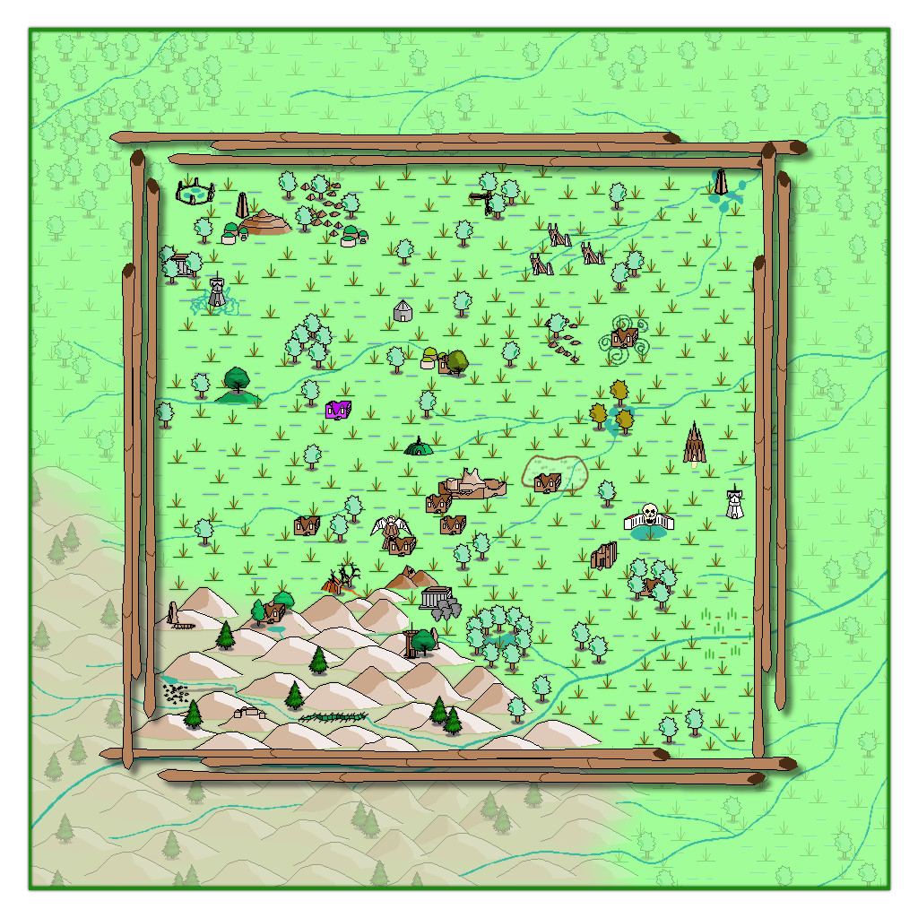
The bamboo poles were placed on the CARTOUCHES sheet, which already had a helpful Drop Shadow effect on it, which with a suitable adjustment, is what we see here. When I began adding labels to the final map version though, I found this new bamboo frame - which already looks a little too awkwardly small and close to the feature markers in places - needed a further slight enlargement. After that a few further changes were needed on the map, to help get a better placement for the labels, and also to correct a few errors in the symbols when checking again with my descriptive notes. Plus some extra embellishments were added to complete the map - as I just couldn't get away without adding a couple of those CA monster symbols after all!
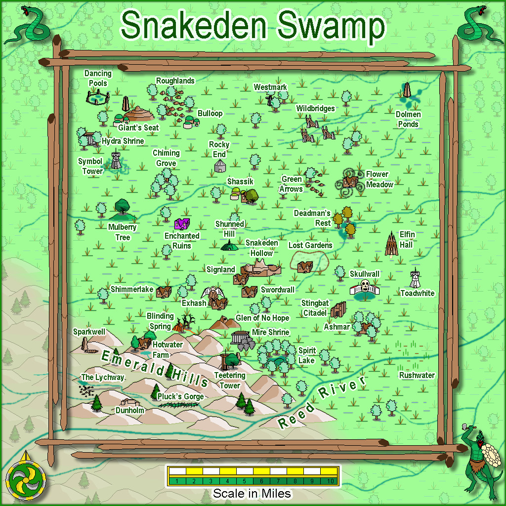
Eventually, there will be text and PDF files on all this for the Atlas version, once I've fully deciphered my hand-scrawled notes, as there are still more maps to prepare in this area, as we zoom-in to Snakeden Hollow and those ruins that started it all...

-
Loopysue Hits 10,000 Posts!
Apropos of nothing much beyond my spotting this, but I see @Loopysue has just achieved the milestone of 10,000 Forum posts here today, the first person to achieve this!
Round of applause for Sue, please!
👏👏👏
😁


-
Community Atlas: Dendorlig Hall - A Sort-Of D23 Dungeon for Nibirum
Day 200 of 2023 seemed an apt moment for a fresh update on this project, so here we are, whole map first:
Further tweaking of labels and minor map features has proceeded apace since my late June update, and the type-up of my notes is in the early part of the University, area 259, currently, while the hand-scrawled preparatory notes are nearing the end of the Manufacturing District, area 293. Still a way from the area 360 end, but well up on the area 200 the day per area idea might have indicated otherwise 😁. (And yes, I STILL haven't got round to adding a symbol key or map title...)
For today's closer look, following last month's minor temptational mention, we have the extracted PDF notes for the less-well-off living areas of the Hall in The Dell, areas 191-224:
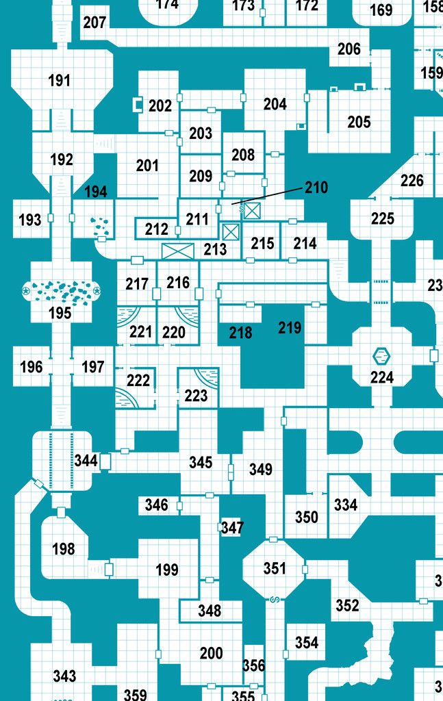
All being well, still more to follow!
Meanwhile elsewhere, most folks I'm aware of who were trying the D23 project seem to have been struggling to continue it of late. Some recent discussions on one of my more active Discords, where D23 was A Thing earlier, have indicated no one there's still persisting unfortunately, although a couple of folks on a separate Discord server were still posting occasional updates into early July at least. Certainly, having the base map and ideas for every area randomly generated in advance, as I did, seems to have helped keep my attention focused at least, so that might be a way to go for anyone contemplating something similar later this year or next, or on a smaller scale, for instance.


-
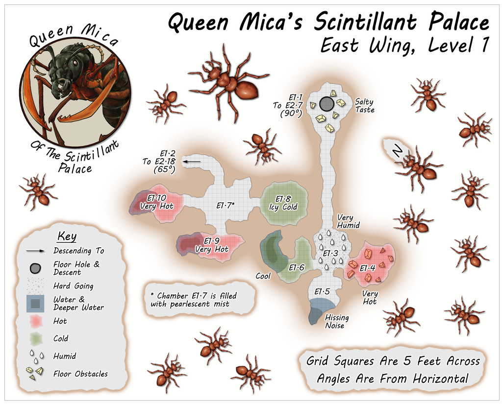
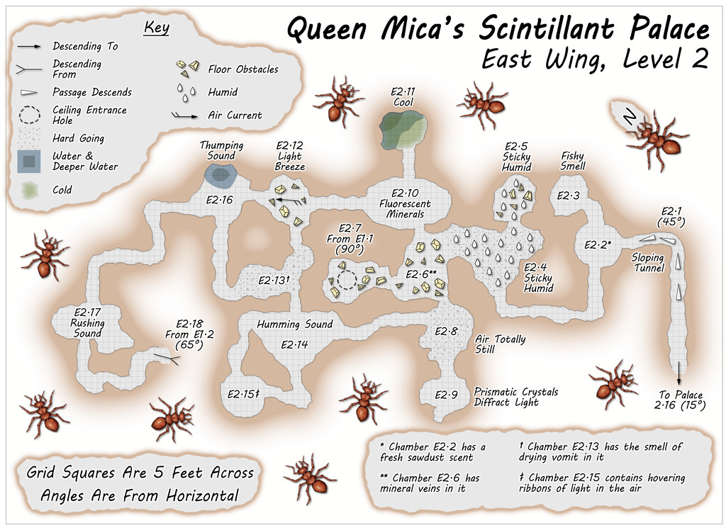
Community Atlas: Queen Mica's Scintillant Palace
The East Wing runs to a mere two vertical Levels by contrast, based on images of a couple of layouts on the DF Discord, combined here with the usual additions and amendments, for all the final plans are much simpler than for either of the preceding pair of Wings, and clearly show their rectilinear original forms rather more. This was though quite deliberate, as part of the concept of the various Wings was to show differences between them, suggesting they could likely be put to different uses, and that this area was probably still largely under construction. Plus it wasn't only the layouts that had been getting figuratively tied in knots with some of the other maps!
Simplicity only counts for so much though, so the entryway from the Palace this time isn't on Level 1, but on the lower Level 2 (which is also a somewhat larger map than the others):
![[Deleted User]](https://secure.gravatar.com/avatar/c75d9a245b74d9c59be0999ea81ca541/?default=https%3A%2F%2Fvanillicon.com%2F92add7f8c954488718110edc4896ad39_200.png&rating=g&size=200)

-
August Mapping Competition - Building Floorplans - Win Prizes
Yes, it's coming up to that time isn't it? So here's my final version of Cloven House, firstly with the secret cave hidden, and then revealed:
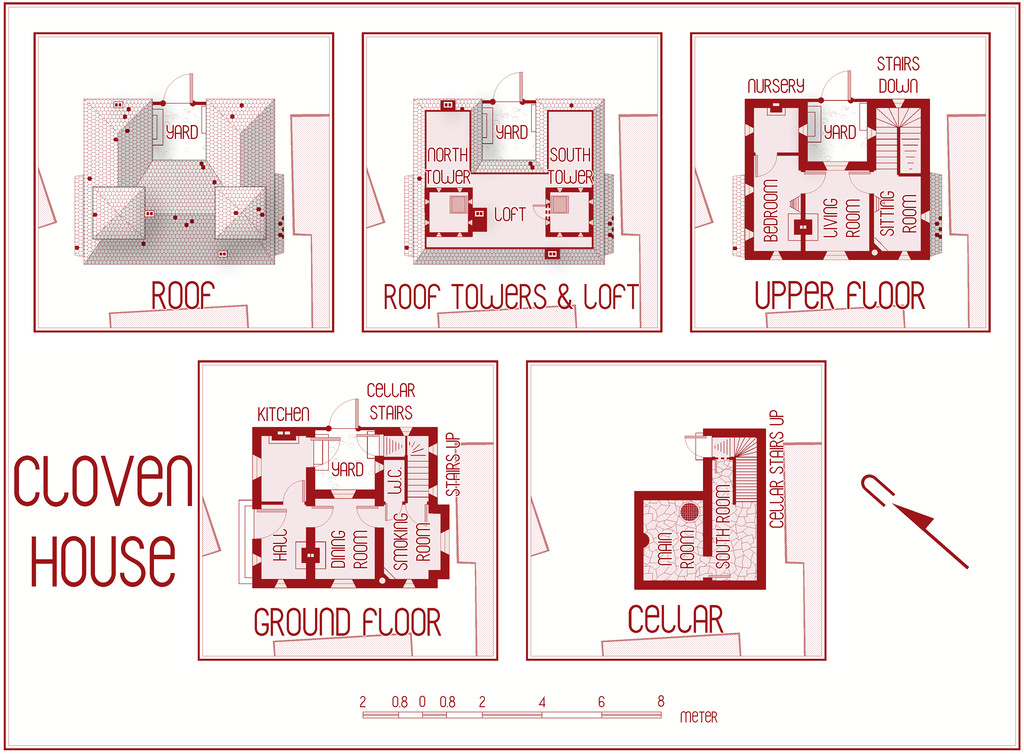
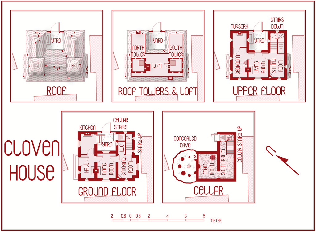
This will be winging its way to Remy for the Atlas shortly, with its text and PDF notes, but in case anyone might be interested, the PDF description is here as well, should anyone wish to be "enlightened" further on the nature of this haunted house:
Worth noting though that a few comments are a trifle "adults only", concerning a couple of the potential apparitions and other ghoulish elements.


-
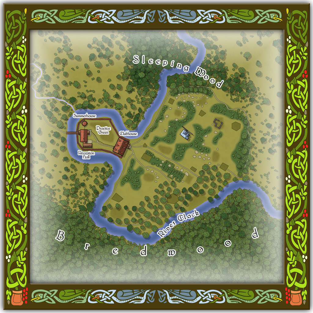
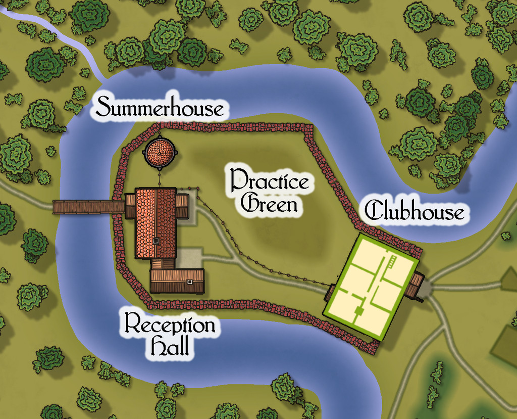
Community Atlas: Embra - Enclosed Places
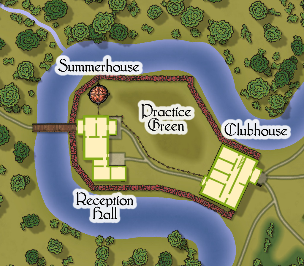
Place 2 is the "famous" Red Picket Golf Course (given Embra is, extremely loosely, derived ultimately from the real city of Edinburgh in Scotland, it proved impossible not to include something relating to golf in these maps of the Faerie city):

This time, there is the option to hide the labels for the course separately from any other map labels, to make the various hazards and obstacles easier to see, although the labelling is essential to work out what is meant to be where in terms of trying to complete the course:
A small key has been provided with this map as well, to better clarify what the recurrent features of the course are meant to be. The PDF and text files for this map describe in detail the Faerie elements of the course, which plays as something like a cross between "real" golf and miniature or crazy golf, with fantasy aspects to-boot. Of course, those descriptions also explain why the course seems both a lot smaller and shorter than real-world golf courses (key word "seems"...), and that it may take players, non-Faerie players especially, days to complete a round of the nine holes. Benefits may accrue for those who do persist and finish the course, however. And they may find their time has not been nearly so wasted as they may have felt while still playing (Faerie time-dilation can work both ways, after all).
There are just a couple of buildings on the map, and these have been provided with internal-layout drawings via a couple more toggles in the Atlas FCW file for the ground floor, and the upper storey of the Clubhouse (only):


-
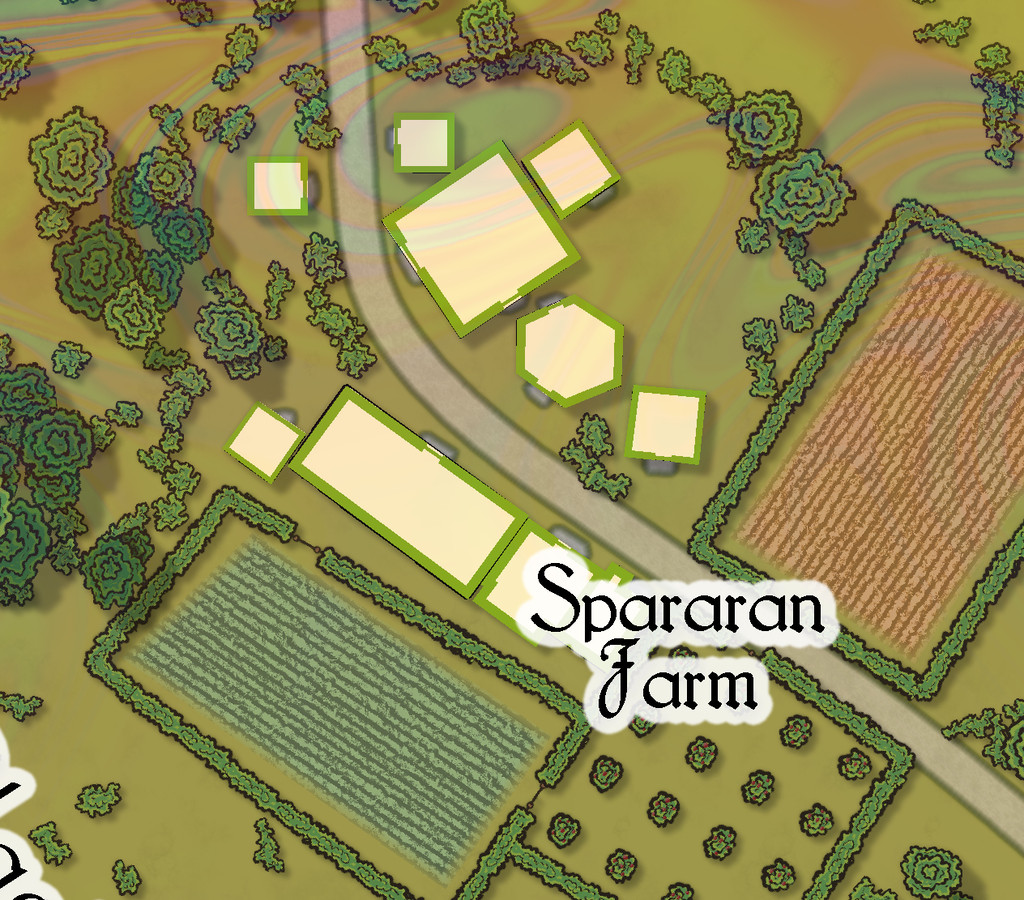
Community Atlas: Embra - Villages
Completing the circuit is Embra - Summerset in the northwest, with its small village of single-storey properties, the River Clack with a bridge (albeit the bridge seems detached from the village rather), both the main Clack Valley tributaries, plus a curiously unlabelled third tributary stream, which seems more significant than the named Silverburn (a deliberate choice!). However, dominating the map's centre are two substantial lakes and a marsh:

Next-up will be the first of Embra city's contents, the Enclosed Places.


