


Wyvern
Wyvern
About
- Username
- Wyvern
- Joined
- Visits
- 3,240
- Last Active
- Roles
- Member
- Points
- 5,519
- Rank
- Cartographer
- Badges
- 24
Latest Images


-
Community Atlas: Embra - Watery Places
The third set of Embra "Places" are the Watery Places of Interest, accessed from the appropriate pie-segment of the "Official Guide" map:
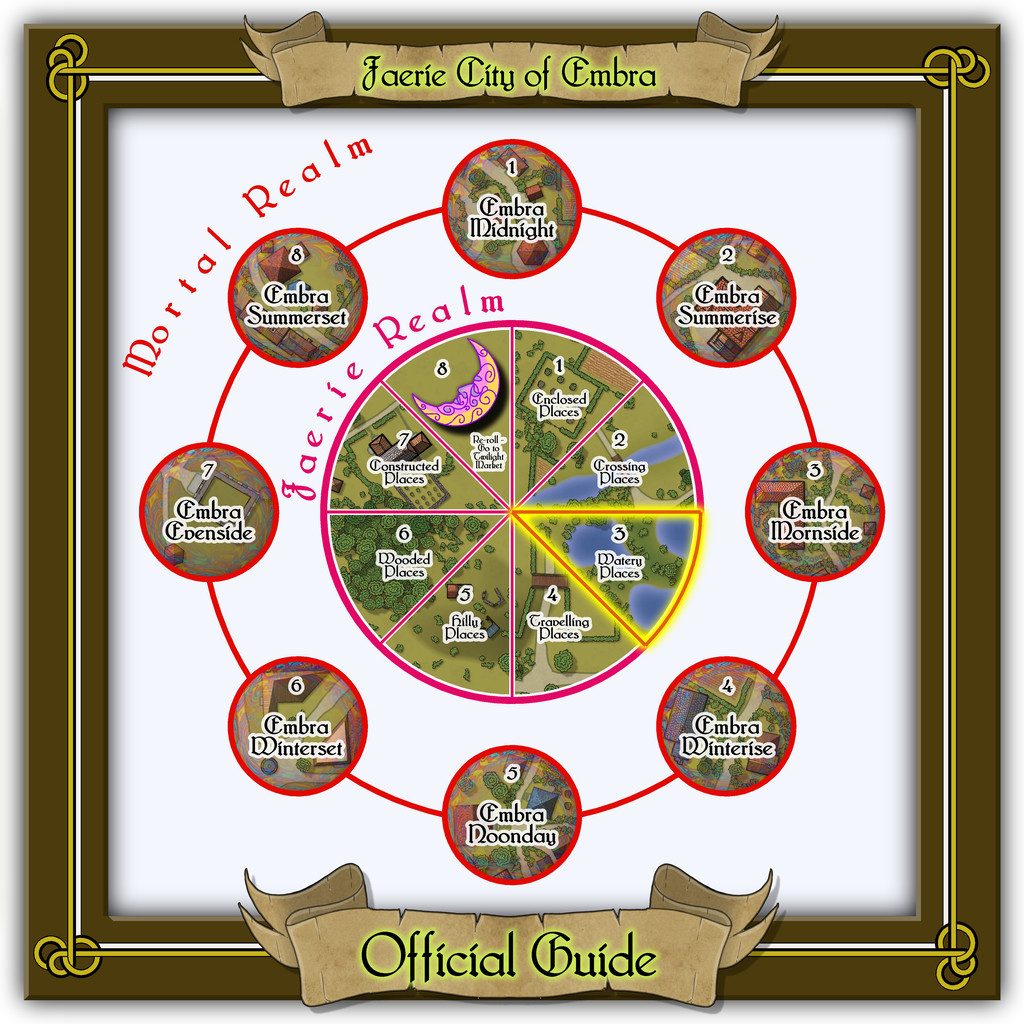
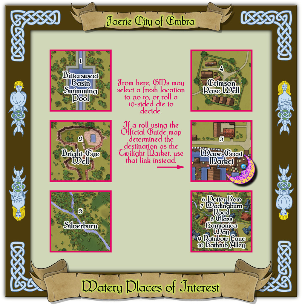
One of the aspects that caught my attention from when I originally bought it in the Dover Clip-Art "Celtic Borders on Layout Grids" hardcopy book, was a page of individual knotwork creatures. Here, I simply couldn't resist the two merfolk to add to the borders for the Watery Places, with a neat little criss-cross design just in the frame's corners. As previously, the link-spaces on this schematic drawing are simply labelled extracts from the actual linked maps, with GM notes. The pattern for the layout here was basically the same as for the first of these Places of Interest maps, the Enclosed Places.

-
Community Atlas: Embra - Hilly Places
Hilly map 5 is Sunset Mound, a rather more characterful hill than some in this set, looking a little like a fish with a small tail, the dominant upland in the area, with a swarm of much smaller, elongated hills clustering nearby:
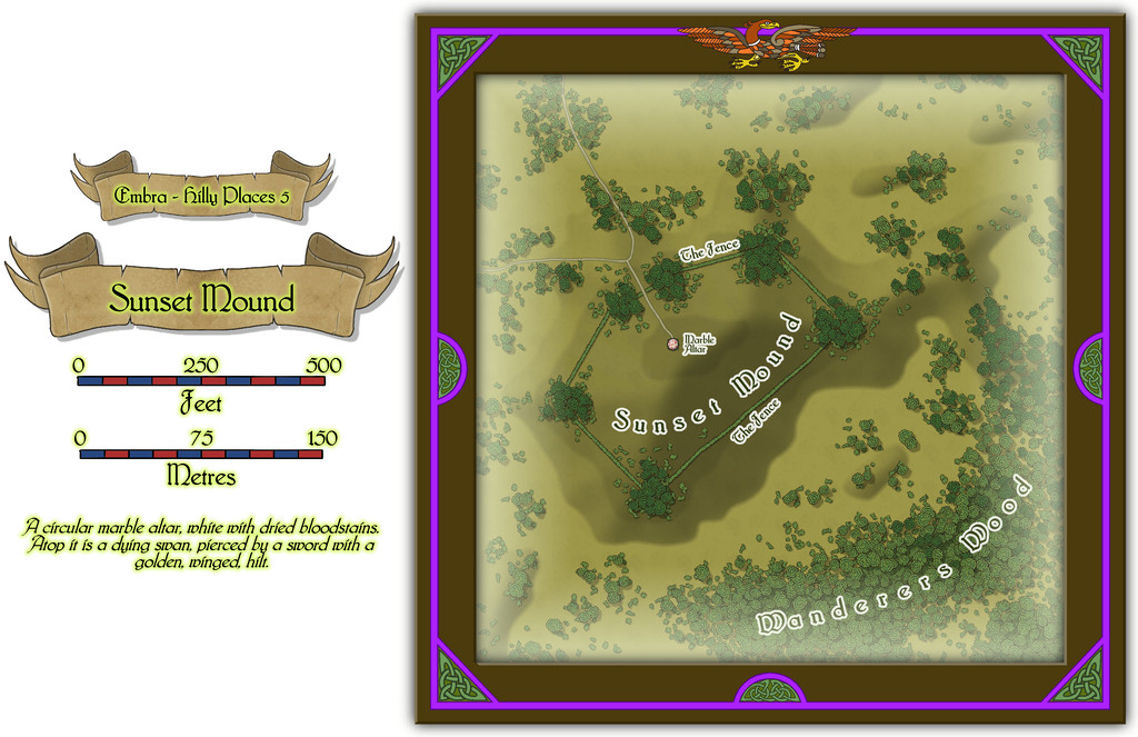
While the shape for The Fence hedge-lines with its dense corner copses was largely determined by the base-map being a castle, most of the interior for that was ignored, replaced instead with a small focal-point derived from the map's accompanying featured text, that bloodstained Altar of the Dying Swan. Why such a huge, empty space surrounds it, is for GMs to expand upon.
![[Deleted User]](https://secure.gravatar.com/avatar/c75d9a245b74d9c59be0999ea81ca541/?default=https%3A%2F%2Fvanillicon.com%2F92add7f8c954488718110edc4896ad39_200.png&rating=g&size=200)
-
Community Atlas: Embra - Hilly Places
Last of the individual Hilly Places is the segment of the Twilight Market for this set, Fair Market:
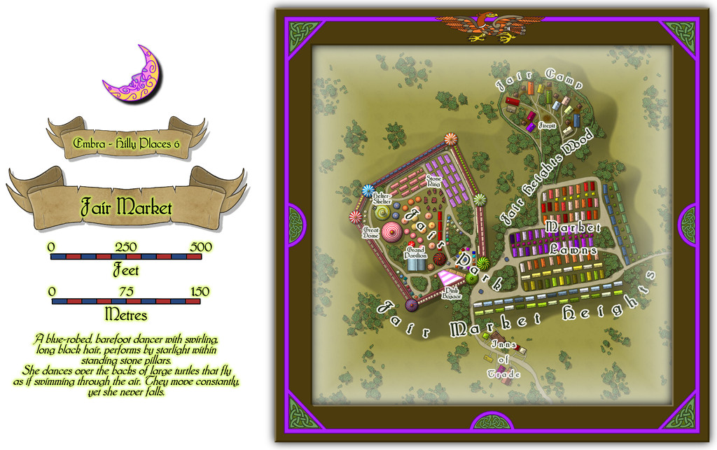
The overall nature of this location was decided well in advance - a hilltop funfair and market, with a living-wagon camp nearby for the funfair folk and some of the traders. And another chance to play "spot the castle" as determined by the original base map! Here though, that allows the easy segregation of the funfair from the main part of the market, though there is a degree of mixing as well.
Most of the features are temporary structures, stalls, tents, etc. Even those "walls" are beautifully-crafted wooden lookalikes, with huge tents at the "turret corners", though stout enough to support an array of stalls built into the lower part of the walls, and more along the upper level's walkway. There is a handful of buildings too, in the Inns of Trade area south of the hill and market proper:
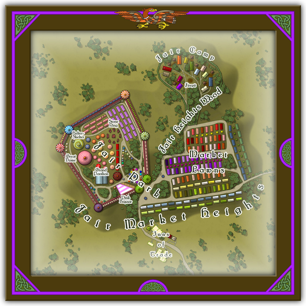
Those varicolor, chimneyless, long, wooden buildings, and the small, square ones, from the CA169 Fantasy Town Annual, are amazingly versatile, I've discovered. Change their sizes a little, and an entire array of market stalls appears as if by magic, especially once some of Sue's City Domes from CA144A are added to the mix for circular tents, stall roofs or awnings, including here for a theatre/performance venue (Great Dome) and a Helter-Skelter tower (with a couple of drawn additions), not to mention that square Grand Pavilion. And the wooden long-houses also work nicely as the living-caravans (with the addition of a drawn, little round chimney top for each), as well as more of the square buildings for the stores/privies alongside the vans in the Camp. Plus there are a few more oddities in the written information to go with this drawing, as normal.
-
Live Mapping: Napoleonic Battles
@mike robel commented:
The contour line in the 1930 annual does not appear to print the hash marks.
It does Mike, but it actually creates a Symbols Along line to do so (assuming you're meaning CA84 1930s Overland Maps). There are detailed instructions on how to set this up in the PDF Mapping Guide that comes with this Annual issue, which is worth carefully reading and following, to get the best from this style.
I don't really understand "map units"
Map Units are simply what CC3+ recognises as the number to be used for the size-ratio of the area of your map. For an overland map, the default is that CC3+ calls 1 Map Unit 1 Mile (or 1 Kilometre if you opt for metric). This has nothing at all to do with what physical size anything will be in whatever final printouts you choose to do.
You simply draw your map to the correct ground scale and size using only Map Units (so ONLY Miles or Kilometres; forget the "inches" thing; forget the "scale ratio" thing - at this stage they're irrelevant), including any hexes, so the hex has the correct scale-size for the map as you're drawing it. If the hex has to represent an area 100 metres from flat side to flat side, say, you can check that the distance across it is exactly 100 metres using the drop-down menu's "Info - Distance" option.
If you're tracing an imported map image, make sure that's correctly scaled in the same way before you start copying it, so the scale CC3+ is using is exactly the same as that on the map image you're copying.
Once you've finished mapping, you can then export an image of whatever size and resolution you need for your final printout using the drop-down menu's "File - Save As..." option. This is the point you can finally switch to thinking about what inch-size you'd like your hexes to be; just don't worry about it before this point. At all!
Simplest way for this is probably to choose one of the "Rectangular section" graphic image export options, PNG or JPG, say, as the dialogue box allows you to set the size of your export by width and height in either pixels (and you can set the pixels per inch or per centimetre at the same time too) or physical dimensions (again, inches or centimetres). Then just select which area you want to export from your CC3+ map. If you've set your snap grid correctly, you can just use that to help draw the area you want.
If you need the hexes to be a specific physical size on the final print graphic, say 1 inch from flat side to flat side, and there are 20 columns of hexes across either the width or height of the map that fit flat-side to flat-side, it's clear you need one of those dimensions to be 20 inches. The other has to fit the hex width, which is usually around 1.15 times the flat-flat size, thus about 1.15 inches per hex, times however many columns/rows of hexes in the area you need the graphic to be.
Remember, what you're drawing in CC3+ is a map, NOT a hex-board printable for gaming on. Only the final exported graphic - which you can always resize precisely in a separate graphics-manipulation program, if you're happier using that - is where you need to worry about what inch-size what feature is meant to be.

-
Community Atlas: Embra - Crossing Places
Not a problem, Remy. There are 58 of mine in this set alone, and I know I tend to add extra complexities too.
In addition to all this (behind the scenes), we ran into a problem with a rogue fcw32.pal file I didn't even know I had, so some of the colours on the initial maps from the Embra set entered into the Atlas were wrong, and those files had to be changed, aside from everything else...
On the upside, I see we're rapidly closing-in on 750 Atlas maps now, and I'd guess once all the oustanding ones have been added, we'll likely surpass the 800 mark.
Might need to start thinking of that 1000-map contest shortly at this rate 😉
-
Live Mapping: Modern Atlas
🌩️Thunderstorms permitting, anyway 😉⚡️

-
Panzer sample thread
Very sorry to hear that @Lillhans .
Hope you can get something resolved and back to mapping (and AFV designing, naturally) as soon as possible.

-
Community Atlas - Forlorn Archipelago - Fisher Isle, several villages and surrounding areas
What I should have done, was start a Marine 2 dungeon map, then added DD3 Color dungeon items.
I did the opposite. Whew. Big mistake.
Live & learn, Jim...
So, should I start a Marine 2 dungeon, and insert the below fcw into it ?
You might find it useful to see this PF blog posting from a few years ago. Although it's dealing with creating battlemaps from a larger dungeon map, it does have relevance for what you've been trying to do here, I think. Only chanced-upon it yesterday myself, because one of the author's random-design products was the "Deal of the Day" on DriveThru RPG, and I was hunting around for more information, because he's made very extensive use of CC3+ in mapping for his products!
-
My First Attempt at Village Scale...
Beyond the Keep Tower shadow issues, I'd suggest adding some shadow effects to all the wall towers, as they also look very flat right now.
Appreciating you may be tied to whatever the publisher wants, but you might want to add further smaller towers where the two walls join, or add crenelations along both sides of that main north wall after where the two link (on the "outer" side from the enclosed part). The crenellated wall ending at the thicker north wall just looks odd right now, because it leaves the south side of that main wall undefended.
If the brown roads/paths are just dirt, I'd suggest making all their junctions less precise (so not just where that "castle path" meets the main paved road), as unless something blocks them, folks will always cut the corner at such places, which will wear away the grass very quickly. Indeed, you might even want to consider redrawing the dirt paths as smooth polygons, rather than lines (or just add a few polygons to break up the precise edges of the lines in places; as long as they're all on the same Sheet, the Effects will blend the two into one). Unless there are obstacles, dirt paths end up getting broader and (loosely) straighter over time with use.

-
Community Atlas - Serkbergen / Peredur
Shame there aren't any descriptions to go with these, though I appreciate that's not an essential requirement for the Atlas. Quite a lot don't seem to have any scale or north indicator though, of which the scale issue seems more of a problem, especially for anyone who'd only be using the image versions of the maps.


