


Wyvern
Wyvern
About
- Username
- Wyvern
- Joined
- Visits
- 3,239
- Last Active
- Roles
- Member
- Points
- 5,519
- Rank
- Cartographer
- Badges
- 24
Latest Images


-
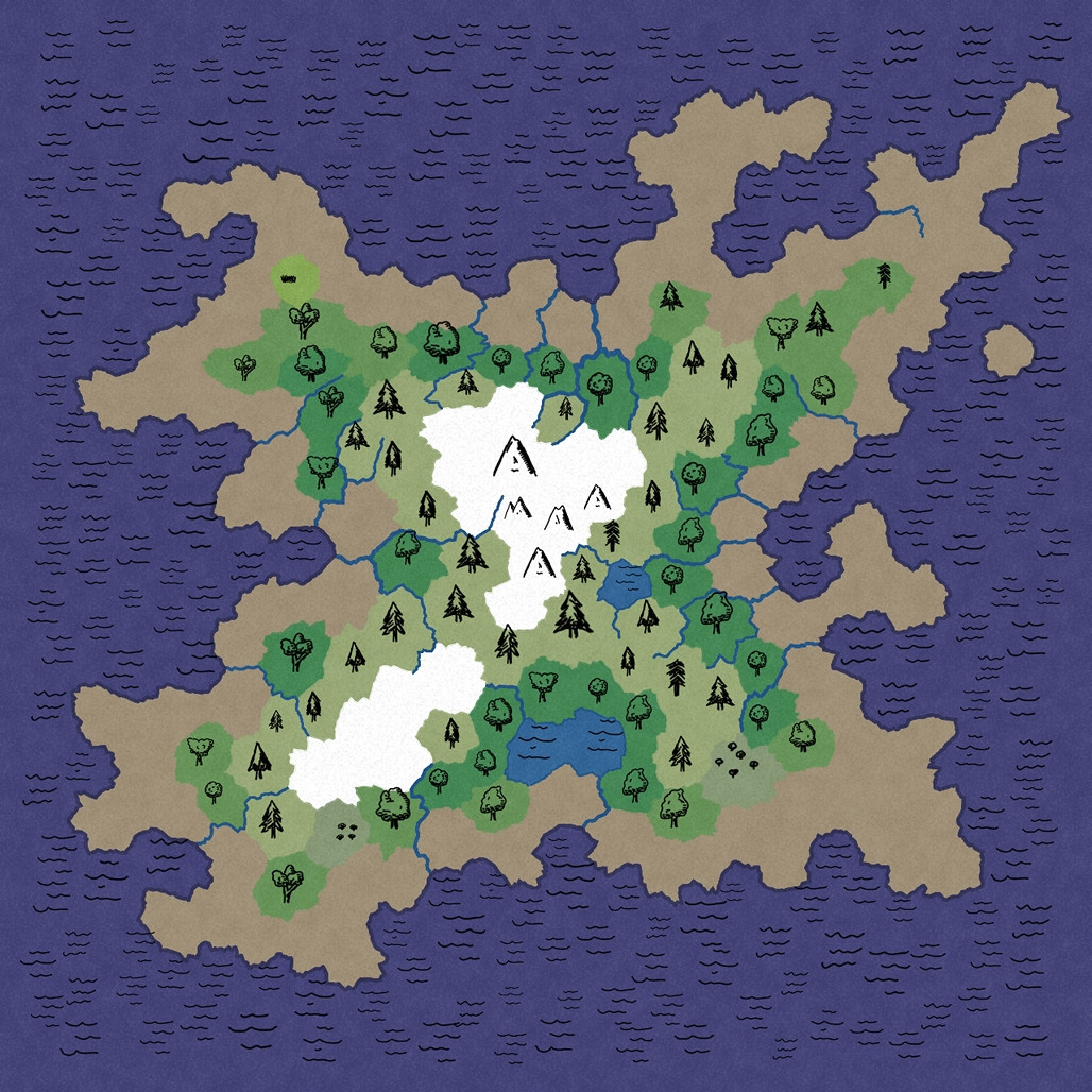
Britannia (Parchment World)
This is a very impressive and detailed map (speaking as someone who's mapped various parts of these same islands at various scales over many years)!
Appreciate this is for game use rather than historical precision. However, the lines of both the Antonine and Hadrian Walls are a little off their actual ones - Hadrian's Wall follows along not far from the north bank of the Tyne in its later eastern stages, and ends at Wallsend (surprise!) on the north bank more or less opposite Jarrow on the south bank (at this scale), for instance. Not sure how important this may be for your purposes though 😊.
Seeing what else has been labelled, it may be worth thinking of adding some names for the more important old Roman roads, as some at least were still in use by the c.560s CE and later (some major roads still follow their lines today), and a few of the surviving names seem to have their origins in the Old English/Anglo-Saxon language.


-
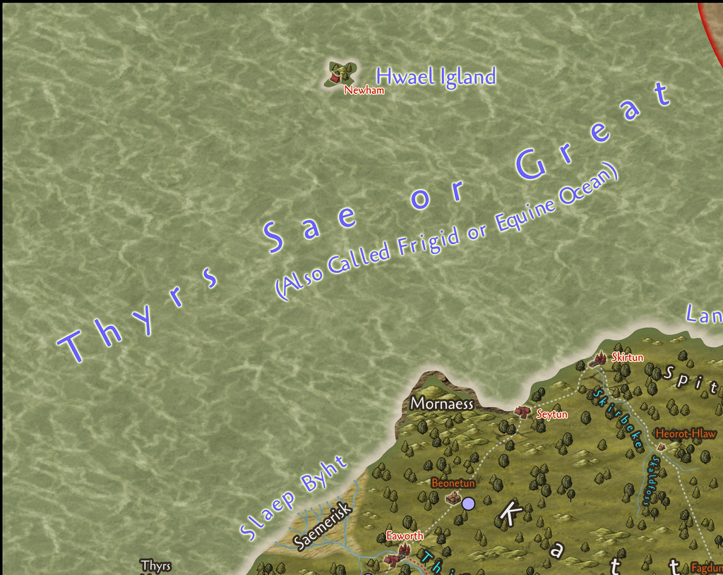
Community Atlas: Errynor Map 33 - Hwael Igland
Well, it's already in the Atlas, but these notes maybe add something regarding the creation process, and some of the problems encountered in preparing it. So, as mentioned in the Siolforland map Forum topic, I wanted to add an additional map to that main one, for the little offshore isle of Hwael Igland, although this is actually the largest of my planned islands off Errynor. During the original planning for this whole Errynor mapping project some years ago, I'd brought together a number of randomly-generated ideas, including a series of base-maps for the scatter of tiny islands in Errynor's seas from the island generator on the Red Blob Games website. The base chosen here was:
This is only one of the map views the site generates, showing just the chief biomes, with symbols and colour-coding. Other views provide more detail on the physical terrain. The rough-edged, sort-of hexagonal pattern the random system uses to create the map is naturally quite obvious here, although personally, this is quite appealing anyway, and produces some interesting coastal shapes especially. The random maps have no scale illustrated, so adjusting them to whatever size is needed is very straightforward, and here largely revolved around calling the mountains "hills", and the rivers "streams".
When generating the random island base maps, I had the overall shape for each in mind from my original hand-sketched Errynor maps, and simply tried different random options until I arrived at a suitably-shaped island for each. In this case, I'd decided this shape fitted what I'd already sketched, but only once it was inverted, as suggested by the final Siolforland drawing, even if the similarity is a bit vague:
Of course, the random base map is very incomplete, given the final Island needed at least one settlement on it, and for an Atlas map, it also needed further points of interest adding. So a series of fresh random rolls on my small-scale-map-feature tables were made, after which a fresh evaluation of the landscape was carried out, and some adjustments made, including factoring-in considerations from the Siolforland mapping (such as the already-decided height of the highest peak on the Island). Then the CC3+ mapping could begin.
As normal, I'd identified several possible mapping styles to use. Here, I was picking from some of the simpler black-and-white styles, suitable for the relatively small area involved. Partly this was a reaction against having been mapping purely in colour for some considerable time up to this point (not simply with my Errynor mapping), and partly a reaction to having mapped two Errynor islands previously in colour, Zariq and Zaraq on Errynor Map 01. However, the style I eventually settled upon, "Treasure Maps" from CA58 in 2011, was one I have used before in Errynor, when mapping the seafloor surroundings of the Kachayan settlements at Shark Bridge in the deep ocean of Map 01. On that occasion though, I'd really used little more than a couple of symbols, the backdrop parchment fill and font from the Annual issue, and had drawn my own not-symbol vector-shape objects for use there instead. This time, I was using the style more as it was meant to be, for a sea-surface island:
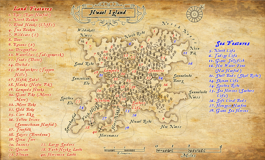
Once drawn, as soon as I started adding the labels, it became very obvious space wouldn't allow them all to be fitted on the map, so the background rapidly had to expand to fit the points-of-interest listings, to which I added a further minor complication by using colour-codings for the features on land, and those around the coast and in the sea, while retaining just the one numerical sequence! And then in the PDF description, I added-in the named places, breaking-up that sequence still further, which was an interesting experiment in producing a non-alphanumeric index...
Part of the reason I'd chosen this mapping style was because it allows the drawing of cliffs, as well as providing other landform symbols. The perceptive will, however, notice there aren't any cliffs drawn on the final map. Unfortunately, I soon discovered that at this map's size, the cliffs looked unworkably clumsy, as the drawing tool for them uses a non-scalable hatch fill, and moreover it sometimes reacts very badly to drawn polygons containing strong convex and concave curves (such as when trying to illustrate that cliffs continue right around a narrow peninsula, or a coastline with substantial indentations). In such cases, it can force part of the hatch fill beyond the drawn borders, so that the land looks like it's ALL cliffs in places, not just at the coasts. Even drawing the cliffs in small segments didn't work, because sometimes there was scarcely anything visible to show there were meant to be cliffs within the polygon area, and others where the polygon was almost all solid black fill. So I settled for relying on just descriptions in the PDF for where the cliffs lie (there are meant to be at least low cliffs around most of the Island's shores, and a couple of places where they're inland too).
There's a similar issue with the hatch fills for the marshes and the "grassy-look" texture on the hills, though luckily the hill symbols don't rely on that hatch fill, as they're scalable objects in their own right, as normal, while there's a series of individual marshland symbols in the Annual as well (which I was particularly relieved to find after trying the marsh drawing tool, with similar problems to the cliffs). I toyed briefly with drawing suitable shapes into separate polygons for the cliffs I wanted, only to veto that as far too time-consuming in this case. I assume part of this problem stems from the fact the style's intended to be used for maps around 20-25 miles or so across (as the PDF mapping guide suggests), whereas Hwael Igland fits very easily within a 10-mile square.
Despite this, I was pleased with how the final map had worked out, and to have had the chance to play around with a style I'd barely touched previously.


-
Live Mapping: Herwin Wielink Overland
I've done a lot of mapping with this style (and indeed I currently am again), largely because I like it so much. I picked it as the basis for the 40 maps in my ongoing Errynor mapping project for the Community Atlas, after all! It'll be nice to see it get some live-streaming love and attention though!
I find it actually has quite a good range of symbols, more so than some styles, which, in combination with the range of textured fill options and colours, is what makes it so attractive for me.
Of course all styles could always do with more symbols - as many of us have commented here before 😁
[And I think we all also know in most cases, that's not going to happen!]


-
The Creepy Crypt project
Dee-licious! 🍳
-
Panzer sample thread
So far as I recall from modelling the 8- and 6-rad armoured cars (i.e. also from period images and information), the aerials were fixed in position, and at a height above the turrets all the time. These are the early-war "bedstead" frame aerial types, not the later war smaller "star antennae" which were retrofitted to some models, incidentally.
Oh - and belated congratulations on your ascension to Master Mapper status @Lillhans ! Very well done!

-
Mr Tumnus’ cave
And congratulations too on having your "Horse & His Boy" map selected by Ralf as one of February's Maps of the Month on the ProFantasy blog!

-
Community Atlas: Embra - Enclosed Places
Enclosed Place of Interest 3 is the Floating Dale Park:
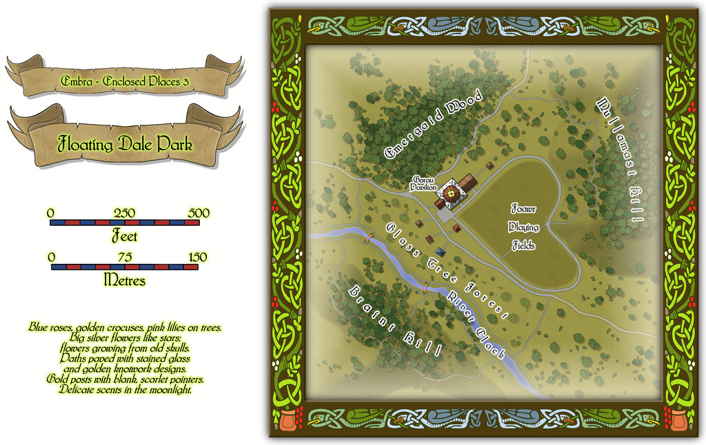
This can be used as a typical real-world park, with opportunities to wander around, or play outdoor games on the central Playing Fields, whose unusual shape may call to mind that Faerie outdoor games and sports may not be quite those familiar from the Mortal Realm.
There are a handful of surface-level buildings scattered around the map's centre, as one of the map toggles will reveal:

These include the Pavilion, where equipment for playing sports and games is available, as well as a restaurant in the central octagon beneath the building's dome. And yes, some of the vegetation is actually intended to be of living glass in Glass Tree Forest. And again yes, those ARE bridges made from rainbows over the River Clack. As ever, the text and PDF files will explain a little more about both facets, and others, from this map. In case this seems not very "Enclosed", there ARE boundaries to the Park which are deliberately less obvious than some.
![[Deleted User]](https://secure.gravatar.com/avatar/c75d9a245b74d9c59be0999ea81ca541/?default=https%3A%2F%2Fvanillicon.com%2F92add7f8c954488718110edc4896ad39_200.png&rating=g&size=200)
-
WIP: A Hidden Vault
Not hard to guess what the party chose to do...
Quietly left without touching anything and went back to their knitting at home? 😉😁

-
Live Mapping: Fantasy Hand-drawn Part 2
Just finished catching-up with today's livestream on replay. Didn't manage to get along in time for it, unfortunately.
I've been mapping a lot with this style over the past week, beyond my Wyvern's Wood map earlier, and as Ralf asked for extra symbol suggestions, these are things that occurred to me that I either needed (so had to hunt for them elsewhere) or felt would be useful as possibilities along the way.
- The style really needs some ruins markers to accompany the array of settlement/structure options.
- A non-Oriental temple/shrine.
- A shipwreck.
- A whirlpool.
- Options for undersea features more generally would be good - such as settlement markers for merfolk. If there were some ordinary flat-topped hills, they'd work as seamounts too, for instance, but coral reefs would be a nice addition, and although the conifers can be used in a pinch, some "genuine" giant kelp would be handy.
- The creature sketches are good now, but it would be useful to have more. Such as, from the "cave art" concept, bears, lions (how can there not be a big cat - yet?!), bison, humanoids (a varicolor option for these could work for different types of fantasy humanoids; actually, varicolor options for all would be useful). Not sure if boars would be needed, given I just used the wolves as boars earlier (and deer for nomadic centaurs)! The sketchy nature of these really works well, so one design will often work for multiple creature types.
- Might be interesting to have a skeleton option in the creature sketches as well. And maybe a dragon or two (one of which would obviously be a wyvern 😉), perhaps a hydra and a roc (which would work as an eagle or any other larger bird of prey). And giant ants...
- Some more rustic settlement designs - including a single hut for those witches, warlocks and hags to lurk in - and some nomadic-tent/campsite options.
- On the terrain side, something to represent farmland would be useful.
I'm sure others will come up with far more as well!

-
Community Atlas: Embra - Hilly Places
Thanks very much Sue!
I wanted the cliffs here to look different to yours, which I'd already decided to use for the red sandstone types at Embra, as the Palace Heights ones are meant to be a harder, volcanic type of rock. Actually, a Faerie type of volcanic rock, which has different properties and abilities to "ordinary" volcanic rock, so I also wanted the forms here to act as a reminder that something a little different to normal was involved. I also used a similar style of cliff drawing in one of the Crossing Places Streets - the Rocky Vale under Seafield Road there, again because the Vale is a weird place that can't be reached, another reminder of something odd happening there.

