


Wyvern
Wyvern
About
- Username
- Wyvern
- Joined
- Visits
- 3,239
- Last Active
- Roles
- Member
- Points
- 5,519
- Rank
- Cartographer
- Badges
- 24
Latest Images


-
Community Atlas: Dendorlig Hall - A Sort-Of D23 Dungeon for Nibirum
Thanks for all the comments, "likes", and so forth folks! Much appreciated.
"Dendorlig Hall" it is then (and topic title amended to reflect the fact)! Please reserve it for me in the Atlas @Monsen, if not already!
@roflo1 - Yours is another fun dungeon generator, and one that for some obscure reason hadn't come up among my Google searches previously. Looking through the list you have there (for random dungeons only), I note several links are broken now, and one of the sites that still exists, Dizzy Dragon's, isn't an "https" site, which sometimes get flagged or blocked by certain browsers/browser settings now. Might be worth reviewing and amending the whole page now?
No thanks, Julian! I prefer to set my own challenges! But this might be an interesting project for another mapper here?
@Loopysue - Maybe just one of the smaller twelve-room dungeons might be a possibility for you though? Might even fit to your creation schedule if there's a fresh dungeon style coming up later this year that will need a sample map preparing, say...
Thanks for the comment re Scott's "Darklands" map too, Remy. I've been checking over the maps and descriptions for the Malajuri area since I last noted anything here, and as you wrote, couldn't find anything suggesting direct links to the surface world, though there is a somewhat "compartmentalised" layout to my blue dungeon map already, which could suggest a possible faction or two from the Darklands might have established an outpost or two here. I'll have to think about this further!


-
Birdseye Continental - style development thread
I don't think we got as far as fossils. Shame, really. I'm very interested in Palaeontology, and binge watch hours and hours of video documentaries relating to that.
So we can expect to see more fossils in Sue-designed dungeon styles in future then 😉?

-
An alternate way to draw elevation changes
It is surprising what you can achieve with lines of very limited thickness, setting them up on their own sheet with their own effects, in CC3+. I've done this quite a few times when I needed a different shadow effect, for instance (such as when you don't always want the shadow to reflect the edge of the polygon you've drawn - just "hide" the line under or exactly along the edge of the poly). I tend not to use zero-width lines though, as they can cause their own problems sometimes (just make use of the decimal places to thin down the line). Transparency acne notwithstanding (yes, it too can be a real pain)!

-
How can I make my grid overlay black on some backgrounds and white on others?
You may find too that increasing the line thickness of the grid may help, regardless of what colour you choose for it. The automatic grid creates zero-width lines, which can simply vanish at some image output resolutions.
You also don't have to create a single grid across the entire map. As long as you use the same snap grid point to start your grid's placement, you can have several smaller grids wherever you choose, and they'll all line up OK. That way, you can have different coloured grids on the same sheet (though of course, that may not work for all, dependent on what effects you have on that sheet). Or you can set them up on different sheets to get different effects per grid colour.
-
The Creepy Crypt project
Dee-licious! 🍳

-
Panzer sample thread
So far as I recall from modelling the 8- and 6-rad armoured cars (i.e. also from period images and information), the aerials were fixed in position, and at a height above the turrets all the time. These are the early-war "bedstead" frame aerial types, not the later war smaller "star antennae" which were retrofitted to some models, incidentally.
Oh - and belated congratulations on your ascension to Master Mapper status @Lillhans ! Very well done!

-
[WIP] Community Atlas: Snakeden Swamp, Lizard Isle, Alarius - Dedicated to JimP
So finally, these maps have now been sent of to Remy for inclusion in the Atlas. Nothing much to add to what was last mentioned here about them, although for those interested, the three PDF files of notes for the set are here:

-
Free symbol pack - Dungeon scale connecting hedges
What's caught my eye is how similar these hedges look at the overall scale-look of Sue's sample map here, to the effect you can get using the hedge symbols in the CA169 Fantasy Town style pack. However, those aren't connecting symbols, so you have to do it all by hand, one bit of hedge at a time!
(And before you ask, yes, I already did this in my Hydras In Smoke Maze for the city of Embra in the Community Atlas 😁)
-
Community Atlas: Embra - Enclosed Places
Enclosed Place of Interest 3 is the Floating Dale Park:
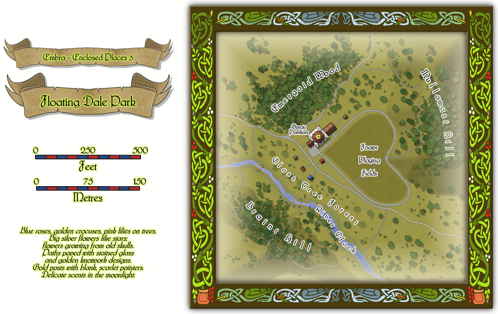
This can be used as a typical real-world park, with opportunities to wander around, or play outdoor games on the central Playing Fields, whose unusual shape may call to mind that Faerie outdoor games and sports may not be quite those familiar from the Mortal Realm.
There are a handful of surface-level buildings scattered around the map's centre, as one of the map toggles will reveal:

These include the Pavilion, where equipment for playing sports and games is available, as well as a restaurant in the central octagon beneath the building's dome. And yes, some of the vegetation is actually intended to be of living glass in Glass Tree Forest. And again yes, those ARE bridges made from rainbows over the River Clack. As ever, the text and PDF files will explain a little more about both facets, and others, from this map. In case this seems not very "Enclosed", there ARE boundaries to the Park which are deliberately less obvious than some.
![[Deleted User]](https://secure.gravatar.com/avatar/c75d9a245b74d9c59be0999ea81ca541/?default=https%3A%2F%2Fvanillicon.com%2F92add7f8c954488718110edc4896ad39_200.png&rating=g&size=200)
-
Floor Question
This style follows the original Hobbs's Architecture book from 1876 (a free PDF of which comes with this Annual issue), and that indeed just leaves gaps for the doorways, which the style mimics.
For advice on using this issue, or indeed any Annual issues, see the accompanying PDF Mapping Guide. You can find this Guide, and any sample maps, images or other associated information files, wherever you've told the program to install the Annuals. On a standard default Windows installation, this will be in the C:\ProgramData\Profantasy\CC3Plus\Annual folder, after which you need just look for either the number or the name (the first year's Annuals only have a number) to find the correct sub-folder with all those details.
If you can't find, or remember, the issue you're after, check Sue's image wall of all the Annuals elsewhere on the Forum here, which covers up to the middle of 2o24 currently.


