


Wyvern
Wyvern
About
- Username
- Wyvern
- Joined
- Visits
- 3,238
- Last Active
- Roles
- Member
- Points
- 5,517
- Rank
- Cartographer
- Badges
- 24
Latest Images


-
Community Atlas: Embra - Constructed Places
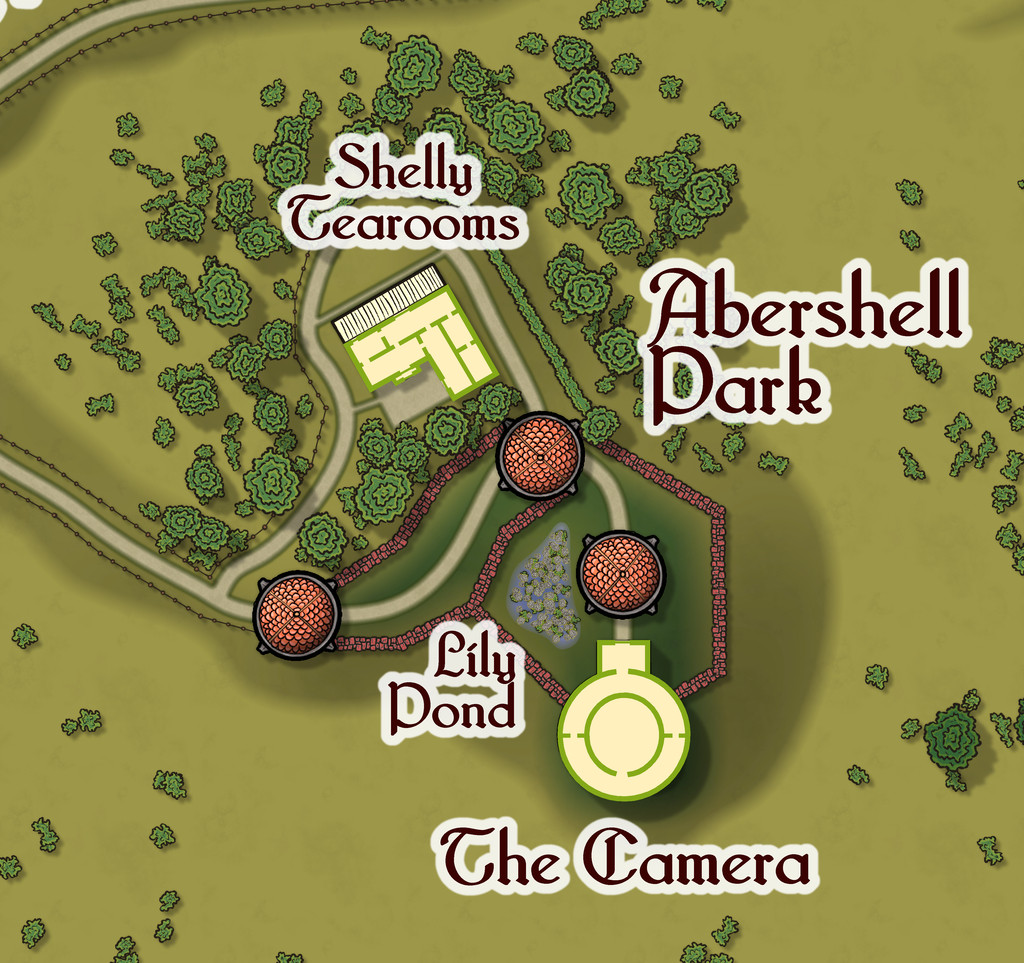
The third Constructed Place is the Abershell Camera Obscura, set in an apparently unlikely open zone, more suited to an observatory, one might think:
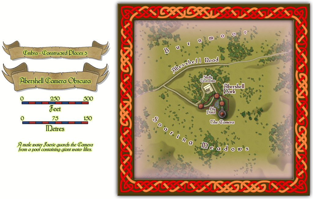
As ever, despite the random selection of base-maps for this series of drawings, the choice of what went where was solely my own, all of which decisions were made with the aim of providing additional puzzles for anyone trying to explore the city, when working to ordinary (i.e. non-Faerie) norms.
There are just two actual buildings here; the rest are open domes over the paths. Oh, and for those who might be interested, the Shelly Tearooms are famous for their exquisite range of ice-creams:
While the Camera shows views of the surrounding scene from its darkened inner chamber, as might be expected, under the care of the featured text's magically-skilled Water Faerie operator, it can show many other things and places too. And when you step out the door, that might be where you'll be. Only if the scene changes, the Camera building won't be there to take you back...

![[Deleted User]](https://secure.gravatar.com/avatar/c75d9a245b74d9c59be0999ea81ca541/?default=https%3A%2F%2Fvanillicon.com%2F92add7f8c954488718110edc4896ad39_200.png&rating=g&size=200)

-
Community Atlas: Embra - Constructed Places
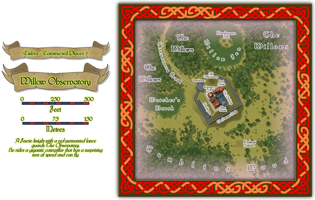
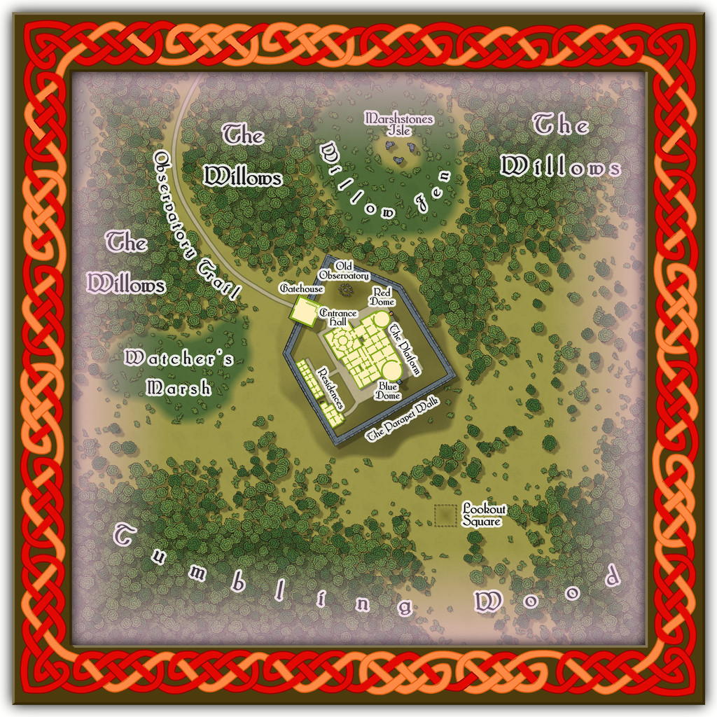
Place 2 is the Willow Observatory, inspired loosely by the real-world astronomical observatories at Edinburgh, Royal Observatory Edinburgh (which is some distance from the city itself) and Calton Hill Observatory, which is right in the city centre, and the consequent long tradition of watching the night sky from there. While some of that tradition was used to inspire what happens at Willow Observatory (including the annual summer activity of looking-out for dragon ghosts in the all-night-twilit northern sky; you'll have more luck trying a search for "noctilucent clouds", should you wish to learn more before the PDF and text files are available), the setting is purely Embra, as the misty marshes and woods nearby would scarcely seem conducive to dedicated sky-watching if anywhere else. And who knows what you might see on the planets of the Nibirum Solar System using one or other of the great magical telescopes here:
Building interiors:
And the upper interior floor for the Gatehouse:
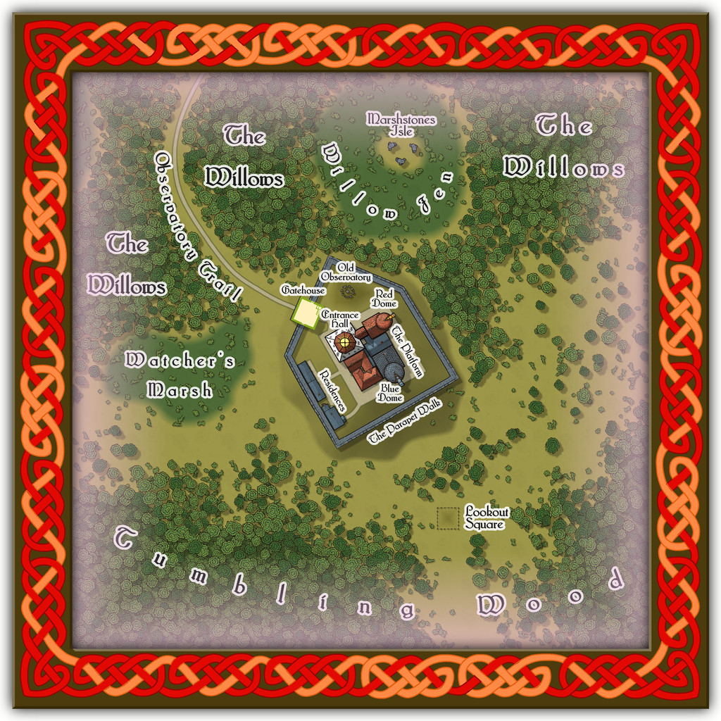
Plus there are oddities nearby, all of which receive at least some discussion in the accompanying notes.
-
Community Atlas: Embra - Wooded Places
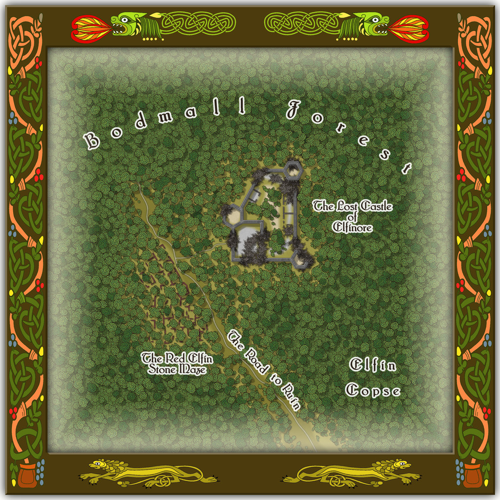
Wooded Place 2 is the Elfin Stone Ruins, now with extra map-border creatures (don't you just love "Mirror Copy" sometimes?):
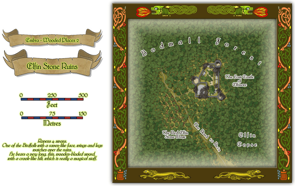
Which also shows I finally gave-in and decided to actually map one of the castles from the original base map as a genuine castle for once - or rather, a ruined version of one. Sort of... As a close inspection will suggest though, the castle doesn't seem to have had an actual gateway. A slightly better resolution image may help:
As for The Red Elfin Stone Maze, that's difficult enough to see on the actual CC3+ map, albeit quite deliberately so, since the adaptation of the original base map's features here called for something odder than just ruined walls of somewhat poorly-constructed peasant housing (my reasoning behind the wall-lines on the hand-drawn JG original not being entirely straight in places). If the ruins give the impression they may have been built that way, and are not of earlier buildings that have decayed and fallen apart, that might well be correct.
Oh, and there really is nothing to distinguish that part of the dense woods labelled "Elfin Copse" from any other part of the Forest nearby, incidentally. Come on - this IS Faerie, after all!
-
Sinister Sewers - Style Development Thread (CA207)
@thehawk makes a good point about ancient sewer systems. I think the earliest definite sewer pipes date to around 4000 BCE in what's now southern Iraq, at the ancient cities of Eshnunna and Uruk, although more sophisticated sewer systems survive archaeologically from the Indus Valley civilization around a millennium later (c. 2300-1800 BCE). Most were of brick or clay construction in various forms.
-
Community Atlas: Embra - Constructed Places
However, the sixth built Place is one more suited to indoor musical performances without such adaptations, Spring Festival Hall:
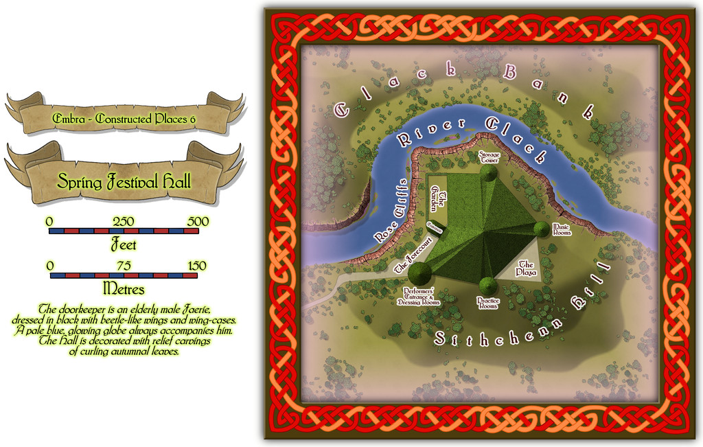
The bright green roof tiles are all made in the shapes of unfurling, fresh, spring leaves, to contrast with the walls and ceilings of the Hall, that bear relief-carved autumnal foliage instead (Embra; what else would one expect by this stage?).
Inside, only the layout plan for the surface-level is provided. Most of the towers have higher, and lower, floors too, which are not illustrated, and which also like to change at times, as the accompanying written notes indicate:
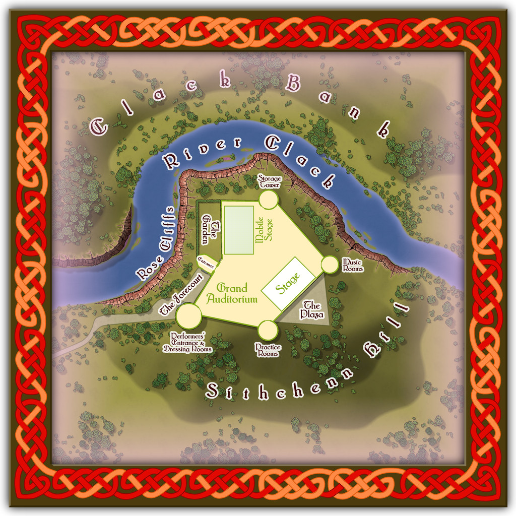
Folding doors allow performances to be enjoyed outdoors on The Plaza or in The Garden, while the Mobile Stage can be raised or lowered to allow more seating in the Grand Auditorium. Despite its odd shape, the internal acoustics are excellent. If you want to perform here - and have the skill to do so - it might help to have befriended some of the musicians from Glass Harmonica Way first (see the Watery Places Streets map). Plus of course, any excuse to use some more of Sue's wonderful red sandstone cliffs!
-
Ricko's Questions
Ricko asked: I'd like to know how I can export the file in the highest quality possible, since exporting with JPEG Quality gives me a small, pixelated file on the street lines when I zoom in below 100%.
This will be for an A0 print.
I tried a couple of tests using the "Save As... - Rectangular Section JPG" option in CC3+.
Ordinarily, I use a small amount of antialiasing on JPG exports, generally 30% to 35%, and forgot to turn that off, which meant the export failed! So I tried again with Antialiasing turned off.
I suspect the single key thing is to ensure the final export size is set to for A0 paper, so I turned that up to 119 cm. This is my settings pane:
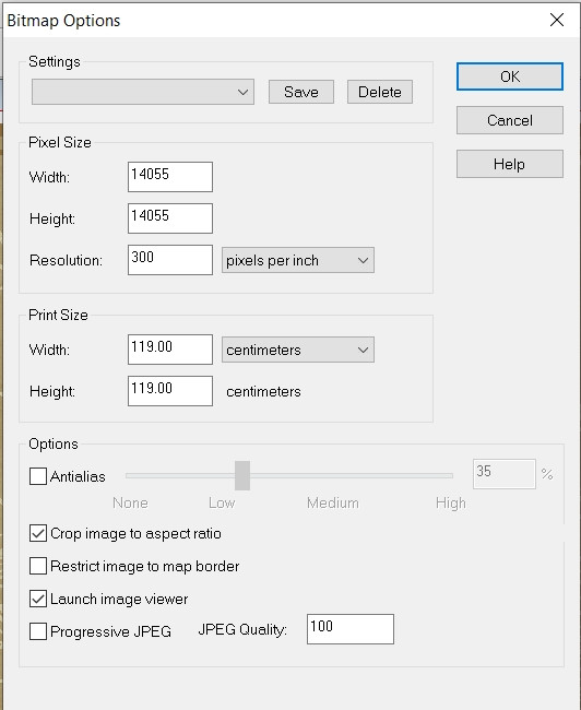
And then I ran the export. The final file size is about 66 MB, but this is a sample zoomed-in to be 100% and then resaved as an image the Forum will accept (so it's smaller than the true 100%). However, when I was zoomed-in at that level, there was no pixellation whatsoever on the roads. This is that smaller image, but using the above settings:
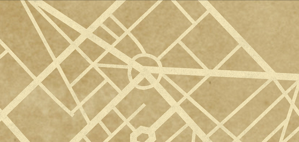
I think all you really need do is ensure the final image size matches the paper size you want the export for print to be - A0 in this case. Good luck!

-
Flooring Maps
Glad you got that sorted. Those are nice-looking floorplans!
Ellipses are fairly straightforward in CC3+. Just right-click on the Circle drawing tool icon - |CC2CIRP| - to call up the options list, and there's an Ellipse tool right there.
Spirals are a lot trickier though. Remy Monsen wrote a blog post about creating a macro to draw a spiral here, and although writing macros like this is pretty advanced stuff compared to simply drawing things and placing symbols using the program, they will let you automate much more sophisticated tasks with elegance. That blog post is the third in a short series of three on using macros, and you may find it useful to read through all of them (there are links at the end of that "spiral" post) if you're unfamiliar with how they're written before embarking on spiral design tests. And as usual, if you get stuck, just ask again here!

-
Community Atlas: Embra - Constructed Places
The fifth Constructed Place moves us into the "entertainment" quarter (if Embra had such a thing, at least), the actors' village of Stubble Chin Theatre. Subtlety isn't really in it, with Sorceress' Hill and Verdant Wood adjoining one another, but theatricals often feel the need to make a clear statement, it's said...
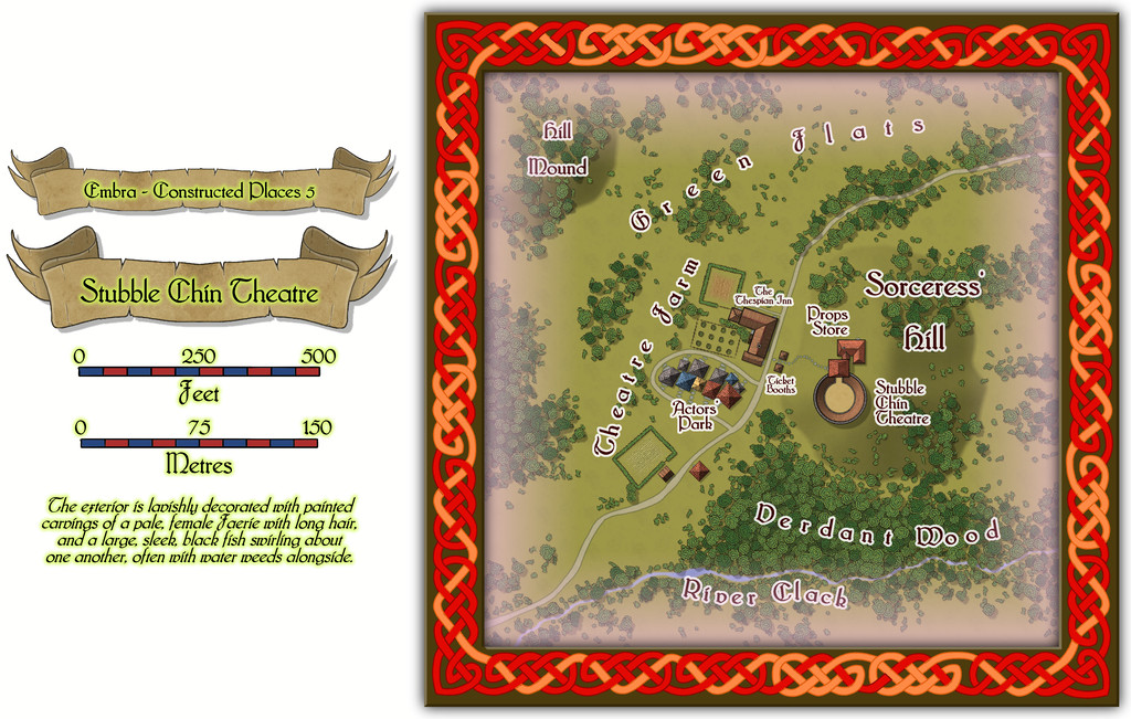
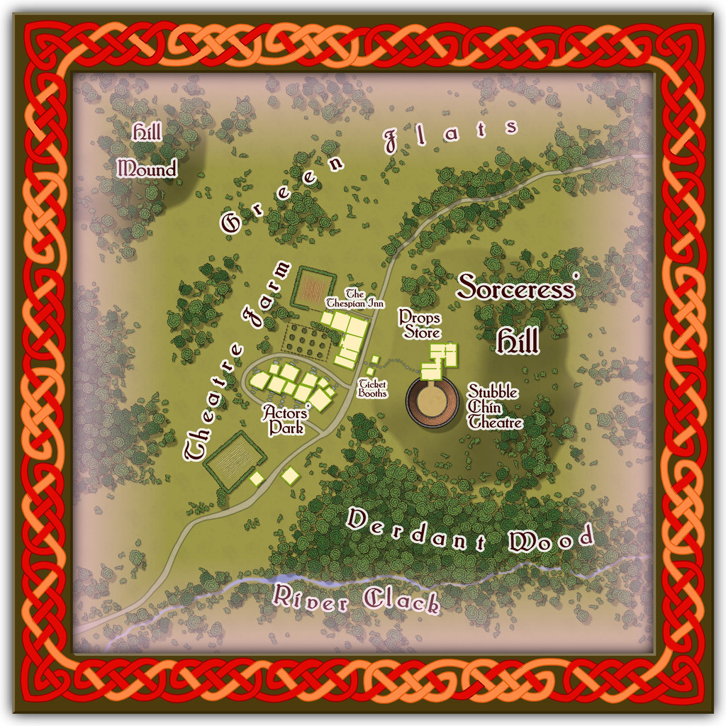
The Theatre itself is an open-air one, though it has a concealed clamshell cover that can be raised to move everything indoors when required, allowing for a greater variety of performances, not necessarily all of a theatrical nature.
-
Winter Village style development (March 2022 CA issue)
Yeah, I'm with Mike on the anti-snow front! It might look OK from indoors, but when you've had to slog through it, or have spent days clearing it at times, it VERY quickly loses any appeal.
And yes, Joe's right about the concrete look now. It's very tricky. I know even looking at specimens of the mineral galena can be difficult, as it can be both shiny silver-white and black at the same time...


-
Winter Village style development (March 2022 CA issue)
Having lived only in places with tile or slate roofs, I can confirm Shessar's photos are indeed entirely accurate for both those materials. Slide, wind effects and thin ice/snow melt basically works from the top down, and outer roof edges facing more nearly into the current wind, so those will all tend to clear of snow first. This can be enhanced around objects sticking out of the roof like chimneys and stove pipes, especially where those are in use. There may also be some smoke discoloration of the snow near chimneys that are in heavy, regular use as well (albeit that also tends to mean snow there will melt faster as well - introducing foreign particulates to the ice/snow helps it melt faster generally, like applying salt to road and path ice).
Roof patches do tend to be harder edged than you've illustrated so far, and with a tendency to remain in the hollows a little longer than the ridges on shaped tiles, as you've already noted. There are a lot of variables however, and commonly, once the snow's started to melt on such roofs, it will tend to clear fairly quickly thereafter, unless there's fresh snowfall heavy enough to fill-in the cleared gaps.


