


Wyvern
Wyvern
About
- Username
- Wyvern
- Joined
- Visits
- 3,238
- Last Active
- Roles
- Member
- Points
- 5,516
- Rank
- Cartographer
- Badges
- 24
Latest Images


-
making a game map from a historical map
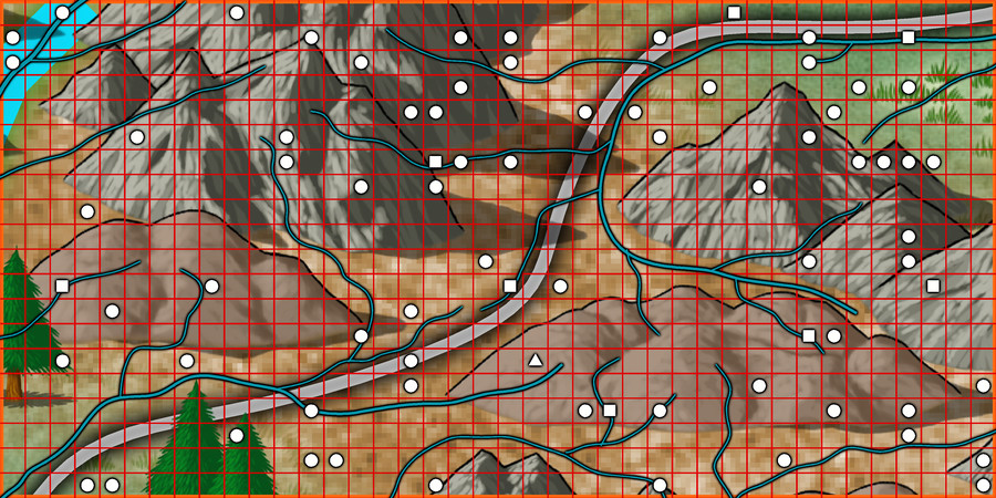
It seems to me that I ought to be able to add the historical map on the bottom layer, add roads and my specific elements over the map, and then delete the historical map. Is this possible?
You'd need a bitmap image version (BMP, PNG or JPG) of the map you could import into the CC3+ drawing on one of the lower Sheets, and then resize it to fit the size of map you're intending to draw, but yes, this is eminently practical.
To import the bitmap, make a new Sheet and a new Layer both called BITMAP in the FCW file you'll be working with, and make sure both are checked to be the active Sheet and Layer.
Then to import the bitmap, use the drop-down "Draw" menu, and click on "Insert File". Navigate to wherever your file is stored, click on it and click OK.
You'll then have it on the cursor in your map. Click once to secure its top left corner, and then move the cursor to enlarge the bitmap to the size you need, and click again to finish the command.
You might find it helps to set up a snap grid of a size to be useful in finalising the bitmap size, and make use of that during the import process.
You can then check the image size is correct by using the CC3+ measuring tools against items of known sizes on the image. You can rescale the size of the drawing very precisely after import too, if necessary.
And if you get stuck, just ask again on the Forum!
One final thought. You might like to check around on the Forum for topics created by @mike robel who's done a lot of high-quality work of exactly the kind you're wanting to do, specifically to create board wargame maps using CC3+.


-
Using Mike Schley symbols
I don't think there is currently, although some do seem to appear in some of the catalogues - just not all. It is irritating.
Don't know if it will help, but this is my own list for what the Mike Schley dungeon (only) symbols are:
- Monthly 1 = Woodcutter
- Monthly 2 = Smithy
- Monthly 3 = Market
- Monthly 4 = Necromancer
- Monthly 5 = Temple
- Monthly 6 = Dragon Lair
- Monthly 7 = Prison
- Monthly 8 = Siege
- Monthly 9 = Stables
- Monthly 10 = Summoner
- Monthly 11 = Fungal
- Monthly 12 = Up and Down
- Monthly 13 = Thrones
- Monthly 14 = Man of Science
- Monthly 15 = Graveyard
Of course, you still need to remember what the names mean...


-
Richard Baker's World Builder's Guide Map Templates
OK. I think this might be what you're remembering: World Builder's Guidebook Templates, drawn by Walter E Starr.
They're in the old ProFantasy Map Library. Although this is still on the PF website, it's not easy to find, as there's no direct link to it from the site any longer. Luckily, there are links on some of the Forum topics, providing you can remember where to look...
Hope that solves the problem!
![[Deleted User]](https://secure.gravatar.com/avatar/c75d9a245b74d9c59be0999ea81ca541/?default=https%3A%2F%2Fvanillicon.com%2F92add7f8c954488718110edc4896ad39_200.png&rating=g&size=200)
-
Community Atlas: Temple of Nidag, Stormwatch, Emerald Crown Forest, Alarius
The starting-point for the subterranean map was to save a fresh copy of the surface map that still had the line drawing of the underground setting in it, and then delete everything that didn't relate to the access-points from the surface drawing. The overall map background was changed to a brown stone bitmap fill along the way, and, so I didn't forget what I was doing, or indeed forget to do it later, the map title was amended too:
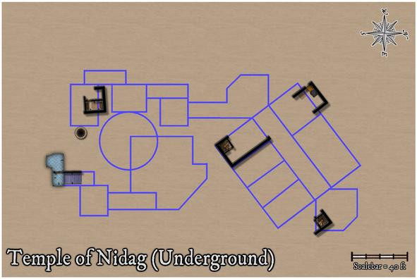
Also left here is the well from Maleng Square, given the shaft below would naturally pass-by this below-ground level. The other well on the surface map, at Bennart Cross, is too far from this underground level to worry about adding it. The surface wall lines and floor textures were simply left as reminders of how the access-points were laid-out in the earlier maps, and were to be removed subsequently.
Next was filling-in the wall lines, with the first subterranean floor textures, around those access points, and disposing of the unneeded surface elements:
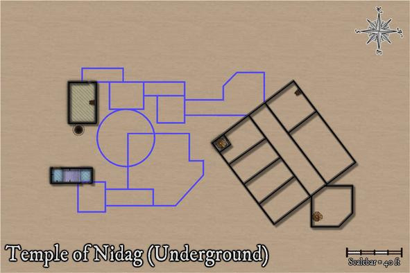
All the northern area's walls have been added, given there are three separate access-points into this part of the complex. The spiral stair in the rectangular room has been walled-off with its own door, and more doors have been added to the two southernmost access route areas, with some extra wall-torches for the temple stairwell.
Effects on the wall lines were still the same as the surface ones at this point, hence the shadows. I hadn't been sure if these would still work satisfactorily, if with added wall masks, and this view convinced me they probably wouldn't, particularly with the outer glow on the floors as well, making the wall lines and shadows overall too dense. These were swiftly amended, and the rest of the upper part of the temple completed to give a better idea of how this would look:
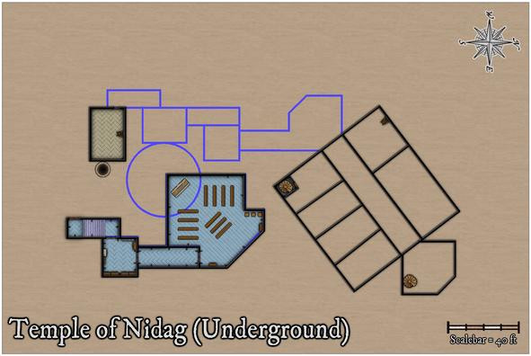
I decided when preparing the surface map that blue was going to be the dominant colour for the pretend-good temple, and started to think at this point too that floor colourings might help enhance the different underground depths at which different parts of this level were intended to be. The blue area here also has no direct connection with any of the rest, except for the unseen drop-shaft below the altar. While said altar isn't as symmetrically-placed with respect to the deeper circular chamber any more, I'd rather taken to the idea that there would be imperfections in the overall designs involved, hinting that perhaps all was not well. Thus some of the upper wall-lines aren't quite true in the surface buildings - many were drawn purely by-eye deliberately for that. Aside from the fact this is a rather rough-and-ready part of the surface town, built outside the walls.
As ideas coalesced around this facet, my explanation for the complexity of the subterranean parts was that they'd been dug-out, or were created using existing surface hollows and hummocks, as the area was being developed by individuals and teams, the original temple group doing much of their own work, in digging out "cellars" for their surface properties, if oddly deep ones in places (obviously, trying to find an alternative well 😉).
Moving ahead, the final wall-line conversions were carried out:
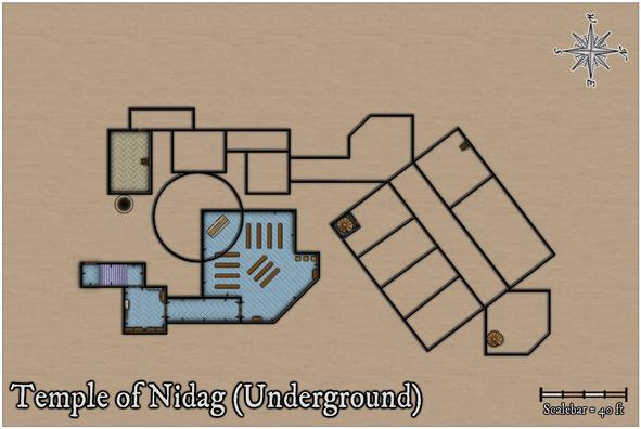
Followed by a more protracted spell of adding floor textures, staircases and doors to the western, in parts deepest, segment:
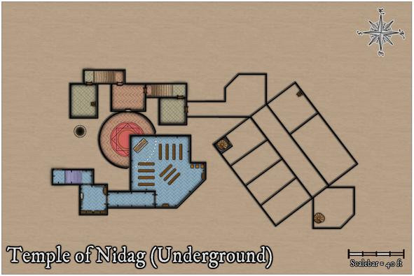
Apart from the new additions, after toying with the idea of a separate well-shaft access-point, ultimately, I decided to shrink the room nearest it instead, given the shaft had probably been sunk some while before the "cellar construction" had begun hereabouts. The segment of wall for the circular chamber below the upper temple has been changed to indicate that now, and the idea of using different floor textures to help show different vertical levels was continued in this area.
Progressing with this ran into problems for the final section, however, as adding one of the diagonal-tile bitmap fills to the connecting passage-room north of this freshly-completed part showed the northeastern wall-angle for the diagonal link into the large rectangular area was off. While something I already sort-of knew, it was one of those things easily forgotten until reality strikes! So currently, I've gone with something rather plainer in texture for the passageways only:
A few more adjustments have been made here too, because that northeastern end chamber not only had a forgotten extra wall line in it for a second chamber there, but its wall-lines didn't quite marry-up with the broad "corridor" trending away to the southwest either. Now though, I'm less happy with the placement of the spiral staircase in that northeastern room, which I think needs changing. The staircase has to be where it is to match the surface buildings, so the subterranean wall lines will have to be moved. Again!
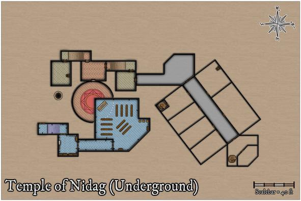
One other element isn't demonstrated by these images. Somewhat like the upper floors on the surface level, the glows between, here, the walls and floors, have shown an irritating tendency to interact badly with one another in places, so an intervening sheet with copied, colour-changed, wall-lines with no effects on has been emplaced between the walls and floors ones to prevent that happening. That though can only be done once the doors have been cut through the walls, and while the res probably doesn't show it, doors have been added in the illustration above.
Still to do: complete the last area, fit-out the whole with more furniture, then worry about labelling, and whether the area surrounding the mapped region still needs to be quite so large. Thus, some way to go...


-
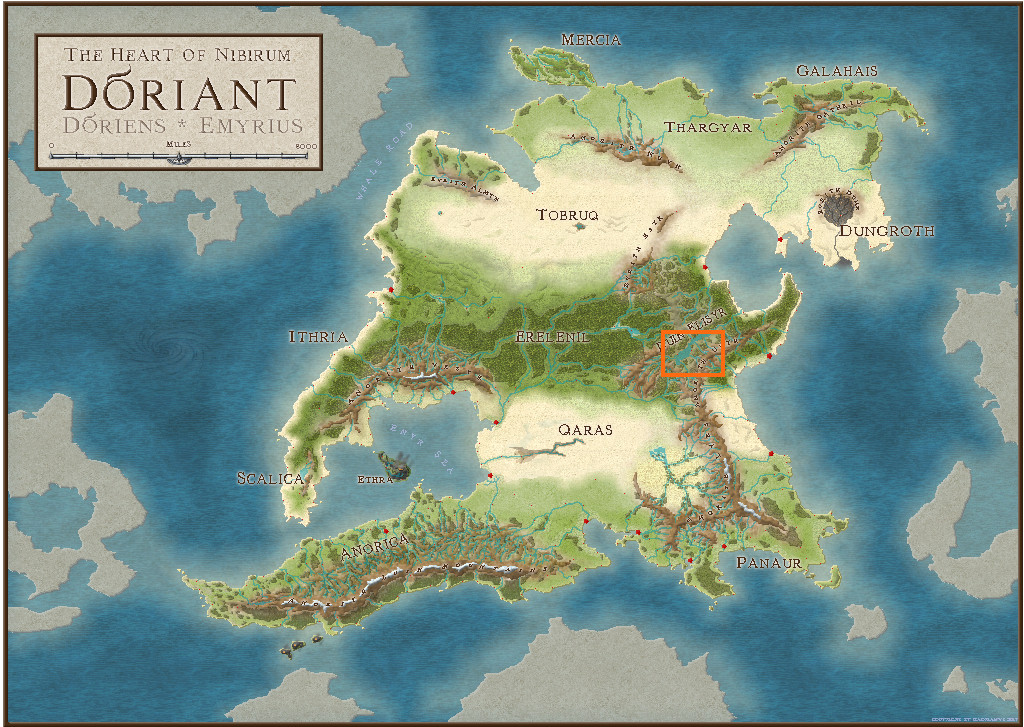
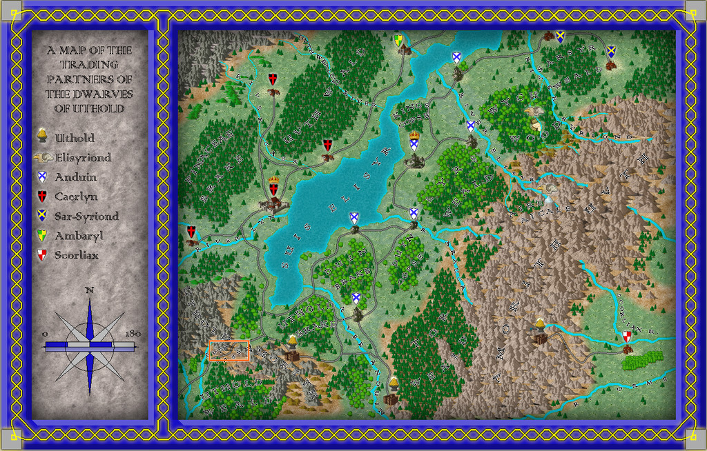
Community Atlas: Map for the Duin Elisyr area, Doriant
Long preamble post today, sidling-up to the area map.
It's never been a secret where the underground map's to go, but the Duin Elisyr area in Doriant is huge, so clearly I needed to zoom-in to find somewhere suitable as an actual location. This is where Duin Elisyr is (the orange rectangle is about 1,000 by 800 miles):
Nibirum's equator runs through this area, so from early on, I was contemplating vaguely warm to hot tracts of jungle-like vegetation, perhaps with savannah stretches, and of course mountains, as the whole area is somewhat elevated (albeit fairly modestly compared with other mountainous areas of Doriant). So it was something of a surprise to open the Duin Elisyr map and find only typical temperate vegetation symbols had been used there, even into the lower lands in the map's southeast corner, not that far from the near-desert lands a little further south.
However, that's what the map showed, and it didn't have a great bearing on my choice of a humanoid bee-folk as the inhabitants of the caverns. So I simply hunted around for a suitable spot, not too near any habitation, to create a new small area map, as no other smaller maps linked from this one when I arrived there. Snag was, my typical choice of about 20 miles square for such a map looked tiny in this vast region. I doubled it, only to find that still looked ridiculous, as just covering half the mountain pass zone I was looking at. Thus - gulp! - I doubled the horizontal length again to be now 80 miles by 40...
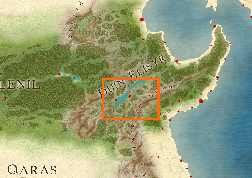
The Duin Elisyr map, complete with my selected rectangular zone:
And a closer look:
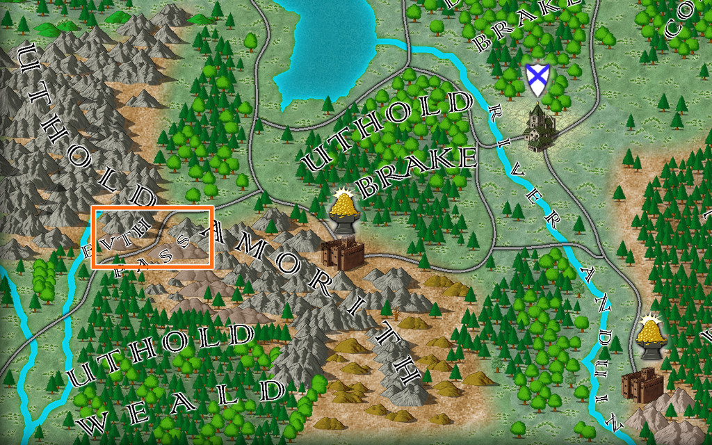
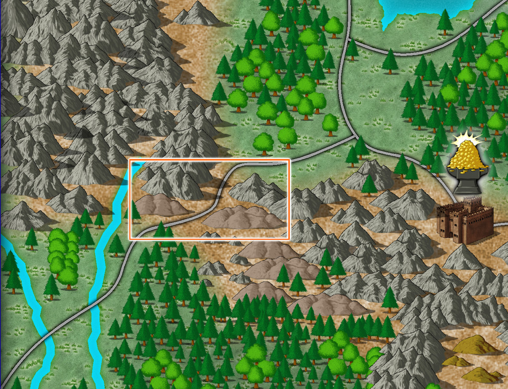
The new map's name had become obvious as "Evth Pass" by this stage, and suddenly those innocuous-seeming bee-folk had become bee-folk raiders, waiting to snare passing travellers using the mountain route from their hidden cavern lair, in this corner of rather peripheral lands to the Uthold Dwarfen realm.
For map-planning of course, we need a still closer view, and preferably without the labels:
Ordinarily, I'd hand-sketch the proposed area onto graph paper, having set an appropriate scale for each square first, which is typically a mile or two. As I'd intended to present the process here on the Forum this time though, I decided a version others might make sense of would be useful instead, so I simply added a two-mile-square grid to the area, thus:
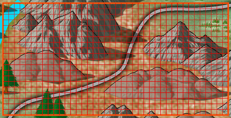
As usual, I then rolled to see what random squares might contain points of interest at this mapping level. I choose a rough percentage value first of all, dependent on the overall terrain and what indications of habitation there may be nearby, which is normally between 10 and 20%. Here, as this is pretty wild country without substantial nearby settlements or farmland, I opted for 10%, of which I decided around 12% might be surface settlements of some kind (this proportion I often vary between roughly 8 to 20%). In this case, that meant rolling quite a lot of D10s (any 1s = the required 10%), and then checking which of those might be settlements by rolling a D8, with again "1" allocated as the determinative.
Once that was done, I had to identify what each feature actually was. The settlements were decided using my own random tables, but for everything else, I opted to use various published sets of information cards. One was a newly-arrived set of Monte Cook Games' "The Weird" cards (like their random RPG tables book of the same name that I've used before, but adding a whole fresh array of options for people, places and things beyond what's in the book). The others were seven different sets of Inkwell Ideas "Sidequest" decks with 52 to 54 cards in each, which provide an array of ideas for enlarging into RPG adventures. The choice of deck was rolled randomly from this group of eight, and then a random card from the relevant deck selected. From that, an option, or sometimes more than one, was picked, or adapted, to fit the map and what terrain the spot was in.
After completion, and some time spent poring over what all this showed, allowed the sketching-in of some basic river lines too (living settlements need a water source of some kind, after all). Which brings us to:
Here, white squares are the surface settlements (8), the white triangle is the bee-folk cavern location, and the numerous white circles are all the other points of interest (68), just a little under the expected random average of 80 items in all. The blue lines, of course, are the potential watercourses (including a substitute place-holder for the one actual river from the original map, up in the top left corner.
As the "new" river lines suggest, the terrain symbols here are simply being used to indicate raised areas and valleys now, and as if being viewed from top-down, not from their pictorial side-on appearance.
All of which (as I warned at the start😊) lengthy preamble means choosing the style and starting the area mapping will have to wait now till next time!
-
A Hand-Drawn Fantasy Map of Jack Vance's Dying Earth
I was going to leave a discussion of some of the text items to my closing post on this topic, but since that's not quite ready yet, and as the subject's been mentioned, we can today take a closer look at...
The Kaiin Mutiny*
Using text in Campaign Cartographer can often raise issues, and is typically one of the most complex elements. Aside from variables such as which font to choose, the font size for particular labels (as only one size can be allocated to each text item), suitable colouring and effects, the placement point can often be the trickiest to get right. Text will tend to expand away from whatever placement point is chosen at different screen and image resolutions - if that's "Mid Left", the text will usually hold fast on its left side, expanding away to its right, for example. This can only be fully overcome by using the "Explode" command on the text, to convert it to graphic entities that will hold their positions correctly. While this has advantages sometimes, it has the serious disadvantage that the text can no longer be edited as text, so make any mistakes, and the whole rigmarole must be gone through again.
In this case, I was using two different font sizes, and thus separate text items, for many of the map labels, larger for the place-name, smaller for the notes. The Kaiin label was an especial problem, because at the place-name font size, there wasn't enough room to fit the full text line in due to "The Melantine Gulf" label. So I reduced the font size for "The White City" part, and set-up the two parts of the name-label aligned, but with the intended fixed placement points of mid-right for "Kaiin" and mid-left for "The White City". It looked fine, as this screenshot from the FCW file shows:
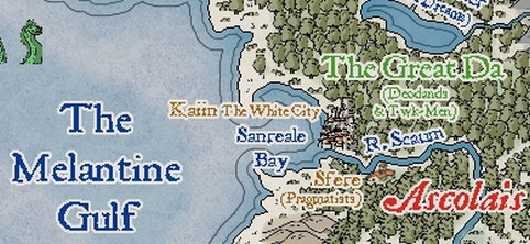
However, rendering the map image as a JPG at the normal Forum resolution, and it came out like this:
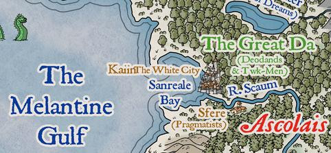
This is unusual, but I didn't spot it right away, hence why it appeared on the map images posted last time (and again in one of the WIP images still to come). Typically, once I think a map's completed, I do a trial printout on an A4 page, so I can check it for mistakes, rather than relying on just on-screen images. Which is where this little "delight" was noticed. Checking the FCW file showed that "The White City" had been given a mid-right placement point as well as the "Kaiin" one, which I'd guess was due to a mis-click on my part; luckily, easily corrected, as this sneak-preview of a later-stage-mapping image shows:
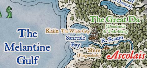
One further point about the map labels should be noted. As often happens with such labels that have effects on them, when placed over mapped features with a very similar to identical colour, that can cause the text to lose definition, or gain unwanted holes and marks. When I spotted that first, for the "Fer Aquila Mountains" label, I decided to duplicate all the on-map texts to a lower sheet without effects on it, which stopped the problem in its tracks. That did though help slow-down the whole labelling process subsequently, both in remembering to do it on a per-label basis, and when the label's placement point, font size, or appearance for multi-line texts, had to be amended after adding it. Which, of course, is partly why the Kaiin Mutiny was allowed to continue for so long 😉!
* A punning reference to the title of an old Humphrey Bogart movie.😎

-
[WIP] Community Atlas, 1,000 Maps Contest: Villages in The Whispering Wastes of Haddmark, Peredur
And so to the third map, Hex 505, Ivan's Keep:
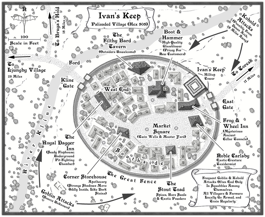
Subject to frequent attacks by bands of Goblins and Kobolds, this had to be a defended settlement, and I thought it might be fun to use what is actually the symbol of a short stretch of straight wooden town wall, to create a neatly rounded palisade! It wasn't actually that difficult, after setting up a guideline oval to work with, ensuring the village properties stayed within that boundary, and then fitting the wall afterwards. The shortness of the wall symbol meant it actually worked rather well in this manner. As to why it's so neatly symmetrical (if not entirely to the low hill the place is built on), there is an explanation in the accompanying notes.
While less intentional, the mix of shadows and road textures does help make the palisaded settlement a very definite focal point for the whole drawing. Plus the fact the village wasn't always where it is now meant a couple of the ruin symbols that come with this mapping style package could be employed to hint at that. Most were cleared away when the Fence was being constructed, to help build the newer properties in the settlement as it now is, of course.
-
1930's Overland Mountain Mapping
I agree the right side version looks better.
I'd suggest making the "contour lines" round the tops thinner and less distinct - closer to how the hatching is drawn, as they seem too dominant otherwise at present.
Not sure if it might be worth trying with a tool that generates longer hatching lines instead of having to draw two or three sets together for the steeper areas. I've a feeling the law of diminishing returns is liable to set-in with too much experimentation, however.
Glaciers might work with a more transparent version of the fill you have showing the seas right now (not sure how the style generates that appearance, so this might need extra work). The original book map looked to have a scattered series of small pale blue dots and tiny circles to show the glaciated tops.
The book-map lakes used a lot of lines drawn parallel to the lake banks right into the lake's centre, more or less, which was also how the seas were shown, although that looked uncomfortable to my eye, so you might want to try that, or maybe tone it down a bit.


-
Pen & wash question
Realistically, and much as Sue already said, if you're aiming for a hand-done pen and wash style illustration, it should look like a watercolour painting, where the wash sometimes covers the line, sometimes runs short of it. There isn't a voting option for that, and I really don't see this as an "either or" choice. So sometimes that'd be "A", sometimes "B", but more often a mix of both, with some additional overlap too.


-
Which style for... Post apocaliptic meshup
Yeah, I've been involved peripherally in a number of discussions elsewhere online lately regarding the use of AI art, including specifically that generated by Midjourney, because a lot of people - primarily artists - have become increasingly concerned about the direction this stuff is taking, most especially how the so-called AI systems are using artworks available online to generate their final images.
The matter is incredibly complex, and much of it remains uncertain, notably how copyright laws in various places pertain to AI-generated artworks, largely because they have never been legally tested this way (a couple of practicing US lawyers posted some very helpful discussions regarding the US situation a little while ago on one of the Discords I'm on, which were very enlightening in this regard).
I can do no better to help inform anyone here as to the current situation, than suggest those interested should read this blog posting from Dec 8th this year, by Jon Hodgson, a British "real" artist, RPG and game designer, who runs a company called Handiwork Games (which is where the blog is). Jon used Midjourney to generate much of the artwork in a new RPG he published this year, so he knows exactly what he's talking about from the genuine artist's perspective. He's also decided that any reprint of said RPG will have all the Midjourney artwork removed, to be replaced with his own, or other artists', real art, and he will not be using Midjourney, or other AI-generated artworks, again.
Personally, I've become very cautious about using any AI-generated artwork now, and would not do so in anything that wasn't purely for my own use.


