Wyvern
Wyvern
About
- Username
- Wyvern
- Joined
- Visits
- 3,238
- Last Active
- Roles
- Member
- Points
- 5,515
- Rank
- Cartographer
- Badges
- 24
Latest Images


-
[WIP] Community Atlas - River Watch - Druid villages
While these are fascinating explorations of different seasonal map depictions, are they really appropriate for a site around 25°N latitude on Nibirum? This puts the locations near the northern limit of the tropics for the planet (equivalent to the Tropic of Cancer on Earth). This would also mean the snowy mountains are a little too prevalent, I suspect.
Sorry if this is a bit late to be useful. I've not been paying as much attention to the Forum here recently as I might, so it's only just dawned on me.

![[Deleted User]](https://secure.gravatar.com/avatar/c75d9a245b74d9c59be0999ea81ca541/?default=https%3A%2F%2Fvanillicon.com%2F92add7f8c954488718110edc4896ad39_200.png&rating=g&size=200)

-
Town Map for a Cthulhu Game
Not sure why you had to use Photoshop for any of this, as from the looks, the whole could have been achieved in CC3+ too. Appreciate that if you're more familiar with Photoshop, that could have been the reason though!
Regardless, nice-looking map. Not keen on the newcomer to town though...


-
Community Atlas 1000th map Competition - with Prizes [August/September]
Having already reserved the orange-highlighted area below in Haddmark, Peredur to place the next small dungeon map in my ongoing mapping project this year, I'd already completed the map for it before the contest was announced.
While it's not been submitted for the Atlas yet (it will be later), this is the map I've prepared, called The Whispering Wastes:
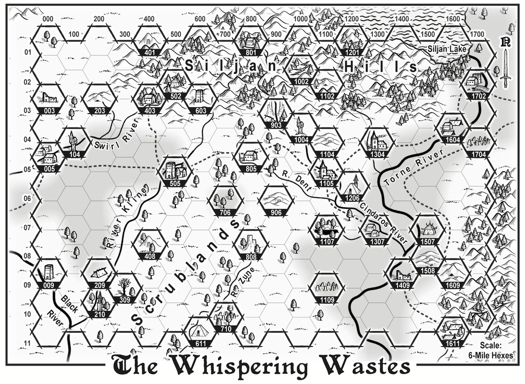
I've explored why it is as it is elsewhere on the Forum, including how I'd had the crazy notion at one point to prepare maps for all 41 features in the labelled hexes. I'd even worked-up details for most, including the ten small settlements. I'll not be doing all that. However, I have decided to try mapping the ten little settlements, although whether I'll finish them all by the end of September is another matter!
The list of settlements, and the theoretical order in which I'm hoping to map them, is as follows:
- Ljungby Village (Hex 005)
- Bruga's Hold (Logging Hamlet, Hex 403)
- Ivan's Keep (Defended Village, Hex 505)
- The Village of Toresk (Hex 805)
- Osalin (Necropolis Village, Hex 1105)
- Arvika (Bridge Hamlet, Hex 1304)
- Rularn (Isolated Hamlet, Hex 1307)
- Brightlawn (Watery Hamlet, Hex 1604)
- Fairbridge (Torne Crossing Village, Hex 1702)
- Skara (Farming & Logging Hamlet, Hex 1611)


-
Community Atlas: Embra - Watery Places
The first two Watery Places were drawn as smaller maps than usual, based on the reduced-size template designed for the Lawn Market map. This was because, as with Lawn Market, both base maps were generated from randomly-selected maps in the old Judges Guild "Temples Book I". As noted previously, this book used a much smaller scaling than the other old JG works I was drawing on for inspiration in creating the Embra maps. The first of the Watery Places then is the Bittersweet Basin Swimming Pool:
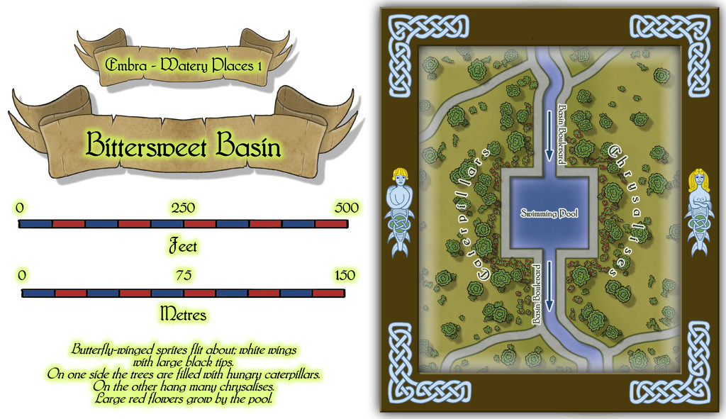
This is a remarkably simple area by comparison with many of the previous Embra Places maps, though of course variety is important in constructing an array of maps of this kind, to prevent things becoming too predictable. The featured text notes were used to add to the details shown here, without taking away any of their oddness. It's perhaps worth noting that as a mapper, it's equally important to have a few maps that are easier to produce like this, again helping avoid things becoming too stale and "samey". Especially as not all the Watery Places maps were going to be so "quick and easy"...

-
Community Atlas: Map for the Duin Elisyr area, Doriant
Thanks Sue! I've been deliberately making the WIP images smaller than the maximum Forum res because they are still very much subject to change along the way, and I didn't want to spam the topic with higher-res shots that were only going to have changed, perhaps quite significantly, by my next posting. On which topic...
Plunging into more of the detailed work within the caves quickly indicated there were several issues in need of resolving or changing. Most revolved around the hex-room caves working as a 3D maze, which needed a mixture of doorways, floor and ceiling openings to work properly. Further complications came about as there were also new, higher, floor levels over parts of what had been simply darkened open areas previously, that were in need of amending. I even managed to find one place where the roof of a lower hex-room needed illustrating, as forming a new piece of "floor"! So, quite a bit of redrawing, adding a new sheet or two, tweaking the effects, and so forth, followed in what needed to be a quite intense spell of mapping.
Rather than post the results of just that, these last notes on the subterranean map condense what were really several sessions spread over a couple of days, as I also added the scaling grid, and then the labels. After reflection, I then changed almost all the labels, as I realised some weren't sufficiently descriptive, and a couple more needed adding! Of course, this is what happens sometimes. Well, it does to me 😁!
Thus the final map:
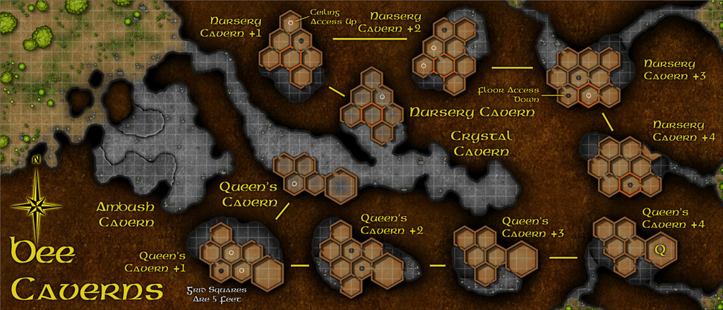
I opted for a subtly pale, 5-foot square grid for this map, after a few trials. The yellow labelling with a black outer glow is naturally quite deliberate for a bee-folk cavern. The font is Gaeilge 1 which comes with CC3+. I'd have preferred a bee or wasp option for the compass pointer, but settled instead for one of the varicolor options from the Pete Fenlon Revisited style from CA 179, because it was spiky and let me continue the bee-flavoured label colour scheme!
Now to work out where it fits on Nibirum...

-
Community Atlas competition entry: The Summer Palace of the Winter Queen
Thanks very much folks!
Closing-in on the final stages of this project now though, so here's a view of Palace 9:
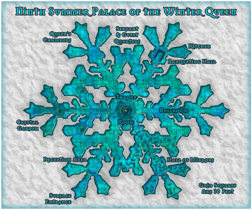
This was done using the SS2 Bitmap A style. I was rather taken with some of the fill options for this, as you might tell! The background here is the snow fill, but the palace itself was drawn using the Water Green 1 fill, as this just seemed such a rich, icy-looking option to give some real colour to this Palace, as a change from some of the previous ones. Not a great many choices from the symbols, unfortunately, as very few come with a varicolor option to better match the icy theme - just the central throne in the end, though at this resolution, you can barely see it, of course.
I'm going to miss drawing these snowflake patterns, I think, but there's the danger that the more I do, the less interesting they may become, since - as my comments regarding the construction of Palace 8 might indicate - I have developed a pattern for drawing these now, which while useful, isn't necessarily such a good thing, as it discourages exploration and innovation. I have enjoyed seeing the styles that were new to me though. There's so much in the full complement of the CC3+ packages I've never properly explored, so I have been trying to take time during this mapping exercise to go through all the fill styles available in each mapping type I've selected, as well as all the symbol catalogues for each. Probably never going to remember where any of these things are when I next need them, but...
Haven't managed to get the rest of the "Palace Quirks" notes typed-up yet; they'll likely follow after the Palace 10 map. And hopefully a little while after that, I might finally get the set submitted for the Atlas!
-
Community Atlas: Embra - Watery Places
Last among the Watery Places maps is one condensing the final five streets into one drawing, the second illustration below showing just the streets for a bit better clarity at the normal Forum resolution:
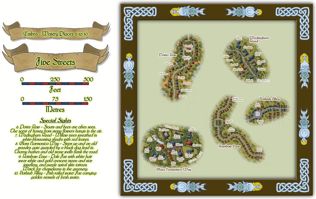
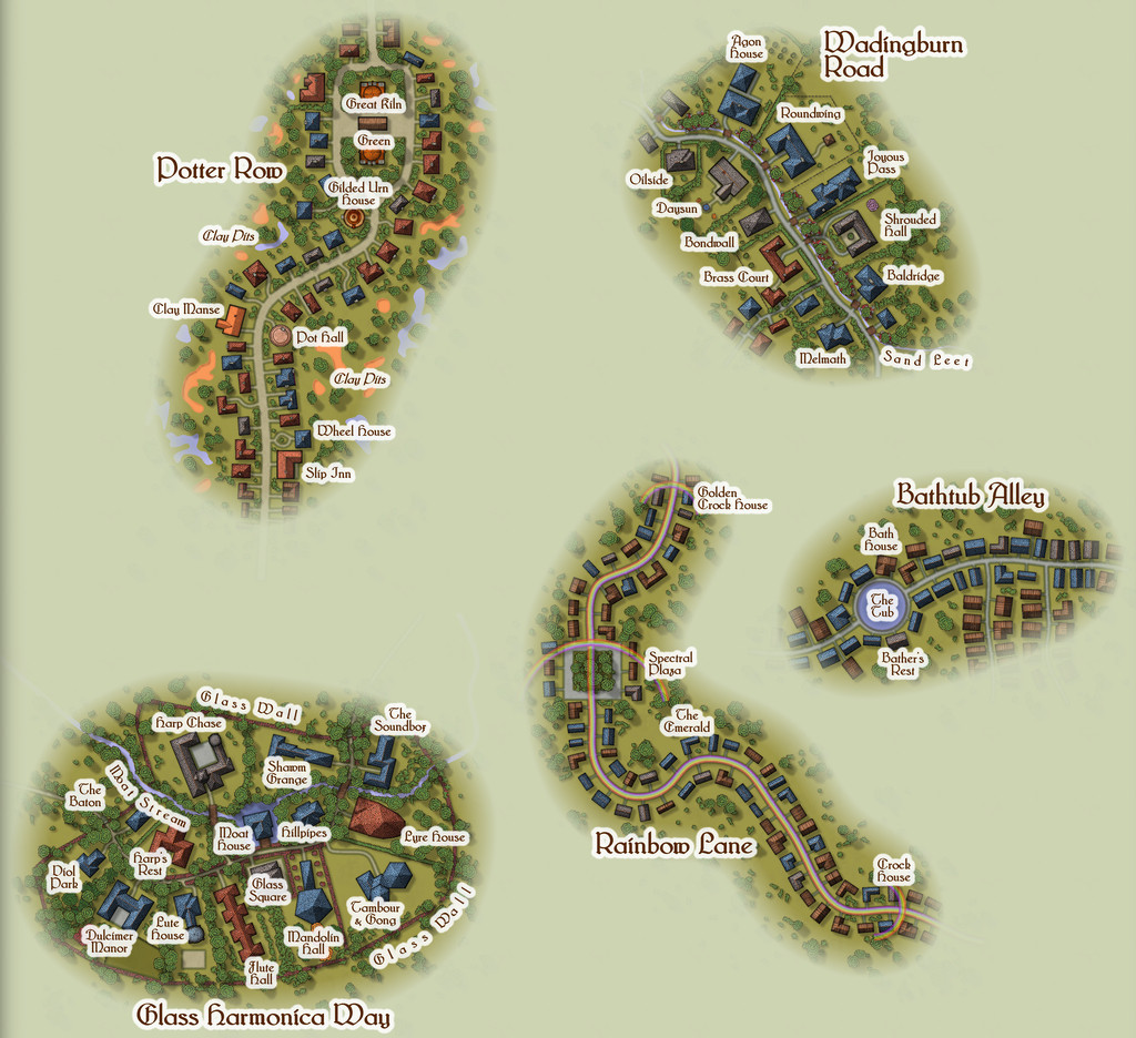
The roadways were constructed randomly, as described in the Enclosed Places Forum notes, with the final appearances and features determined sometimes by the street names, sometimes by other factors. Potter Row is of course where the great ceramic craftsfolk live and work, several in houses built of pottery - a couple even in the form of gigantic pots (this is Faerie, after all). The featured text for Wadingburn Road suggested a willow-lined stream, and fancier properties. Rainbow Lane had to have rainbows along it - even to the roadway itself - while Bathtub Alley cried out for a large pond or pool to be added for those water faeries to be in. And then we have Glass Harmonica Way...
I mentioned in the introductory Embra topic that music had been one of my primary influences on how a Faerie city should be presented, and maybe one of the most "faerie" real-world instruments should be the glass harmonica, as well as being one that requires extraordinary skill and ability to play. So having come up with the street name near the start of developing Embra, it was always clear this was going to be a community of musicians, instrument makers, composers, and the like. The random nature of my street design mechanism meant the available area was smaller than I might have preferred initially, though the whole point of using random systems is to work with whatever that may throw at you, and adapt accordingly. The featured text provided an interesting adjunct, suggesting this wasn't going to be an ordinary street at all, but one closer to a gated community in the real-world, and from that everything else simply flowed (appropriately for a Watery Place, perhaps!). The one downside to the final map is that because I wanted everything clearly labelled, the small area meant the labels ended up concealing quite a lot of the area's character. However, the toggle option in the FCW Atlas file to turn off the place-names means it is possible to get a better view of the whole:
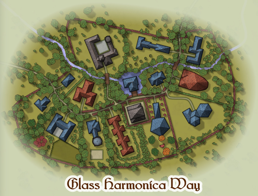
From which we can all again play "spot the red sandstone components" - and hopefully get a clearer impression of the final layout. And yes, the street was originally populated with random CD3 houses, which then got moved, adapted, redrawn and converted to their final shapes here.
-
Community Atlas: Embra - Travelling Places
Moving on swiftly from the dubious delights of Toll Cross brings us to the cheerier Travelling Places segment of the Twilight Market, Market Row:
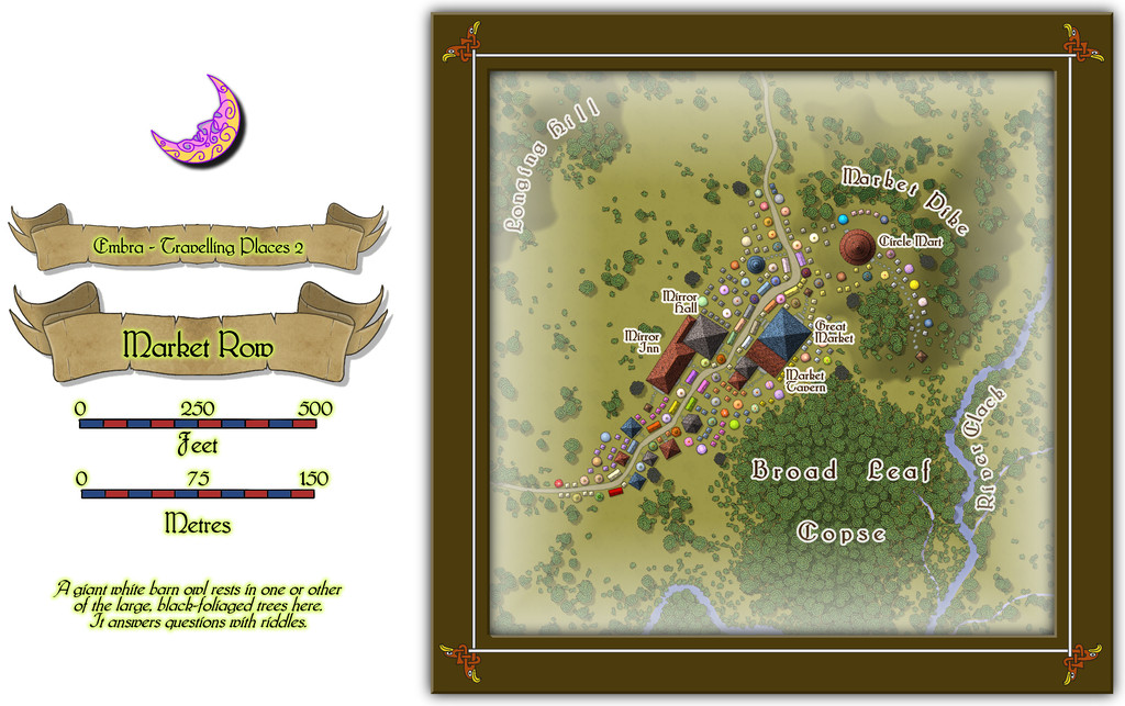
A colourful scatter of tents, wagons and stalls spills along and beyond the road here, and there's even a group of buildings, since for once, there is a more fixed settlement alongside the Market (or perhaps it grew up because the Market was here). Though the footprint of several buildings is large, particularly when contrasted against the much smaller market stalls, I opted to make them all merely single-storey structures, so the Market didn't get lost among the houses. Only the buildings have been provided with internal floorplans, which also helps clarify which they are, of course:
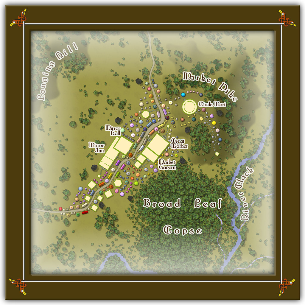
The individual darker trees are to match with the featured text notes, and I think something of the strangeness of Toll Cross lingered with me, as I decided not to name the open land between the two "Mirror" properties and the foot of Longing Hill, which the Market also seems to avoid, and simply kept it as an empty place the locals become evasive about if anyone asks. Quite why I've left for GMs to determine, however...
-
Community Atlas 500th Map Voting Thread - Please vote
I second Sue's comments; this was an extremely difficult vote, as there are just so many fascinating maps produced in such different styles.
Hopefully, everyone contributing enjoyed their mapping, and perhaps learnt something fresh along the way.
It's certainly been a delight reviewing them all again now!
Get voting folks!


-
Hexcrawling starter maps
Just to make sure I'm not leaving anyone behind here, some brief explanation. From the early days of RPGs, those running the games have been encouraged to design areas for the players to explore, frequently using random generation systems to do so. "Hexcrawling" is the overland version of this, where each hex represents a fixed distance (if sometimes a little vaguely defined, given a hexagon is not the same size from its centre all around), commonly 5 or 6 miles, though larger or smaller sizes than this are not infrequent. What are now called "Old School Rules" (OSR) RPG systems often make use of this technique, and these have seen a particular upsurge in popularity this year, following ongoing problems from the current owners of "Dungeons & Dragons".
One of the unexpectedly phenomenal successes of recent times in the OSR line has been a new RPG called "ShadowDark", which presents a very streamlined update on the OSR theme, that incorporates improvements from modern RPGs more generally. I've been very taken with the whole ShadowDark RPG conception, particularly as the Core Rules include everything needed to play the game, such as a random generation system for hexcrawls.
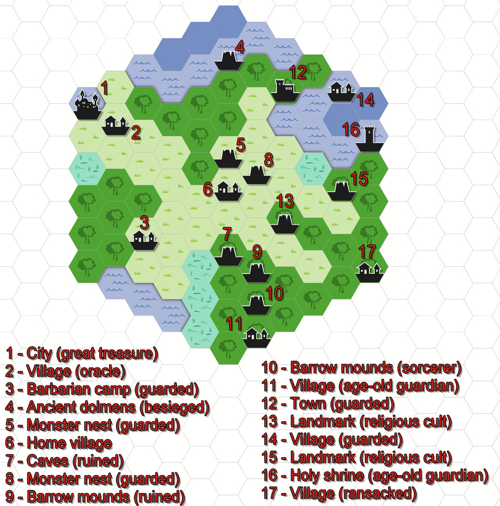
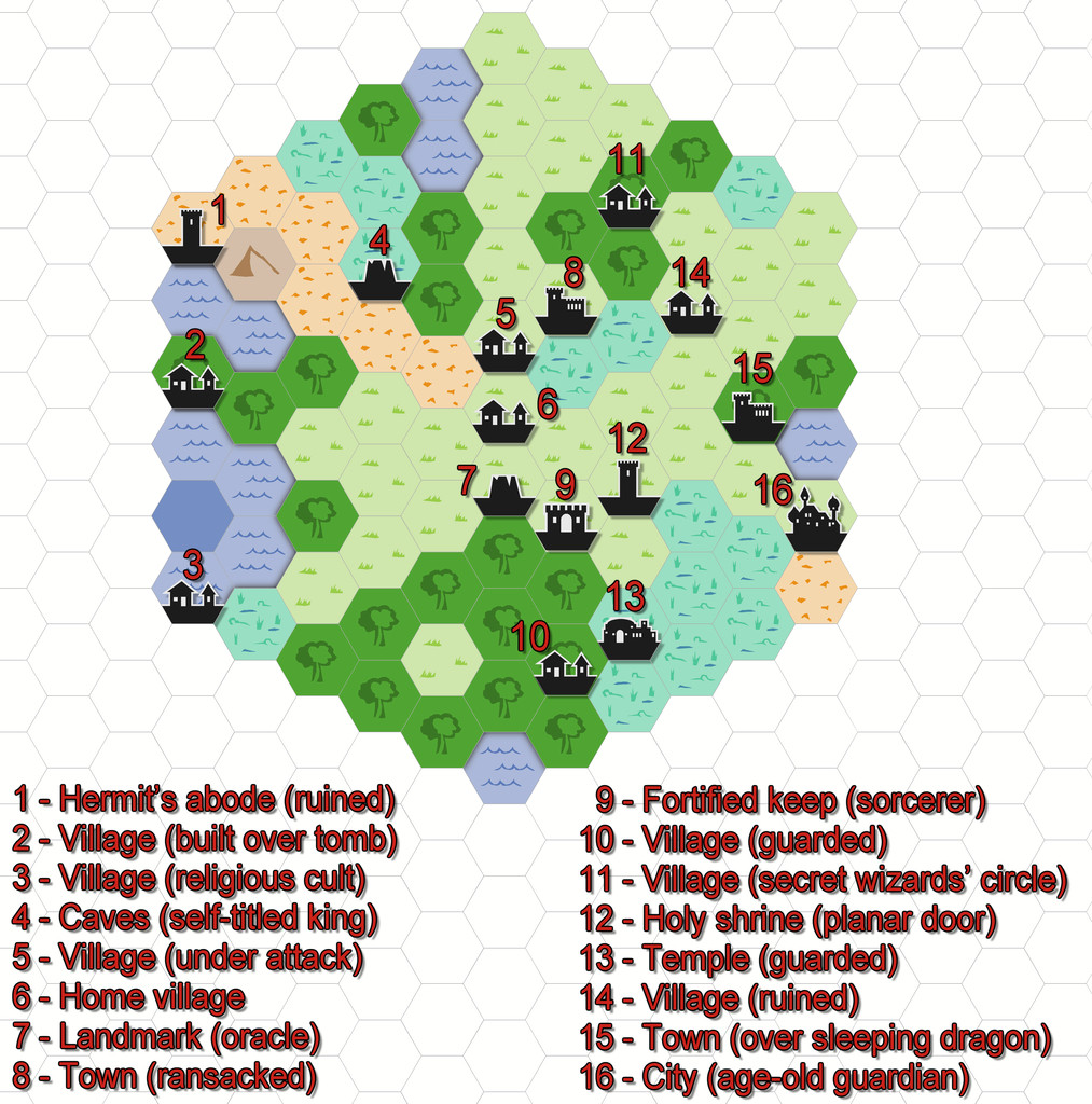
Last weekend, I did a couple of small test areas, to see how the system worked (hexes here are 6 miles in size), and although the system which will appear in the printed Core Rules has been tweaked a little since then, I prepared the maps in CC3+ through the week, to see how they'd look, using the 2010 Overland Hex style. These are the basic maps as generated by the random system rolls, with a list of their contents, and a separate key: