Wyvern
Wyvern
About
- Username
- Wyvern
- Joined
- Visits
- 3,238
- Last Active
- Roles
- Member
- Points
- 5,515
- Rank
- Cartographer
- Badges
- 24
Latest Images


-
Community Atlas: Embra - Travelling Places
Which brings us to the last map in this group, covering the eight "ways":
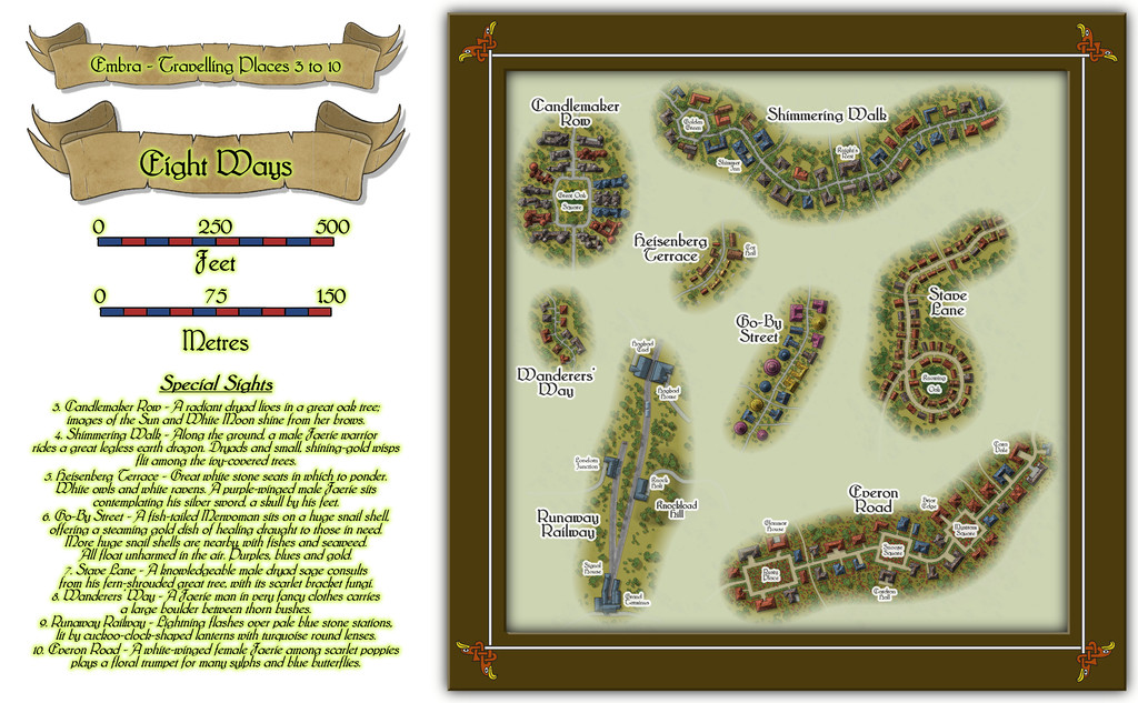
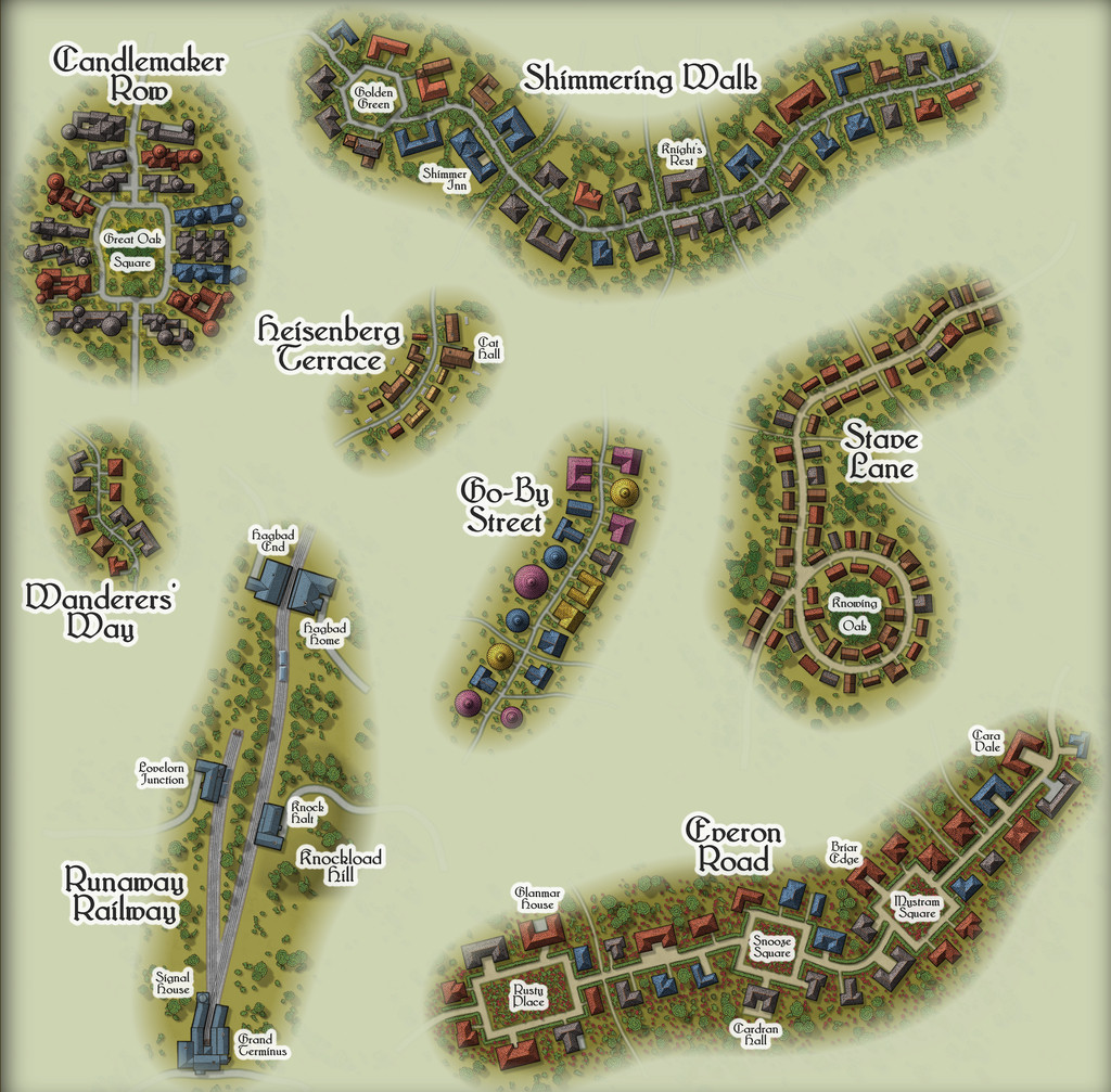
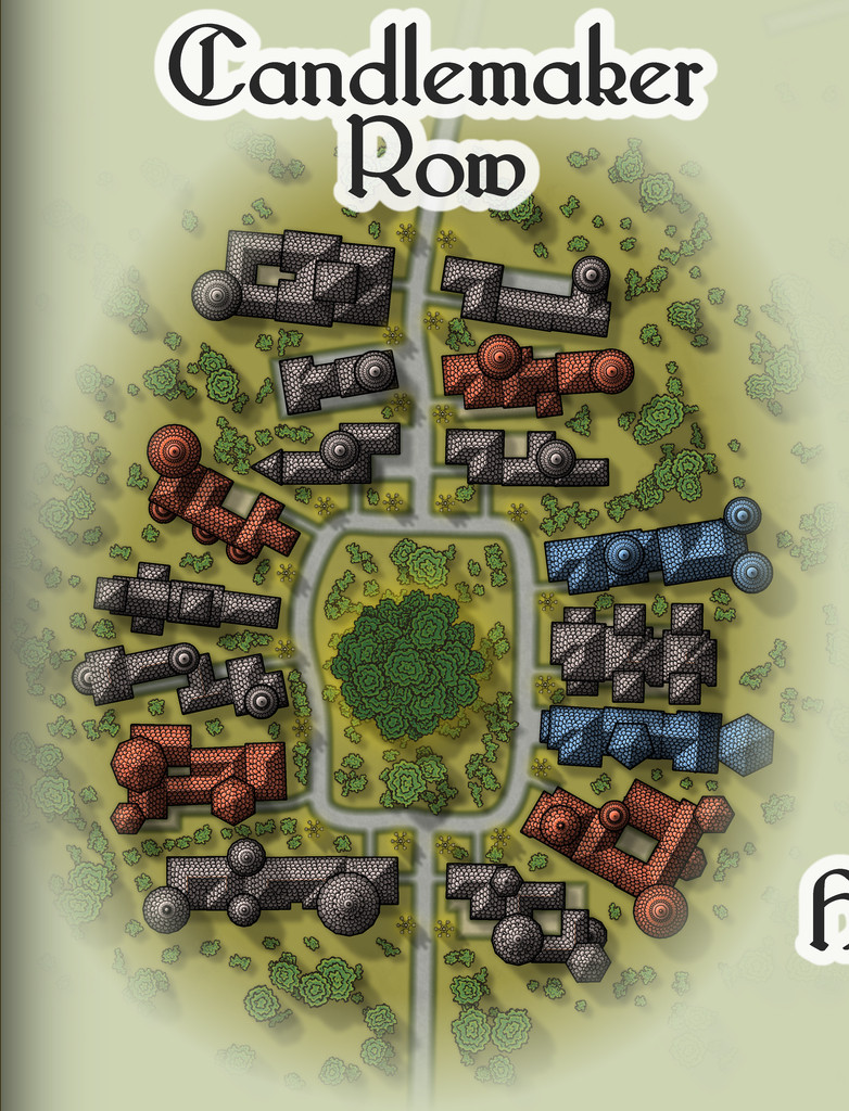
While the seven streets were constructed randomly from the simple system I'd devised and used previously, the railway needed some further adaptations, reducing the angles turns and junctions could have, and such like. In drawing the final maps, I kept the roads deliberately free from as much obstruction as possible (vegetation and the proximity of the properties along each), since the essence of Travelling Places relates to movement. In the accompanying notes, I've suggested GMs should allow speedier normal movement when using any of these routes, as long as the party sticks to the way itself. And naturally, there are oddities. Such as the large, complex building shapes along Candlemaker Row, where sadly, I fear the giant standing candelabra that light this route at night will be barely visible, and likely unidentifiable, at the Forum's resolution on the above maps. So let's try this view instead:
That weird loop in Stave Lane came from the construction process alone, which was a pleasantly amusing surprise when I plotted-out what the dice had rolled for the first time, especially as it made Stave Lane - a name yielding expectations of being straight and direct - one of the most convoluted of Embra's mapped streets!
Heisenberg Terrace, naturally, isn't always there, while the bazaar in Cat Hall is run by a humanoid feline, Shrew Dinger... Go-By Street is easily missed too, without care (aside from being a test for people's knowledge of fantasy literature; a good spot to place The Genuine Magic Shop, perhaps - despite its different author). The literary origins of Everon Road's name might be an easier test though.
As for Runaway Railway, aside from the real-world city of Edinburgh (very loosely the inspiration for some of Embra's place-names, as well as its actual name) being a major railway centre in Scotland, it also has the surviving remnants of a far earlier horse-drawn passenger rail-line, the "Innocent Railway", so I felt I had to include a railway of some sort in Embra. It's obviously short and simple, though as with everything else in Embra, its size can be as deceptive as GMs require. Rather than get bogged-down in detailing the line's operation, I chose to have the rolling stock run by the magical forces of electrickery (see Wyvern Citadel on this, if necessary). Conveniently, the featured text - and remember, these things were chosen randomly! - involved lightning flashes, which made that decision very easy.


![[Deleted User]](https://secure.gravatar.com/avatar/c75d9a245b74d9c59be0999ea81ca541/?default=https%3A%2F%2Fvanillicon.com%2F92add7f8c954488718110edc4896ad39_200.png&rating=g&size=200)

-
[WIP] Community Atlas, 1,000 Maps Contest: Villages in The Whispering Wastes of Haddmark, Peredur
Having thus generated the surrounding wilder lands, it was then time to construct the random, geomorphic-dungeon-designed map, as noted earlier, using the OSR Dungeon style from the 2015 Annual, in the manner established for my immediately prior map, again mirroring that used in the Shadowdark supplements. Since the Inkwell Explorer dice are one of the sets for which no written descriptions are available, I'd had to work up some ideas about the content well in advance, so seeds for some could be planted in the regional Whispering Wastes map. One of the random map designs for this layout was a fairly obvious temple structure, albeit with a curiously crystalline-looking central focus:
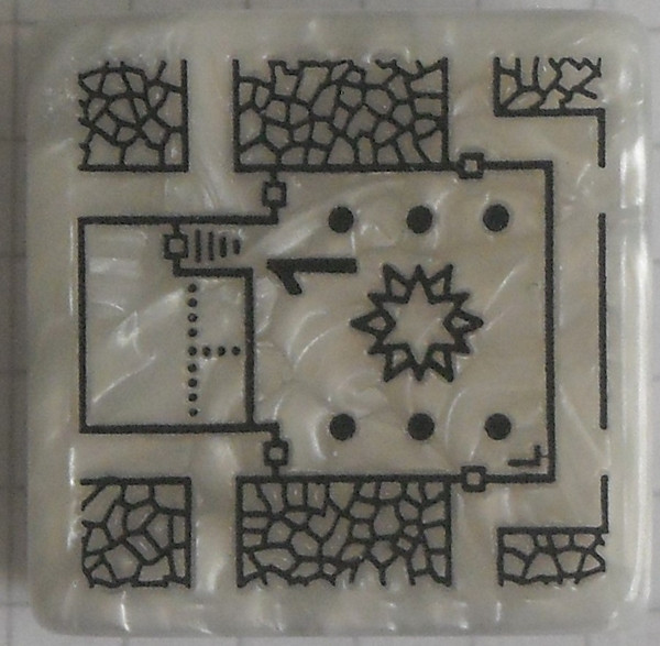
Having tried a few random rolls on the main Shadowdark tables, I came up with a cult that spoke only in whispers (which of course ultimately developed into the area's name), but nothing that seemed to match the temple's crystal focus. So I turned instead, and rather by-chance, to a free PDF Shadowdark supplement, created by the online Discord community earlier this year, which allows the design of slightly weird mega-dungeons randomly, on-the-fly. This is called "Shadowdome: Thunderdark" (SD:TD), and was used to create a random mega-dungeon, run through by two teams of players in direct competition, at Gary Con 16 in Lake Geneva, Wisconsin, USA, in March 2024.
I began with a few random rolls from tables in SD:TD, and stumbled onto several items with a crystalline theme that way. Some quick adaptations to extract other related features, more random rolls and a few deliberate choices, and suddenly the layout became The Crystal Cathedral of the Whispering Wastes, or "Crystal Cathedral" for short:
This was located, hidden away and hard to find, in Lightning Ravine, Hex 1002, with the Outer Doors opening onto a ledge partway down one of the side-canyons in said Ravine. It was rather fun to watch the whole coming together from what was provided by SD:TD, with some expansions and a little adaptation in places.
Ultimately, the process provided a gigantic creature, "The Shimmering", that was living in the crystal, and which had descended from the stars long ago, sinking into the earth and creating a protective crystalline casing for itself. It had set-up a cult of humanoids (The Shimmering Cult) to provide living creatures it can feed upon, turning them into fresh parts of the crystalline features scattered throughout this little complex, with a view to eventually having sufficient power and energy to return to the cosmos. (Freely acknowledging here influence from Lovecraft's "Colour Out of Space", and Nigel Kneale's "Quatermass 2", where even the cult acolytes receive a small "mark".) The cultists become transformed into parts of the crystalline structures eventually, gaining extra powers and abilities along the way. Plus parts of the cult can be found in other places in the Whispering Wastes, as the notes for that map, and this one will suggest. Cultists who are always on the lookout for lone travellers and others who seem unlikely to be missed...
Ordinarily, that would have been that, submission ready for the Atlas, and I'd have been moving on to the next small dungeon map in the series, intended for somewhere in the Feralwood Forest of Alarius. However, while I was finalising the notes for both these maps, Remy Monsen dropped-in the 1,000 Atlas Maps Competition. As noted in my first posting here, the Shadowdark hex-mapping system allows the creation of individual sites as well, including settlements, of which there are ten on the hex map, all village or hamlet sized. As I'd already done the basic layout designs for these in preparing the map notes anyway, I decided to try mapping all ten. Whether they'll all be finished before the contest ends is, of course, another matter. I will complete them, if other things allow, regardless of that though.
First village is to come next - Ljungby (Hex 005)!


-
Community Atlas: The Hall of the Seer, Glaciär Kristol, Ezrute
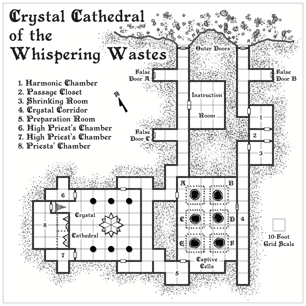
Third map in this group, for the Hall of the Seer, was actually drafted first, using the same style and look as established for all four underground maps in this "Explorer" dice batch, using the two dice designs involved for the layouts of the above-ground and subterranean segments, as mentioned last time. It was really this map though that led to establishing the "gritty" look of the stone-edged roads and paths outside, largely to help give a better contrast between the outside and inside of this little complex. Originally, I did think of just using gravel-filled polygons for the roads, but that appeared confusing with the similar dot-shading to represent the solid interior of the hill lying adjacent to the entrances. Ultimately, I did use the polygon drawing tool for both, altered by the stone edging outside, which with the trees, buildings and blank ground surface seemed to provide sufficient contrast.
For the internal layout, this was largely what the dice designs provided, omitting the geomorphic connectors in places beyond this layout, and adding one secret door between rooms 9 and 12, as I wanted to provide an inner sanctum as the private domain of the Seer herself. This was chiefly because (and there are hints in the label descriptions) that the Seer had been randomly determined as a Frost Dragon from Shadowdark, modified here to be also an ancient, prophetic creature, able to shapechange to various forms under the local magical influences. There are also three "ordinary" Ice Dwarf Oracles as well (lesser, humanoid seers, in effect), who live in the Village, and provide aid and prophecies here too, when required. I decided to really push the legendary significance, importance and reliability of the Seer - who has the randomly-determined name of Leminsiskiel - to help enhance the significance of this little site overall. After all, there needs to be a serious reason for folks to traipse across the vast, frozen wastes of the surrounding larger region to get here!
As ever, there's more detail in the accompanying notes for the Atlas as to how the set-up here works, as it's not really intended as the traditional kill-the-monsters-and-steal-their-treasure dungeon, more a living place of importance for the lands around - and perhaps even further afield.
Next time, I'm heading off to map somewhere a little more tropical, a site in the Demosthenes Swamp of central-southern Artemisia, according to the random rolls...


-
Community Atlas: Embra - Travelling Places
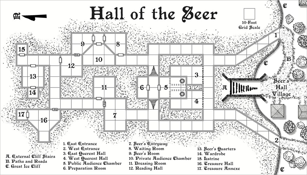
Travelling Place 1 is Toll Cross, which as we see, is an unusually heavily built-up area, surrounded by dense greenery, beyond which is open grassland or moor:
While the base-map was a similarly heavily-urbanised area, the nature of Toll Cross (and indeed even its final name) derived chiefly from the accompanying featured text, and especially that demonic satyr figure. The Impassable Hedges mean anyone wanting to visit the shops or houses here, or even just pass through it directly as a crossroads, is channelled into using one of the four access-routes. Then I adjusted the layout of the buildings slightly in places so those on foot can get to only a fraction of the properties inside unless they pass through the central Boulder Square, where Guess Who waits, like a spider in a web... This view is with the labels turned off to get a better impression of the settlement:
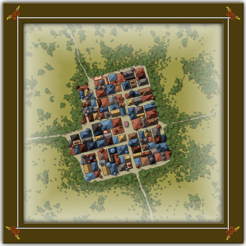
This looks a bit odd (or at least, it's meant to), with some strange rooflines, and what seem to be many towers. An extract from the accompanying text and PDF file may help explain:
There are...many tall spires and tower-like structures of different sizes and forms, some of which are visible above the trees from outside the settlement. These features are all entirely solid, and appear to have simply grown from the roofs and upper walls of the buildings. Few are straight, and many could pass for horns. Quite a number of roofs overhang their properties as well, and can give the impression of being ill-fitting, or as if they were worn as wigs that have slipped slightly. The whole can be quite unsettling for those not used to Faerie, and even those visitors with Faerie blood may feel there is something a little off-kilter about Toll Cross.
Despite the range of building shapes and sizes, they all have just a single accessible storey at ground level inside, as the toggled view to show the building interiors indicates:
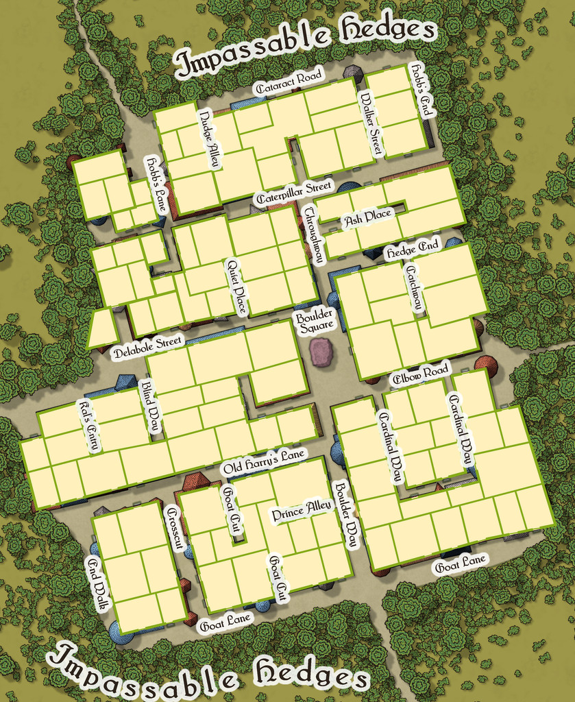
This also shows just how much some of the rooflines, and particularly those horn-towers, don't marry-up with the building outlines, yet the buildings, thanks to their lack of internal connections, further help block any attempts to avoid using Boulder Square. And if you try to fly in, it turns out those roofs aren't so immobile as they may appear...

-
Community Atlas: Embra - Crossing Places
The last of the individual Crossing Places maps covers the part of the Twilight Market here, Slateford Market (with a second view below showing just the map, hopefully for a little better clarity at the typical Forum resolution):
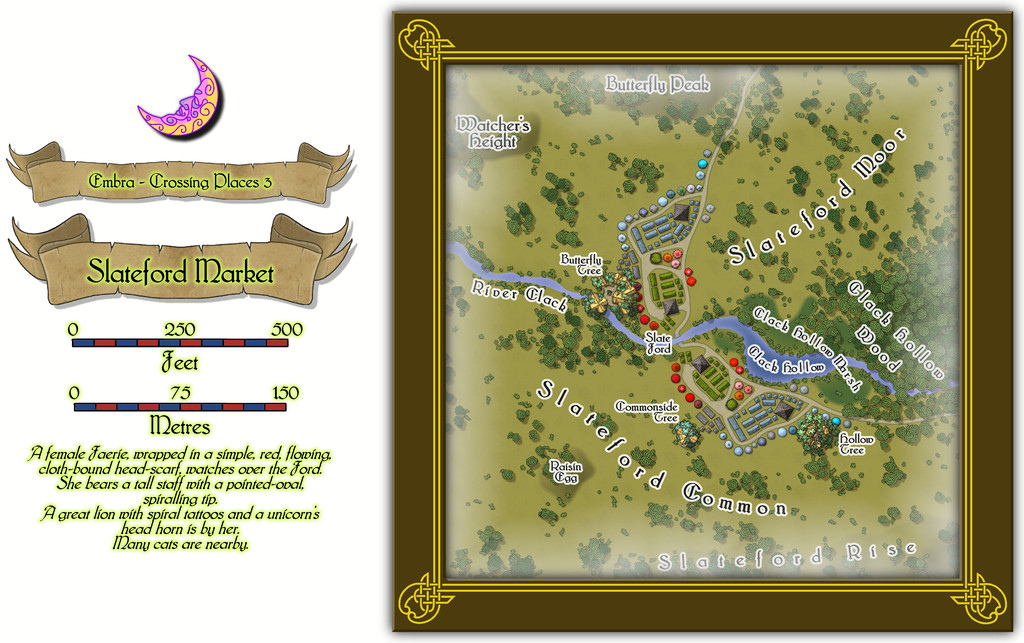
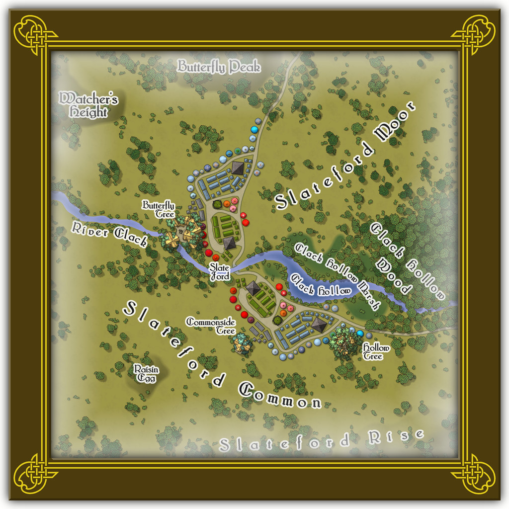
That the road layout and market stall placements look like the wings of a butterfly is not accidental. The original Judges Guild map on which this was based only had the layout on one side of the stream. It was though obvious that a simple ink-blot-style mirror image would produce this more pleasing pattern, thus this segment of the Twilight Market was designed with that in mind. Of course there's a watcher at the ford (from the featured text), and some more of the Mike Schley tree-houses, including an aerial tavern in the bough-structure overhanging the River Clack in the Butterfly Tree, "The Tasty Drop" (also a comment on patrons who miss their footing and end up in the Clack below...).
There aren't any actual buildings here however, simply tents, stalls, awnings, wagons and several open-plan covered spots (including a pair of green-tiled, circular bandstands). The thatched buildings in the treetops are intended as living parts of the trees, so aren't real buildings as such. Or that was my excuse for not providing interior layouts for them anyway!

-
Trying to create a simple style
Shaded relief might be the way to go to be more convincing on the higher or more rugged terrain. There's this Cartographer's Annual from 2008 that would help in that regard, if you have it, or if not, try this free PDF tutorial by HadrianVI from 2017, elsewhere on this Forum.
-
Advice on what looks better, please, on a completed map
Yeah, as someone who's been preparing illustrations, diagrams, graphs, etc., for print publication for decades, draw it in black and white from the start, and keep things simple. Some of the delicate lines and shading on the cliffs, for example, may not look great on a BnW print, especially if the size is to be reduced to something like a typical paperback novel page, and the mottled fill will likely end up looking just grubby. Line clarity is often key too; the use of ruled-line hatching and dot-shading in printed drawings and maps didn't end up that way by-chance, after all.

-
Town Map for a Cthulhu Game
Not sure why you had to use Photoshop for any of this, as from the looks, the whole could have been achieved in CC3+ too. Appreciate that if you're more familiar with Photoshop, that could have been the reason though!
Regardless, nice-looking map. Not keen on the newcomer to town though...

-
[WIP] Community Atlas August Mapping Contest: Cloven House
Meanwhile, back at the mapping, more progress, more battles!
Two main challenges today, firstly to get everything correctly aligned and pulled together into a single coherent map (I hope!). I decided that this simple style didn't justify a string of separate maps for each level in the building, so, as probably suggested by yesterday's image, I wanted to present everything on just the one drawing. This is the current state of play, now complete with labels:
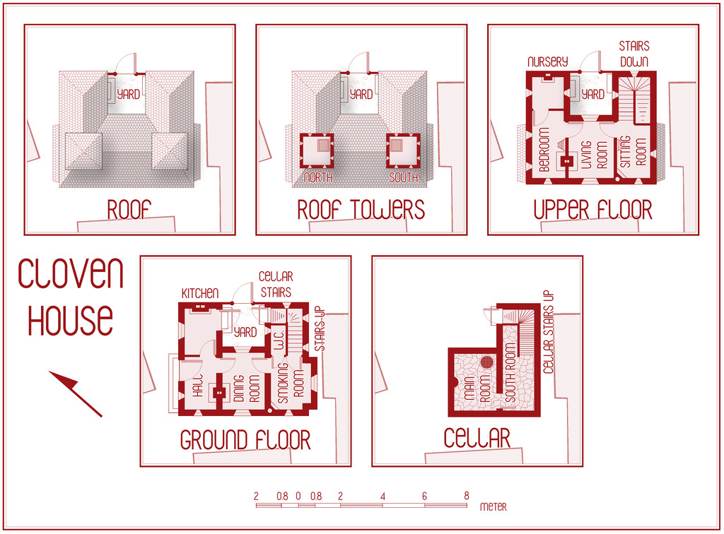
I very nearly slipped-up on the labelling, as the original style on which the CC3+ Dracula Dossier style is based, uses the Blanch Caps font, which was linked from the Annual's PDF mapping guide, and which of course, being freely available online, I'd already downloaded and installed back in 2015. However, the font isn't available for free redistribution, so instead ProFantasy had substituted the similar free Franks font. As this map's intended for the Community Atlas, fonts not available with PF products or a standard Windows 10 installation can't be used (well, they can, but you have to explode the text to become polygons, so you can't change it as with normal text afterwards). Of course, the default font is set as Blanch Caps if it's available, so there was very nearly an "oops" moment, followed by Naughty Language, had I gone ahead with that! Franks it is though!
The second challenge was getting the scalebar correctly rescaled and then labelled. For reasons I won't pretend to understand, the scalebar symbol doesn't have equal divisions along its length, so trying to rescale it exactly to the scale grid, when all you can see is a ghostly outline in places when you move it proved, shall we say, trying... There may even have been an N.L. moment or two! Once it was finally sorted, I measured the irregular divisions, which turned out to be 0.8 metres long, something that still leaves me mystified. Perhaps something important from the original Dracula Dossier RPG book though (as I don't have that).
If you think the Cellar plan looks a little empty, you might be right:
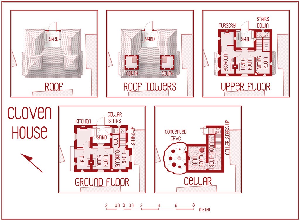
There's a walled-up low cave concealed on the SECRET Layer, with the tops of some very ancient, worn, partly inscribed standing stones visible in its floor, one of which (admittedly smaller than it was yesterday now!) has been built into the actual cellar wall, and protrudes somewhat from it. The idea is this ancient circle, dating to long before the city was built here, is at least part of what's causing this house to be haunted and abandoned now. As well as such a favourite spot for ghoul feasts, naturally. The "S" = secret door, isn't technically a door at all, but a walled-up thinner part of the cellar wall, so it's obviously been used for access to the cave at some earlier time, and then deliberately sealed later, so it can't be told from the normal stone walls in the cellar now.
Still plenty to do though, more tweaking primarily, plus getting the notes typed up, and maybe adding some missing or slipped tiles on that roof. The house is meant to be boarded-up and shunned by the locals nearby, after all.
-
Community Atlas 500th Map Voting Thread - Please vote
I second Sue's comments; this was an extremely difficult vote, as there are just so many fascinating maps produced in such different styles.
Hopefully, everyone contributing enjoyed their mapping, and perhaps learnt something fresh along the way.
It's certainly been a delight reviewing them all again now!
Get voting folks!