


Wyvern
Wyvern
About
- Username
- Wyvern
- Joined
- Visits
- 3,238
- Last Active
- Roles
- Member
- Points
- 5,515
- Rank
- Cartographer
- Badges
- 24
Latest Images


-
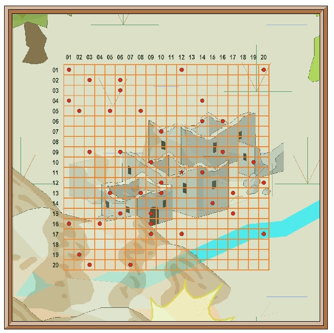
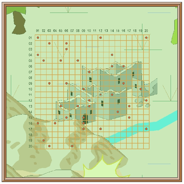
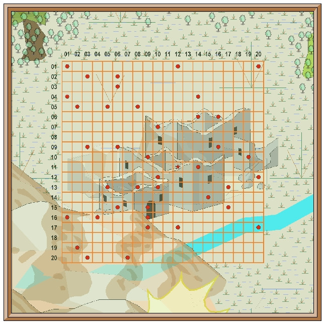
Community Atlas: Temple of Nidag, Stormwatch, Emerald Crown Forest, Alarius
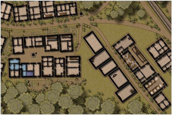
The next step was to add fireplaces to the remaining properties, as their placement determines where the doors, windows and interior walls can go:
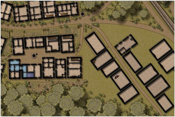
The first exterior pathways have been added too, and though it may not be obvious at this resolution, there's a spiral staircase in one corner of the second "under development" house on the left of the street, which will go into the dungeon level below eventually. That mid-building fireplace in the fourth left-side property is going to be interesting to work around!
After adding another descending spiral stair to the fifth left-side structure, I started developing the main bar feature of the series of inn buildings on the street's right side. This also connects with the adjacent property to its northeast, though I haven't finalised exactly what this property will be yet; perhaps another bar-room, or an entertainments room:
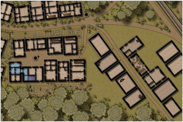
The range of fitments in the bar-room are there so I don't later forget what I was meant to be doing here, of course.
And then the inn started to develop in an unexpected direction...
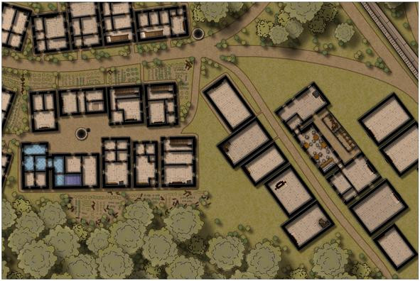
Aside from connecting it to the kitchen-house (first building on the street's right), which was always intended, now there's a fence-enclosed narrow yard, with a latrine block and woodstore, together with a gate nearest the curving road off to the northwest (probably hard to spot at this res).
After which, the pathways around all these right-side buildings were drawn, and some bushes added:
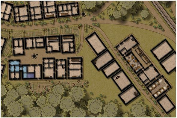
Oh yes, and we now have a stable block for the inn! While it may be hard to tell here, this has been provided with a cobblestone floor, instead of the usual wood planking, and those hay piles look somewhat less strident on higher-res images (I hope!).
Followed swiftly by more external paths, a little more vegetation cover, and a staff house at the east end of the "inn-side" of the street:
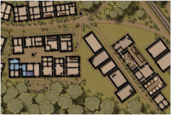
Lastly for today's update, are the outer wall and internal fittings for the two northern map-edge properties:
More shortly, with luck!


-
CA style development - "Darklands City" (issues for September and December 2021)
They're lovely trees Sue, but I think we're hitting the same issue as with the Darklands overland style, in that they're just too nice!
Maybe think about something less symmetrical, and with some dead branches, or just branches without leaves, and maybe even some very battered trees too?


-
Community Atlas: The Haunted Cloud Mesa Area of Kraken Island, Forlorn Archipelago
With the area map done, and near-central Site 12 selected as the location for the Oracle Temple map created from the dice throws, I thought it might be interesting to try to tie the mapping style up with what the Fantasy Realms one was based on originally, which was that used in the 3rd Edition "Forgotten Realms" D&D published products. I'd hoped to provide an illustration here to show what I mean by this for the dungeon-scale maps, but I've struggled to find anything suitable online, and while I have a couple of PDF books from that era (when I was too deep in my long-standing interest in many other RPG systems than D&D to collect D&D books!), I'm dubious about reusing something from those here on copyright grounds. Plus, a lot of the subterranean maps in this style seem uncomfortably dark and hard to read to me (in the PDFs at least). They do though have a couple of interesting quirks. Walls have a consistently "hand-drawn-wobbly" look, and are highlighted further by use of closely-ruled lower left to upper right hand-drawn hatching strokes, while the scaling grid is a double one, with heavier 10-foot squares subdivided internally into 5-foot ones.
Having randomly opted for just two dice designs for this map, I felt I could probably cope with this for a small area, and set about pulling together a sort-of new style, using elements from both the Fantasy Realms Annual (as the textures in the 3rd Ed dungeon maps have a similar look to the overland maps) and the Old School Dungeon style from Annual 12, the latter mostly for the symbols, though in the end, I only used two of those, and one of them was a repurposed door! The map:
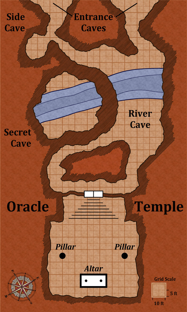
The only further addition was the Alyssa Faden style's compass rose, which is a closer approximation to the 3rd ED one than any others I could find. Most of the map is simply hand-drawn, including all those ruled hatching lines (hey, the Mesa map was mostly hand-drawn too, so I was in practice!).
For a more formal style, the hatching could doubtless be done with a suitable bitmap fill of tile-able ruled lines with transparent gaps between, the polygon tool set up to be drawn fractally, and the colouring of the texture bitmap fill adjusted to fit this reddish-brown theme (which is very characteristic - the original was notably darker than this; I've deliberately aimed for lighter tones). To achieve this colouring here, I've used two different fills, one atop the other, one reddened with an RGB Matrix effect, the other made partly transparent, and then punched holes through both with a Color Key effect to show floors and grid (which latter is on two different sheets to help thicken up the 10-foot squares a little more). There would need to be one more darker blue water fill as well in a fuller style version, as some of the original maps showed up to three deepening water contour levels.
Although the doors in the "real" style were always shown as they are here, elements such as the altar were drawn in a similar brown colour to the background fill, which again I find hard to read (is it a room feature or just a rectangular rock pillar?). However, I was happy with this final result as being close enough to the original to work - to my eye anyway! It's much the same sort-of look to how the Fantasy Realms style is to the published Forgotten Realms overland maps, at least.
Next time, I'm slipping sideways to the left in Nibirum to find somewhere to drop in a little dungeon to somewhere in Serkbergen, Peredur!

-
Community Atlas: The Hall of the Seer, Glaciär Kristol, Ezrute
Third map in this group, for the Hall of the Seer, was actually drafted first, using the same style and look as established for all four underground maps in this "Explorer" dice batch, using the two dice designs involved for the layouts of the above-ground and subterranean segments, as mentioned last time. It was really this map though that led to establishing the "gritty" look of the stone-edged roads and paths outside, largely to help give a better contrast between the outside and inside of this little complex. Originally, I did think of just using gravel-filled polygons for the roads, but that appeared confusing with the similar dot-shading to represent the solid interior of the hill lying adjacent to the entrances. Ultimately, I did use the polygon drawing tool for both, altered by the stone edging outside, which with the trees, buildings and blank ground surface seemed to provide sufficient contrast.
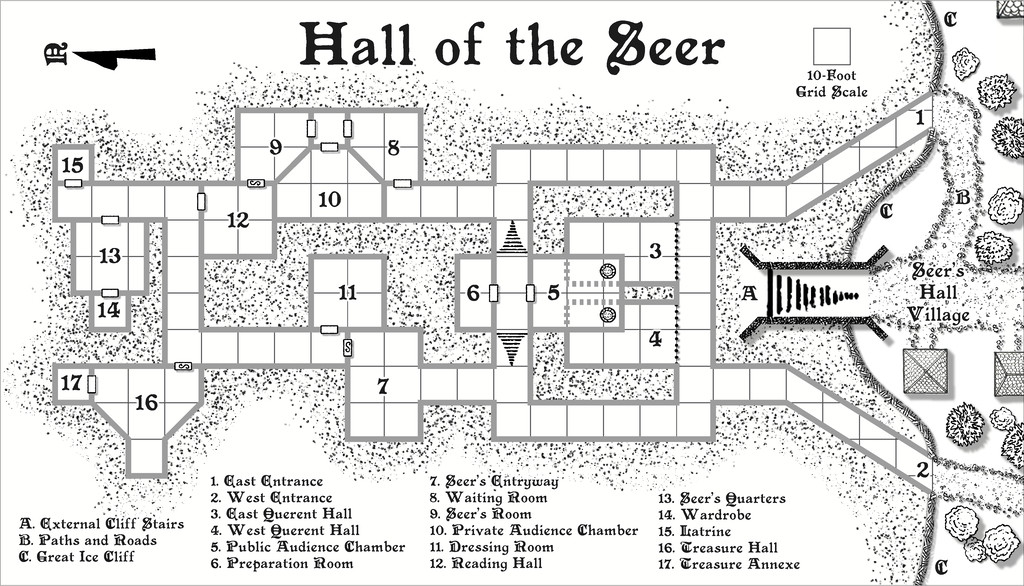
For the internal layout, this was largely what the dice designs provided, omitting the geomorphic connectors in places beyond this layout, and adding one secret door between rooms 9 and 12, as I wanted to provide an inner sanctum as the private domain of the Seer herself. This was chiefly because (and there are hints in the label descriptions) that the Seer had been randomly determined as a Frost Dragon from Shadowdark, modified here to be also an ancient, prophetic creature, able to shapechange to various forms under the local magical influences. There are also three "ordinary" Ice Dwarf Oracles as well (lesser, humanoid seers, in effect), who live in the Village, and provide aid and prophecies here too, when required. I decided to really push the legendary significance, importance and reliability of the Seer - who has the randomly-determined name of Leminsiskiel - to help enhance the significance of this little site overall. After all, there needs to be a serious reason for folks to traipse across the vast, frozen wastes of the surrounding larger region to get here!
As ever, there's more detail in the accompanying notes for the Atlas as to how the set-up here works, as it's not really intended as the traditional kill-the-monsters-and-steal-their-treasure dungeon, more a living place of importance for the lands around - and perhaps even further afield.
Next time, I'm heading off to map somewhere a little more tropical, a site in the Demosthenes Swamp of central-southern Artemisia, according to the random rolls...

-
[WIP] Community Atlas: Snakeden Swamp, Lizard Isle, Alarius - Dedicated to JimP
So, back for an update today!
Opening the New Drawing Wizard, and naturally picking the CCPro Overland style, I set-up a 30 by 30 mile square area (to give room around the base 20-mile-square mapped region for a title, possibly some labels, and suchlike), and changed the background colour from its default sea-blue to green, to fit the landlocked swamp I had in mind. Then I went to set-up a new BITMAP sheet and layer to import the base map image into, and was surprised to find there was more than just a single sheet available (which was what I'd expected), and that some of those sheets already had effects on them. I'd been assuming I'd be working without sheet effects (beyond a transparency on the BITMAP sheet, at least). This though opened up some fresh possibilities, as one concern I'd had was that a lot of the early vector symbols and fills use zero-width lines, which tend to vanish when extracting higher-res images. Being able to add elements like glows could help them stand out better, so this was going to be a somewhat more sophisticated map than I'd anticipated!
This is the opening scene with just the imported bitmap image in the map (I'm keeping these opening images deliberately under-sized for the Forum, as there's fairly little detail on them):
And this is it with the transparency effect on:
Next, I started sketching-in some base terrain elements beyond the centrally-mapped area, using only symbols, to have more control over their sizes. Here, I'm working with the BITMAP sheet's transparency turned off:
This is the appearance without the bitmap image entirely:
One advantage of this vector mapping style is that you can add effects such as transparency to the symbols sheets, and see - as here - that the symbols fade out a little, which is what I wanted to do for the area beyond the mapped zone, showing the terrain there still, yet without so much detail. There's no need for technicalities like the forced redraw command that would be needed for raster symbols, though these were all set-up on their own new sheet, of course. The symbols, incidentally, were all from the extensive "Filled" vector set available under the CC3+ overland style, which was the default set available on opening the new map.
The next snapshot shows this whole border zone completed, with the hills and river added, as well as a background colour showing the full extent of the hills into the central region as well:
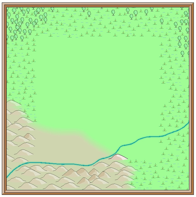
I amended the edge fade on the terrain sheet to retain the softer transition at the edge of the hilly area. The perceptive may notice too that one hill seems a little less transparent than the others, as that one's now on the main symbols sheet, that has no transparency effect on it. That difference is a little more obvious as the central area gradually fills-in fully:
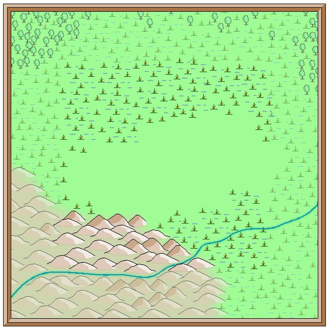
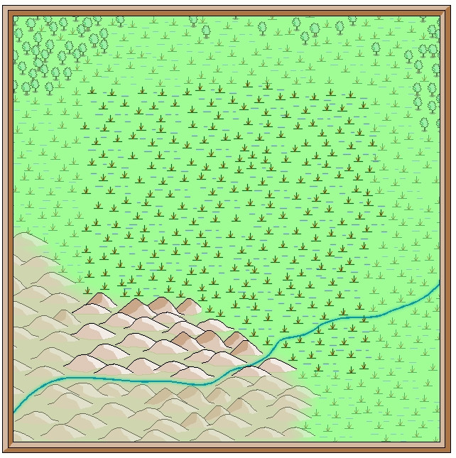
With that completed, deciding what symbols would be suitable to highlight the features on the fully-mapped area could begin - next time!

-
Issues with Inked Ruins Style: Hatching "Texture" Size and Water Rendering
The water lines problem looks to be one of the classic issues with too many nodes too close together, in this case because the water drawing tool is set to not extend beyond the map border, and as a smooth drawing tool, it will automatically put a pair of "Corners" at the map border to create the straight line there. A Corner is basically three nodes very close together.
A quick check suggests you should be able to solve this by using the "Advanced" button for the water drawing tool, unchecking the "Restrict to map border" box and then save the tool. Then redraw your river, making sure you draw the ends a little way beyond the top and bottom map edges. DO NOT use the "C" = "Corner" option, just add a few nodes and make the ends of the river outside the map border a bit more rounded, with fewer nodes close together. The screen should hide this once you're done (or if not you can use the COLLAR commands to create a new, larger one - use COLLARDEL first to remove the existing screen, and then COLLARAUTO to add a new one - if I've remembered that right).
Hopefully, that'll cure this point at least. Good luck!

-
[WIP] Community Atlas Competition - Runcibor Dungeon
@Quenten asked:
I will probably change to X-section to show joining passage ways, by bending the red line - can that be done, ie would it be stupid to do it?
It's pretty much standard practice in a lot of real-world cross-sectional mapping to vary the line direction like this, often to follow a specific passageway, or series of linked passages and caves. The purpose of the cross-section is to provide useful detail that's not so easy to identify on the plan-view map, so any line that works best to show that is appropriate.
Indeed, if you take a look at the PDF mapping guide for CA7, Caves and Caverns, this is exactly what Ralf (I think?) did in drawing the sample cross-section for that cave using the modern cave mapping style.
Sometimes, it may even be helpful to use more than one such cross-section.
Looking at the cross-section on your first map above here, while it's interesting, in pointing out how variable the levels are in different parts of the cave system, it's not all that helpful, since it implies other parts of the caves may be at similarly variant levels, without indicating what those may be.
In some cases this may be of merely academic interest, where caves aren't directly linked to one another and are some considerable horizontal distance apart, for example. However, where the passages and adjoining caves are at different vertical levels, it can be much more important - i.e. if a passage enters in the ceiling of the next cave, say.
It may also be useful to add some cross-sections of individual passage segments next to the area on the main plan view too. For instance, there are a couple of clear choke-points towards the SE end of the narrow, SE passageway. This suggests they're more or less impassable, yet there's a mapped cave beyond them, so there must be a way through, if perhaps only a crawl-space. A cross-section of just the choke-points on that passage next to the narrowest parts would help clarify that.
![[Deleted User]](https://secure.gravatar.com/avatar/c75d9a245b74d9c59be0999ea81ca541/?default=https%3A%2F%2Fvanillicon.com%2F92add7f8c954488718110edc4896ad39_200.png&rating=g&size=200)
-
Community Atlas: Embra - Travelling Places
Which brings us to the last map in this group, covering the eight "ways":
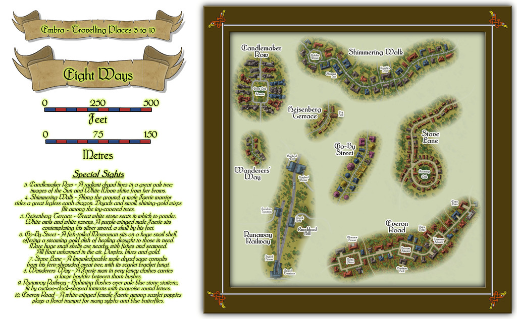
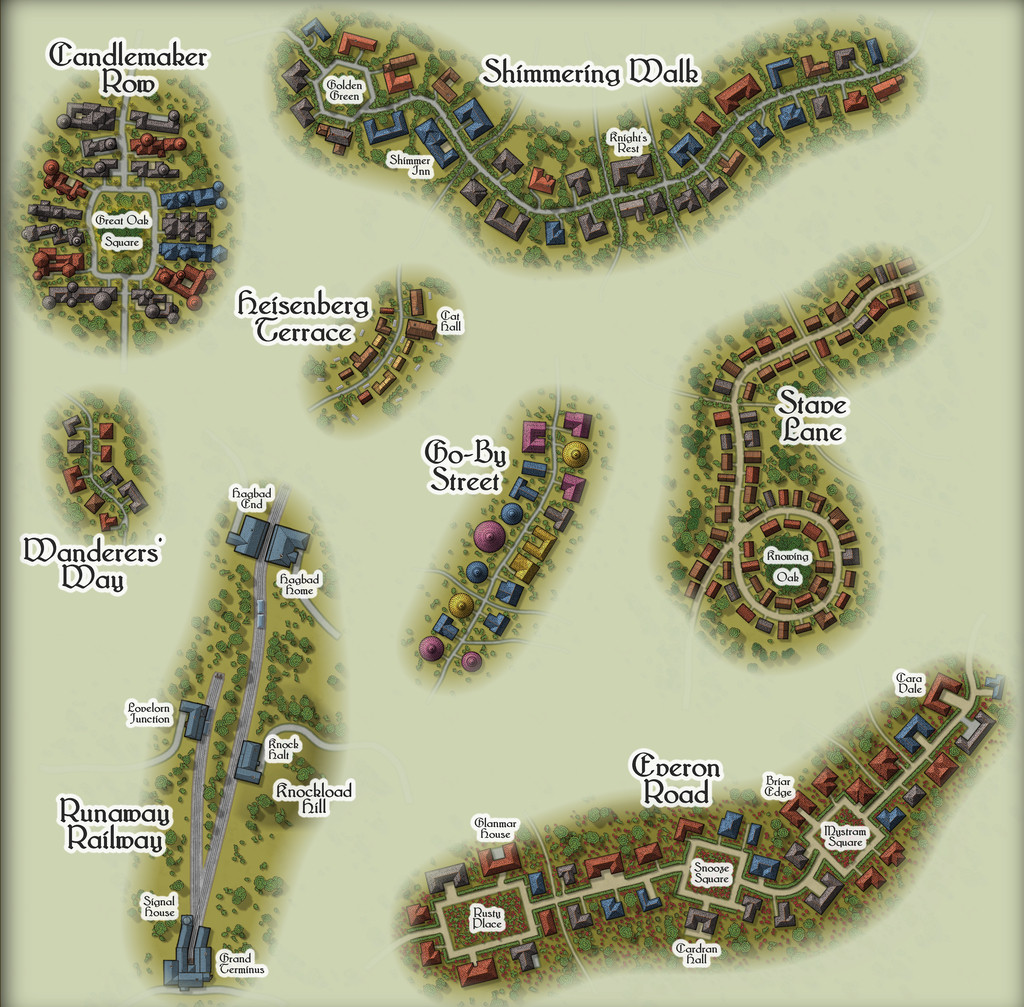
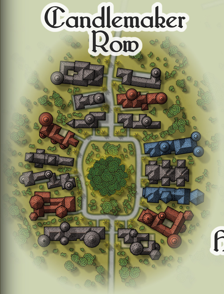
While the seven streets were constructed randomly from the simple system I'd devised and used previously, the railway needed some further adaptations, reducing the angles turns and junctions could have, and such like. In drawing the final maps, I kept the roads deliberately free from as much obstruction as possible (vegetation and the proximity of the properties along each), since the essence of Travelling Places relates to movement. In the accompanying notes, I've suggested GMs should allow speedier normal movement when using any of these routes, as long as the party sticks to the way itself. And naturally, there are oddities. Such as the large, complex building shapes along Candlemaker Row, where sadly, I fear the giant standing candelabra that light this route at night will be barely visible, and likely unidentifiable, at the Forum's resolution on the above maps. So let's try this view instead:
That weird loop in Stave Lane came from the construction process alone, which was a pleasantly amusing surprise when I plotted-out what the dice had rolled for the first time, especially as it made Stave Lane - a name yielding expectations of being straight and direct - one of the most convoluted of Embra's mapped streets!
Heisenberg Terrace, naturally, isn't always there, while the bazaar in Cat Hall is run by a humanoid feline, Shrew Dinger... Go-By Street is easily missed too, without care (aside from being a test for people's knowledge of fantasy literature; a good spot to place The Genuine Magic Shop, perhaps - despite its different author). The literary origins of Everon Road's name might be an easier test though.
As for Runaway Railway, aside from the real-world city of Edinburgh (very loosely the inspiration for some of Embra's place-names, as well as its actual name) being a major railway centre in Scotland, it also has the surviving remnants of a far earlier horse-drawn passenger rail-line, the "Innocent Railway", so I felt I had to include a railway of some sort in Embra. It's obviously short and simple, though as with everything else in Embra, its size can be as deceptive as GMs require. Rather than get bogged-down in detailing the line's operation, I chose to have the rolling stock run by the magical forces of electrickery (see Wyvern Citadel on this, if necessary). Conveniently, the featured text - and remember, these things were chosen randomly! - involved lightning flashes, which made that decision very easy.


-
Community Atlas: Kara's Vale, Ethra, Doriant
Back to topic!
Windy Tower: Sited near the east bank of Summer River in the Kara's Vale map's northwest, northeast of the line of Quarry Cliffs, and surrounded by jungle, is this fabulously ancient Tower, said to be a Wonder of the Ancient World. Notable for its unusual red stone.
Which is a slight paraphrase of the Kara's Vale map notes about it. I'm not sure quite why, but my thoughts for how this might be mapped drifted away to a 50-year-old fantasy skirmish wargame from 1976 called "Citadel: A Quest Within A Wizard's Tower" published by Fantasy Games Unlimited. This used basic thin-card-printed maps (brown ink on pale yellow card) drawn to 25 mm scale (the general height of cast-metal, normal-human-sized wargame miniatures back then), with square, thin card markers for the creatures defending the tower, the treasures and traps inside, and the connections between the different tower levels. Hero miniatures had to be provided by the players, and their relative strengths also decided that way, which made for quite a bit of work in advance, before being able to play the game originally. There were six card maps, printed on both sides, giving a dozen different floorplan layouts, only six of which were used per game, and the blank reverse counter sides created a fog-of-war situation, meaning the heroes had to check every counter to navigate their way between the tower's levels, find the treasure, and battle the monsters, without knowing what each counter might be in advance. As a game, it was OK, though often quite lengthy to play, and the card markers made it very easy to accidentally knock things out of position, albeit these were common elements in other games of the period. It also didn't look great, so we sometimes substituted monster miniatures for the card markers, only to then forget what strength each monster was meant to have... Joys of youth, eh?!
Feeling this to be a suitably Ancient Wonder of the World, I thought it would be interesting to adapt it for the Windy Tower maps. The floorplans meant the layouts for each level were available straight away, although those were amended in places to add doors (the original game had none) and a few extra walls. The connections between levels were originally portals in essence, because any on a given level might go to, or from, or both to and from, any other level in the tower, a concept retained here too, along with the two main treasure options, an amulet and a talisman, and the use of three types of defending creatures. In the original game these were "humans", "near-humans" and "non-humans" of varying numerical strengths. That, and the general "ancient" concept, drew me to warriors and mythological creatures from ancient Mesopotamia on Earth, because artworks from the 3rd to 2nd millennia BCE and later there show a similar range of beings - humans, demi-humans and non-human creatures. We know very little about any of these, even archaeologically for the human warriors, so there'd be options for some suitable expansion and interpolation of fantasy elements here.
Having got this far, with a list of possible options for all three defending creature types, some semi-random rolls helped decide what was where (limited so as not to have too many creatures or portals on any given level), after a further decision had been made to use all twelve tower floorplans, so Windy Tower would have twelve levels. Naturally, not all the creature options were chosen in the final version, but those that were are all provided with notes in the Atlas version (and here too for clarity), with statistics for the Shadowdark RPG, to help provide some pointers to their strengths, powers and abilities.
And so to the map. As each level in the Tower is an identically-sized square in area, there was the possibility of setting up twelve separate Atlas maps, using a simple copy & paste option between each map to draw their outlines and other basic features. However, that seemed a bit "ordinary", and as part of the point of this project has been to try new (for me) things from time to time, I decided instead to draw the Tower in a single map, with the contents for each level on its own Layer, and then to set-up hyperlinks for the portals on each level that would then allow one click on said portal to show each Tower level as it was encountered, using the FCW version of the map. After first checking with Remy Monsen to ensure A) that this wouldn't cause problems with the normal Atlas navigation processes, and B) that I had the correct macro commands to actually do this!
Following which, the mapping could begin. As the connections between levels were randomly set, including the surface entry point, the first level encountered when approaching from outside is Level Five:
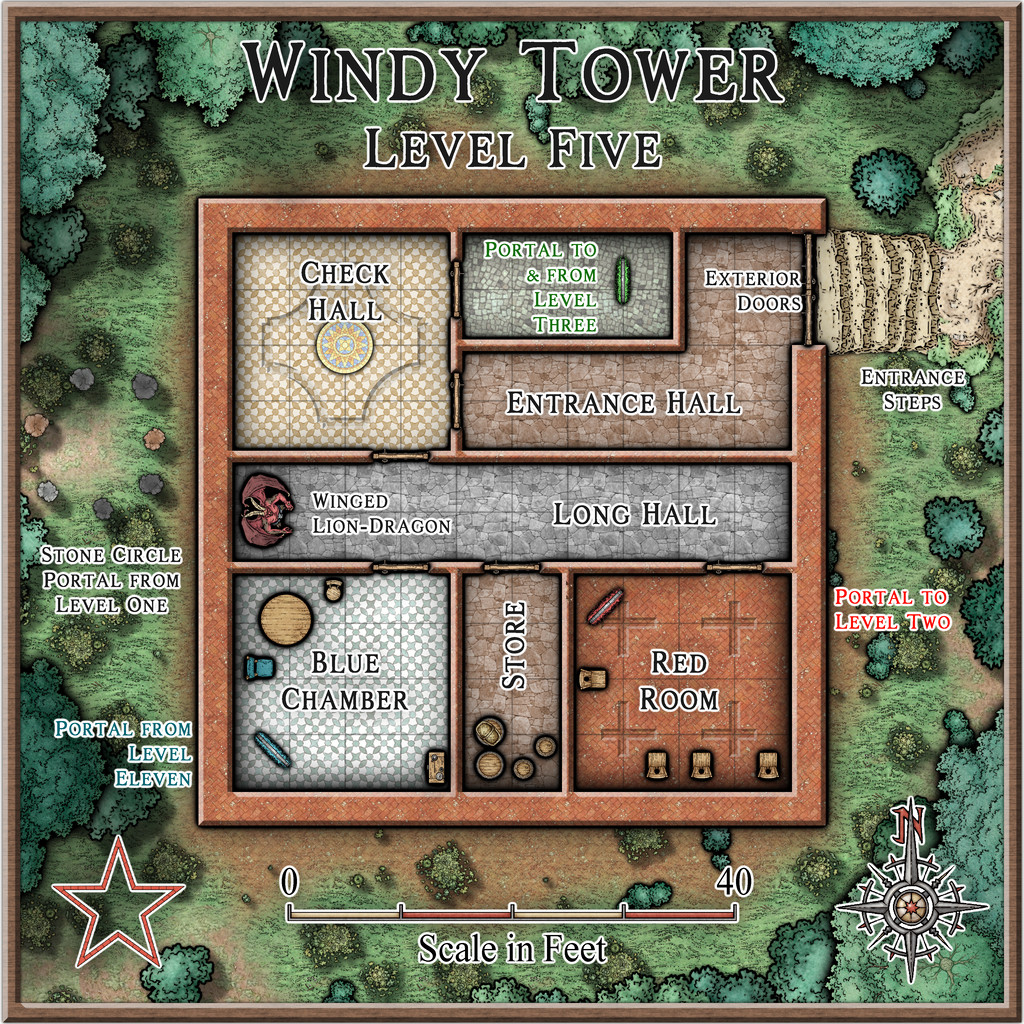
While the original floorplans were fairly basic, they did commonly show variations between the flooring in separate areas, so something of that concept was adopted here too, with effects and furnishings to liven things up further.
One significant problem was finding suitable markers for the different defending creatures per level. I'd already decided that these would appear as statues until activated by intruders in their part of their own level, so their starting locations needed to be identified. However, the range of top-down statues and creatures in the Mike Schley style - even with all the monthly symbol options - is extremely limited, especially as some of the statues have large bases as well. Adding the original DD3 creature options only helps marginally, again thanks to a limited range of options, most of which don't include varicolor that will allow creatures to appear as statues instead. So the creature options used here were purely a compromise, using varicolor shading at times to separate the different kinds, and occasionally adjusting the sizing as well for the larger non-humans.
From Level Five, we have portal options to go to Levels 2 or 3, but rather than following such convoluted paths in showing the rest of the maps, the remainder will be presented simply in numerical sequence.
That though will have to wait for another time - like the notes on what a "Winged Lion-Dragon" might actually look like!
-
Show me your science fiction maps!
Not sci-fi, since they were all done for the Nibirum Community Atlas, which is all fantasy mapping, but they were done in the general style of planetary-system mapping, so may still be of interest. However, I did a series of maps for said Atlas back in 2018 - Forum thread here, Nibirum Solar System start page here, with a sample map to give you an idea, just for the inner planets:

All these maps are also in my Forum Gallery here.


