


Royal Scribe
Royal Scribe
About
- Username
- Royal Scribe
- Joined
- Visits
- 9,536
- Last Active
- Roles
- Member
- Points
- 3,353
- Birthday
- February 5, 1968
- Location
- San Francisco, California
- Website
- https://legacy.drivethrurpg.com/browse/pub/31814/Royal-Scribe-Imaginarium
- Real Name
- Kevin
- Rank
- Mapmaker
- Badges
- 16
Latest Images
Reactions
-
Seeking: Feather, scale fills
Thank you, Sue. No, please don't drop anything for this! Right now, I'm just experimenting without any time deadlines. And it's not commercial, so that tip is helpful.
I forgot you can't align a Texture Overblend. Let me see if I can experiment with some symbols, or with seamless fills available for noncommercial use.
Thank you!

-
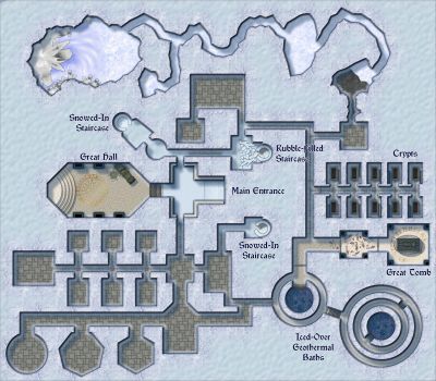
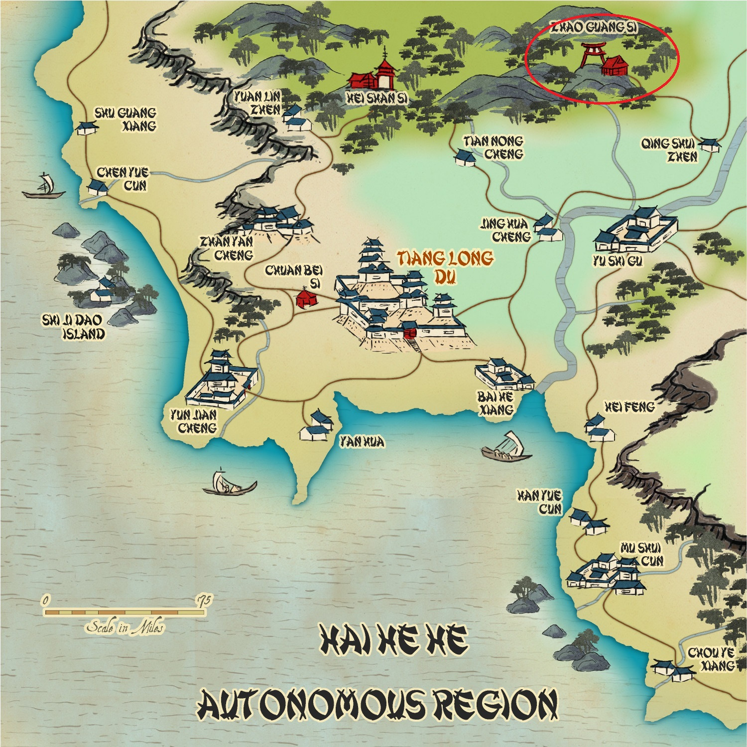
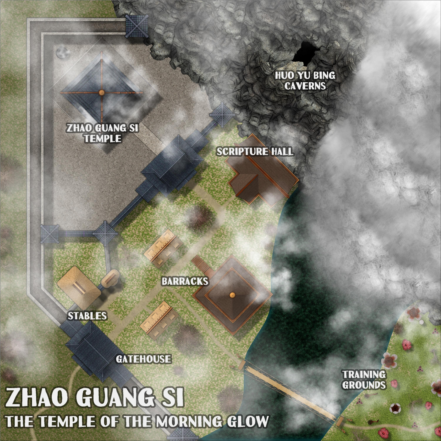
[WIP] Community Atlas: Kumarikandam - SE Tiantang Region
Here is the third of the three monasteries that I collaborated with @Ricko on for the Atlas. This is Zhao Guong Si, and it is located here (circled in the upper right corner):
There are a bunch of FCW files to submit because in addition to the monastery's grounds, we also go inside (and below) the temple, as well as in two "dungeons." I will post each discrete location separately in this thread.
First, the city map for the Zhao Guong Si monastery.
Toggle: CLOUDS layer to hide/reveal the clouds.
Description
Zhao Guang Si
The Temple of the Morning Glow
Situated in a hidden valley where the morning mist never quite dissipates, Zhao Guang Si (Temple of the Morning Glow) is a place where deceptive beauty hides a dark core. Despite its poetic name, the temple is synonymous with silent death and lethal precision. Here, under the first rays of dawn, apprentices learn the art of killing. The morning glow symbolizes the last moment many see before their silent and ordered death.
The Dark Environment
The temple, with its angular and austere architecture, is surrounded by twisted trees and a river of dark waters that flows silently like clotted blood. The black stone walls are decorated with murals depicting stories of betrayal, revenge and glory gained by force. The only constant sound is the echo of calculated footsteps in the cold corridors. Lanterns covered with red veils create a blood-red glow, making the environment even more somber and oppressive. Life and Training
Those who come to Zhao Guang Si are desperate, rejected, or ambitious, seeking a new identity. Under the watchful eye of their masters, known as the Shadows of Dawn, the apprentices undergo intense and cruel training.
• Physical Training: They climb cliffs without ropes, traverse fields filled with deadly traps, and duel to exhaustion, all to strengthen their bodies and reflexes.
• Mental Training: They are taught to hide emotions, manipulate the minds of their targets, and plan assassinations with surgical precision.
• Practice of Forbidden Magic: The temple houses ancient grimoires containing magics that grant temporary invisibility, silencing voices, and even cursing the senses. These spells demand sacrifices, often blood, making the price of power high.
The Bond with the Emperor
Although few would admit it, rumors persist that the temple has deep ties to the imperial throne. Men of the Emperor’s Personal Guard, known for their lethality and unquestioning loyalty, are said to have received secret training at Zhao Guang Si. Some claim that the emperor himself is the temple’s greatest patron, using its resources to eliminate rivals and consolidate power.
Legends and Intrigues
The temple is shrouded in dark tales:
• The Ritual of the Scarlet Mist: It is said that an assassin can sacrifice his soul to merge with the shadows, becoming invincible for a night. But few return from this ritual unharmed.
• The Echo of the Morning Glow: Legend has it that those who hear a whisper at dawn are marked for death by a blade that will emerge from the temple.
• The Faceless Master: A mysterious leader who never reveals his identity rules the temple. Some say he is an ancient spirit who has ruled the place for centuries.
A Haven of Questionable Morality
Zhao Guang Si is not just a temple; it is a training ground, a storehouse of forbidden knowledge, and a center for the trade of death. Those who enter rarely leave, but for those who survive the rigorous training, life outside the shadows becomes irrelevant.
In the dim light of dawn, under the treacherous glow of morning, Zhao Guang Si molds assassins, manipulates destinies, and remains a dark pillar in the region's balance of power.

-
[WIP] Wizard's Tower - Interior
Thank you!
I admit that I drew from a lot of different sources. The base is CA186 Creepy Crypts (2022), which I used in preparation for when I get to the basement/dungeon section. The main fills for the walls and floors of the tower itself come from CA149 Beaumaris Castle (2019), and the windows are from that, too. Most of the furniture comes from Dungeon Designer 3, but some are drawn from CA14 Symbol Catalogs (2008), and some of the fireplaces are from Shessar's free supplement. Some of the outside vegetation comes from CA141 Japanese Temple and CA143 Asian Town (both 2018).
Normally when designing something for the Atlas, I try to limit it to just a few styles to minimize the chance that others might be missing chunks of it. This time, I gave myself free rein to create my wizard's "dream home."
-
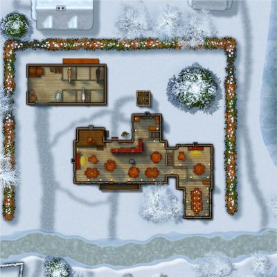
A Monastery by the Sea
The elevation changes are really great!


-
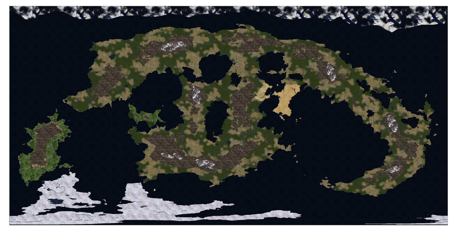
[WIP] Adnati - Birdseye Continental
That central donut shaped continent looked to me like a sloth hanging from a tree, but a friend of mine thought it was a smiling frog. It’s like a Rorschach test.

-
The Sola System: Adnati's star and celestial neighbors
Inspired by Ralf's tutorial today showing the Cosmographer System Map, I did a little solar system.
My campaign world is named Adnati, and I had long ago worked out the major celestial bodies that could be seen by the naked eye or by rudimentary (by modern Earth standards) gnomish telescopes.
The sun is named Sola (named so that words like "solar" still make sense).
There are five observable planets, and just as Earth's planets are named after Roman gods, I decided that Adnati's would be named after elven gods. They are:
- Eldamarí – Named after the elven god Eldamar Galion, god of mountains, minerals, and the forge. It has a slightly reddish hue.
- Gatheloní – Named after the elven god Gathelon Tarminel, patron of patron of instrumental music, democratic institutions, pranks and mischief, toys, wine and other intoxicants, the judicial system, and illusions and cantrips.
- Lassamistrí – Named after the elven goddess Lassamistra Ordymil, goddess of the hearth and domestic institutions.
- Lythí – Named after the elven goddess Lythia Nuros, patron of governance, diplomacy, battle strategy, and academia. It is the brightest of the planets.
- Tyrí – Named after the elven goddess Tyra Manora, patron of the sea. It has a slightly bluish hue.
Since the template also has Outer System and System sections, I decided to add more -- stuff extraterrestrial observers would know about, but Adnati's indigenous population wouldn't know about: an asteroid belt, two more gas giants, a tiny Pluto-like planet, and farther out, a wormhole.
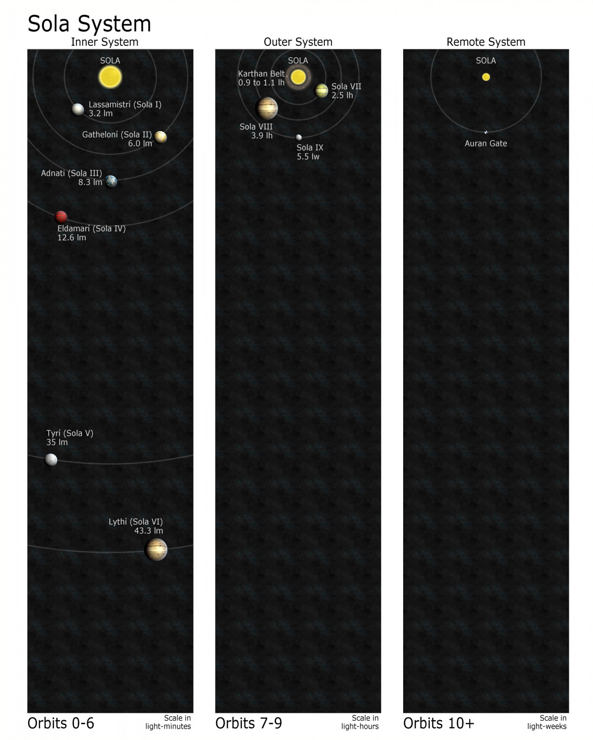
Now I need to do a map showing Adnati's three moons:
- Lunaal - The gray moon with an orbit of 29 days (named so that terms like "lunar" still make sense)
- Raudraal - A smaller red moon with an orbit of 40 days
- Caerudraal - The smallest moon, a blue moon with an orbit of 77 days

-
Adnati - Cosmographer Satellite
Inspired by the most recent Live tutorial, here's a quick and dirty rendering of my campaign world in the Cosmographer Satellite annual. Taught myself a few new techniques in the process regarding exploding multipolies so that the land masses brought in from a Fractal Terrains export could be managed separately -- but then I had to rescue the inland seas and lakes.
This is pretty rough. I used the partially transparent forest fill over most of the land as a cheap shortcut. Just wanted to see what I could get done in an hour (though this was closer to two hours).
-
[WIP] Wizard's Tower - Interior
-
Missing Fill and Castles Failure
Moat is a water fill from Vol 13 but you could substitute any water fill you want.
-
Missing Fill and Castles Failure
Don’t worry about Cobble Final. It shows as missing on mine, too. Remy said something about how that shows up and is a weird legacy fill, or something like that.
The Beaumaris Castle fills are from CA 2019 (volume 13). Did you get that one?

