KertDawg
KertDawg
About
- Username
- KertDawg
- Joined
- Visits
- 2,706
- Last Active
- Roles
- Member
- Points
- 188
- Birthday
- February 16, 1978
- Location
- NC, USA
- Website
- https://playbyweb.com
- Real Name
- Kertis Henderson
- Rank
- Surveyor
- Badges
- 3
Latest Images
Reactions
-
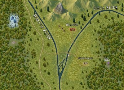
WIP Community Atlas - Mortyn-Goya Confluence
This is my first community atlas contribution. I ask for input. What do you think should be added? I tried a few things like fishers, hobbit (or baddie?) holes, and wizard towers. These things did not seem to fit well. I have creator's block!
(Yes, I see the need to clean up the text. That will come.)
What do you think might be in the woods to the west, for example?
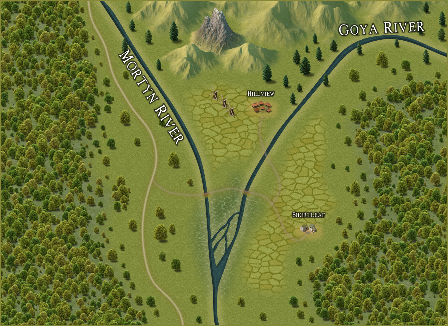
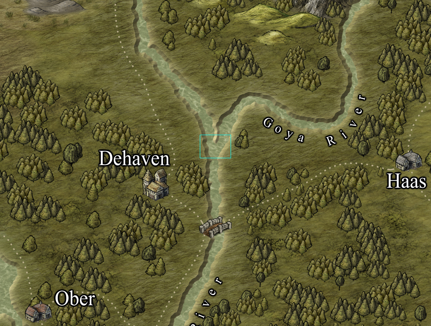
For reference, here's the parent map:
Thank you.


-
Export lights to Foundry
Loopysue! They can "shed some light!" At least *I* got it.

-
New Laptop Time - thoughts on configurations?
I have two suggestions. I agree with what JulianDracos wrote, by the way.
Don't get a 4K display. I love them for everything except CC3. Scaling CC3 for 4K doesn't seem to work for me. A 1080 HD display is perfect for CC3, in my opinion.
Get SSD for storage. I think it's hard to find a model without SSD. It's important enough to mention, though.

-
Post-processing Map to Age It
I've been working on this off and on for a few days. I appreciate all the help and input.
I experimented with matrices, and I think a scaled unity matrix (contrast) and adding brightness is exactly what I needed.
The multiply blend mode gives the texture underneath. This is a success.
Now to actually finish the text. That's another story...
Thanks again.


-
JPG Fill Different from Editor
All, much better. Thank you!


-
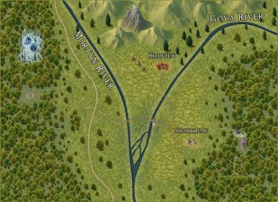
WIP Community Atlas - Mortyn-Goya Confluence
Here's an update. I added some detail. I'm stepping back to evaluate the entire map.

-
Looking to Hire a Mapper
I will leave that to Xargun, as that is the owner of the maps. I also refrained from posting them here to avoid spoilers for the players!
I was asked to do everything but the roads, settlements, and labels. That left just the basics to do. I had a lot of fun doing it.
An interesting note: We selected SS1b as the style. I used that for everything including the symbols. I eventually split some things into their own sheets, like the hills vs mountain areas. I think I made my own river style based on the existing lake style. The point is that I used only what was in that style and nothing outside of it. Rather, I tried to do that. I somehow got some Darklands hill symbols in there. I don't know how that happened. It turned out to be good because the hills went well on that map. The downside was Xargun had to buy that annual. (Though I think one can never have too many annuals.)

-
xkcd: Bad Map Projection
There's a webcomic, xkcd, that sometimes has comics about maps. I enjoy these a lot. The latest one is a crazy projection with the US state of Kansas as the outer edge of the map.
Have any of you experimented with projections in unusual ways? For example, the maps I saw in primary school use Mercator projections that made Greenland look much larger than it really is. It gave me a skewed idea of what the world looked like. Has anyone used this kind of effect in a map or game? I think it could be fun.
Arriving at a new kingdom, the travelers step onto the small island. "This island is tiny! Let me see that map again..."


-
Gurgen's Rock - Mining outpost
I think this is great. I love the texture.
The only thing I suggest is to compare the length of the cliff's shadow with the shadow of, say, a building. I think the cliff shadow is too short.
Maybe that's a perspective thing. Most of the map is overhead, but the cliff is not. I'd say that if the cliff were narrower and the entrances were at a sharper angle, it would match even better.
These are just comments, as I think the map is really good.

-
Trying to create a simple style
How to make the mountains pop? I'm not sure they need to change. I kinda like it. Maybe a shadow of some kind, but I don't think it's needed.
I like it!