KertDawg
KertDawg
About
- Username
- KertDawg
- Joined
- Visits
- 2,705
- Last Active
- Roles
- Member
- Points
- 188
- Birthday
- February 16, 1978
- Location
- NC, USA
- Website
- https://playbyweb.com
- Real Name
- Kertis Henderson
- Rank
- Surveyor
- Badges
- 3
Reactions
-
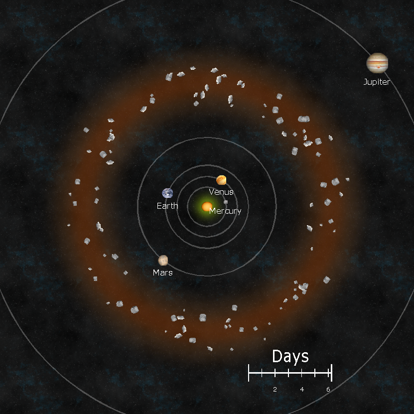
XP - Solar Legends Map Generator
I present a map generator for my own RPG: Solar Legends
The game uses a solar system map that is updated as the campaign goes on. On one day, the distance between Earth and Mars might be a quick trip, but the next month it could be a long journey. This XP add-on calculates the orbits and draws them out. You can zoom in/out, pick specific planets, and scale everything.
I have the code at:
My next effort will be to package it so that you don't need Visual Studio to run it. I'll probably ask for advice soon. Thanks everybody!
-
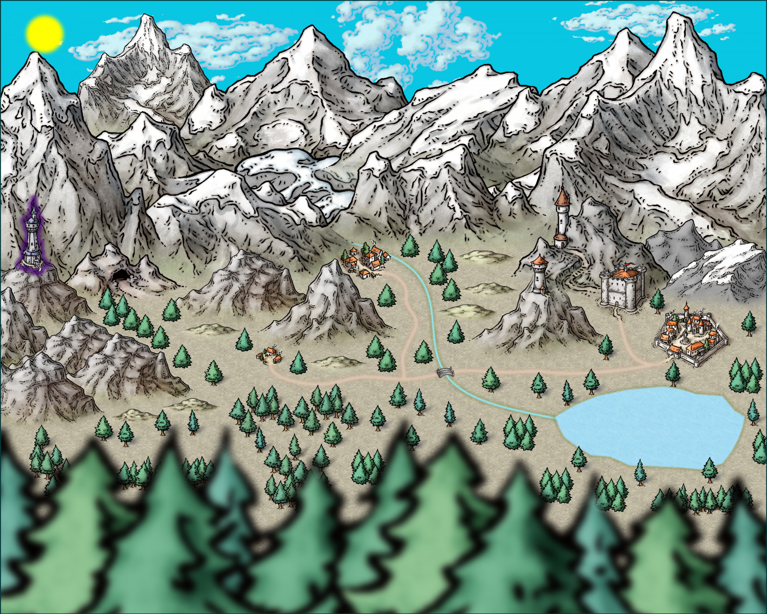
Mountain Town
As you may have guessed, I'm relatively new to CC. I wanted to show off a map that I did for fun. I had no goal or use for this, aside from the experience. I've been enjoying CC3+ so much that I now seem to be seeking it out in my spare time. Any feedback is welcome.
(FYI, this was done on Wine in an Ubuntu VM over RDP to a Macbook. It seems cumbersome, but it works very well.)
-
Wrought iron *decorative* gate
(edited step 4)
GIMP can select areas by color. You can select all white pixels on the image with one click. Maybe use a little tolerance to include your preferred shade of gray in the borders between white and black so it's not rough around the edges; it's a visible setting. Then add a layer mask based on that selection. White will then be transparent. You can save that as a PNG or put whatever color you want behind it with a fill of a other layer behind it.
Short answer:
1. GIMP
2. Select by color, click any white pixel
3. Menu: Layer, Mask, Add Layer Mask
4. Pick "selection" and check "invert selection" at the bottom.
Done!
-
One Page Dungeon Contest - Cave Map
Greetings! I mentioned a little while ago that I planned to enter the One Page Dungeon contest this year. Since cartography is a favorite hobby of mine, I wanted it to have some map elements to it. I have a few versions worked out, and I'm pretty happy with the progress. I wanted to show off some maps that I plan to use.
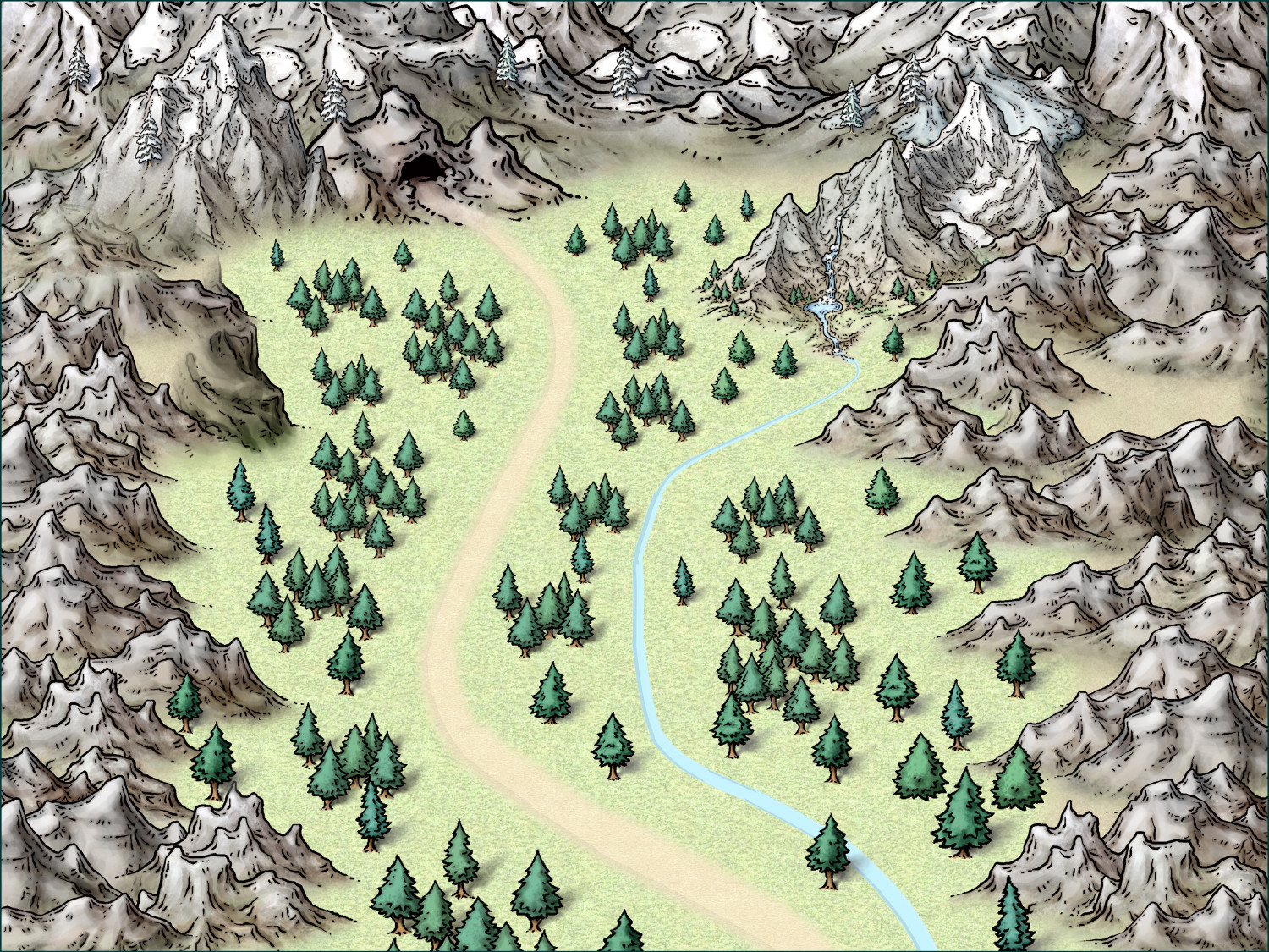
The first map is an overland map of the path to a cave. Since the entire work has to be on one page, there's not much room for such a map. I decided to make it light and in the background like a watermark. The map is cropped vertically on the page so that the path and cave are on the left half of the page. That puts it under the description text and monster information. Again, it's light on the page, but it shows some of the theme.
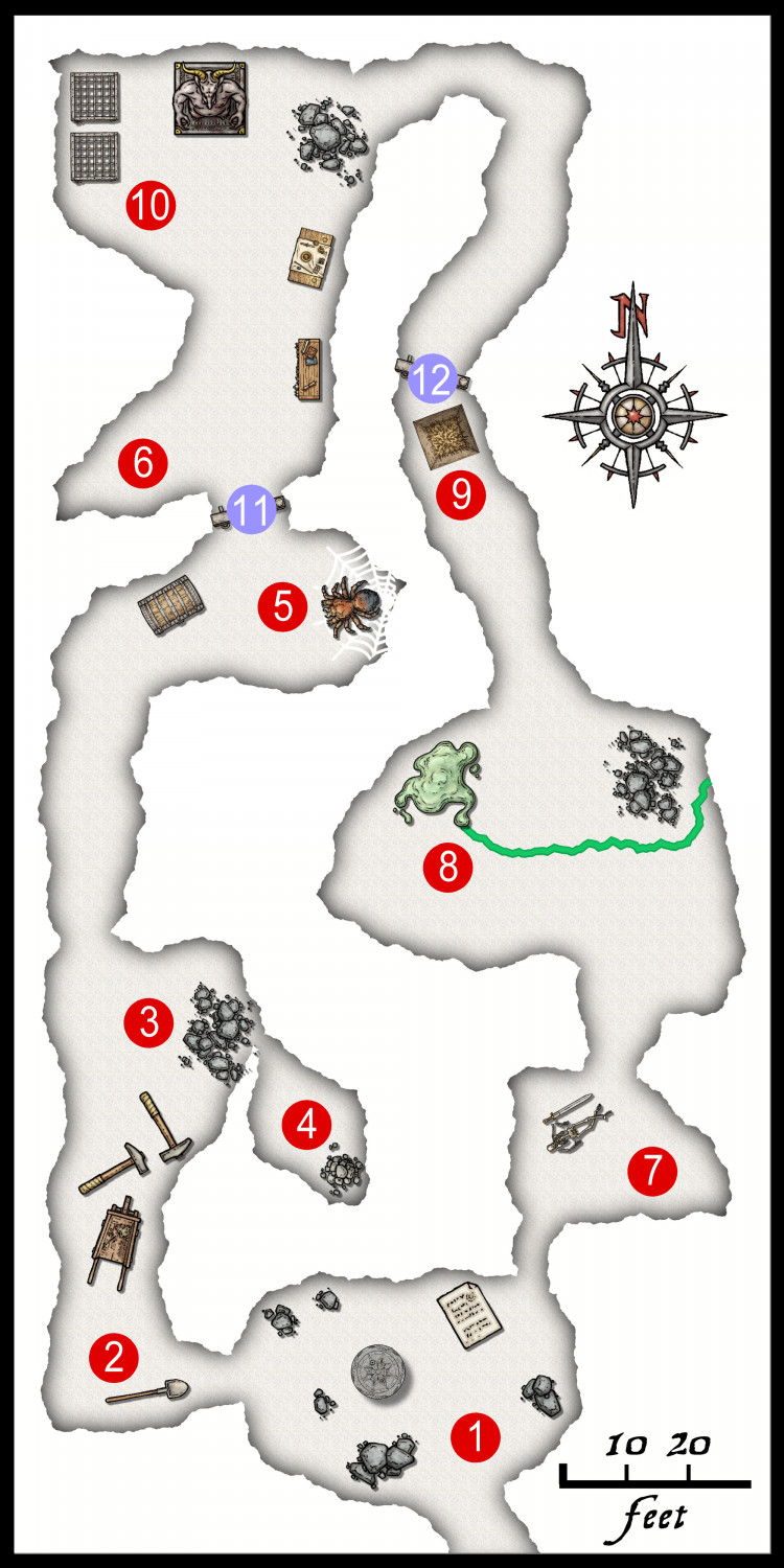
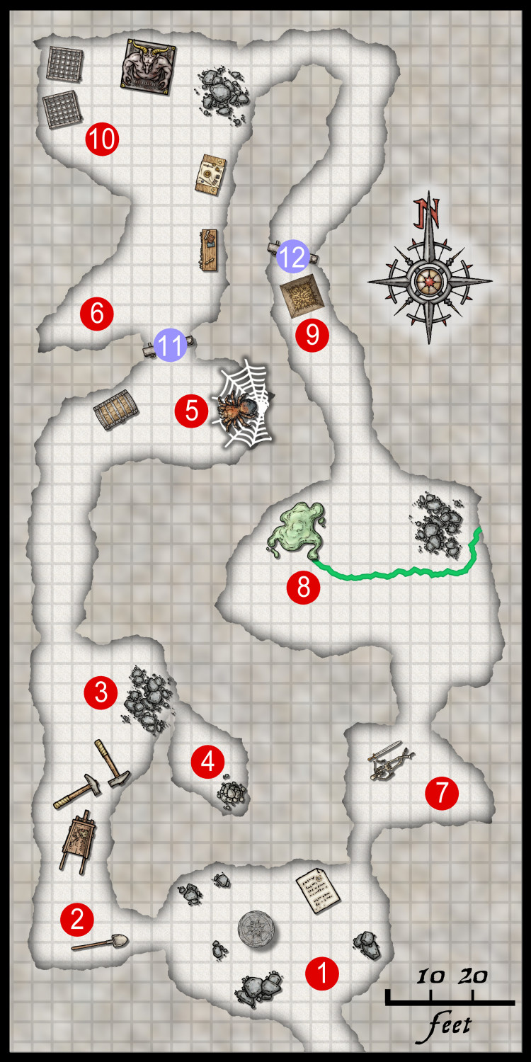
The second map is that actual "dungeon." In this case, it's a cave. I realized that each little bit of space I have on the page is very valuable. I chose to make this map about one half of one column, so roughly a quarter of the page. So, I had to keep things very clear and simple. I'd have loved to add tracks, rubble, and more mise en scène, but it just made the final page busy and unclear.
I hope the explanation of the use of the maps make the design clearer.
I'll post the entry when it gets submitted in July!
-
One Page Dungeon Contest - Cave Map
-
Show me your science fiction maps!
I have been working on an XP command to generate a system map for my conversion of Buck Rogers XXVc to D20. It's coming along, but it's not complete. The game relies on dates so that distances between bodies changes, and thus so do trade and politics. I'll share this once it's finished.
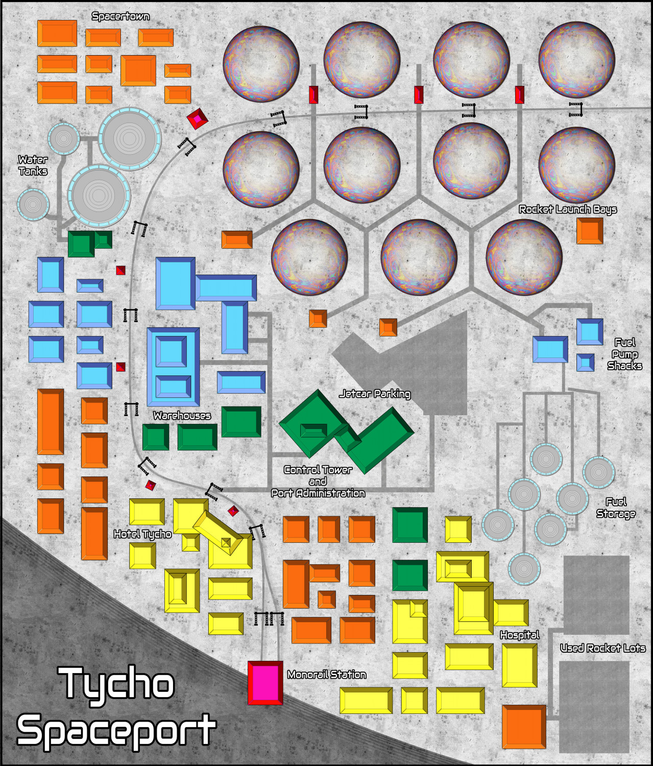
I know you weren't asking for surface maps, but I do have a remake of a spaceport from that game. (I just noticed a few mistakes, so sharing this might be a good thing.)
-
How long have you been using Campaign Cartographer?
I first used CC2 when it was a big deal in the late D&D 2e age, maybe very early 3e. Around 2000, I guess. It wasn't my copy, though. It was on a friend's PC. I expected to open a window and drop a beautiful map onto the screen with a few clicks. Boy was I wrong. It was my fault, of course, but you couldn't convince me of that. I think that friend hated it for a similar reason.
Then at Gen Con 2022, I saw the ProFantasy booth. I was again lured in by the fancy maps. I talked to somebody, but I forget who it was! We talked for a while, and he kept pointing at somebody sitting down, saying, "He knows this or that technical situation," etc. They convinced me to buy a package. This person said again and again, "Watch the YouTube videos! That's the key to beginning to learn." Again and again in this 5 minute conversation. That was my first real purchase.
I got home and installed it. I was overwhelmed again. Then, that voice boomed in my head: "Watch YouTube..." I did, and everything clicked. Then, I discovered the forums, and it set me on the right path. I do think these forums are an under-advertised part of CC3, and one of the best parts.
So, whoever that was at the booth: Thank you for convincing me!
-
Dialog Resizing - Testers Requested
Introducing CC3 Dialog Tool!
After yet another thread about the size of dialog boxes, I worked on an XP add on that can change the sizes of these dialogs. I created CC3DialogTool, an open-source project on GitHub. I ask for people to test this early version. It can only resize one dialog, the "Custom Drawing Tools" dialog, at this point. If things go well, more dialogs can be added. It doesn't save your settings yet, but that can also be added, too.
To test, get the installer from the GitHub releases page below, and give it a test. DO THIS AT YOUR OWN RISK! I tested it myself a number of times, but please be cautious. Then, let me know what you think. Any feedback, good or bad, is welcome.
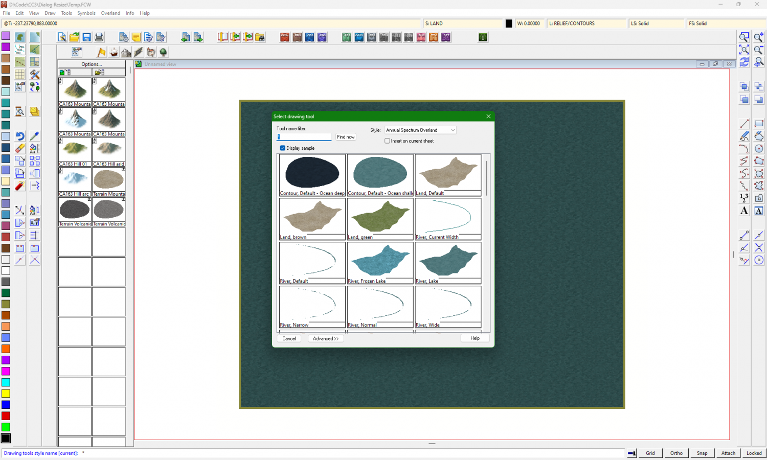
The original dialog looks like this:
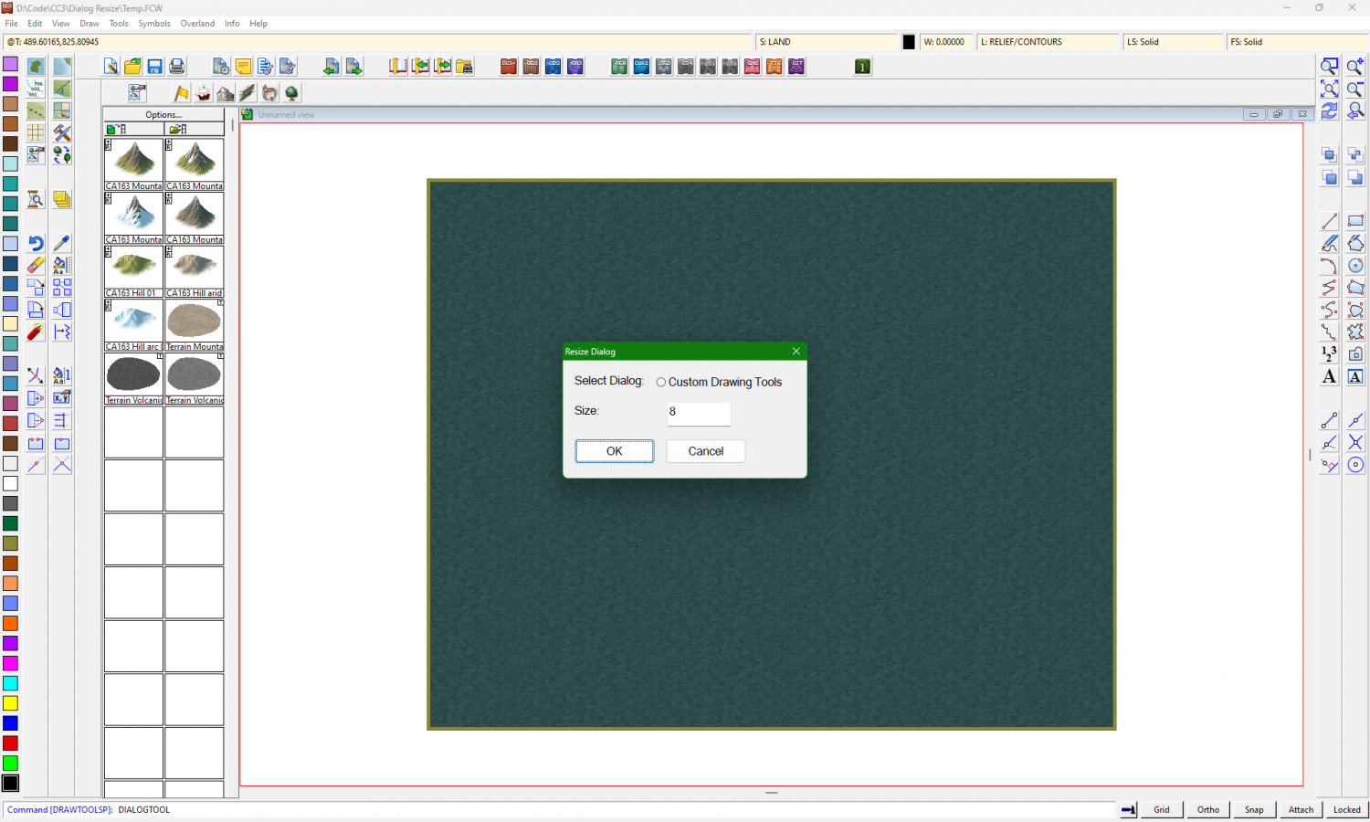
Type the command "DIALOGTOOL" and hit Enter:
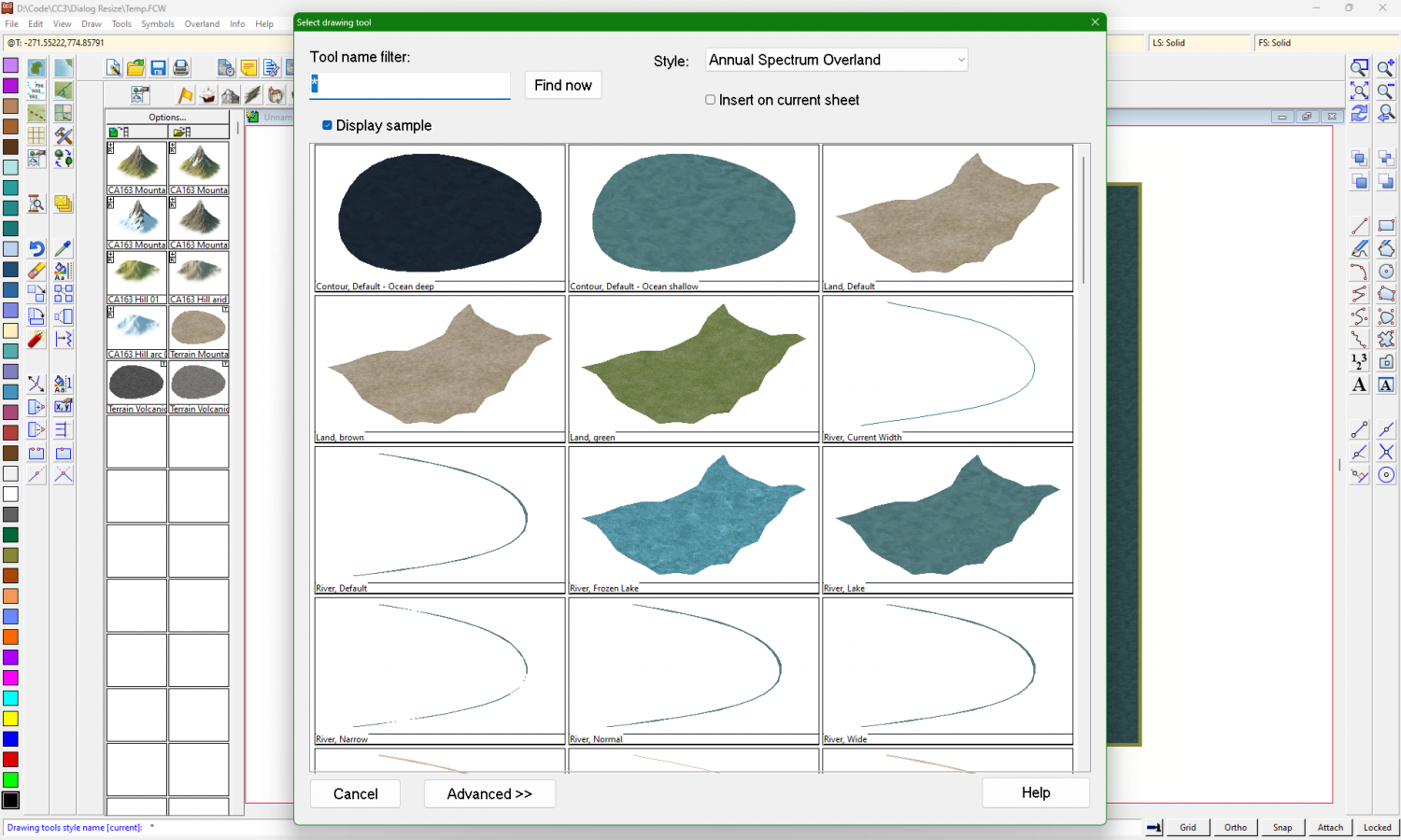
Right now, there's only one dialog affected. Enter a new size. The default is 8. Try 12, 14, or 16 to see what works best.
Thank you!
-
WIP Community Atlas - Mortyn-Goya Confluence
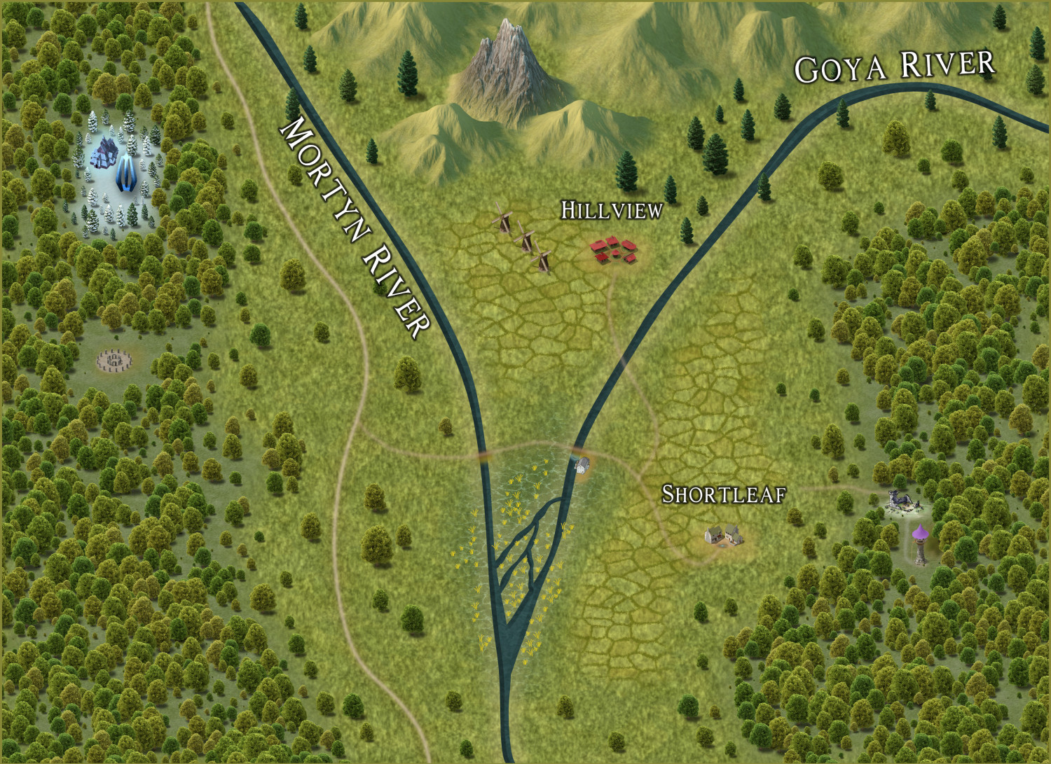
Here's an update. It's really minor stuff. I think I'm close to submitting this. I need to review the process, as it's been so long since I started!
-
Post-processing Map to Age It
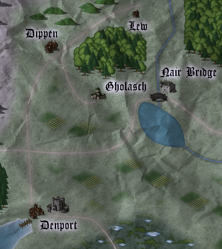
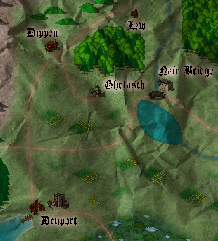
OK, done. Here's a screenshot.
It looks similar, but a little darker. I'm going back and forth between thinking that lighter text glow is better, and then thinking that the darker glow looks more "realistic." I then tried disabling the RGB Matrix, and this makes it look even darker but with more contrast.
I actually like this! Do you know of a way to decrease contrast so that it looks a little faded and not just sepia?
Thanks for the ideas! I appreciate the help.


