EukalyptusNow
EukalyptusNow
About
- Username
- EukalyptusNow
- Joined
- Visits
- 660
- Last Active
- Roles
- Member
- Points
- 1,248
- Location
- Germany
- Rank
- Surveyor
- Badges
- 8
Reactions
-
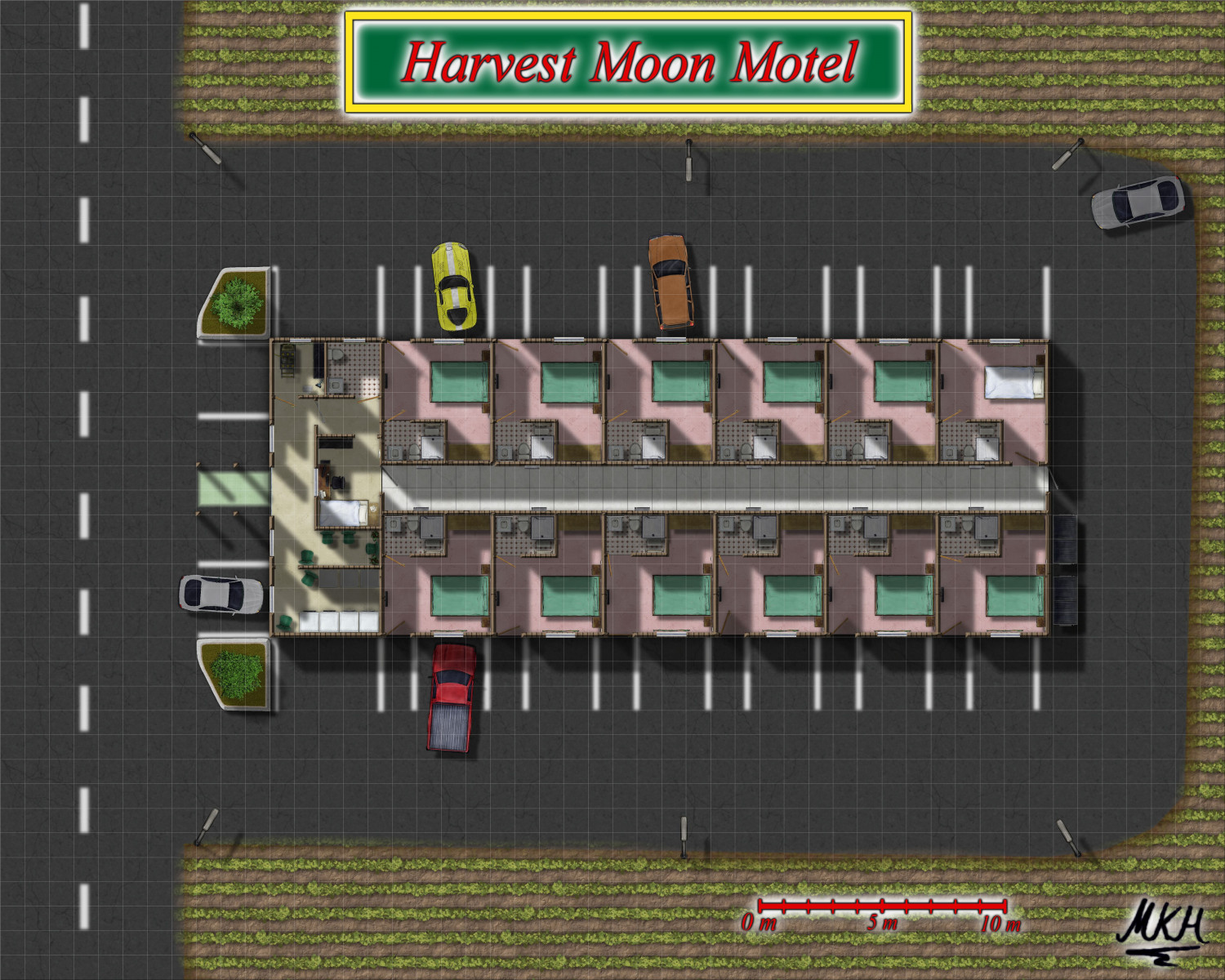
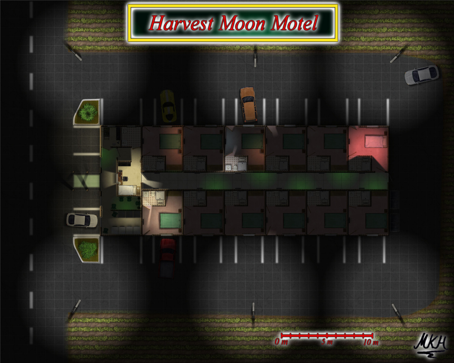
The Harvest Moon Motel - a floorplan attempt
Wanted to try around with the "modern" floor plans a bit. This is based on a real motel floor plan that we once used for a World of Darkness Game.
Overall I'm not the biggest fan of the floor plan styles. They could use more symbols and some textures appear to be very low resolution. I ended up rescaling the indoor textures and using Darklands City and Creepy Crypts for some outdoor textures.
Will try creating a lighted night version next.
A larger version is in my gallery.
-
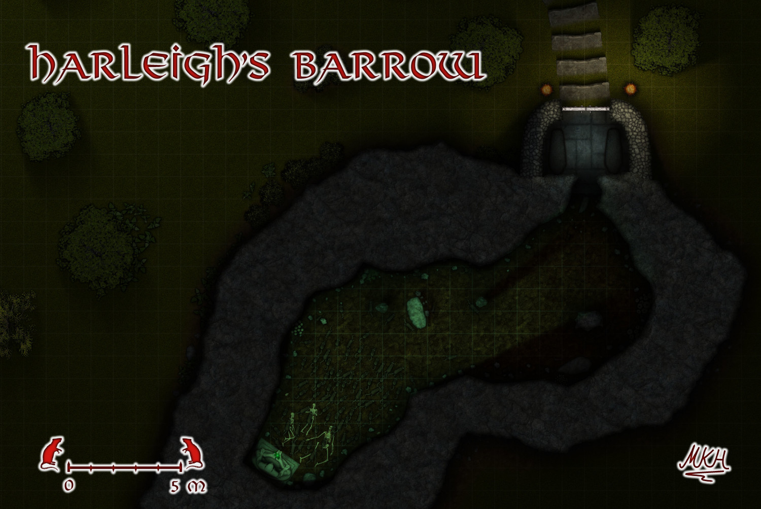
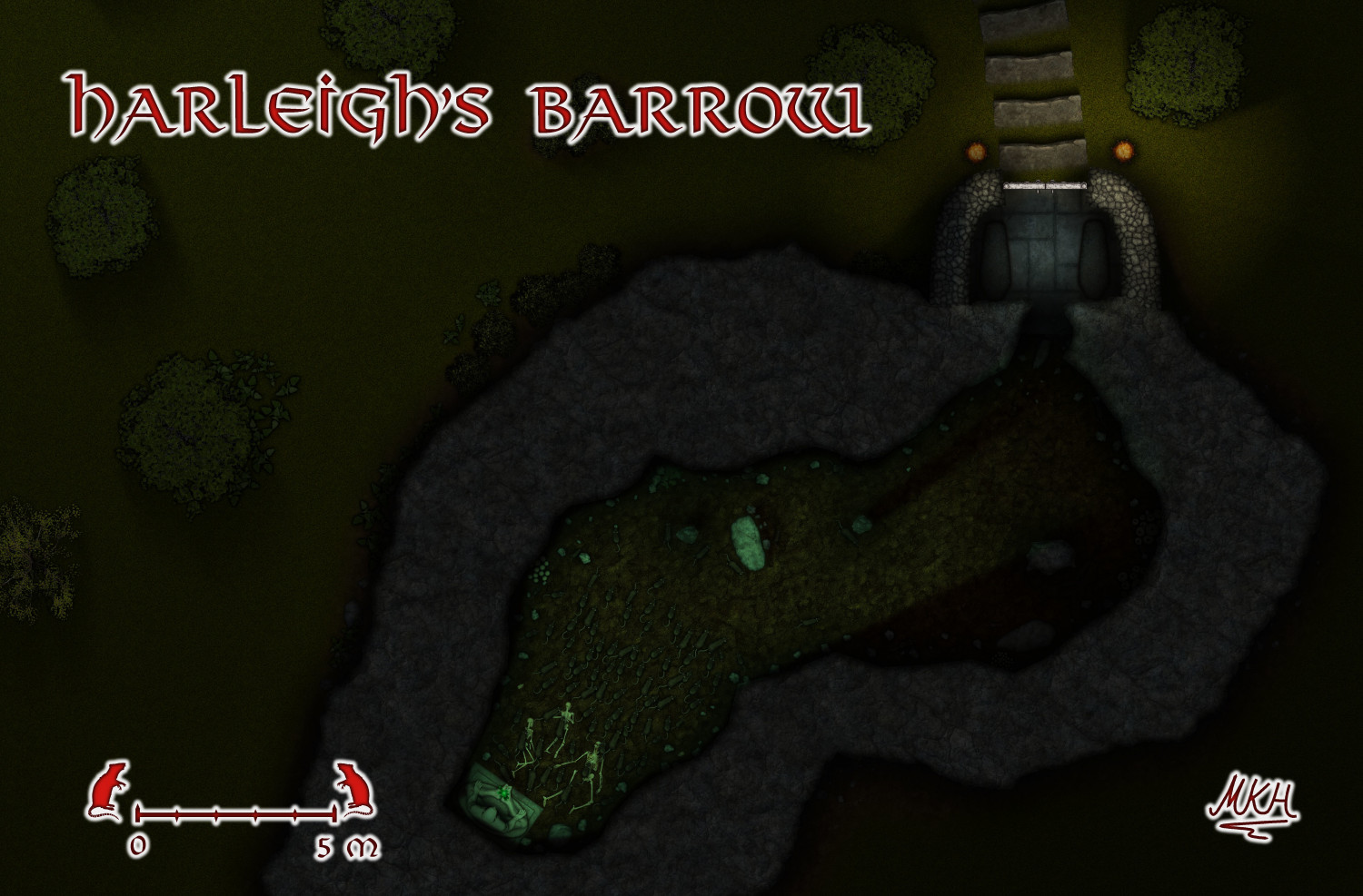
Harleigh's Barrow - a lighted Creepy Crypt
Wanted to try out the "Creepy Crypts"-Style - and had seen something with rats recently.
The lighting gave me a bit of a headache. Had to use a light-blocking hidden sheet to prevent the cave walls from being illuminated.
Also tried using a single, weak light source as general outside lighting, which prevented me from cropping the map.
If anyone has tips on how to better handle these issues, I'd be glad to hear them
Here's a version without grid, which makes the rats more visible, too.
Larger versions are in my gallery.
Happy Halloween. 🙂
-
The Harvest Moon Motel - a floorplan attempt
-
Issues with Inked Ruins Style: Hatching "Texture" Size and Water Rendering
Dear fellow forumites:
I'm working on a map in the new Inked Ruins style, but I'm facing two issues:
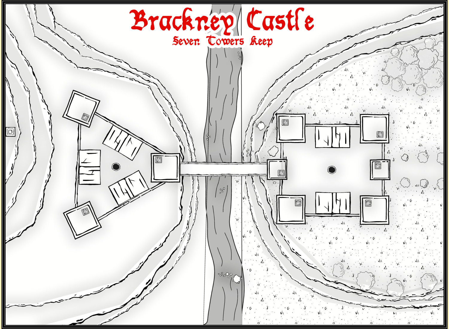
When I try to use the terrain fills (on Metric) and Wall drawing tools, the size of the fill items is about 3 times too large. Walls are also far too thick. I've worked around the issue by creating another map in the same style with 3 times the size, in which I create trace the terrain fills. Then I copy them back into the original map, which is a bit cumbersome. Could this be an issue with the scaling of the "metric" style?
Drawing bodies of water that touch the map edge creates render issues. Samples:
Central river rendered as one body of water: See the vertical lines touching the river.
Second attempt: Central river deleted and rendered as two separate bodes of water, with the "gap" inbetween hidden under the bridge:
What can I do to solve these problems? If it helps, I can provide the FCW file.
-
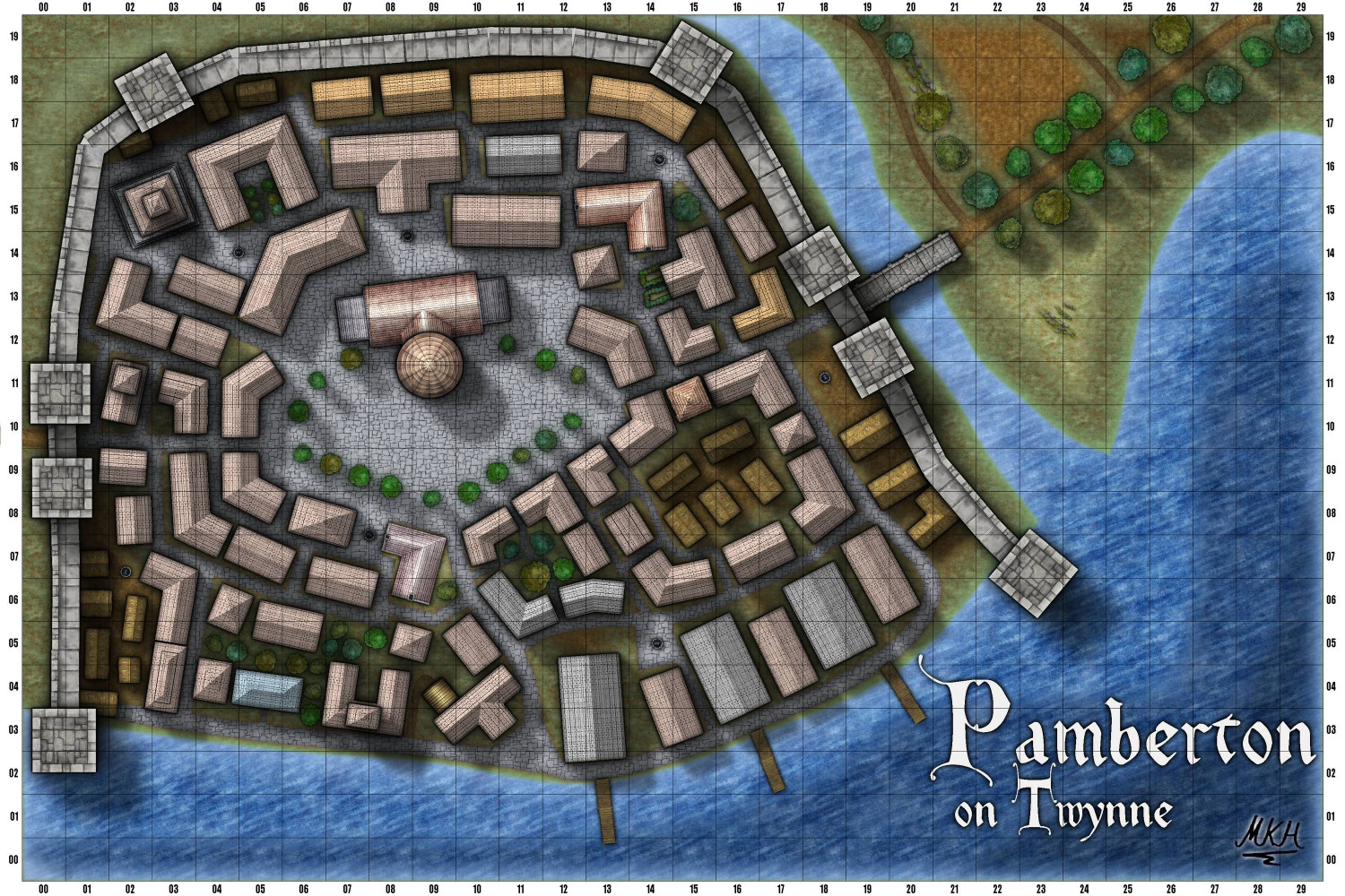
Pamberton on Twynne - A John Roberts Style City
Tried out the John Roberts City Style to see what I could to with it.
I'd appreciate a few more symbols - it did not look good when I added symbols from other styles so I removed them again.
But all in all I like the look.
Edit: The overlap and gaps in the city walls gave me a bit of trouble. In the end I used simple polygons on the "Walls"-sheet to fix it - sort of. Does anyone have a better idea for touching up the city walls?
-
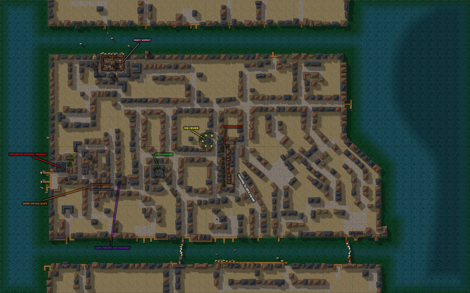
WIP - The Pink Lantern Quarter - A Kowloon Walled City Style Asian town map
Hello again.
The boat bridge thing is coming from the official background of the city. This background also says the city is ruled by a council of merchants and other rich people, interpreting ancient law texts to best suit their interests.
So my explanation for it is the following:
The map just shows the entertainment quarter of a large metropolis.
Some time ago, the emperor created a law stating that no bridges were to connect the "entertainment quarter" to the rest of the city (maybe to keep the "upstanding" citizens apart from the "riff raff", maybe to increase the boatman's guild's revenues, who knows...).
The groups running the entertainment district want more customers, so they look at the laws and come to the conclusion that a boat bridge is not a bridge, as long as there's one or two small gaps between the boats. Voila, boat bridges! :)
There's no strong current going through this canal, and the middle boats can be quickly untied to make way, if someone important urgently needs to pass.
@JulianDracos : Thanks Used Cities of Schley boats and the most simple straw hut roof symbols. The Purple and red are current placeholders to mark the brightly coloured end ships of the bridges. Might adjust the colours later.
@DaltonSpence Want the docks to be at ground level, but put the above the ground sheets. I've eliminated the "docks casting shadows on streets"-effect in the parts where it most shows.
Agree about the coastline. Reckon there will be hardly any "natural" coast left when I'm done.
After looking at pictures of the canals in Bangkok, I've also introduced stairs leading into the water in some areas.
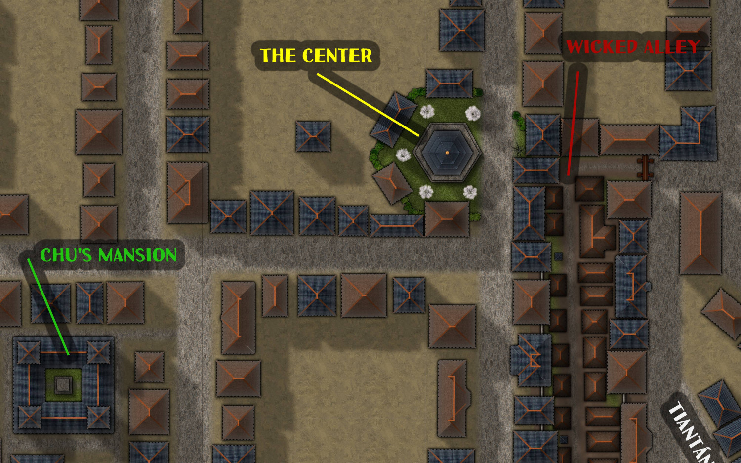
I've also added some annotations so I don't forget what locations I came up with. Will show details tomorrow - my group now actually wants to play in there.
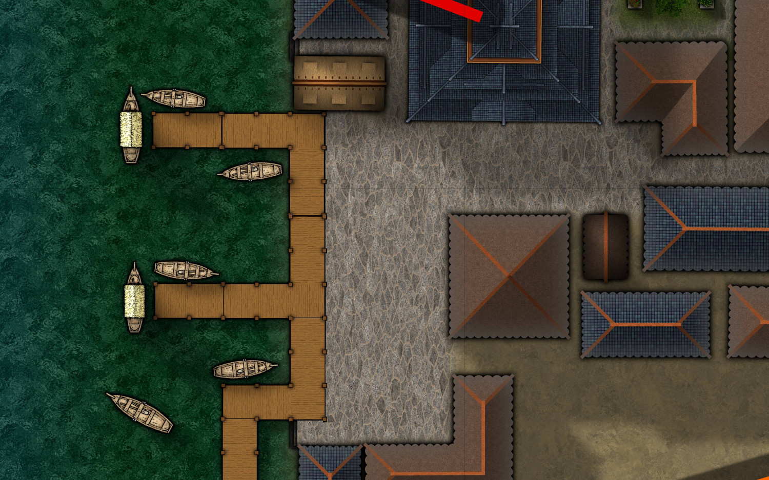
Update: Here's a couple of quick detail shots:
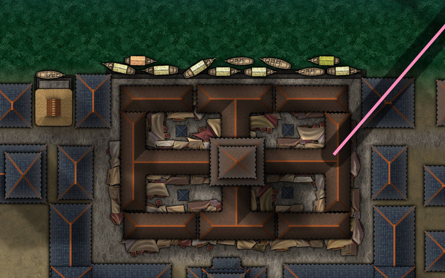
Revised west side pier: Note the stairs and "lower" piers.
Night market at the North side of the island: Still on the fence whether I should use Cities of Schley market Stalls instead.
Center of the island - starting to come together:
-
The Legendary Panyang
I've paused my multi-level dungeon because of a cold and lots of small real life stuff.
Just created this little map for fun.
Styles used were Sarah Wroot, Mercator, Here be Monsters and Realms of Legend.
Music playing in the background was mostly Toto's "Africa"
A larger version is in my gallery, as usual.
-
Northwestern Midstad - A local area map for Splittermond
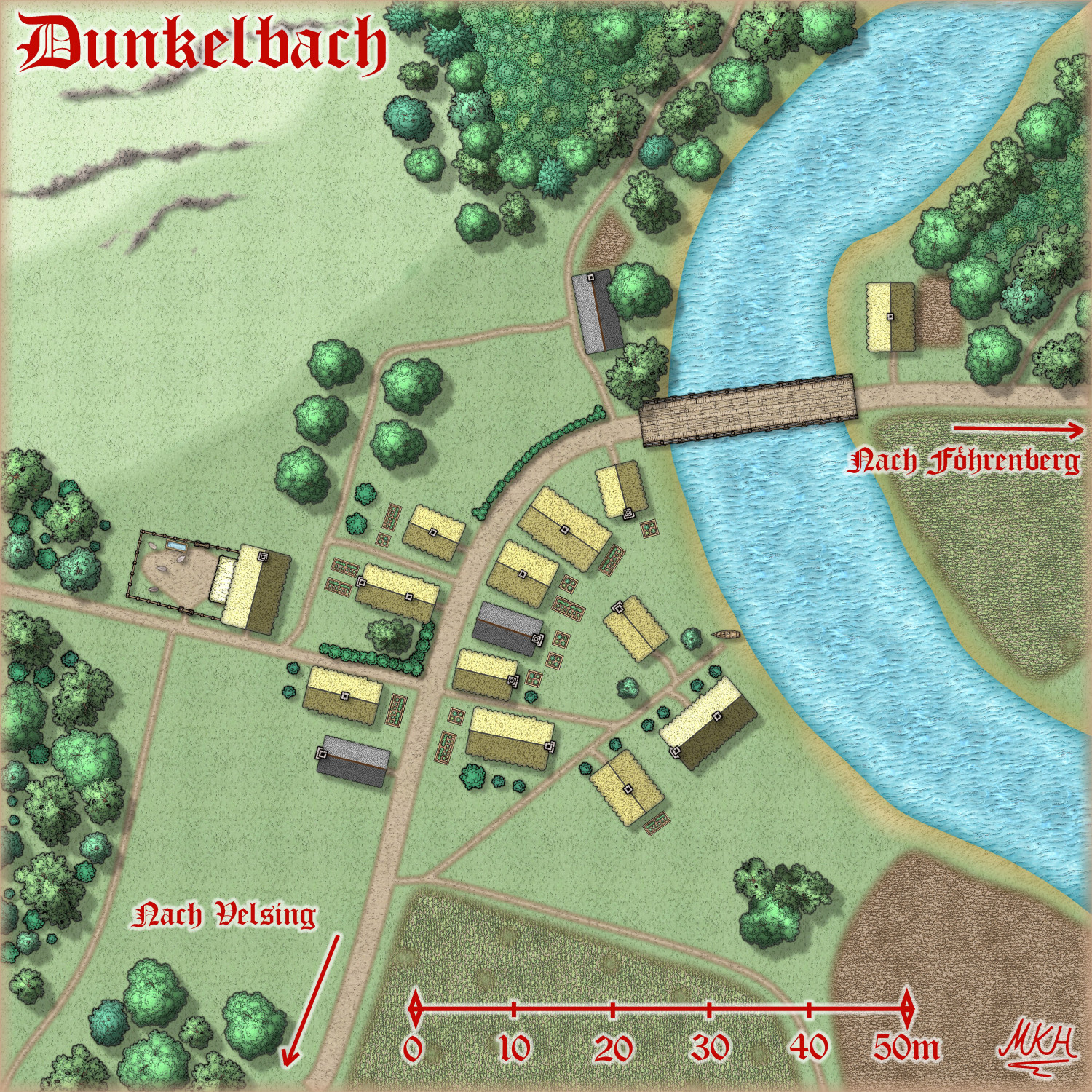
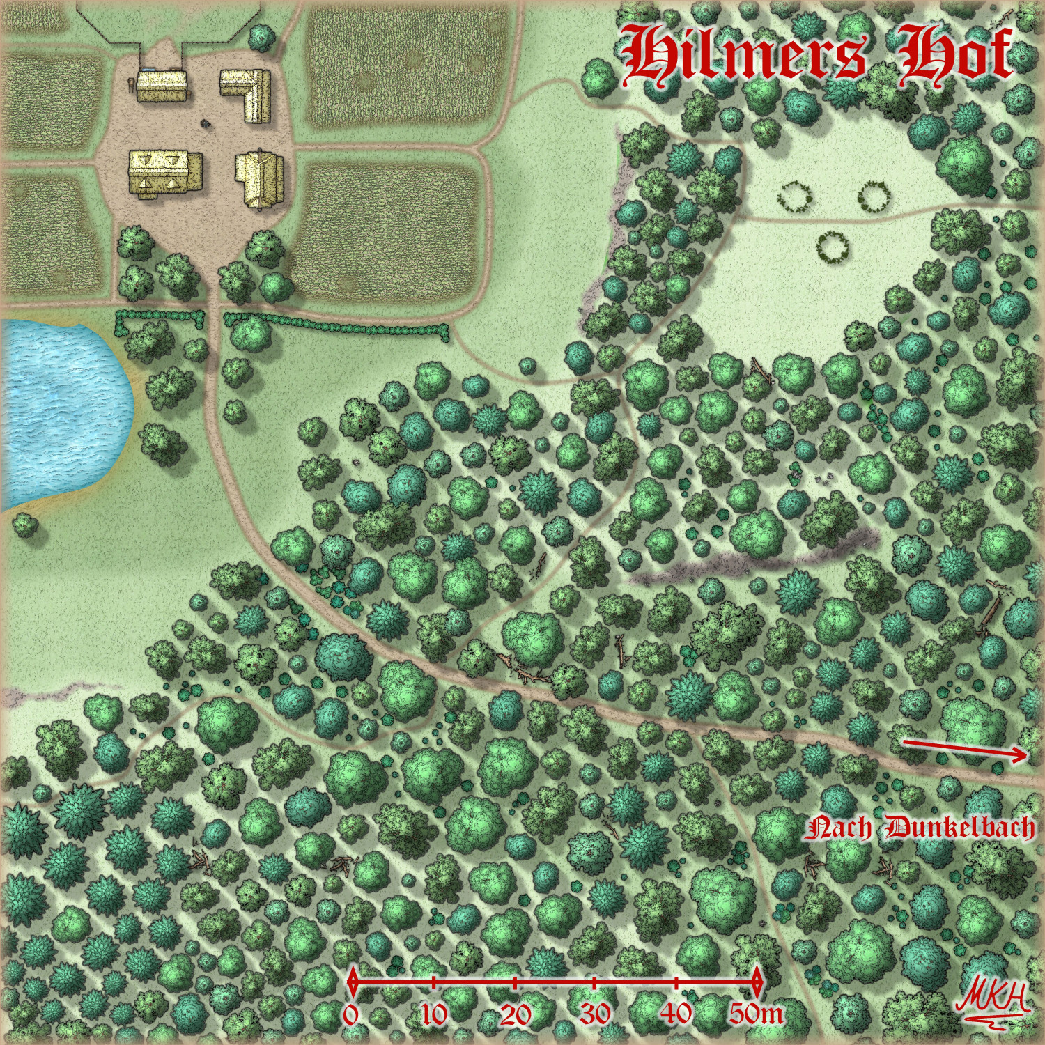
Dunkelbach and a nearby farm, where our group will most likely have the first direct confrontation with the villain and his henchmen.
I've moved back to placing individual trees instead of the forest fill because I wanted to show the different ground colours / height levels.
Larger versions are in my gallery. Have a great Sunday! :)
-
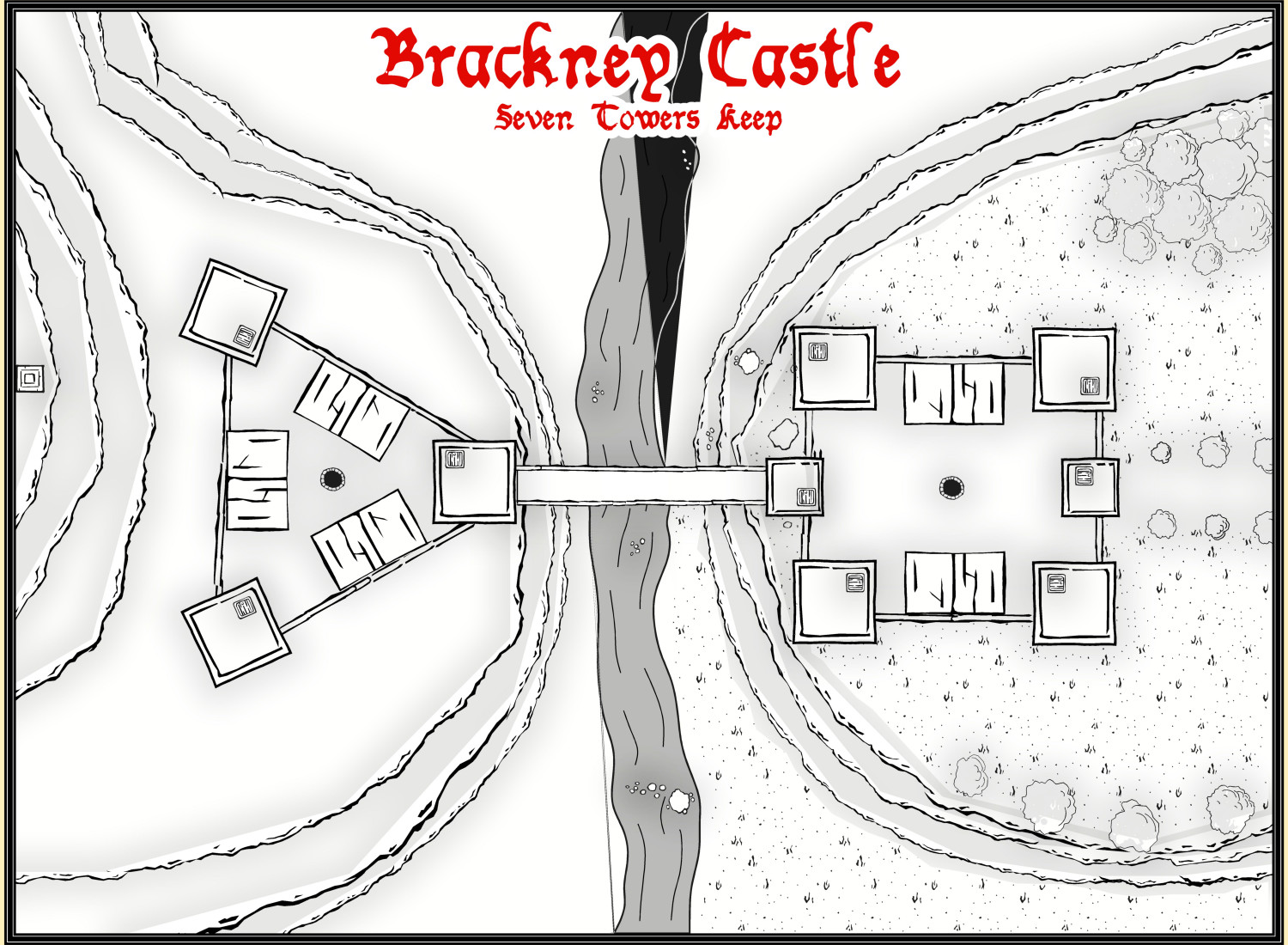
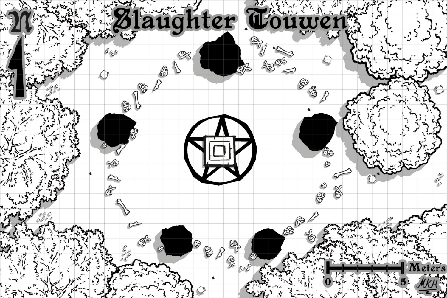
Slaughter Touwen - Just a small battlemap
"Nah, Nothing to see here, move on..." 😇
I was thinking about filling the stones with a hatching pattern, but I like the solid black.
It kind of adds to the "brutal" feel of the map, and I fondly remember old b/w RPG maps (probably MERP/Rolemaster) with black standing stones like this.
The only slight change I made was fractalizing the stones a bit. They looked slightly too smooth.
-
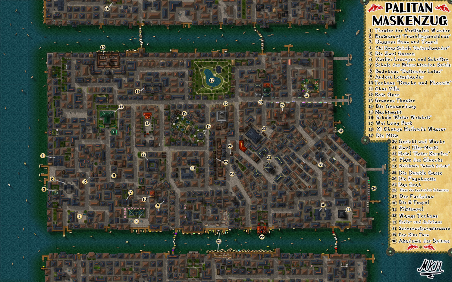
WIP - The Pink Lantern Quarter - A Kowloon Walled City Style Asian town map
It's finally finished. :-)
I added the original district name ("Maskenzug" roughly means "Carnival train" in German) and created the map key in German, since it's set in the German RPG "Splittermond".
Might create a second map key in English, if I have time/ energy.
A bit of detail from the map key. Created the Dragonfish Crest by roughly tracing the original crest with rounded polygons. The ornaments are vignettes and compass roses from overland map styles.
Larger version is in my gallery. Very pleased how this map looks at 10000 x 6250 pixels.
My next project will probably a lot smaller, though. 😉
Edit: Hmmm.... this could actually need a scale bar and North indicator. I'll think about it...


