EukalyptusNow
EukalyptusNow
About
- Username
- EukalyptusNow
- Joined
- Visits
- 660
- Last Active
- Roles
- Member
- Points
- 1,248
- Location
- Germany
- Rank
- Surveyor
- Badges
- 8
Reactions
-
SS6: First Attempt
-
Issues with Inked Ruins Style: Hatching "Texture" Size and Water Rendering
It worked. and now I' also know about the advanced drawing tool options and the ability to turn "Restrict to Map Border" off, which'll help a lot in other styles. Thanks a lot, Wyvern. 🙂
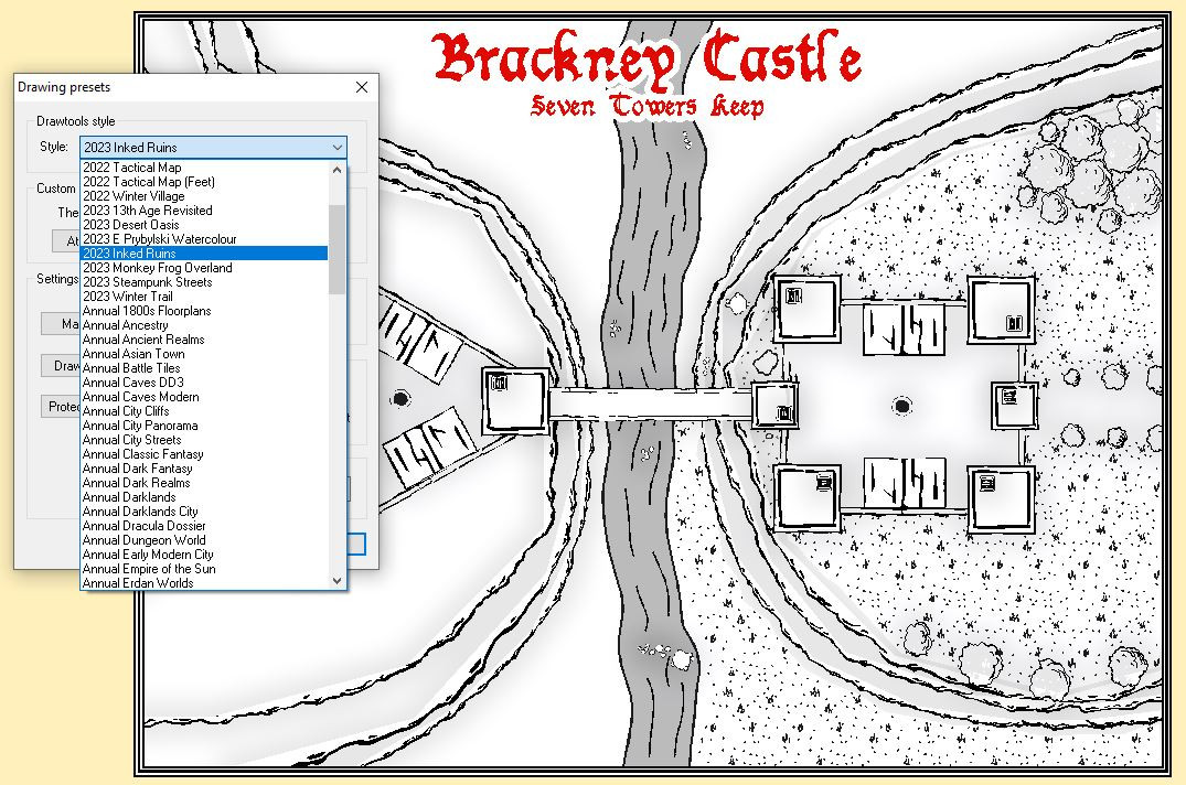
In regards to the Fill Issue, there seems to be no separate "Metric" Style in the Drawing Presets:
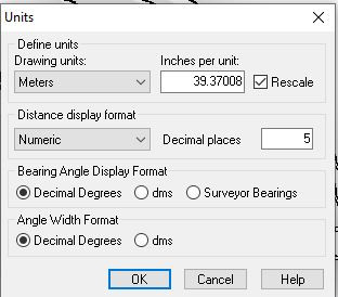
But the drawing units are set to meters, which looks correct.
Here's the FCW if anyone wants to take a look.
I'll prepare the support request - while probaly finishing the map using the workaround.
-
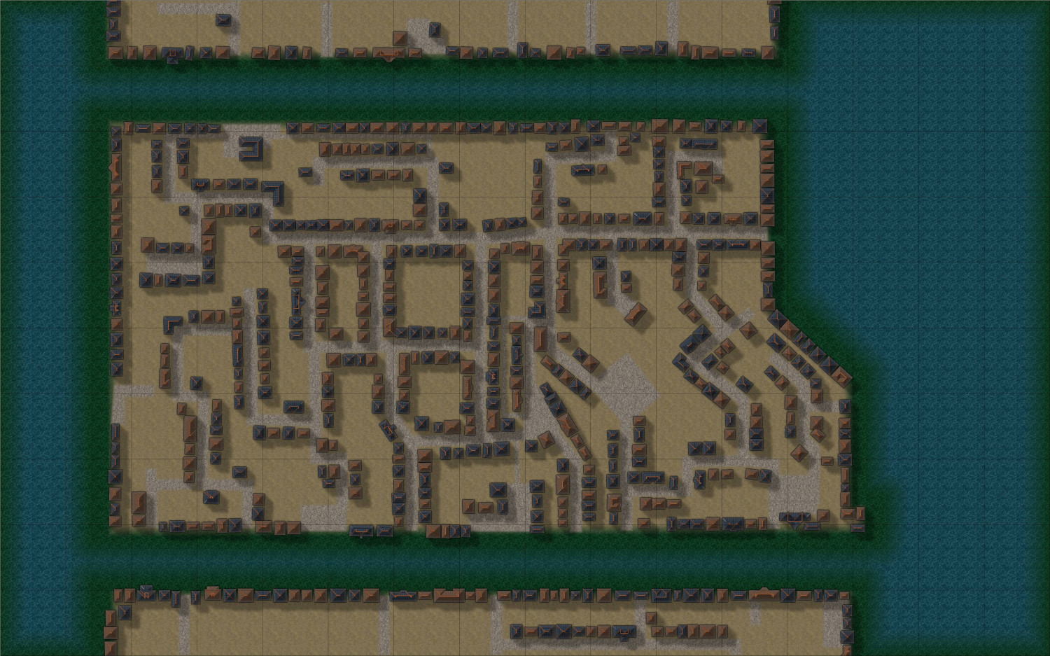
WIP - The Pink Lantern Quarter - A Kowloon Walled City Style Asian town map
This will become the entertainment district of a huge metropolis located in a river delta.
Existing sources only have a very large scale map for the entire city (where the shown map would be about 2x3 cm in size), so I'm creating this for our group to get lost in. ;-)
Currently using auto-placed housing a lot - will manually add larger landmark buildings later. Will also improve the water once I've made progress with the buildings.
This one almost has a bit of a near future urban sprawl feel, despite being a fantasy map. Let's see where it goes...
-
Community Atlas Project - Download information - Contributions Welcome
Dekunu Oasis is fine. Makes it easier to associate with the parent map.
Had actually googled "Shammar" and seen that it was not really a word. I'm ok with inventing words - just don't want to give my map a name that might have a real word meaning I don't like. There was an... um "not safe for work" connection to a Japanese term I used once... 🤗.
-
Style Request: East Asian Floorplan/Dungeon
-
My First Floorplan: Cybperpunk Club
Cool :) I need to do something modern, too - haven't really gotten into the modern floorplans yet.
You might want to go for broke and activate lighting.
Add the "Wall Shadow, point light finalize" effect to a rather "high sheet" like the map border, then start adding coloured light sources (turquoise around the "neon furniture" and maybe a different colour behind the bar/ near the entrance).
-
Grand Duchy of Cimmetra: Ancient Realms with Heraldry
-
A bridge
Me too. :) The dirt tracks in the center of the roads are nice too.
Are those stairs from a Perspectives style?
So far, I've only used barrels and other small decorative items from Perspectives with SS6, but the stairs might be an easier solution than manually creating stairs out of blocks / stone piers.
-
Forest Trail project - part 2
@Loopysue They look a bit like cobwebs in the example picture, which is probably due to the green water and rocks underneath.
Also, the contrast between rapid, foaming water and perfectly still, clear water in between looks unnatural, as do the sharp "non wavy" water edges towards the lower left of the screen.
The rocks under water look great, but maybe some kind of blur - effect and "rougher" edges would make the water look more "flowing".
-
A Temple and Market Square Battlemap


