EukalyptusNow
EukalyptusNow
About
- Username
- EukalyptusNow
- Joined
- Visits
- 660
- Last Active
- Roles
- Member
- Points
- 1,248
- Location
- Germany
- Rank
- Surveyor
- Badges
- 8
Reactions
-
How to Create Decorative Symbols by Tracing
This is a tutorial for creating vignettes / decoration symbols out of rounded polygons by tracing existing images.
I've more or less stumbled upon this method, after I wanted a spider to decorate a map and could not find one exactly like I wanted, so I drew/ traced it.
Step One: Determine what you want for your map.
Based on the opinion of a certain younger member of our household, I'm going to use a unicorn as an example. It should be suitable as a crest, stamp or as a general map decoration.
Step Two: Find a suitable source image:
This image could be any drawing, picture or even photo. The most important thing is that the general shape of what you want to trace matches what you want.
Please keep copyright in mind if you are planning to use the created symbol for a map you are going to publish. I try to use public domain images whenever possible.
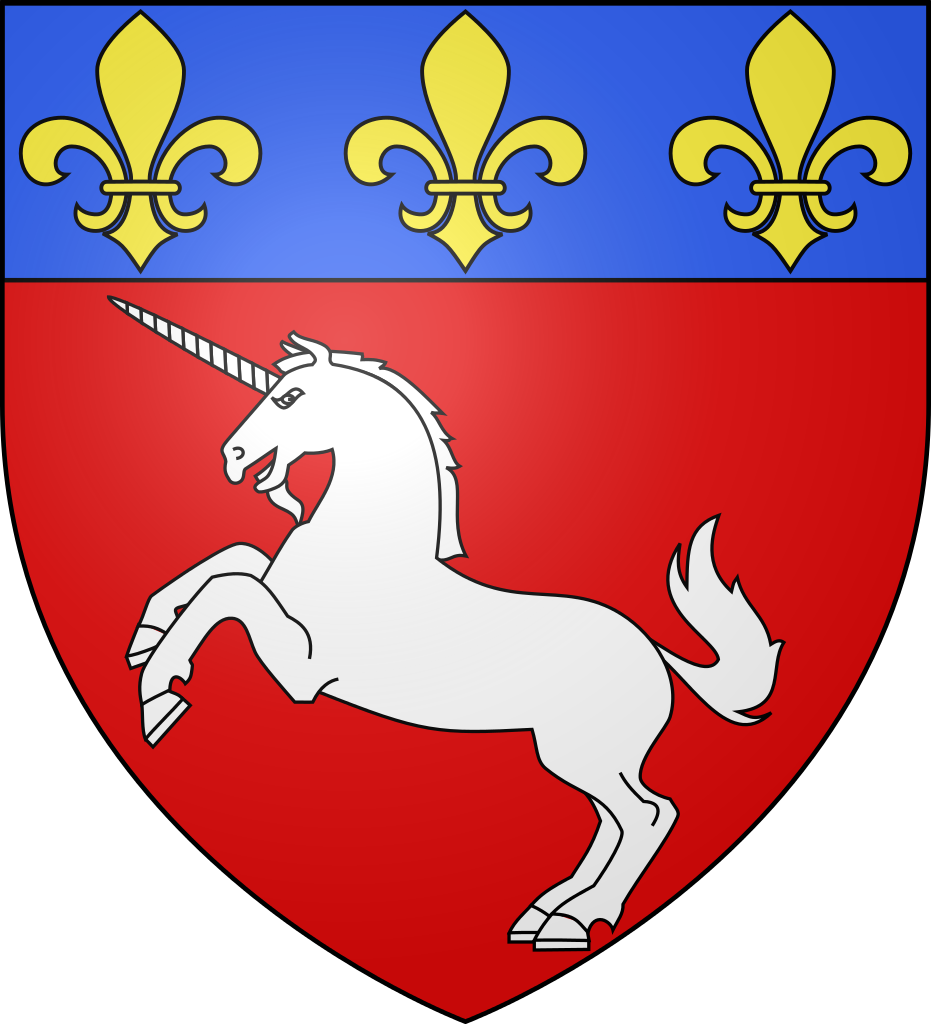
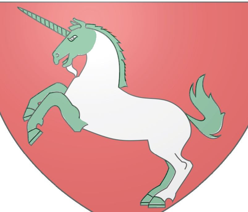
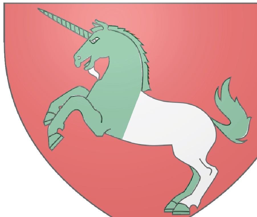
After some searching around, I've found this public domain crest on Wikipedia:
https://en.wikipedia.org/wiki/File:Blason_ville_fr_SaintLo_(Manche).svg
Step Three: Think about any possible changes you'd like to make:
You can mark these changes, or just keep them in mind.
I don't really fancy the „beard“ of the unicorn, so I plan on leaving it out. Also, I'm thinking about modifying the mane, so that it has more „folds“.
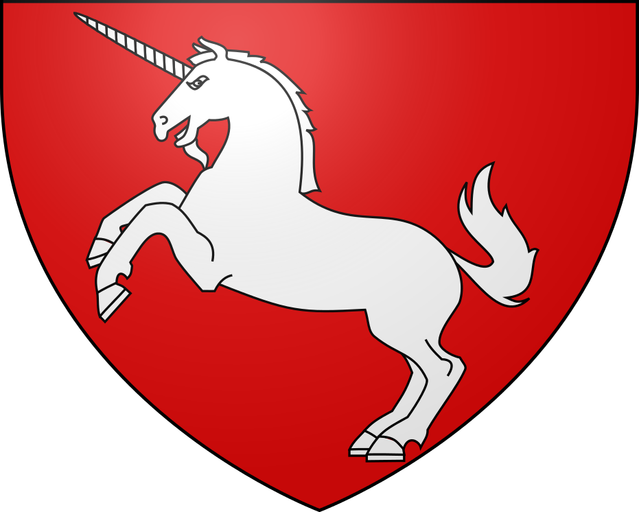
Step Four: Prepare the trace and upload it into your map
Cut away any parts of the image you don't need for tracing.
Open the map where you want to put the symbol
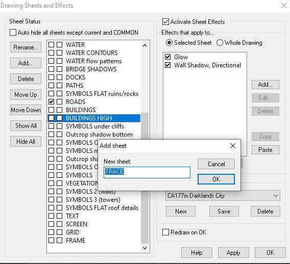
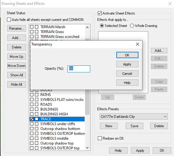
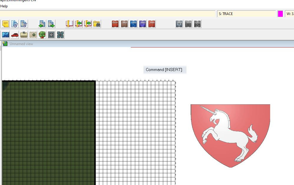
Create a new sheet „Trace“, with a transparency effect (50% usually works well).
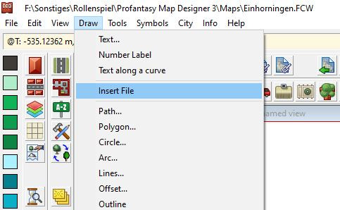
Put the trace image into your map by using the „insert file“ option of the „draw“ menu.
If you are working on a map that's already filled with other objects, put the trace image outside of the map boundary, so that you have a clear workspace
Make sure that the image is on the „trace“ sheet.
Step Five: Set up a separate sheet/ layer for what you want to trace
This can be skipped (Sometimes I just put my vignettes on the text sheet, if they share the same effects), but it will help selecting your traced image.
I create both new layers and sheets, named „Unicorn“ and "Unicorns".
Step Six: Select initial setting for your traced image.
Choose a solid fill with a colour that's different to the colours in the trace. I've chosen dark green.
I also put a Colour key effect on the unicorn sheet, because I want to use it while tracing.
I put the „Unicorn“ sheet just beneath the „Trace“ sheet. You can put it above the trace, if you prefer.
Step Seven: Trace!
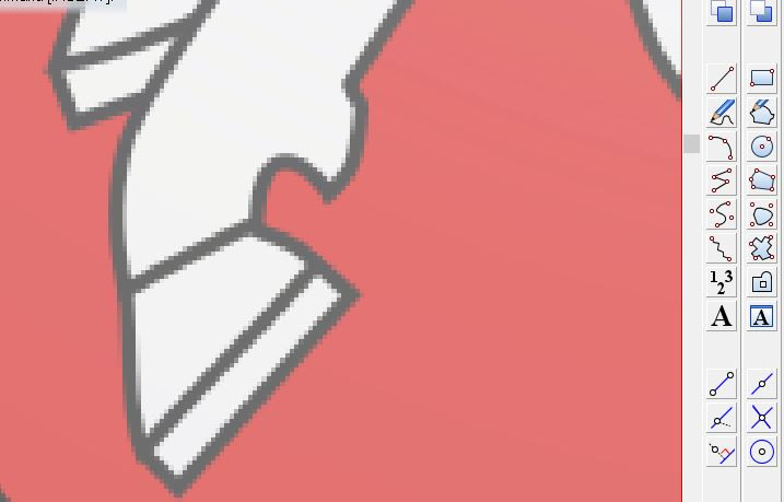
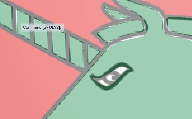
Select the „Rounded Polygon“ tool and fill the trace with rounded polygons, separating it into manageable sections.
Tips for this:
- Zoom in as closely as possible
- Draw individual parts, so that there is a blank space between them.
- Draw around/ between the fill lines, not on them.
- Split large, complicated parts into individual, overlapping rounded polygons
- Start with small, easy sections and work your way up to the more complex ones.
- Keep in mind that you can make the next point of the rounded polygon a corner by pressing „C“
- Don't mind small irregularities – they will most likely be unnoticeable in the smaller, final image.
- If you are not happy with a rounded polygon, just delete/ undo and draw it again. Trying to correct the polygon by moving individual nodes is usually more complicated and time-consuming.
- Colour key can be useful for creating cut outs, but it will complicate things when changing the colour of the sections.
Example:
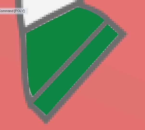
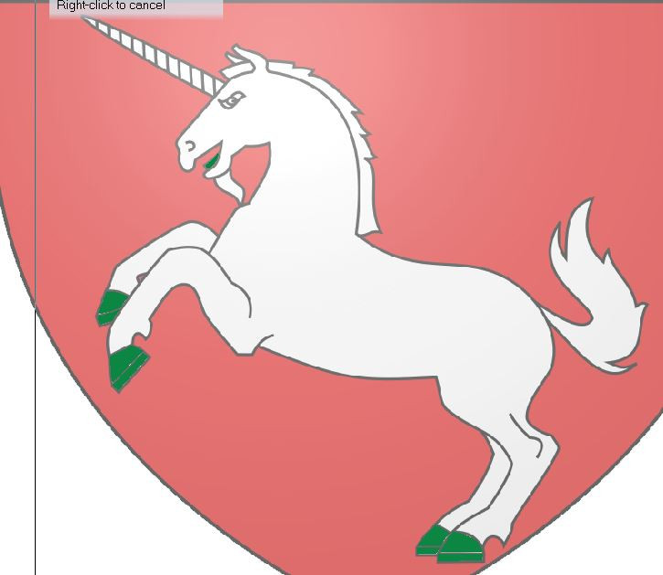
Start with the hooves. Zoom in.
Draw green rounded polygons.
Keep drawing, moving from simple to complex.
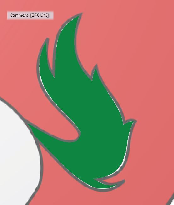
The tail.
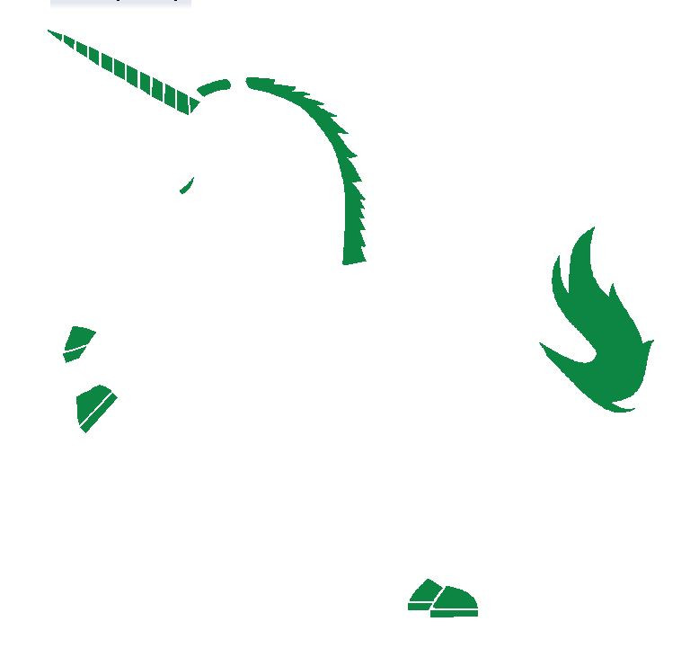
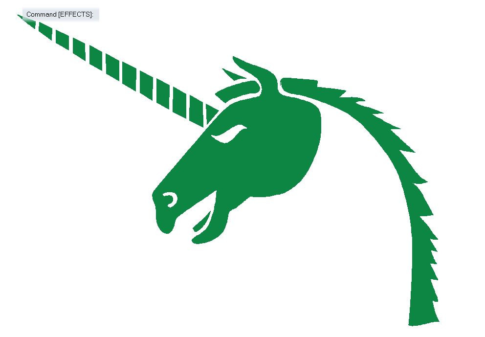
Mane and some horn sections. Note that I've added a few more „ mane folds“, compared to the original image.
This is how the image looks without the trace so far:
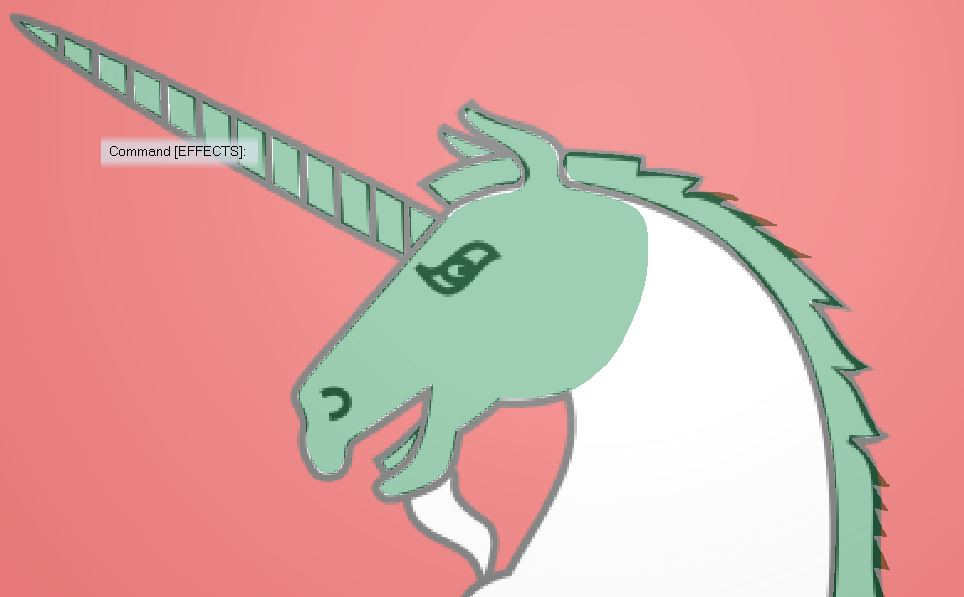
Starting with the head
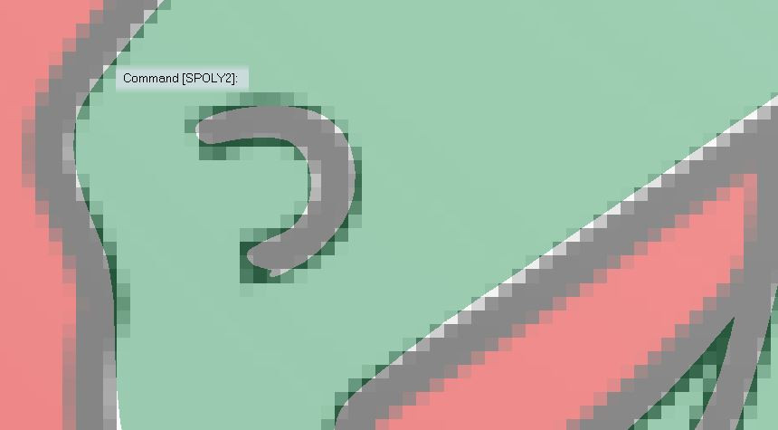
Cutting out the eye and nose using colour key. I used a polygon instead of lines for the nose, because I think this will work better when rescaling.
The show so far:
I continue tracing separate, slightly overlapping sections of the body, adding another colour key „cut out“ in the hind legs.
The completed 37 polygon image:
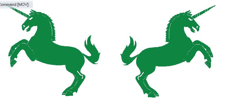
Step 8: Copy/ mirror and add effects
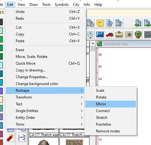
To create a mirrored copy of your image, copy the image first, then use the „mirror“ option under „Edit – Reshape“.
Clicking the „Ortho“- icon in at the bottom right of the screen helps to draw a perfectly vertical mirror line.
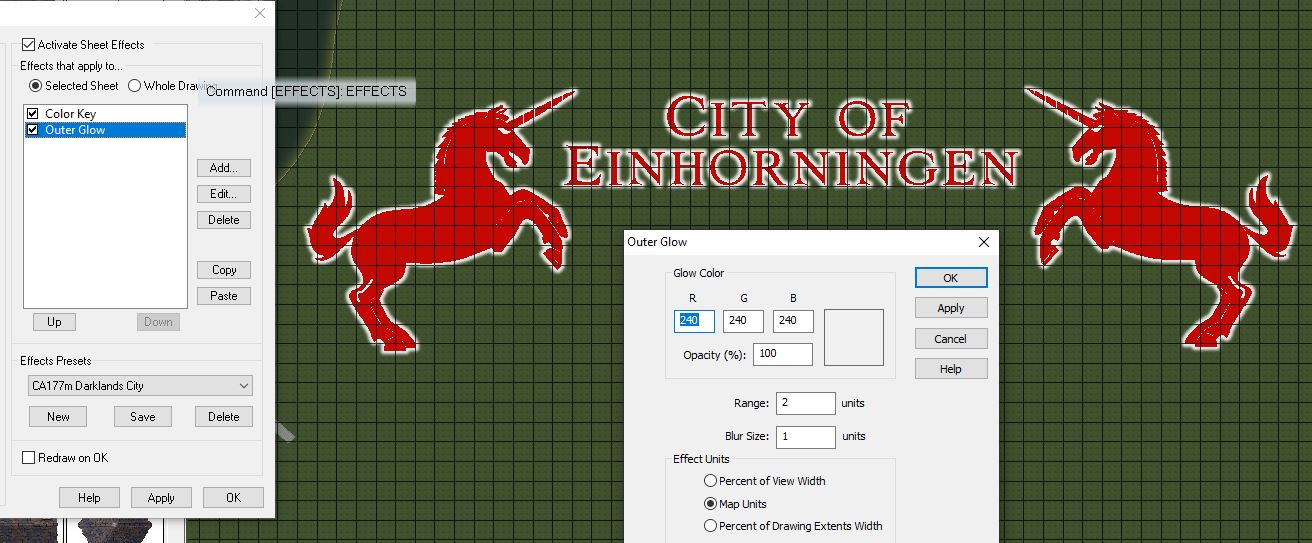
Since the image consists entirely of polygons all kinds of effects can be applied to it.
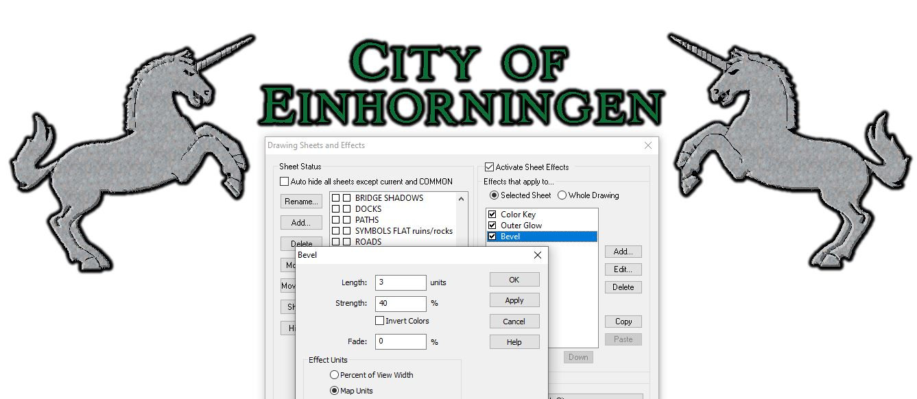
I've found Outer Glow and occasionally Bevel the most useful.
Examples:
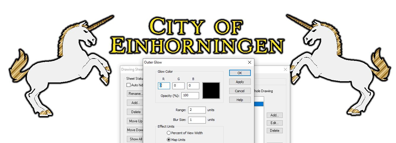
White outer glow, matching the text:
Black outer glow and different fill styles (using Bronze from Maritime Dungeons 2 for some parts):
Black outer glow, stone texture and bevel. This creates trouble with transparency acne, but looks promising otherwise.
This is how the symbols look on a Darklands grass background.
And here's the FCW if you want to take a closer look.
If you have any questions, or suggestions on how to improve the process or manual, please type away!
-
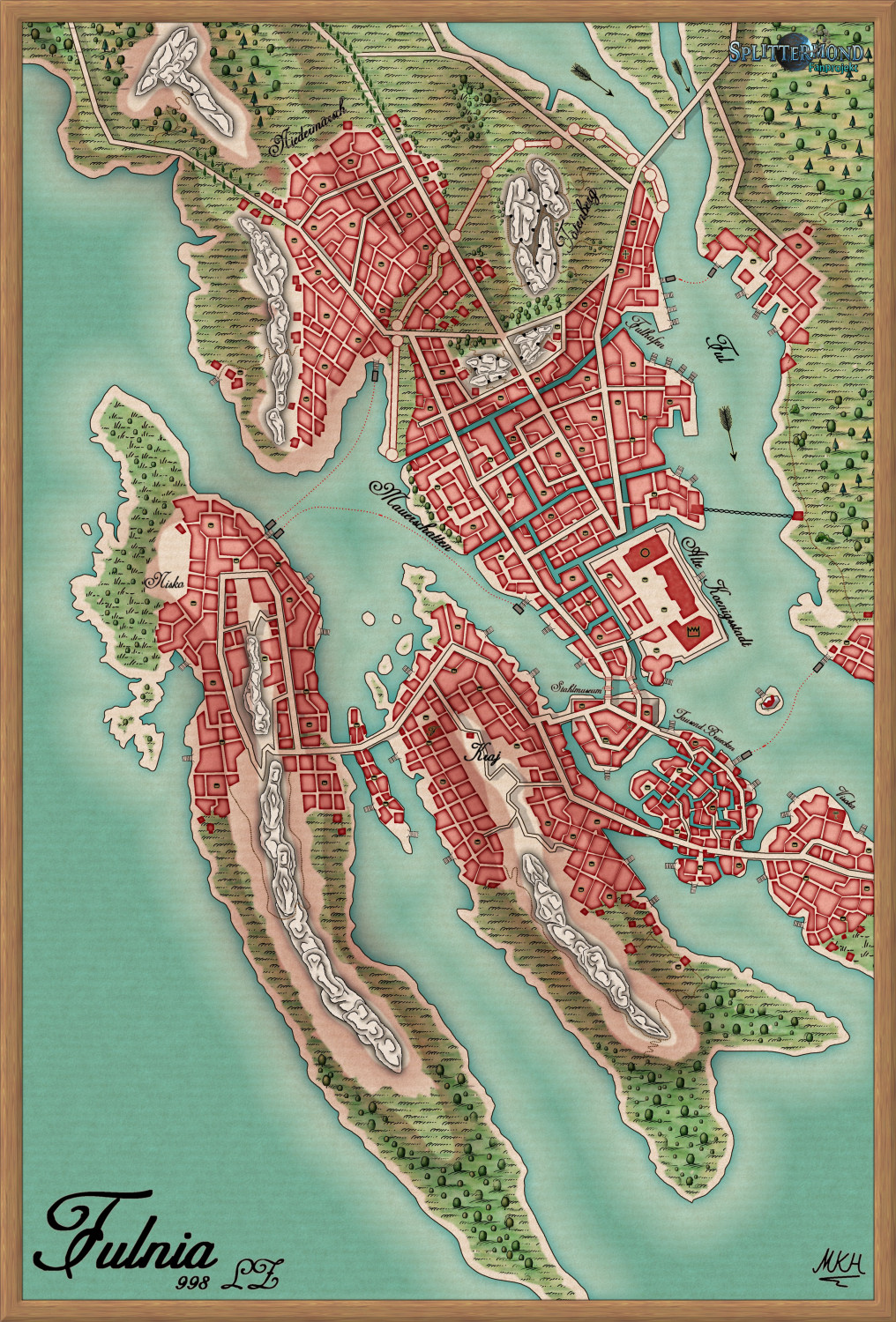
Fulnia - A Splittermond Map Conversion in Ferrari's Style
Wanted to try out Ferrari's Style and converted the Splittermond map of Fulnia, the former capital of Mertalia.
The style is a lot of fun, and it was also great to look at the scanned original Ferrari's maps.
Ferrari's does allow adding a lot of small scale details, so the map is best viewed as the large version in my gallery.
Thanks a lot for the great style @Loopysue .
Have a good start into the new week! :)
-
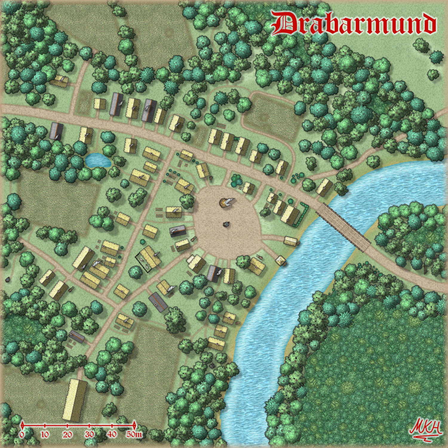
Drabarmund - an SS5 village
Needed a village for a witch burning, to establish a villain.
Might as well create a proper map, in case our heroes return there, or the group decides to escalate things further:
Almost pure SS5, with only a few chimneys taken from City Streets /Darklands Cities.
A Larger version is in my gallery.
-
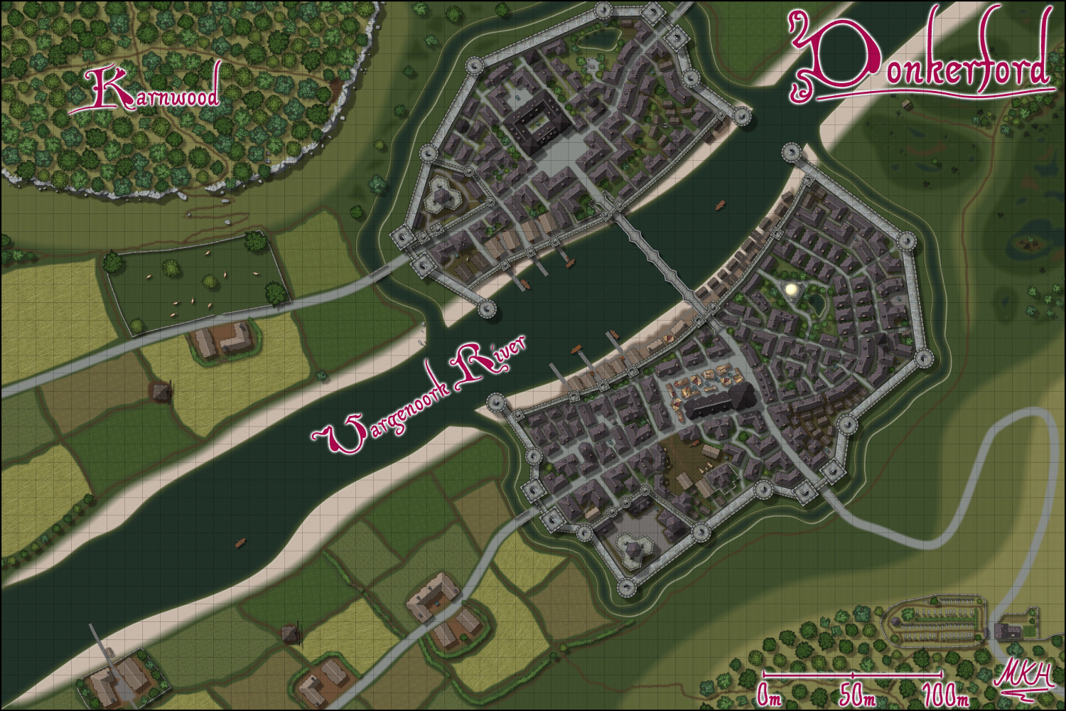
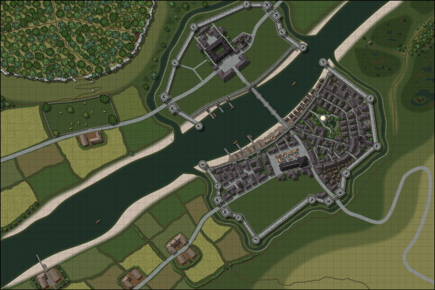
WIP - A Darklands River City
@NZgunner Completely agree. No climbing opportunity for would-be besiegers next to the walls.
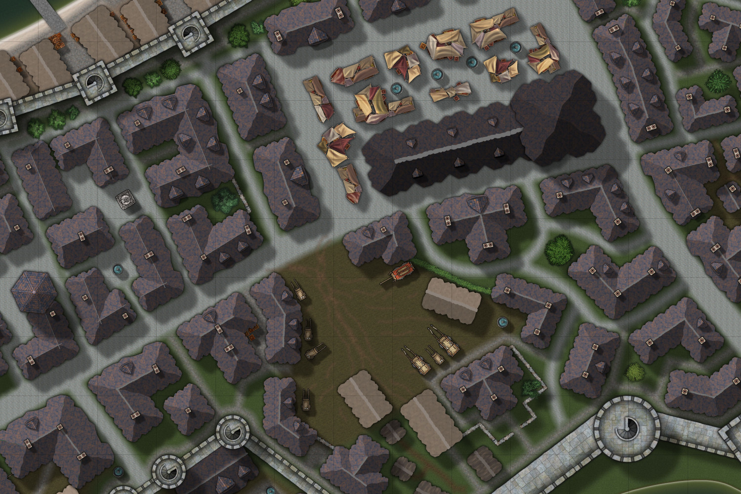
Added two windmills for the grain and a place for merchants to park their carts and let their horses/ oxen get some rest.
Here's the final version:
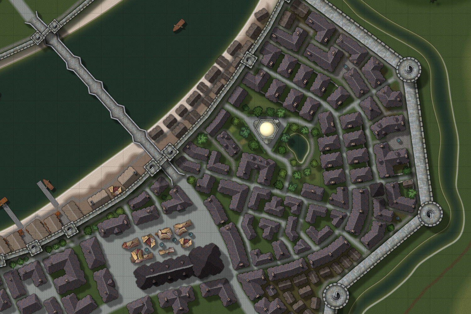
And a detail shot of the updated market and "merchant parking" area
Update: Large version in the gallery, as usual.
Update 2: The area east of the market was still a little unfinished, so I added a few details
-
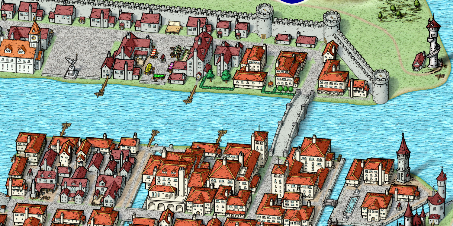
Bridgetown - An SS6 experiment.
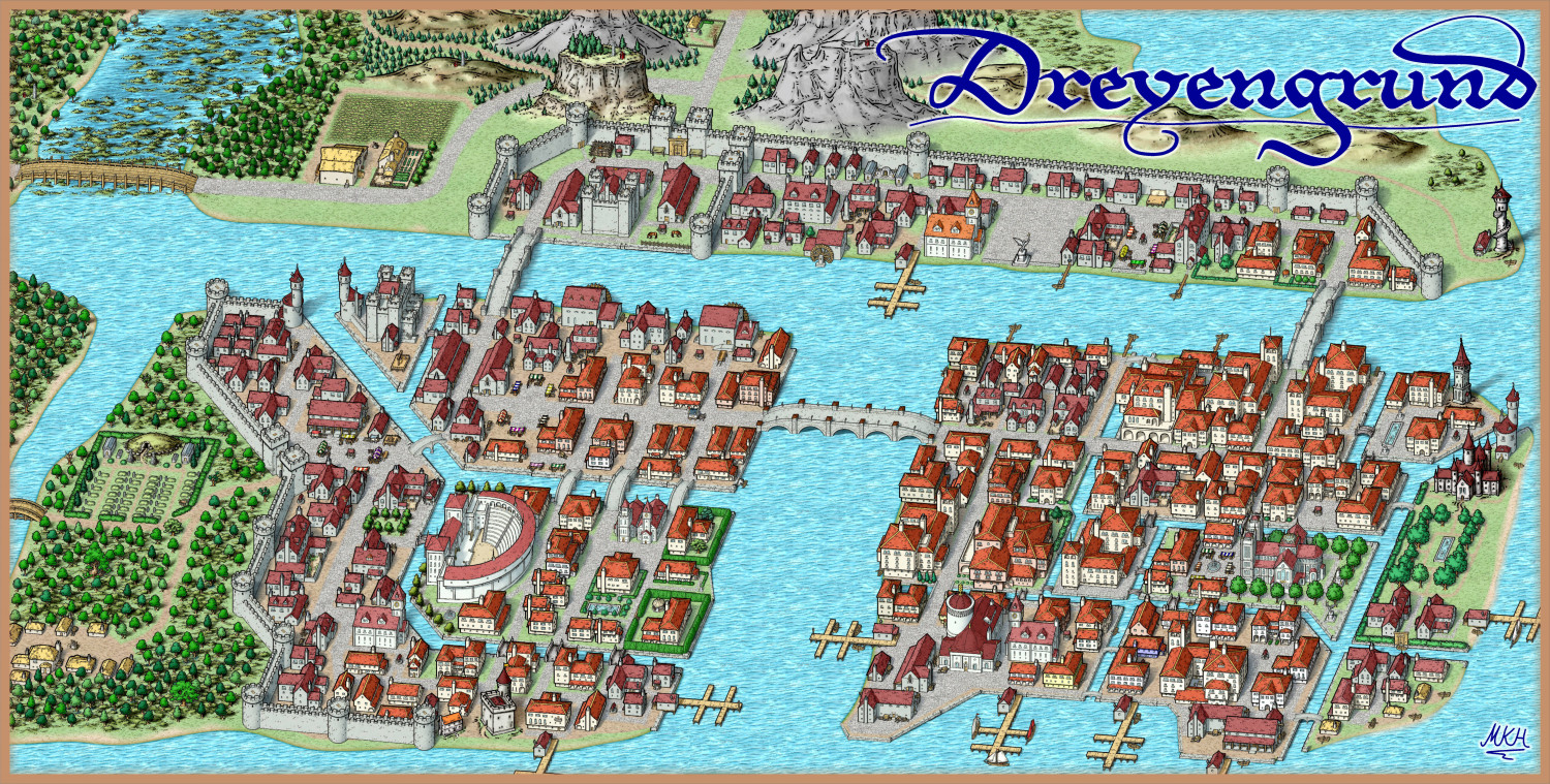
Filling the North was surprisingly easy: I present the bustling trade town of Dreyengrund:
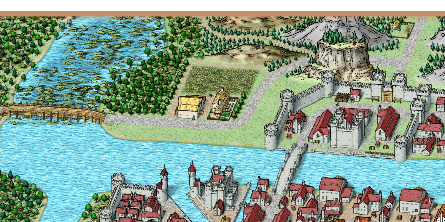
A few detail shots:
The relatively empty North West:
And the North Eastern part, with added smaller piers:
Mapping this was fun, but I'll probably create something a bit smaller next time.
Larger versions are in my gallery.
Keep having a great Sunday! :)
-
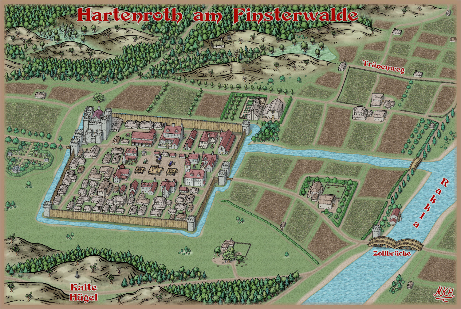
Hartenroth am Finsterwalde - Trying out SS6
This is the setting for one of my character's backstories: A small town being bled out by a greedy king and his nobles.
Used Mike Schley overland style for the hills, some of the trees, livestock and a few other bits.
I also darkened the map using GIMP, because it fit's the theme better this way.
Overall I found SS6 easy to use, except for the walls, hedges and palisades which took a bit of getting used to. The "sort symbols"-button helps a lot.
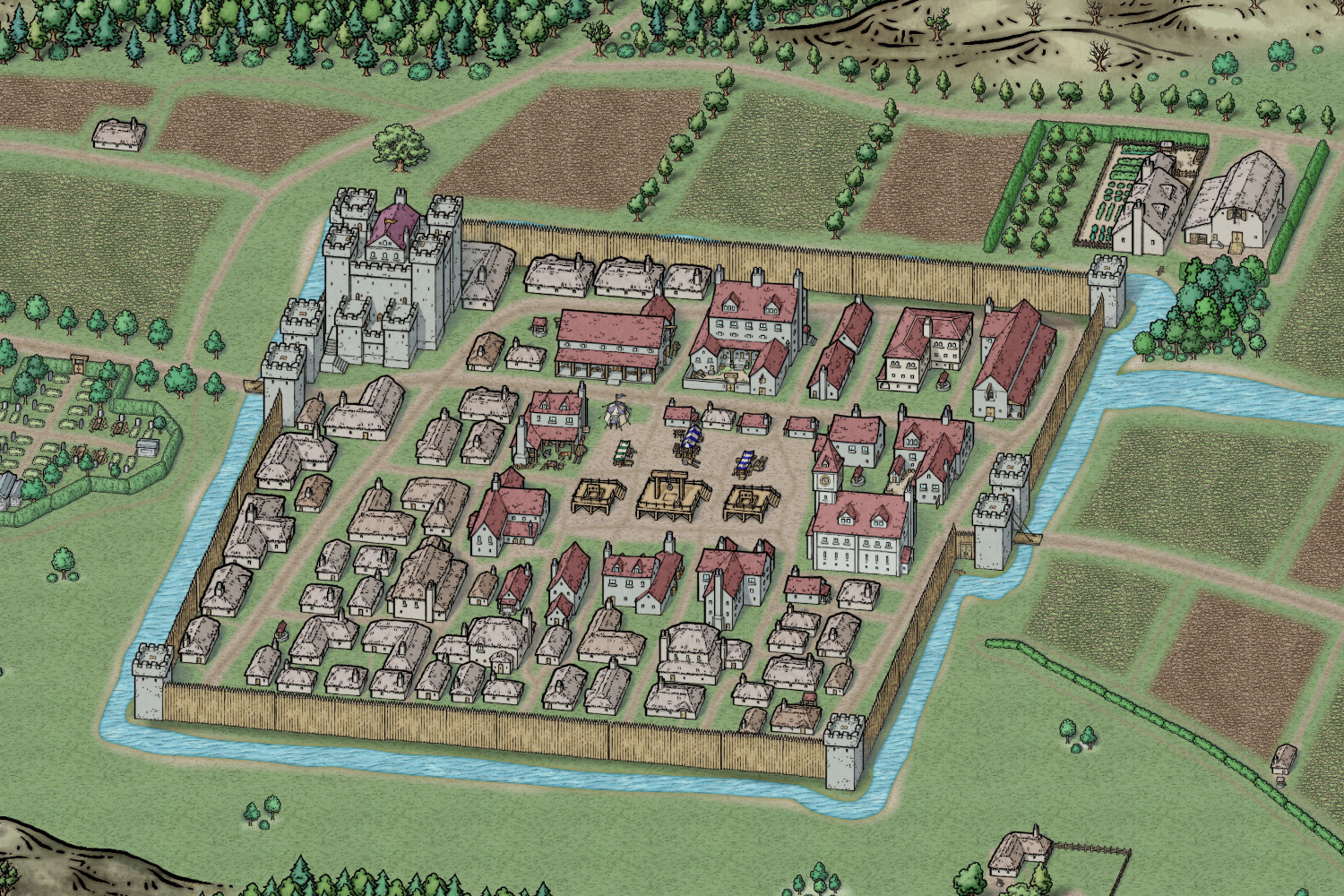
Details of the town: If a town's marketplace has more displays of punishment than market stalls, you might want to travel somewhere else (or change things and be a hero, of course. :) ).
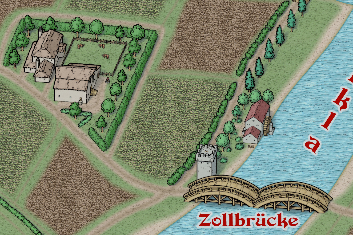
Details of a relatively rich farm and the bridge. Quite a few people have bought boats, since the king raised the toll for the bridge.
A larger version is in my gallery. Have a great Sunday.
-
WIP - A Darklands River City
Wanted to do a Darklands City map for quite a while, but for some reasons I've always been struggling with the style. Now It looks like it finally clicked.
Borrowed crates and fountains from City Streets and boats from Fantasy Town.
Will post the larger version as soon as it's complete.
Update: Detail shot of the relatively complete southeastern part of the city:
-
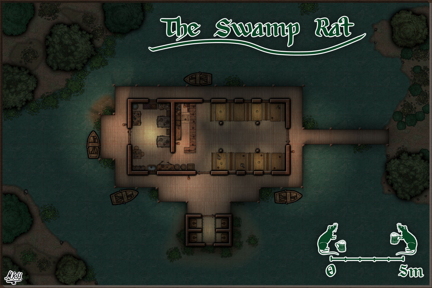
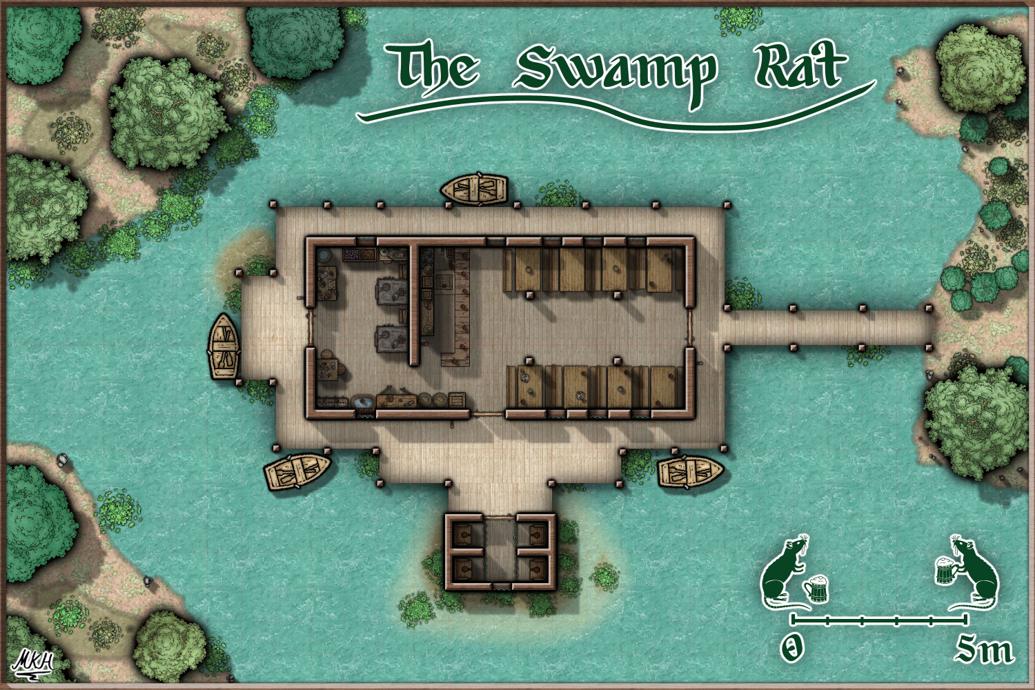
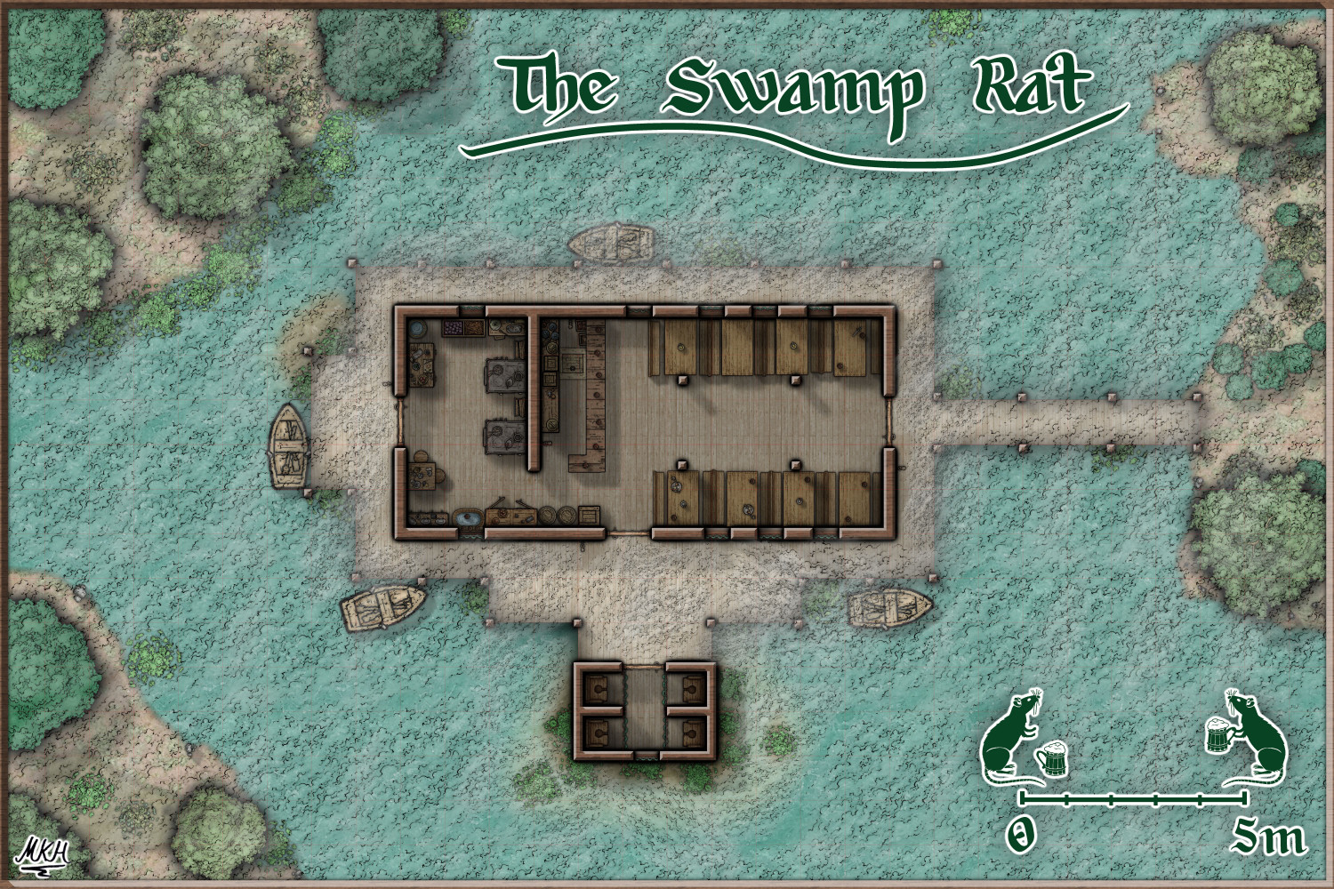
The Swamp Rat - Playing around with Lighting
Thanks a lot, Sue.
The Shadow-Blur function was what I was looking for. Had forgotten how to find the Global Sun settings...
Also found out I had added an infinite shadow lenght to the bar by mistake.
Here's what it looks like now, with added ceiling lights for the kitchen and toilets and a "dishwashing station" in the kitchen.
UPDATE: Here's the midday version, Think I got the shadows sorted out now.
Update2: And here's the "House of Swamp and Fog" bonus version.
-
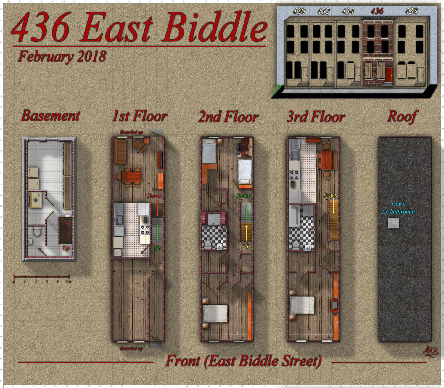
436 East Biddle - A Baltimore row house
Long time no see. Hello again. 😊
Here's a fictional version of a dilapidated Baltimore row house for our World of Darkness campaign.
I've used an existing floor plan of a Philadelphia row house as base, and modified it to fit the building's exterior dimensions and look.
Assets used were from both modern bitmap styles, with a few textures and objects (notably the doors) taken from fantasy "dungeon"-styles.
I might update this floor plan later - once our GM tells me what's in the empty first floor room.
A larger version is in my gallery.
Have a fine start into the week!
-
Al Shammar - Cities of Schley fortified oasis
Sometimes things go different than planned. Wasn't happy with my first Empire of the Sun map, built a 1001 nights themed RPG character, started thinking about her origins/ background and ended up with this map. 🤗
Mainly used the Cities of Schley style, with cliffs from the City Cliffs Annual and palm trees from the Spectrum Overland style. Actually did a search for "palm" in the symbols folder to find them...
Manual shadows could be a bit better, but I think they'll do.
Might add Vignettes and two map Keys (one for the main settlement and one for the former slave gnome enclave on the left side) if I have the time.


