

Community Atlas - North Central Alarius
 Shessar
🖼️ 34 images Mapmaker
Shessar
🖼️ 34 images Mapmaker
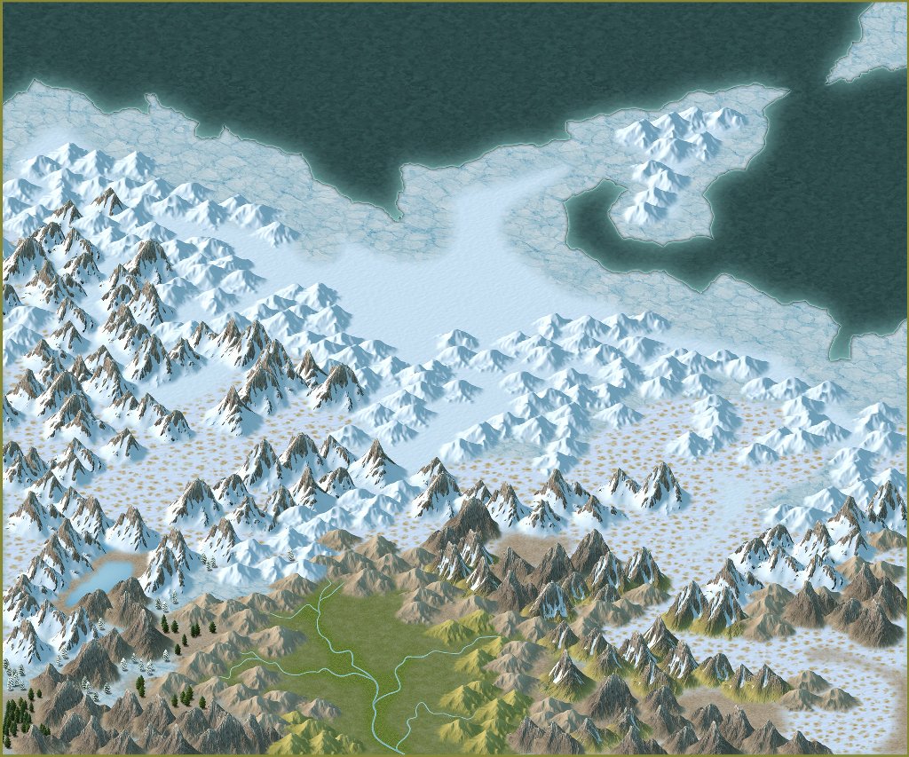
This is just my beginning layout. As usual, all things subject to change and input always welcome. ")
Comments
I had wondered what all the arctic stuff looked like when it was put together in a large area, but hadn't had time to try it out for myself.
I am surprised by how well structure symbols from other styles go with this one. It wasn't a design thing - just a happy accident.
I will be making quite a few more structure symbols for part 2.
Map's looking great so far regardless!
Quenten, the village is yours to do (it IS named after you, after all).
Thanks so much for the comments everyone! Onward!!!
Here's a simple update. I've expanded the map just a bit and have been adding more locations.Still a lot to add.
I've also spent more time than I'd like to admit trying to get the text to be readable yet still look good. I'm open to any suggestions on the text. Bigger? Different color? Different glow? Ahhhh! Help me!
Not sure that digression helps here. However, given the nature of the river names - and they can't really be made larger and still label as they do - does the text actually need to be more legible than it is at this level of view? The current "mistiness", and colouring, look right to me, and sufficiently legible.
"Frost Giant's Tower" seems to be in a larger font size; deliberate, or an experimental option? To my eye, the smaller font size seems to work better.
Edited to add: I forgot to add shading and such to the ocean. Will do that too before submitting to the Atlas.