

Nineteen Kingdoms (which one looks better in your view)
 kevbeck43
🖼️ 13 images Surveyor
kevbeck43
🖼️ 13 images Surveyor
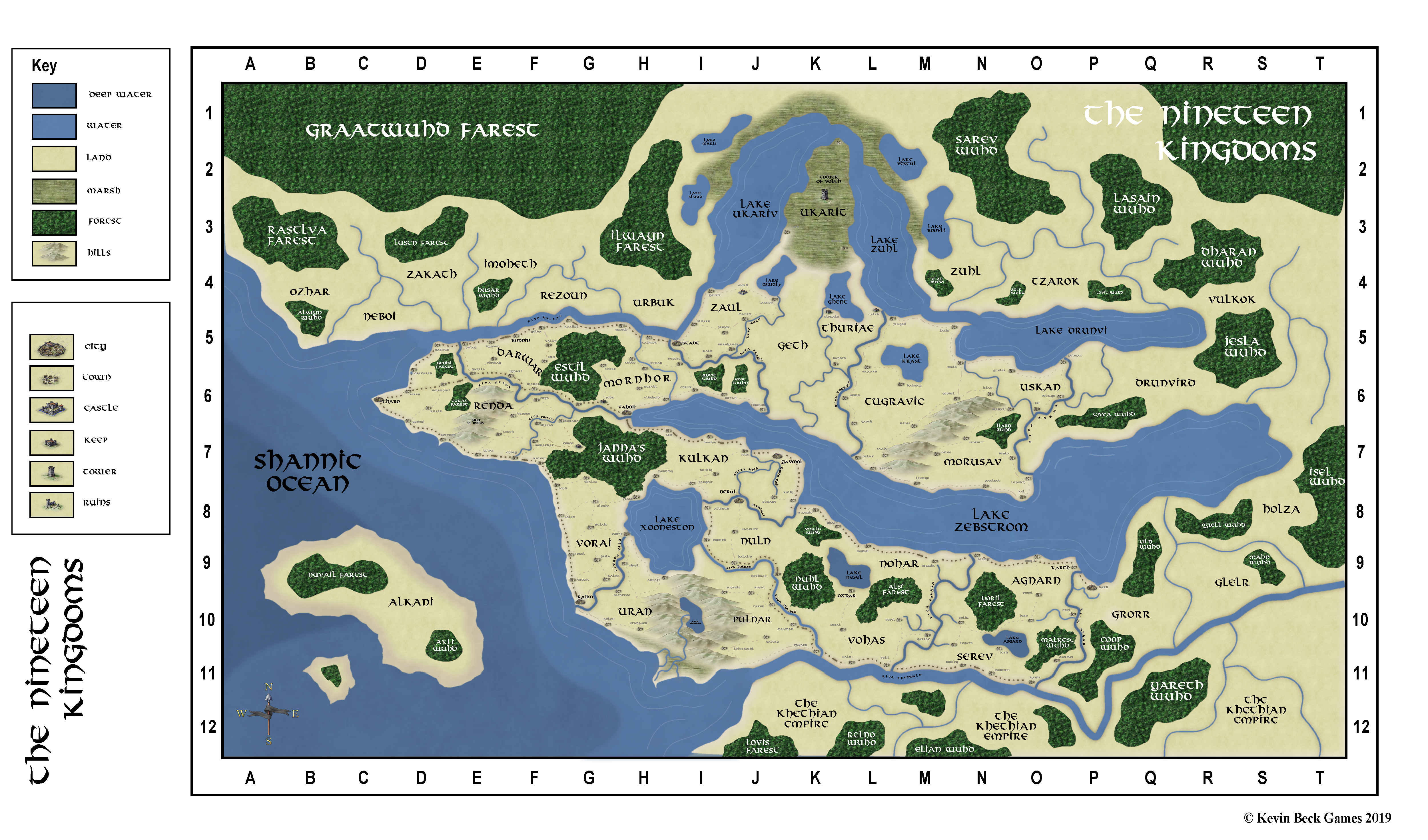
I know ultimately I need to use the map I like the best for this but I am interested in opinions.
This one?
This one?
Comments
How about a very tiny Edge Fade Inner sheet effect on those forests? The edges are very hard compared to the soft way the mountains blend into the background.
The fill on the trees looks more organic.
I notice too that you have three different water contours, but only two listed in the key. Maybe there should also be a distinction between the seas and inland waters (assuming the seas are meant as salt water, the inland waters as fresh, of course)?
Map needs a scale too, or will that be covered by the final grid (assuming the edge letters and numbers refer to a square grid across the map not shown here)?
You may need to rethink the size of the settlement symbols on the map, as at this zoomed-out scale, it's hard to say what's what, except for the cities, some of the castles and the one (?) tower.
The second, to me, is far more aesthetically pleasing. I'd want to spend a lot of time exploring it.