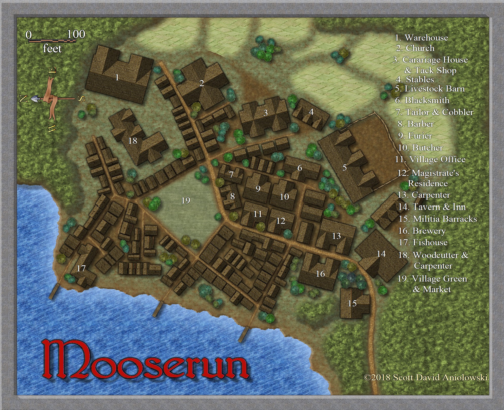
I did a quick little village from one of the area maps I just did. I need practice with city maps, so this was the perfect excuse to do a little village.
Hm... the labels won't stay in a neat orderly column! What is the best way to do that? I swear they all looked nice and even when I saved the map to print...
I've been having the same problem. Usually what I will do now is do a multi line and put in five labels at a time. Then when done with each one, I try to print. If it doesn't work out, then I will usually move them around a bit with the move tool. Most of the time I can keep them straight now, but for a while it was giving me fits. I'm not sure if we need to explode the text to keep it from doing that or what.
Nice looking map though. I really like the color palette you used.
Thanks. Its the Jon Roberts city style with one or two Roberts overland fills (the farm fields, I think). I'm pleased with the way it came out, beyond the text gremlin! My only concern was if there was too much industry for a little village, but it's all things most towns would have, I suppose.
I don't think it's too much. Villages vary in size from just a few souls to up to 1000 or so before you start hitting "small town" status...well, that's how they are described in a few role playing guides anyway.
Scott, the text alignment issue is a perpetual problem because of how Windows interacts with CAD programs like CC3+ at different zoom levels. See the CC3+ Help file under "Text", "problems" using the "Index" option. The only full solution as noted on that Help page, is to Explode the text, just as Tonnichiwa said. Irritating, but useful to know at least, if not that helpful for the Community Atlas, where folks might want the option to change the text, rather than having to remove the exploded once-was text and replace it themselves.
Even with the "lurching" problem due to text handling, you should still be able to arrange things in an orderly column without exploding it as long as you use the appropriate text alignment. Just don't try to align it on a character inside the text text string. (If you need that, such as aligning on the dot, split the text string with one part left justified and the other right, and use snaps to place things precisely.)
I think what I generally do is set up the grid so that its spacing is about the same as the distance between consecutive lines of text in the font and size I want to use, the set the alignment of the text up to be bottom left, then just let them snap to the grid all lined up nice and pretty. That way if they do change length at different zooms they are all still anchored in the same column at the left hand end. A bit like lots of little flags on a very tight straight and vertical flagpole blowing out to the right.
Quite nice. But how about a background behind the legend, using something like a white or black background with a high degree of transparency to just subtly fade out the area below it. Helps separate the text a bit from the content of the map.
The village of Mooserun is in one of the Alarius regional maps I just turned in, Quenten.
Great idea, Monsen. Thought it needed something. I was originally going to draw a wooden placard behind it to look like a hanging sign but then decided it would be too big. Let me play with it and see what I can come up with...
How did you make building 3 and building 22. Did you use the #11 tool in the building tool in City Designer? If so how does that work. I can't get mine to function for some reason.
Posted By: kevbeck43How did you make building 3 and building 22. Did you use the #11 tool in the building tool in City Designer? If so how does that work. I can't get mine to function for some reason.
I answered my own question using the TOMB for CC3+. The TOMB is the guide to the magic!
Comments
Nice looking map though. I really like the color palette you used.
I really get the feeling that I'm flying over it.
I think what I generally do is set up the grid so that its spacing is about the same as the distance between consecutive lines of text in the font and size I want to use, the set the alignment of the text up to be bottom left, then just let them snap to the grid all lined up nice and pretty. That way if they do change length at different zooms they are all still anchored in the same column at the left hand end. A bit like lots of little flags on a very tight straight and vertical flagpole blowing out to the right.
Are you for hire by any chance, GThiel?
Great idea, Monsen. Thought it needed something. I was originally going to draw a wooden placard behind it to look like a hanging sign but then decided it would be too big. Let me play with it and see what I can come up with...